Worldly Gray vs Agreeable Gray look a lot alike at first glance, but their undertones tell a different story. Picking between these Sherwin-Williams neutral colors can feel tricky, even if you’ve painted a few rooms before.
Worldly Gray has cooler undertones—a touch of green—that show up clearly under certain lights. Agreeable Gray, on the other hand, is a warmer greige, making it more flexible for different decorating styles. Agreeable Gray lighting tends to make rooms feel cozy, especially in sunny spaces. Worldly Gray can look a bit cooler and softer in natural daylight, perfect if you’re pairing it with blues, greens, or a cooler palette.
Acc to Interior Designing Blog research, real-life paint examples, Agreeable Gray usually fits well anywhere—from a warm farmhouse kitchen to a modern open living area. Worldly Gray works nicely in rooms with less sunlight, adding depth without feeling heavy. Find out which color wins in these side-by-side matchups.
Choose Worldly Gray if…
Your space has cooler tones (like blues or greens)
You prefer a subtle, cooler neutral (LRV 57)
Choose Agreeable Gray if…
You want a versatile, warm greige paint (LRV 60)
You’re painting an open-concept home or need the best gray for living room spaces
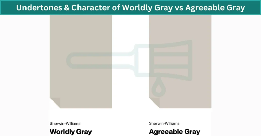
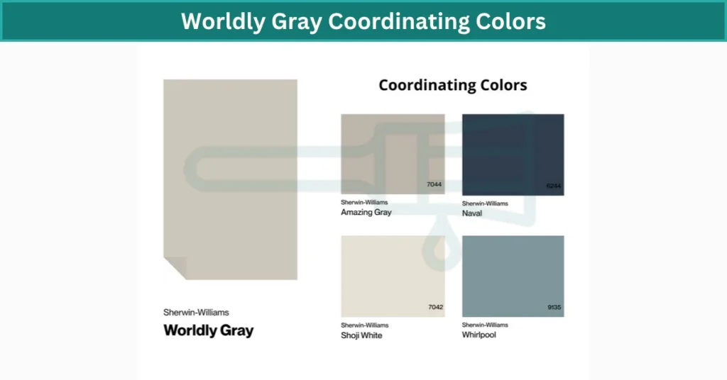
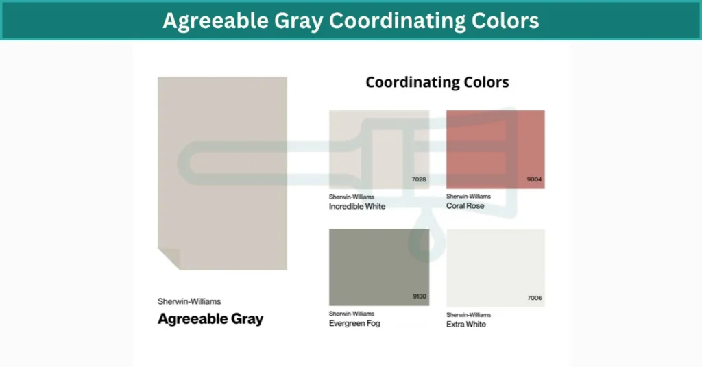
Undertones & Personality: Worldly Gray vs Agreeable Gray
The undertones in gray paint can shift how a color feels, especially under different lighting. I’ve noticed even small changes in daylight can really affect these two popular grays.
Worldly Gray is a warm gray undertone with a quiet hint of green. It has a stable personality—doesn’t change too dramatically as the day goes on. In soft morning light, it looks cozy but clean. Later in the day, even if the sunlight fades, it stays consistent because its undertones aren’t too strong. Its LRV is 57, making it just right—not too dark, not too bright.
Agreeable Gray, on the other hand, has a warmer, slightly lighter greige base (LRV 60). Its undertones can shift between beige and violet, especially in brighter, sunnier spaces. I’ve noticed Agreeable Gray lighting shifts more noticeably compared to Worldly Gray—looking warmer and creamier at midday, and sometimes a bit cooler or violet-toned by evening.
Side-by-side, Worldly Gray is your steady pick. It feels reliable, a true green-gray paint that won’t surprise you much. Agreeable Gray is playful—it reacts more to the room’s lighting, making it perfect for spaces that change moods throughout the day.
My quick advice? Choose Worldly Gray if you like consistency, especially in open-plan spaces or rooms without huge shifts in light. Go with Agreeable Gray if you enjoy watching colors subtly change through the day—great for rooms with big windows or different light angles.
Feature
Worldly Gray
Agreeable Gray
SW Code
SW 7043
SW 7029
LRV
57 (medium brightness)
60 (slightly brighter)
Undertones
Warm gray, subtle green
Warm greige, beige/violet
Color Family
Neutral Green-Gray
Versatile Warm Greige
Quick Use-Case Summary:
Use Worldly Gray: Open-plan rooms, steady neutral feel, reliable undertones (best in eggshell or matte finishes). Use Agreeable Gray: Dynamic rooms with changing lighting, playful undertone shifts (works great with eggshell finish in moody spaces).
Room-by-Room Comparison
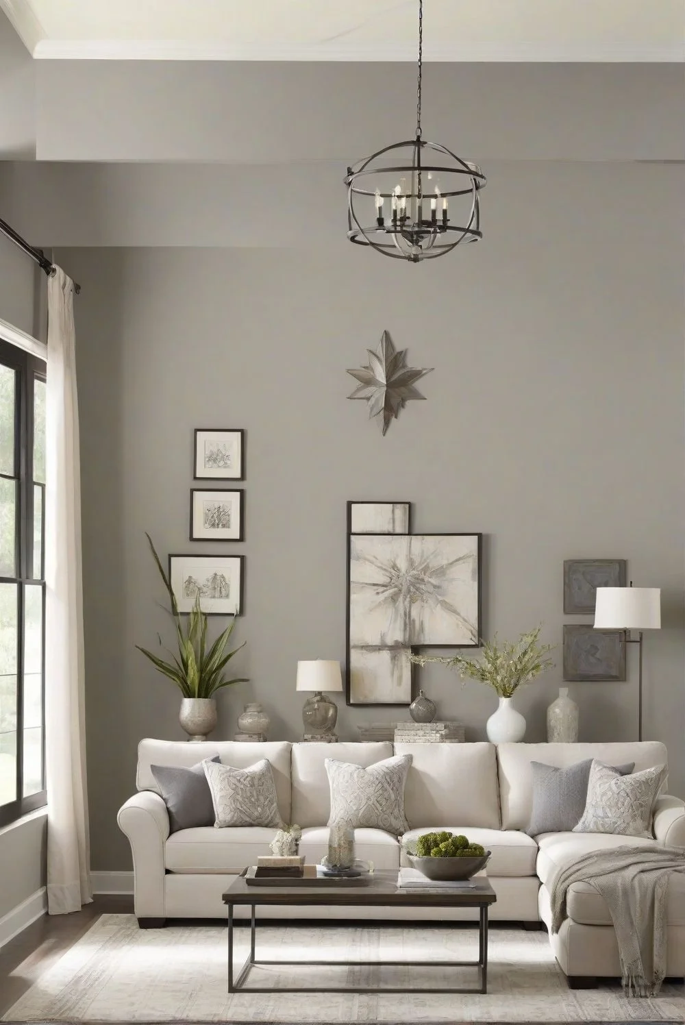
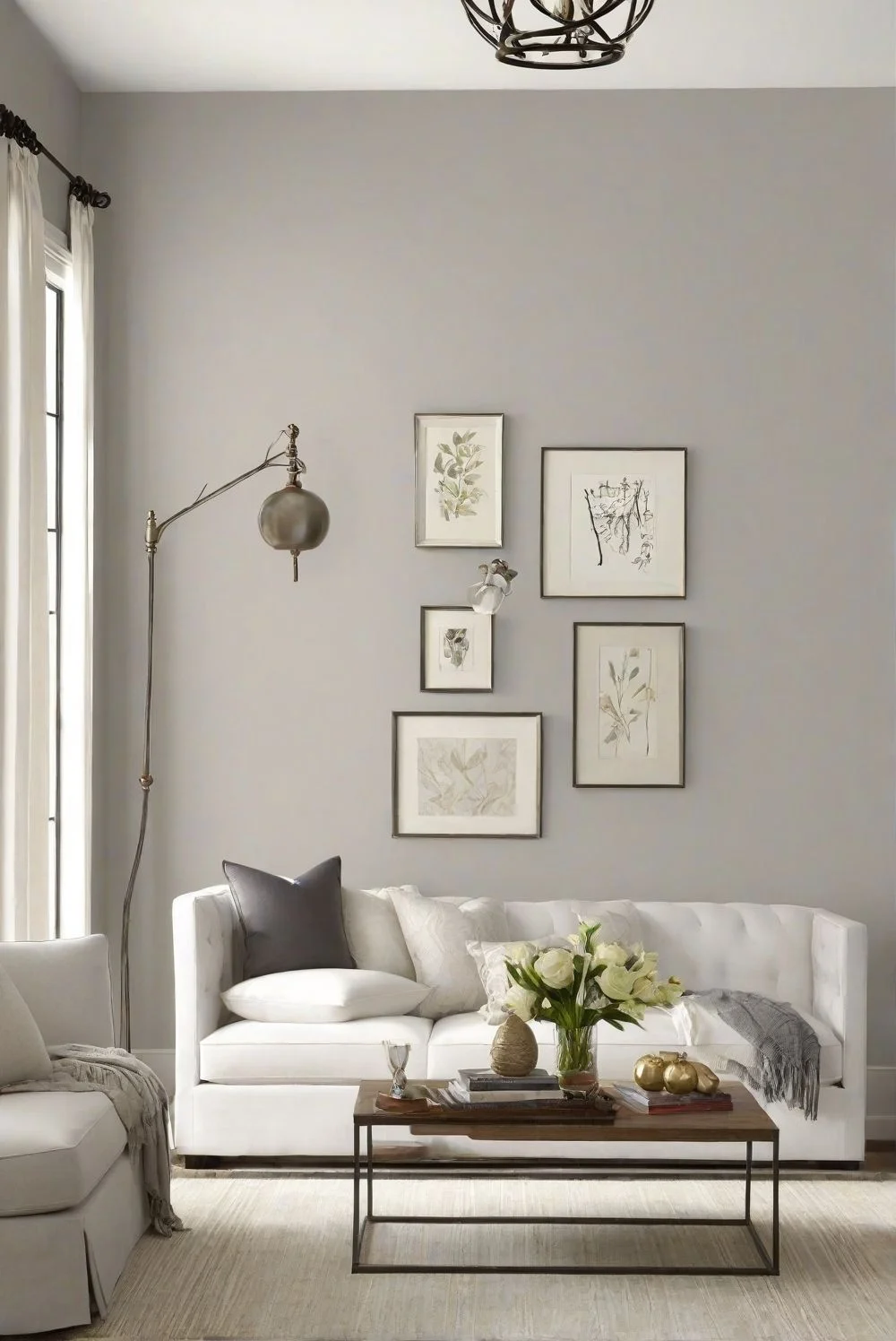
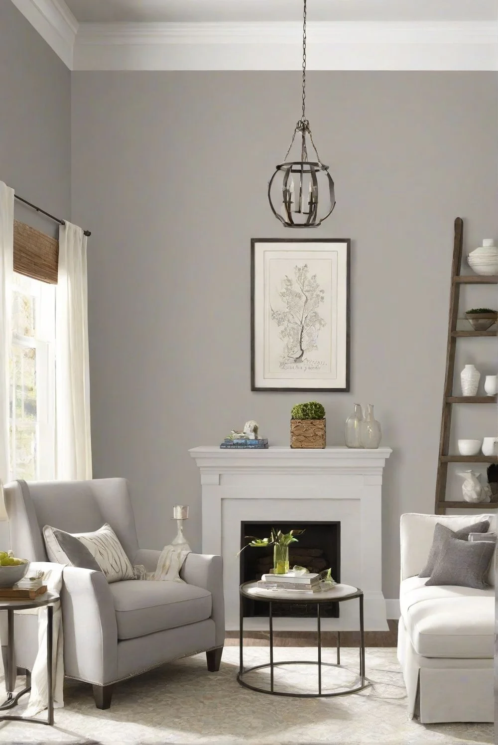
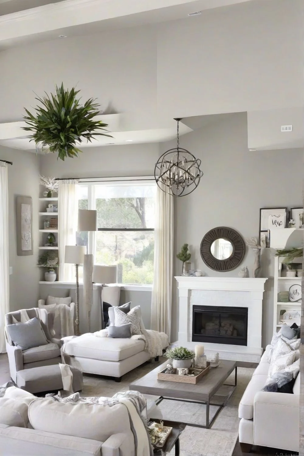
Best Pick for Living Rooms: Worldly Gray or Agreeable Gray?
Gray tones can really set the mood in your living room. Choosing the right one helps the space feel just right for hanging out.
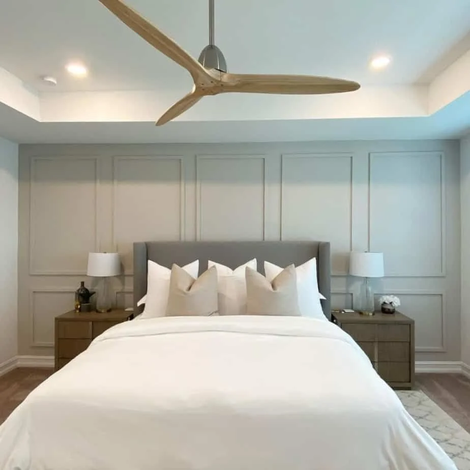
Worldly Gray is warm and cozy, especially when sunlight hits it. It works great in open-concept living rooms with lots of light and pairs nicely with light hardwood floors. I’d say it looks fresh with whites and soft blues, making the room feel calm and inviting.
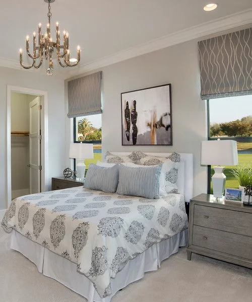
Agreeable Gray is a bit lighter and warmer. It loves wood furniture, especially medium to dark tones, and adds a comfy, lived-in feel. This color fits well in south-facing rooms or spaces with textured decor like rugs and cushions. Earthy accents like rust or olive really pop with Agreeable Gray.
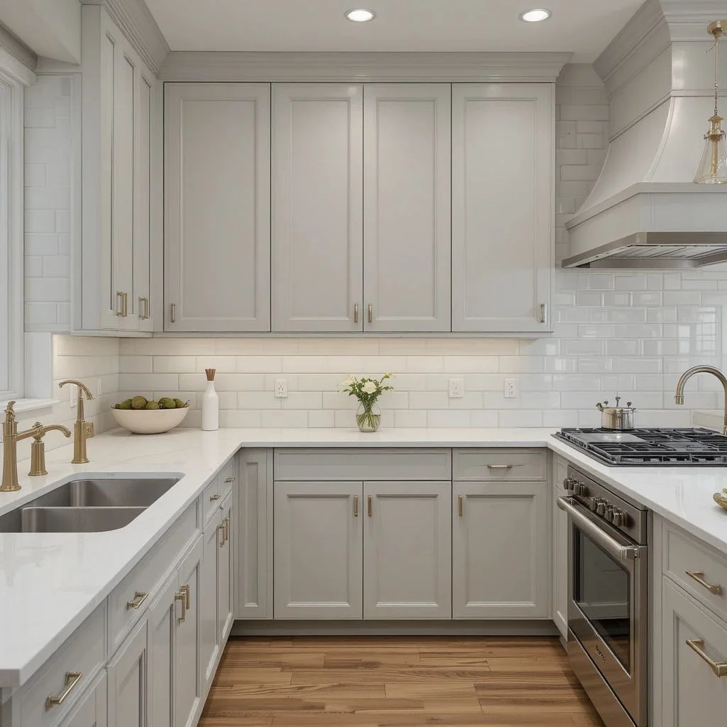
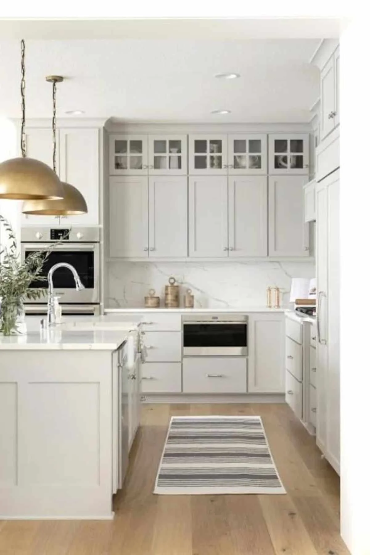
The kitchen color really sets the tone. Gray shades usually work well with lots of materials and styles.
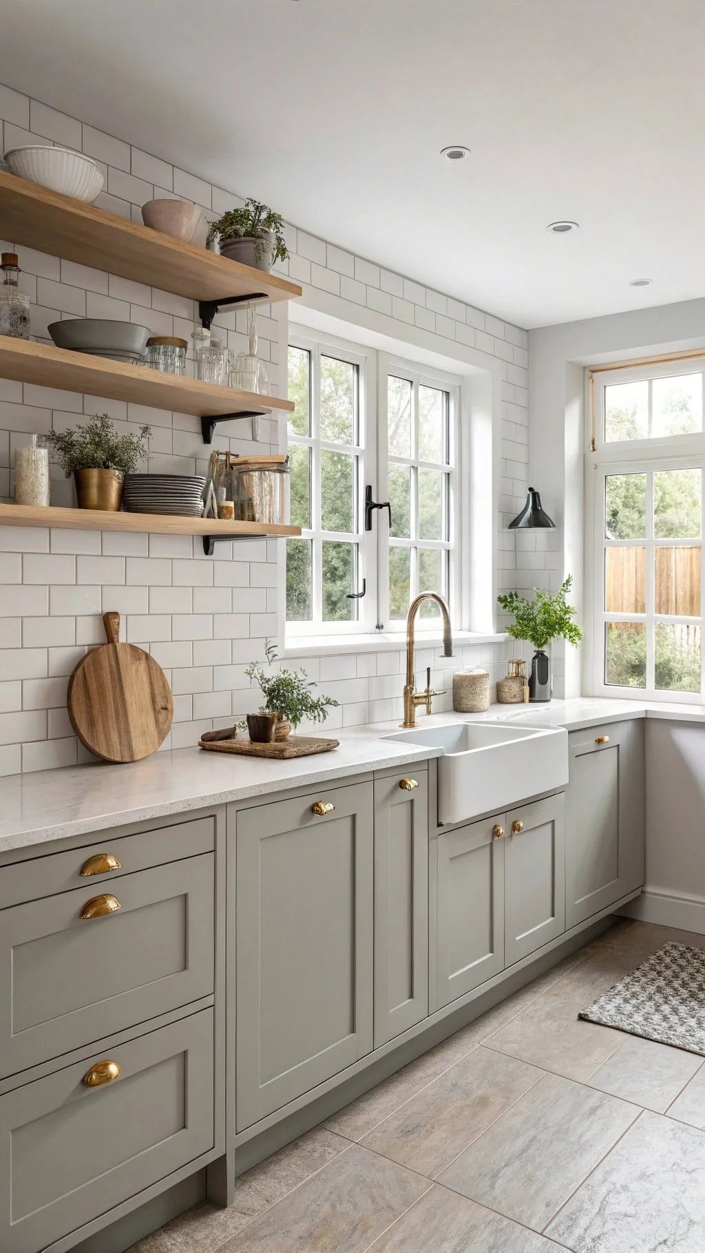
Worldly Gray is a fantastic companion for white cabinets and marble countertops. It feels balanced and neutral, giving your kitchen a classic, clean look. If you have bright LED lights, this gray stays cool and fresh, making the space feel open and calm.
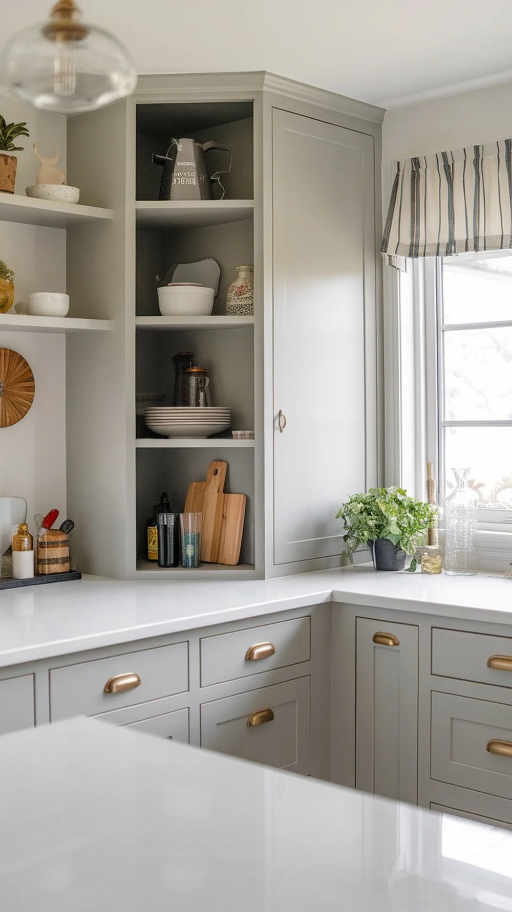
Agreeable Gray adds warmth that’s perfect for small kitchens. It pairs great with metallic hardware and butcher block counters, making the space feel cozy and modern. This color tends to shift warmer in artificial light, which can brighten north-facing or windowless kitchens.
Worldly Gray: white cabinets, marble, cool lighting
Agreeable Gray: warm counters, metals, cozy small kitchens
Color really changes how a bedroom feels. Gray paints are calm and work well for lots of styles.
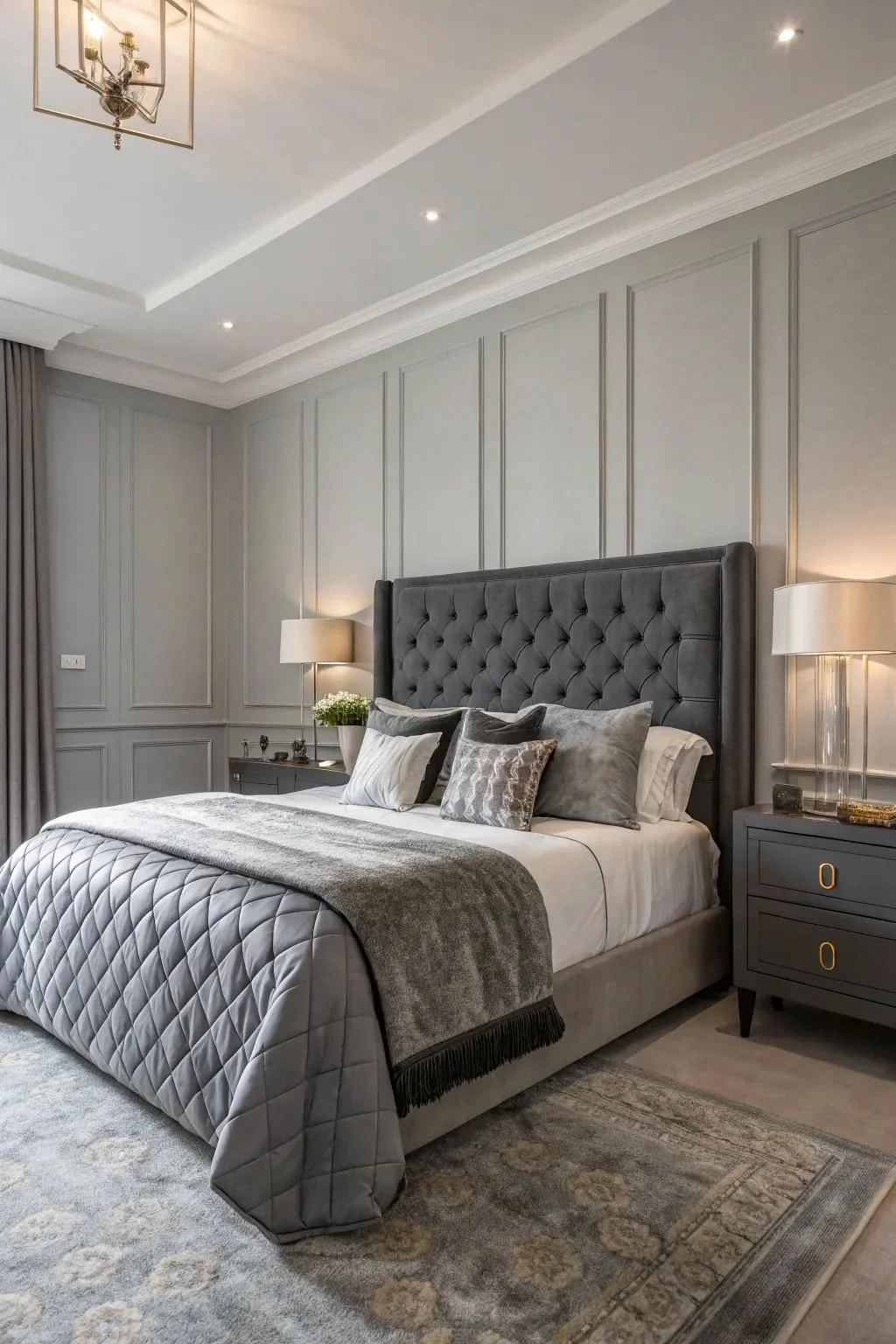
Worldly Gray is peaceful and neutral but still has some personality. It fits both modern and classic bedrooms. I think it’s great with black hardware and clean lines for a calm, restful vibe.
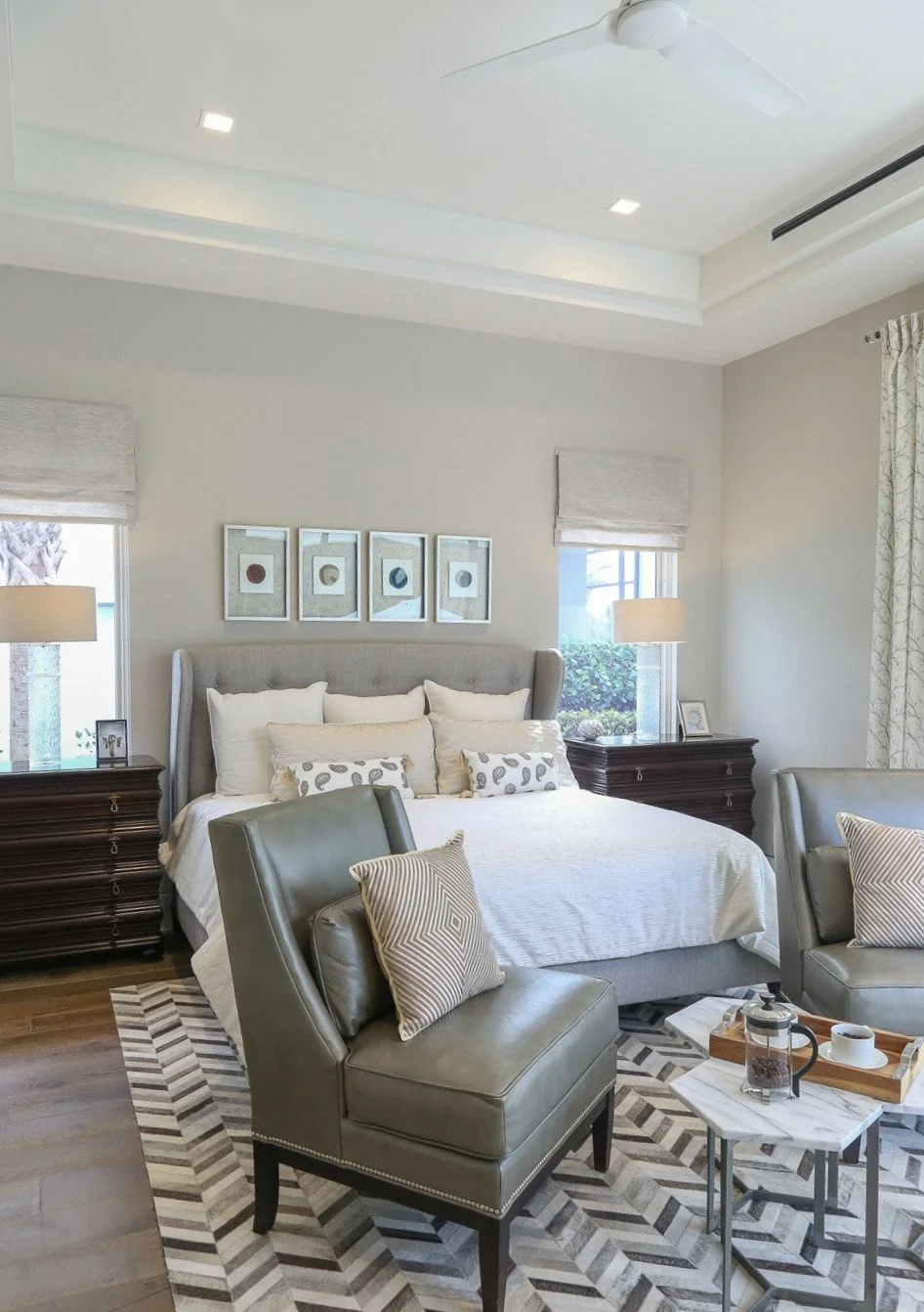
Agreeable Gray feels warmer and cozier, making it perfect for master bedrooms. It pairs nicely with soft bedding, linen curtains, and natural wood tones to create a snug, inviting retreat.
Some say cooler grays like Worldly Gray might even help you sleep better, while Agreeable Gray shines when layered with soft, natural textures.
Exterior Appeal: Worldly Gray vs Agreeable Gray
Picking the right gray for the outside of your house matters because light and materials can change how the color looks.
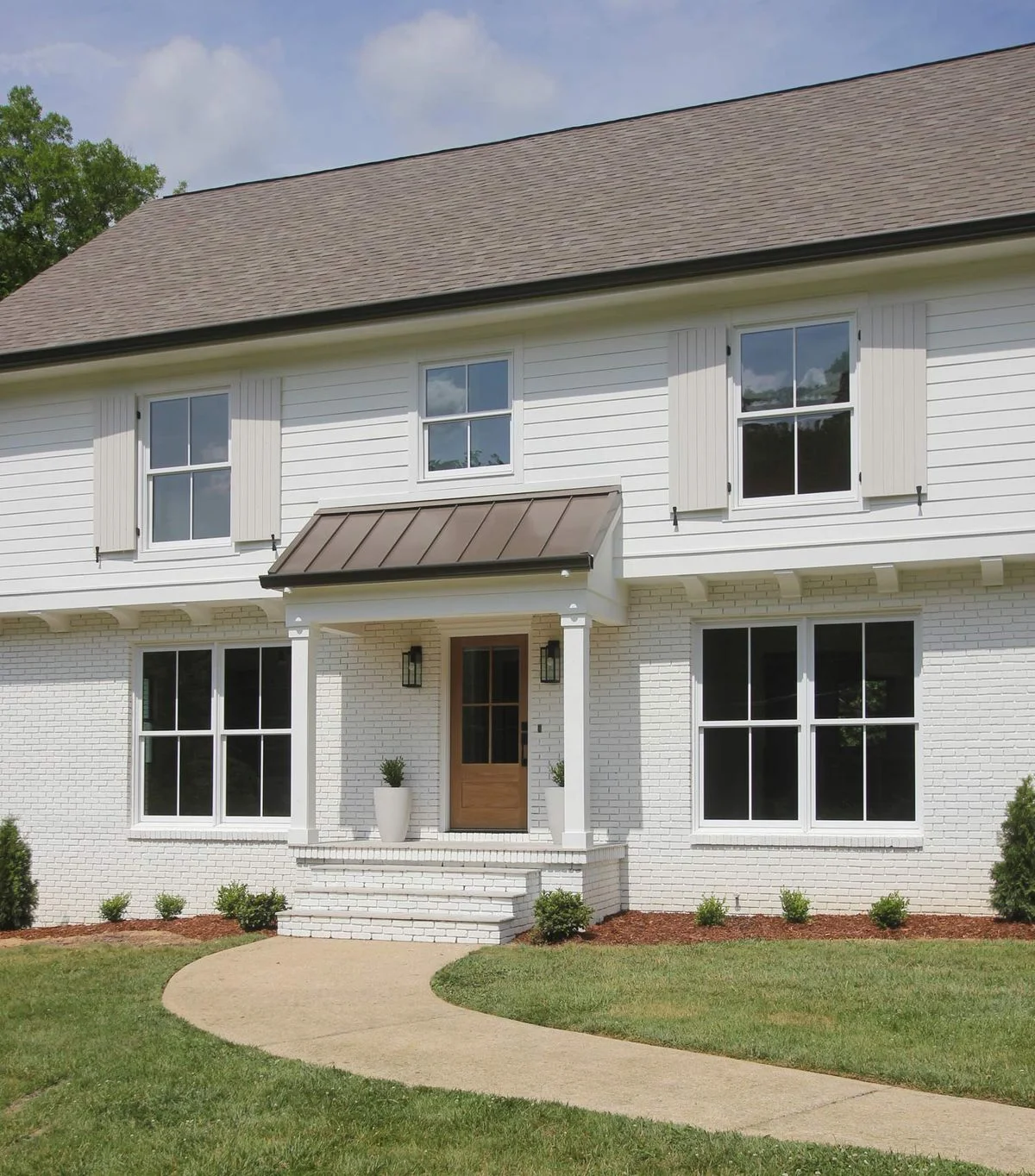
Worldly Gray comes off clean and refined outdoors. It looks great with white trim and a dark roof. If you have stone or brick, testing a big patch first is smart—sometimes the green-gray undertones pop differently in sunlight.
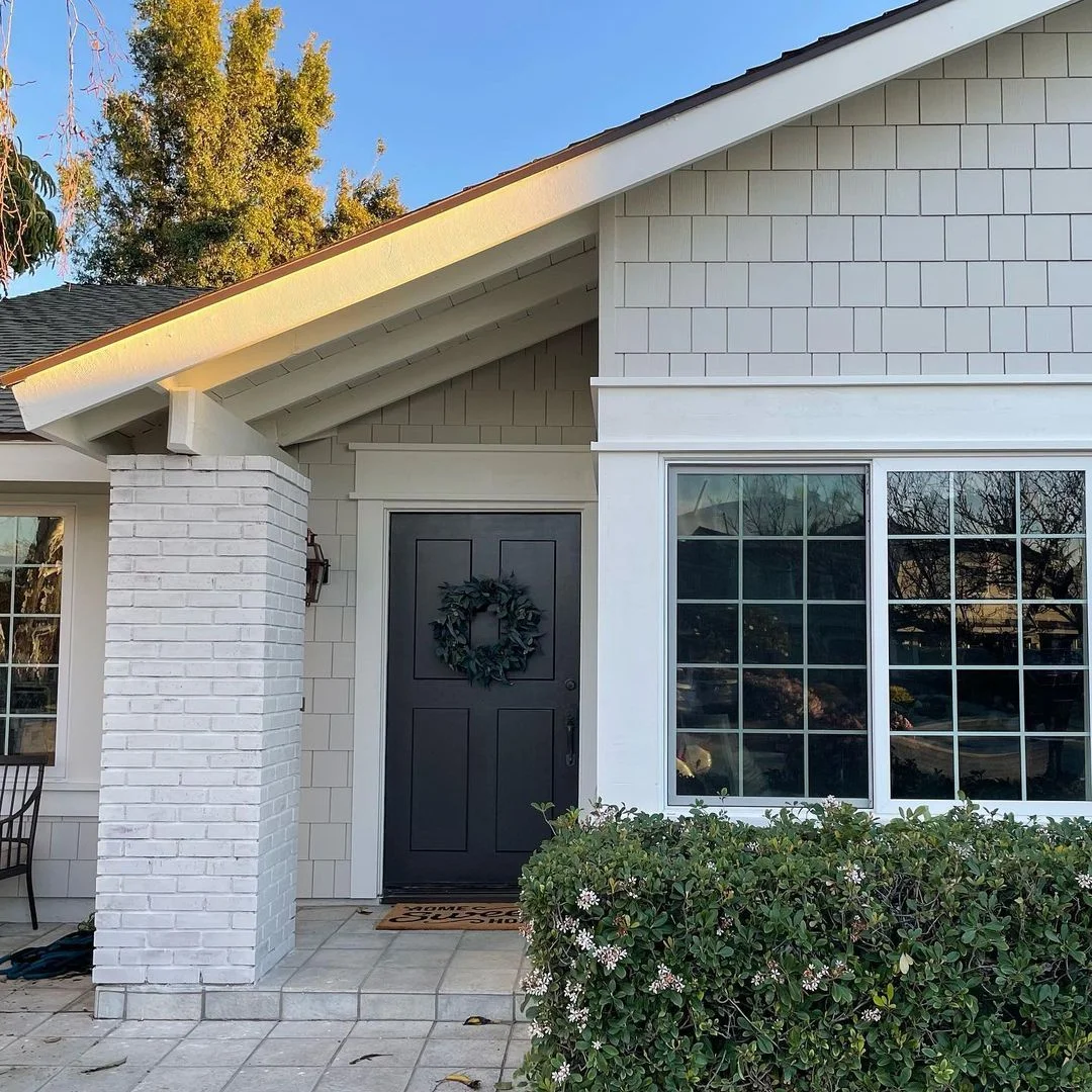
Agreeable Gray feels warmer outside and really glows with landscaping. Its beige undertones mean you want to be careful pairing it with trim colors—earthy or taupe shades usually work best. Keep in mind, sunlight can make Agreeable Gray look warmer, so testing samples in natural light helps.
Quick Tips:
Worldly Gray → crisp white accents, works well on stucco
Agreeable Gray → earthy or taupe trim, softens red brick
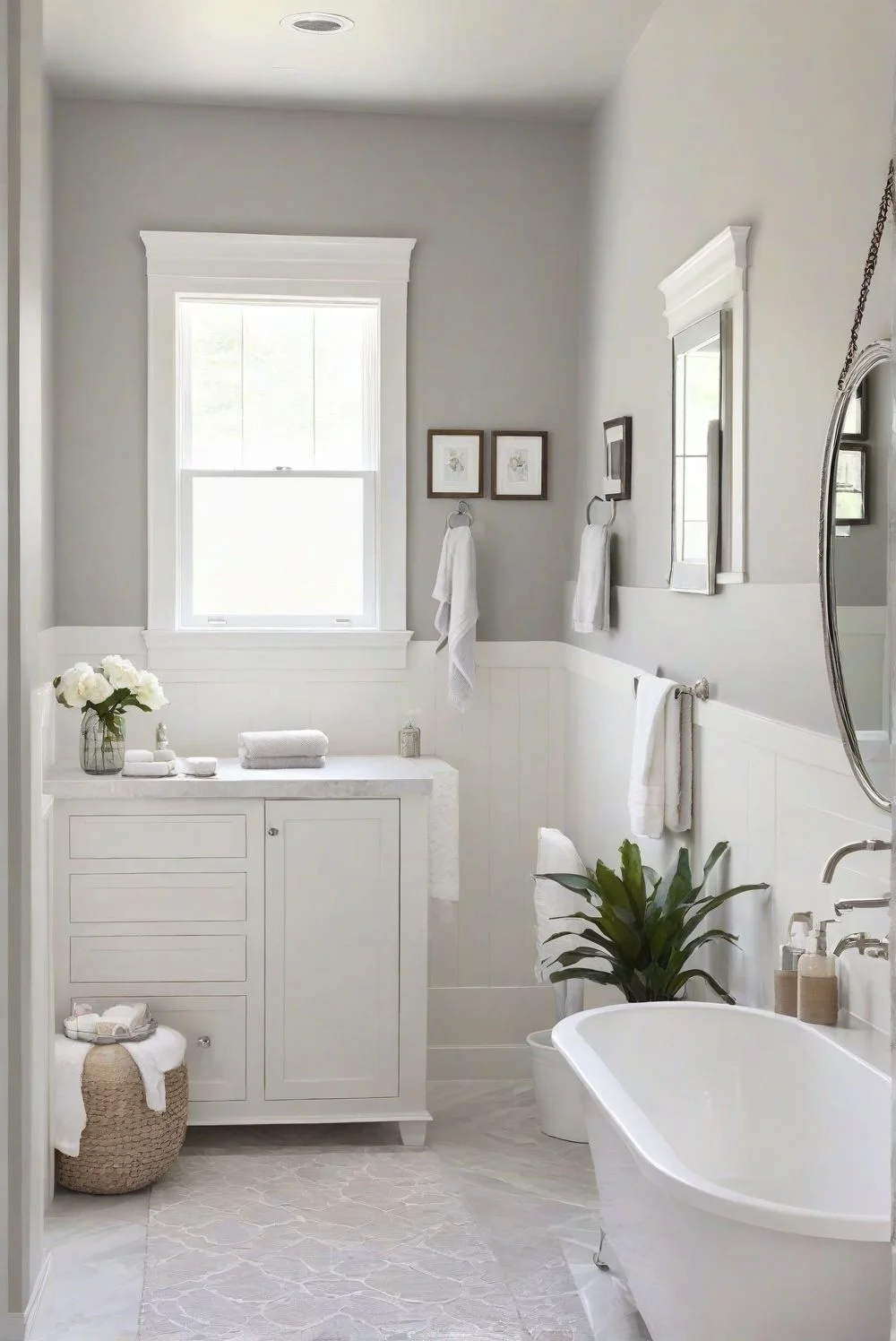
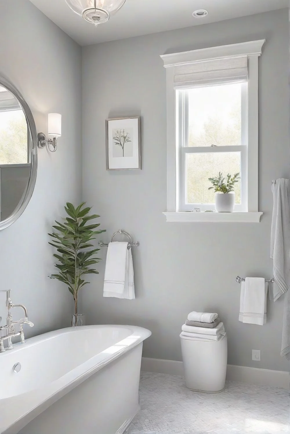
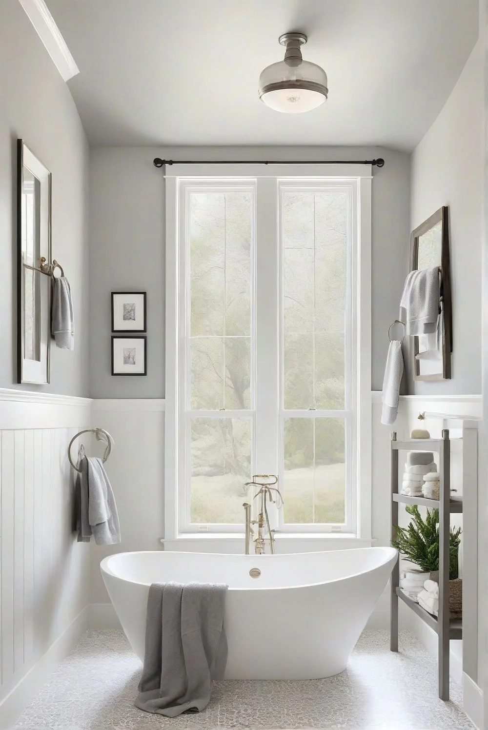
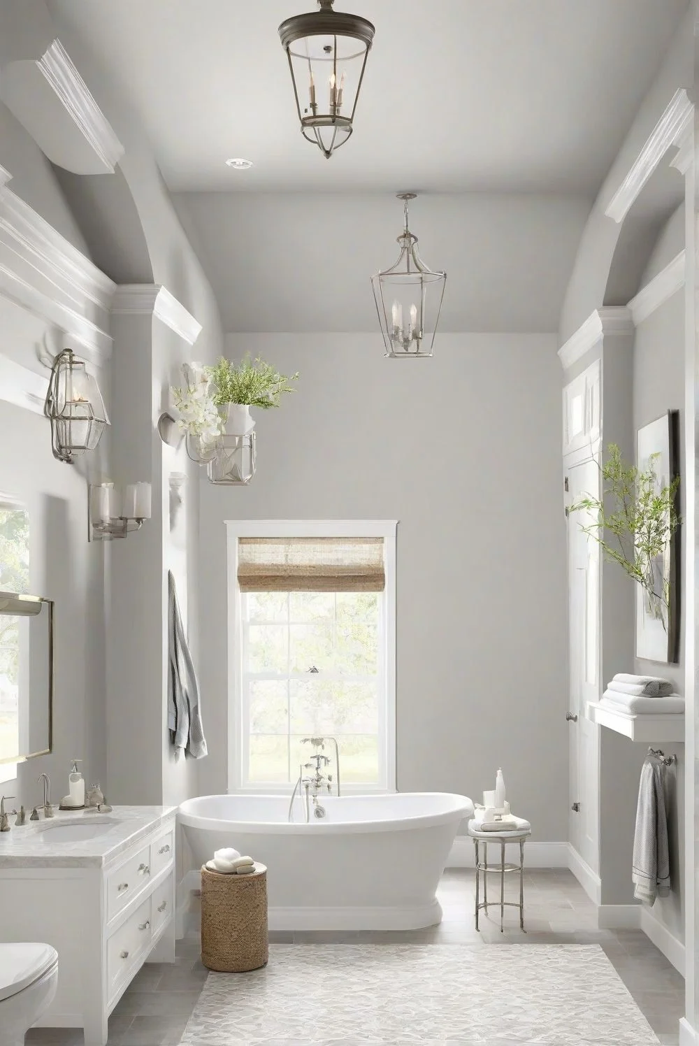
Bathrooms need paint that handles moisture and looks good in different light. Picking the right gray helps keep the space fresh and comfy.
Worldly Gray feels calm and spa-like in bright bathrooms with natural light. But in low-light or windowless spaces, it might look a bit flat or dull. It can show subtle green undertones under some LED lights, so testing it near mirrors is smart.
Agreeable Gray adds cozy warmth and works great with soft white tiles and brass or black fixtures. It’s better for bathrooms without windows because its warm tones make the room feel inviting. Satin or semi-gloss finishes help both colors resist moisture and peeling.
Agreeable Gray → warmer, great for windowless baths
Worldly Gray → spa vibe, best in naturally lit bathrooms
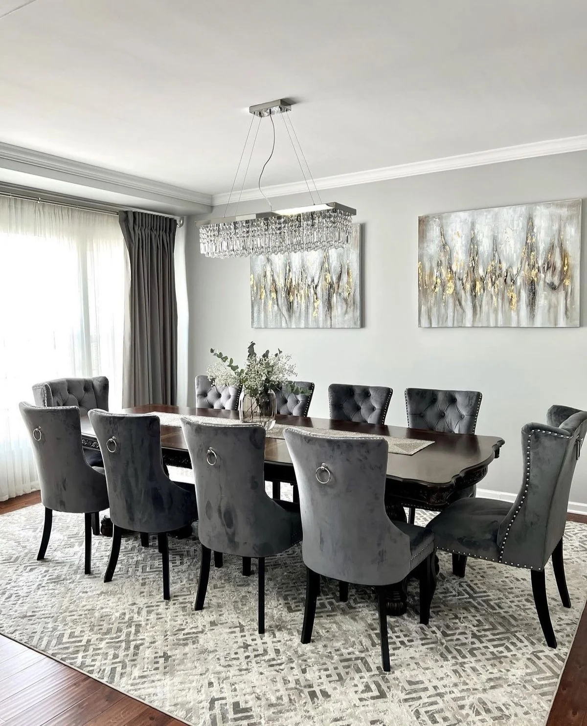
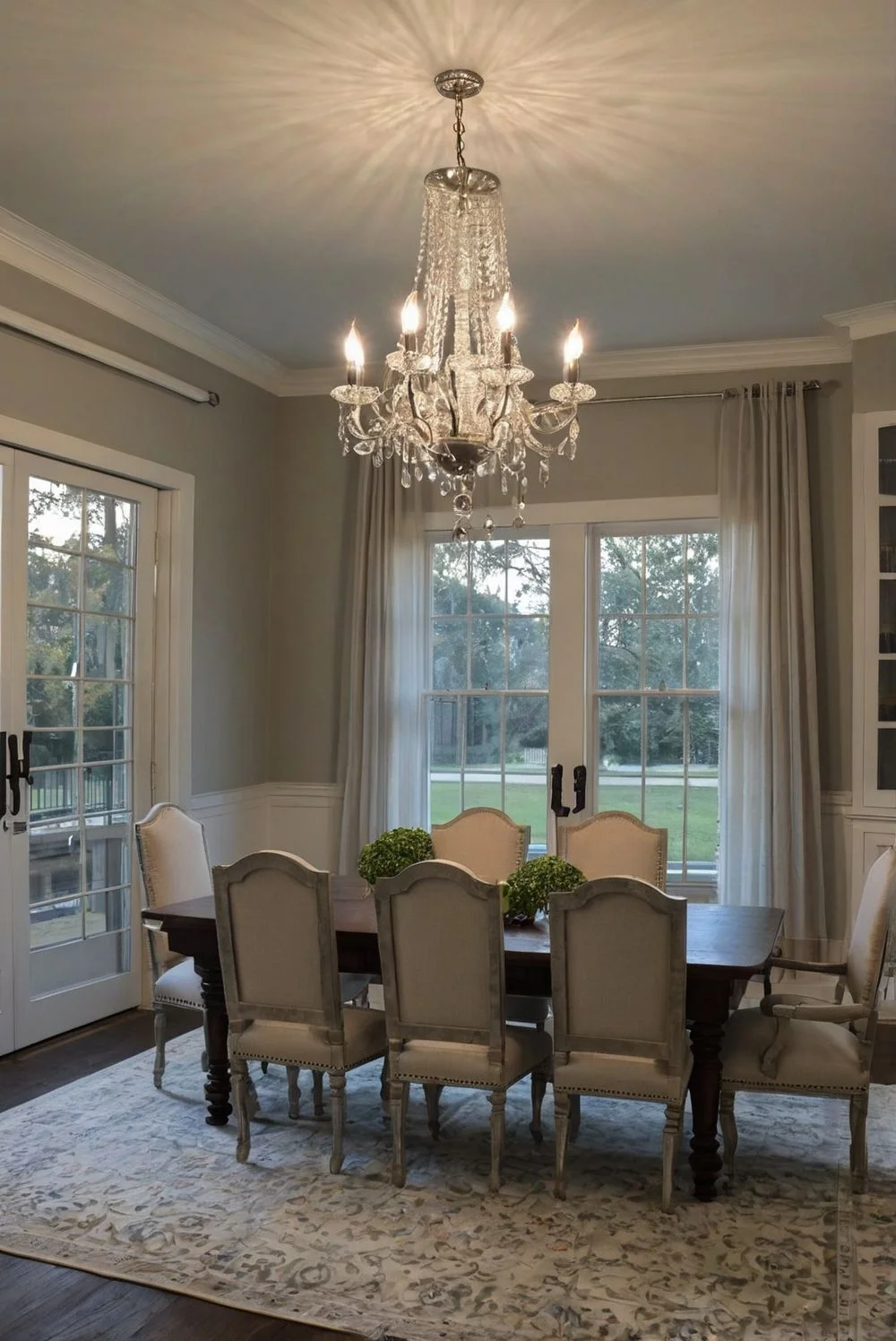
Dining Room Ambiance: Worldly Gray vs Agreeable Gray
Dining rooms need the right mix of style and warmth, and gray paint can set that mood just right.
Worldly Gray brings a calm, sophisticated backdrop that works well in formal or modern dining rooms. It pairs nicely with black chairs, white trim, and shiny fixtures like crystal or chrome. Cooler lighting, like glass pendants, makes this gray pop with elegance.
Agreeable Gray adds warmth and comfort, making it great for casual, family-style dining areas. It goes well with wood furniture and soft lighting, like vintage bulbs or farmhouse-style fixtures. Think cozy dinners with linen or velvet fabrics that invite you to stay longer.
How Lighting Affects Worldly Gray vs Agreeable Gray
Lighting can really change how gray paint looks and feels in a room.
Worldly Gray tends to shift cooler when it’s in north-facing light, showing off its subtle green undertone especially in the mornings. In south-facing rooms with more sunlight, it warms up a bit. It needs good natural light to look its best because in dim spots, it can seem flat. Its LRV of 57 means it’s a bit darker, so brightness matters.
Agreeable Gray is lighter, with an LRV of 60, and shows more of its green, beige, and purple undertones depending on the light. It does well with artificial lighting like soft white or daylight LEDs but can look patchy or uneven in darker, shadowy corners. This gray is more flexible but tricky in low light.
Lighting Conditions Summary:
Worldly Gray → best in bright, well-lit rooms with warm white bulbs
Agreeable Gray → more adaptable but watch out for low-light unevenness with soft white or daylight LEDs
Best Color Pairings for Worldly Gray & Agreeable Gray
Picking the right colors and textures can really make these grays shine.
Worldly Gray pairs best with warm woods like oak or walnut and colors like beige, cream, terracotta, and deep green. It’s a bit picky—cool silvers or shiny metallics don’t mix well here. I like to see it with soft textures like linen, matte black accents, or woven baskets. For trim and ceilings, Sherwin Williams Alabaster or Creamy works great to keep things warm and inviting.
Agreeable Gray is more flexible. It plays well with both warm and cool tones like navy, sandy beige, and black accents. Brass fixtures and dark wood bring out its best. Just be careful not to overcrowd the space with too many colors. I’d pair it with Pure White or Extra White trim for clean contrast. Textures like velvet drapes or matte finishes really complement this gray’s style.
Top Pairings for Worldly Gray: terracotta, cream, warm wood
Top Pairings for Agreeable Gray: navy, black, brass, sandy beige
LRV of Worldly Gray by Sherwin Williams: Explained Simply
Worldly Gray has an LRV of 57. LRV stands for Light Reflectance Value, which means how much light a paint color bounces back in a room. A mid-range LRV like 57 means Worldly Gray isn’t too dark or too bright. It works well in rooms with balanced lighting—both natural and moderate light. For context, Pure White has an LRV of 84, so Worldly Gray is more muted and softer. Just keep in mind, in very dim rooms, it might look a bit flat without some bright accents.
LRV of Agreeable Gray by Sherwin Williams: Quick Breakdown
Agreeable Gray has an LRV of 60. LRV means how much light a paint color reflects in a space. This makes Agreeable Gray a bit lighter and brighter than Worldly Gray, which has an LRV of 57. Because of this, it’s a safe choice for both bright rooms and those with less light. It can help small or darker spaces feel more open without looking washed out.
Is Sherwin Williams Agreeable Gray Warm or Cool?
Agreeable Gray is a warm gray. It blends gray and beige, which is why people often call it a “greige.” This mix makes it feel soft and inviting—not cold or stark like some grays can be. It works great as a warm neutral paint, pairing well with other warm colors and acting as a gentle backdrop in many rooms. While it might look a bit cooler in north-facing spaces, it’s still considered warm overall. Many designers call it the “perfect greige” because it fits both warm and cool styles easily.
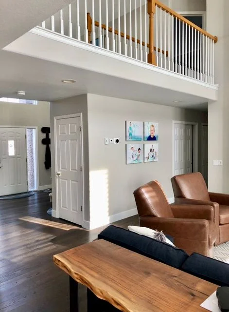
Where to Use Sherwin Williams Agreeable Gray in Your Home
Agreeable Gray is super versatile, so it works well in almost any room.
Living Rooms: Cozy but neutral, great for family time.
Bedrooms: Warm and calming, helps create a relaxing space.
Kitchens: Pairs nicely with white cabinets and warm countertops.
Bathrooms: Looks fresh with tile and soft lighting. Hallways: Brightens narrow or darker areas, making them feel open.
Because of its balanced warmth and neutrality, it’s perfect for open-concept layouts and fits styles like modern, farmhouse, and traditional. Builders love using Agreeable Gray since it appeals to many homeowners and is a favorite in home staging for its clean, inviting look.
Side-by-Side Paint Swatches: Worldly Gray vs Agreeable Gray
Worldly Gray is a bit cooler with a subtle green-gray tint, while Agreeable Gray looks warmer and lighter with beige tones. Seeing them side by side helps you spot these small but important differences.
Feature
Worldly Gray (SW 7043)
Agreeable Gray (SW 7029)
Undertones
Green-gray
Warm beige-gray
LRV
57
60
Best Rooms
Cooler, open spaces
Warm, cozy areas
Try testing peel-and-stick samples on different walls—lighting changes how these colors show up!
Real User Fixes & Community-Backed Solutions
We found a user on r/paint asking which gray paint colors are popular for a gray and white trim theme in homes. The community shared several recommendations including Sherwin-Williams’ Agreeable Gray, Repose Gray, Worldly Gray, and Dorian Gray, as well as Ben Moore’s Revere Pewter and Cashmere Flat. Many emphasized that the choice depends on the room’s lighting and surrounding features, advising to try samples and see how the color lives in the space before committing.
Other users pointed out that while some popular grays are widely used (sometimes even by decorators), the best gray really varies by home and personal taste. One shared a helpful video explaining how to select gray shades for homes, and another recommended Farrow & Ball Purbeck Stone as a beautiful option that pairs well with white trim. Overall, the consensus was to test samples and consider the unique room conditions before choosing a gray paint.
We found a user on r/paint struggling to choose between Sherwin-Williams’ Agreeable Gray and Accessible Beige. The community overwhelmingly favored Agreeable Gray, with many praising its true neutral tone that works well across different rooms and with various color schemes. Some even joked that touch-ups on Agreeable Gray look like “disagreeable gray,” showing how popular and commonly used it is.
Others noted that Accessible Beige leans browner and pairs nicely with warmer wood tones or ivory cabinets but may not blend as well with cooler colors like gray bathroom cabinets. A few shared that while gray tones can feel a bit depressing if not accessorized well, Agreeable Gray tends to feel more beige than gray and generally creates a versatile, balanced look. Overall, Agreeable Gray was the preferred choice for its adaptability and neutral warmth.
Final Verdict: Worldly Gray vs Agreeable Gray
In the battle of Worldly Gray vs Agreeable Gray, the winner depends on your space and style. Worldly Gray offers a cooler, more stable tone with soft green undertones that shine in bright, open rooms. It’s perfect if you want a calm, elegant backdrop that doesn’t shift much with the light—ideal for modern or transitional designs with cooler palettes.
Agreeable Gray, on the other hand, is the more flexible and popular choice. This warm greige adapts easily to different lighting and décor styles, making it a go-to for cozy bedrooms, family spaces, and open-concept homes. If you’re unsure which neutral to pick, Agreeable Gray’s soft, inviting tone makes it a safe and stylish bet.
FAQs
Which is better, agreeable gray or worldly?
Worldly Gray has an LRV of 57, which means it’s a bit less reflective and slightly darker than Agreeable Gray’s LRV of 60. Because of this, Agreeable Gray feels a bit brighter and more versatile for different spaces. I’ve seen designers pair Worldly Gray with colors like Porpoise and warm woods, while Agreeable Gray looks great alongside soft tones like Peach Fuzz and crisp whites from Sherwin Williams.
Is worldly gray too dark?
LRV stands for Light Reflectance Value, which measures how much light a paint color reflects. It helps you understand if a color is dark or light. Worldly Gray sits in the middle of the spectrum with an LRV of 57, meaning it’s not too dark or too bright. This makes it a balanced choice that works well in many rooms without feeling heavy or washed out.
What undertone is worldly gray?
Sherwin Williams Worldly Gray is a warm gray with a subtle green undertone and an LRV of 57. It warms up beautifully in south-facing rooms with lots of sunlight but can take on a cooler vibe in north-facing spaces, making it important to test how the light affects it before choosing.
When not to use worldly gray?
Worldly Gray works well in super bright rooms where its LRV of 57 helps it hold its color nicely. But in darker rooms, it can look a bit dingy or flat, so you’ll need good interior lighting to keep it looking fresh and balanced. If your space doesn’t get much natural light, this might not be the best pick.
What pairs well with worldly gray?
Worldly Gray (Sherwin Williams SW 7043) pairs beautifully with light colors like Alabaster and Pure White for a fresh, clean look. To add depth and contrast, try rich, grounding tones such as Urbane Bronze and Iron Ore. For a balanced, mid-tone option, Dovetail works well alongside Worldly Gray to keep the space feeling calm and cohesive.
Is agreeable gray warm or cool?
Agreeable Gray is a warm greige that many consider one of their favorite neutrals. It leans more toward greige than pure gray and can look a bit more gray depending on the sunlight. With an LRV of 60, it’s on the lighter side, which helps brighten up rooms. Its versatility makes it a popular choice for many different spaces and styles.
Why is agreeable gray so popular?
Sherwin Williams Agreeable Gray is a neutral and warm gray paint color with undertones of beige, making it a true greige. This versatile neutral works well in many different spaces, from living rooms to bathrooms. It looks beautiful in all paint sheens, whether matte or satin. No wonder it’s such a popular choice for homeowners and designers alike.
What compliments agreeable grey?
White Trim: Using Pure White or Extra White trim creates a clean, classic look that brightens the space. Navy or Dark Blue Accents: These add depth and visual interest against Agreeable Gray’s warm neutral base. Natural Wood Tones: Wood elements bring out the warmth in Agreeable Gray, making rooms feel cozy and inviting. Muted Greens: Soft green shades enhance the natural, calming vibe when paired with this greige color.
What is lighter than agreeable grey?
SW White Heron is not just a 50% lighter version of Agreeable Gray. Simply lightening Agreeable Gray by half changes the color too much and doesn’t give an accurate match. For the truest, most accurate lighter color, White Heron is the recommended choice by Sherwin-Williams.
I’ve seen a lot of folks get stuck between these two — Tricorn Black vs Iron Ore. Honestly, I get it. They both look bold, deep, and kind of similar at first. But once you start painting, the little differences start to matter. Especially when you see them in real light. And yeah, both are…
I’ve seen a lot of folks struggle with picking between Repose Gray and Agreeable Gray. Honestly, it’s a fair question — both are from Sherwin-Williams, both are super popular, and yeah, they kind of look the same at first. But here’s the deal: they’re not exactly the same. Agreeable Gray is more of a warm…
I’ve messed up more paint jobs than I’d like to admit—wrong finish, wrong paint type, or just choosing the wrong brand. Picking paint isn’t just about color anymore. I’ve learned that the best interior paints for 2025 are made for specific jobs. Like, for high-moisture areas (think bathrooms), you need moisture-resistant paint that won’t peel….
I used to think picking white paint was the easy part. I mean, it’s just white, right? Nope. Total rookie mistake. When I had to choose between Shoji White vs Alabaster, I went down a full-on color rabbit hole. You might think all whites look the same—until you put them on the wall. Side by…
I’ve seen mauve pop up a lot lately—and honestly, it just works. It’s soft but not boring, cozy but still fresh. Whether you like vintage vibes or something more modern, mauve has a way of fitting in without trying too hard. Designers love it because it’s super flexible. You can use mauve paint for walls…
Picking paint between Swiss Coffee vs White Dove can seriously mess with your head. One minute you think you’ve got the perfect shade, next minute it looks yellow… or gray… or both? Yeah, we’ve all been there. Swiss Coffee vs White Dove by Benjamin Moore are two of the most talked-about neutral paint colors. Both…