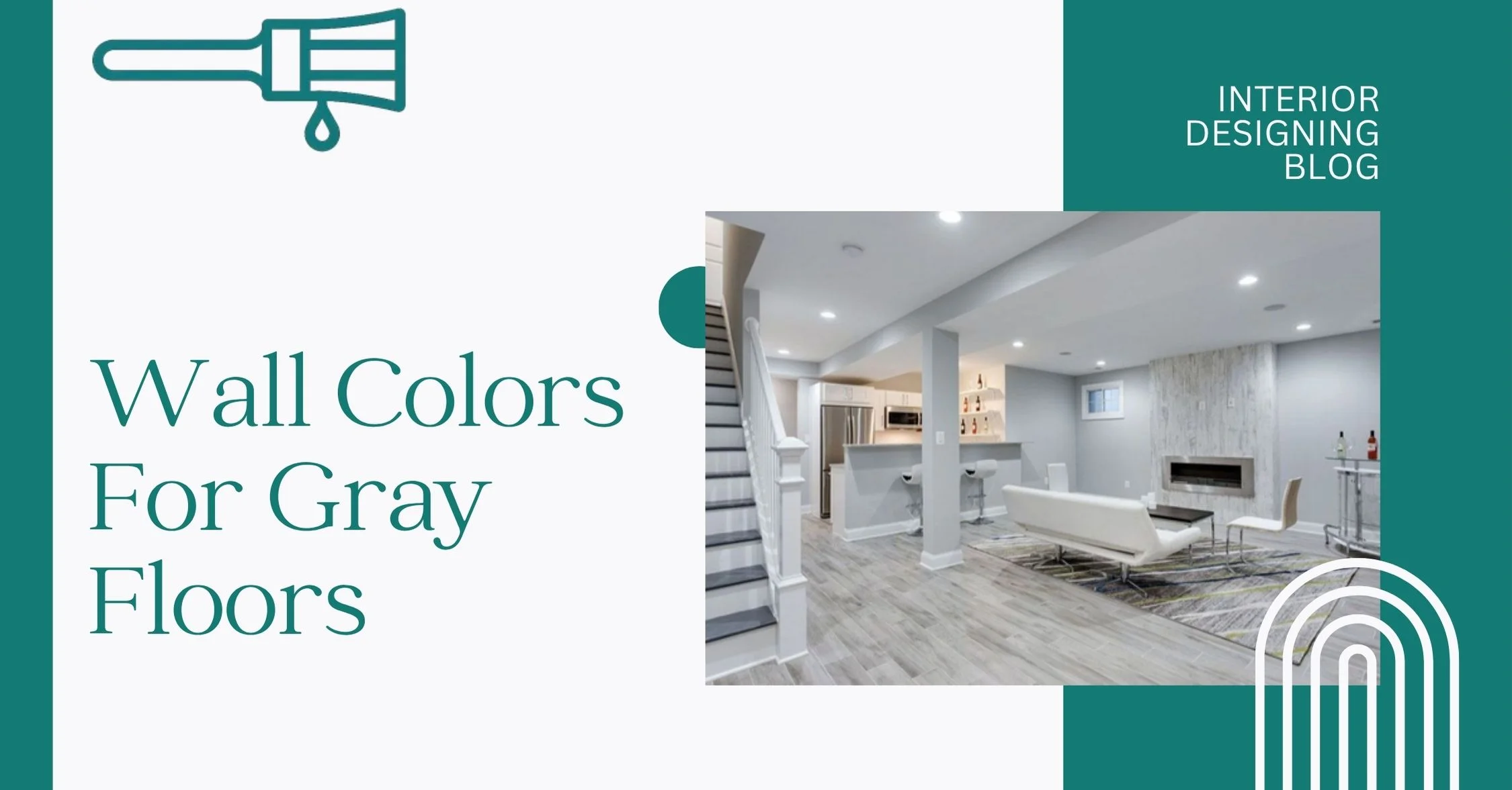
11+ Top Wall Colors For Gray Floors
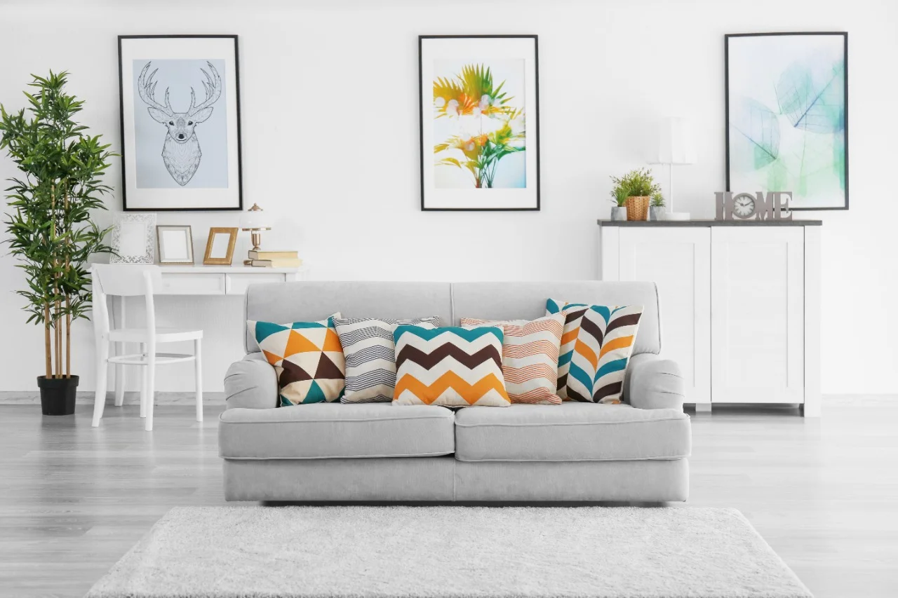
Gray floors are super popular right now. I think it’s because they go with almost anything. They look clean, modern, and kind of fit right into that minimalist home vibe. Whether you’re going for a simple look or something cozy, gray floors make a nice base.
But here’s the thing—getting the wall color right? That’s where things can go wrong. Some colors make the whole room feel cold or just plain boring. Others warm things up and make everything feel more put together.
Interior Designing Blog seen a bunch of good Wall Colors For Gray Floors ideas that work really well. Some are soft and calm. Others add a little boldness. And yeah, lighting plays a big part too—what looks good in sunlight might feel totally different at night.
How to Pair Wall Colors For Gray Floors Undertones
Here’s the thing most folks miss—gray floors aren’t just gray. Some lean warm, some cool. And if you don’t match the undertone right, your wall color can feel off. I’ve messed this up once, and the whole room felt weird until I repainted.
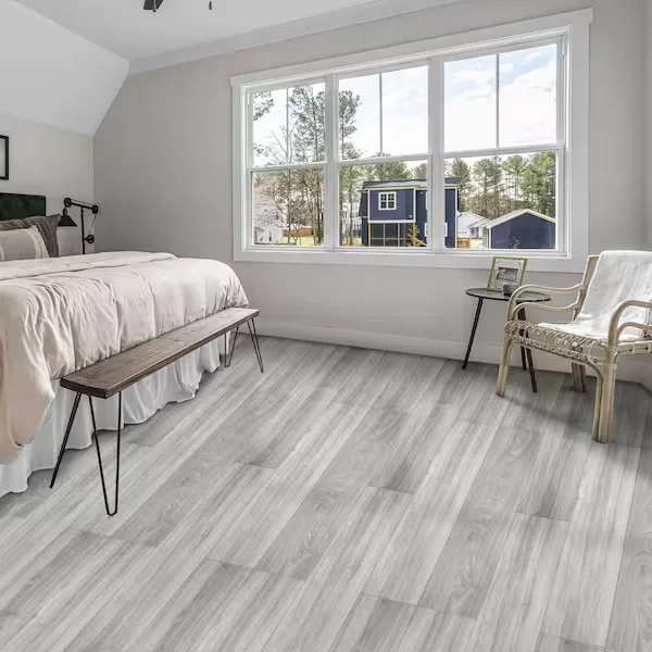
Cool gray floors usually have a blue, green, or even slight purple tint. They work best with other cool tones—think crisp whites, light blues, or even something dark like navy if you want contrast. These combos feel fresh and modern.


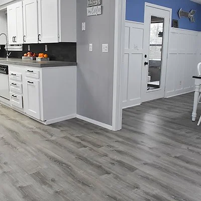
Warm gray floors have hints of beige or brown. These play nicer with creamy walls, soft whites, or warm beiges. It gives off a cozy, welcoming vibe without looking too yellow or muddy.


If your floors are light gray, lucky you—they’re super flexible. You can go soft and airy with pastels or make a statement with bold colors like teal or even deep green. Just depends on the look you’re going for.


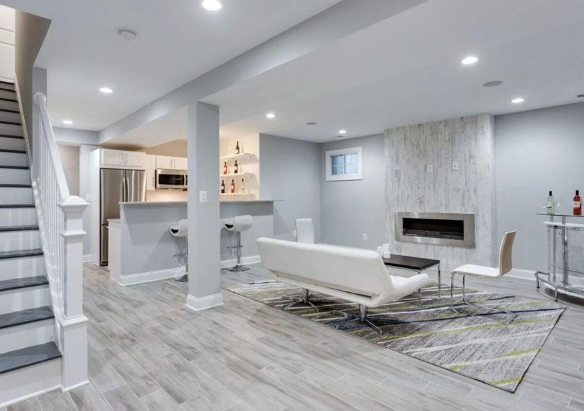
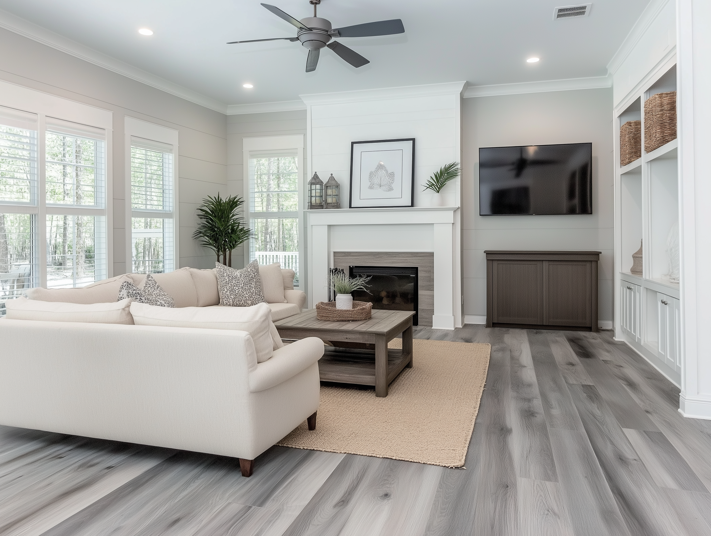
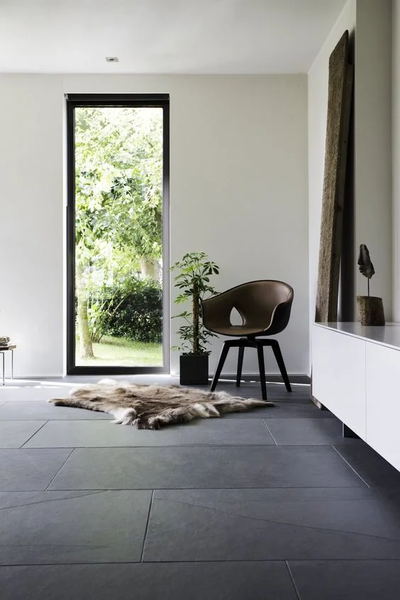
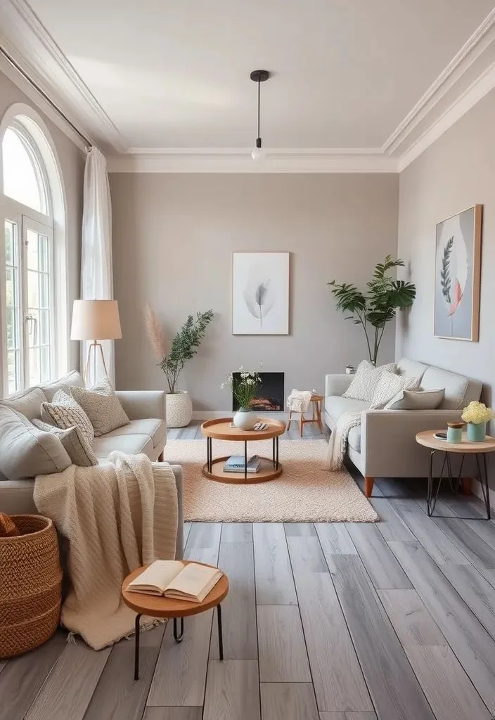
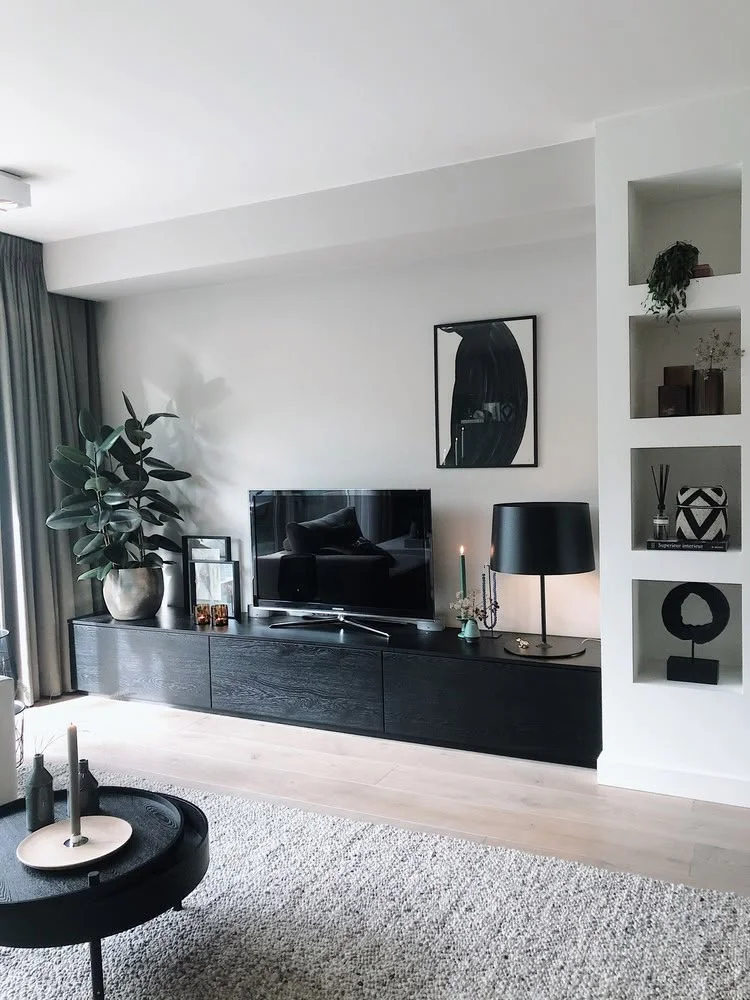
Now, dark gray floors can look sleek, but if you pair them with dark walls, the whole space might feel heavy. I’d go for lighter walls to keep the room feeling open. A warm white or pale greige usually works well.


And don’t forget about floor texture. If your floor has a busy pattern—like wood grain or tile veins—keep the wall color simple. But if it’s smooth or plain, you can try something fun on the walls, like patterns or bold colors.
One last thing—lighting changes everything. What looks warm during the day might turn cool at night. So test paint samples under different lights. And try using those paint brand tools online—they’re super helpful for previewing combos.
Wall color sets the mood. Light walls = more open. Dark walls = more cozy. So yeah, your choice really does shape the whole space.
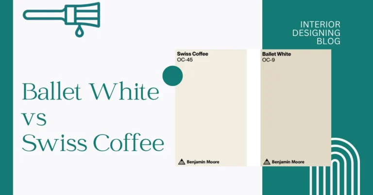
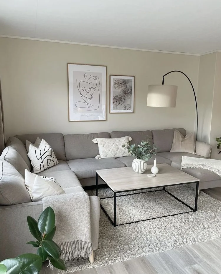
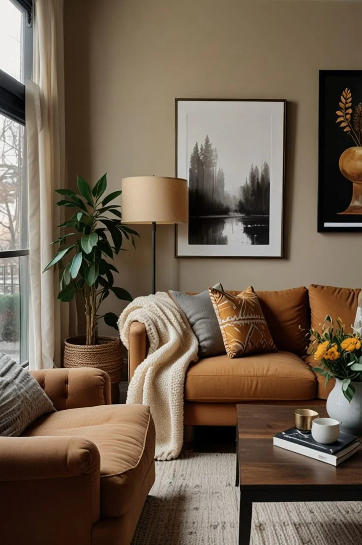
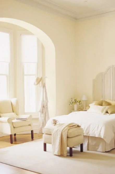
1. Off-White Shades That Soften Gray Floors
Off-white is one of those easy picks that just works with gray floors. It feels soft, not too bright, and definitely less “hospital-like” than plain white. I like it because it lets your furniture and decor do the talking—kind of like a quiet background that still looks good.
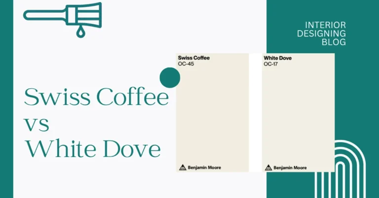
If you’ve got warm gray floors, I’d go with something like Swiss Coffee by Benjamin Moore. It has a warm undertone, so it blends in nicely and makes the room feel cozy. Plus, it’s a favorite among designers for a reason—it never looks too yellow.


Now if your floor leans cooler, try Strong White by Farrow & Ball. It’s got a slight gray tone that keeps everything calm and balanced. These off-whites also bounce around natural light in a nice way, which just makes your whole space feel brighter.
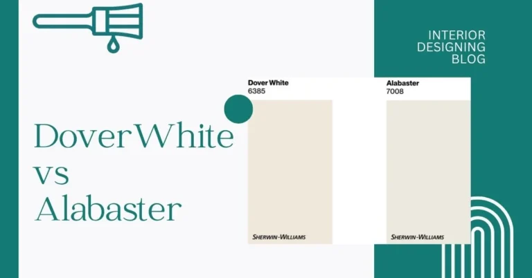
2. Greige: The Perfect Blend with Gray Floors
Greige is one of those wall colors that just gets gray floors. It’s a mix of gray and beige, so it blends right in without feeling too cold or too blah. I’ve learned this one the hard way—pure gray walls with gray floors can feel like a concrete box. Greige softens that up and still looks clean and modern.


If your gray floors have warm undertones, go with something like Revere Pewter (HC-172). It’s a medium greige that looks great in bigger, brighter rooms. For a lighter, more versatile greige, Agreeable Gray (SW 7029) is solid. It’s actually one of the top picks if you’re thinking about selling your house later—real estate agents love it.
Here’s a tip: got a room with lots of natural light? You can get away with a deeper greige. But if your space feels dark, keep it light so the room doesn’t feel heavy.
3. Sage Green: A Soothing Match for Gray Floors
Sage green walls with gray floors just feel calm. It’s one of those colors that makes a room feel grounded without being boring. The soft green tones balance out the coolness of gray and give off a cozy, peaceful vibe. I like how it brings in a little nature without going full forest.
This combo works great in living rooms, bedrooms, or even home offices—basically anywhere you want to relax or focus. It also pairs really well with natural wood furniture, like oak or walnut. Everything feels soft and connected, like a quiet retreat.

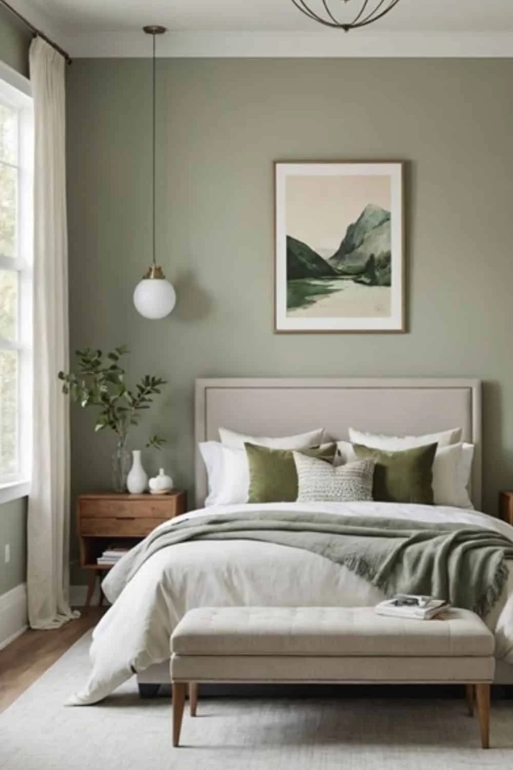

If I had to pick a favorite, I’d go with Saybrook Sage by Benjamin Moore. It’s subtle, not too green, and fits easily with both warm and cool gray floors. If your room is small, maybe try it on just one wall—it still gives that calm, zen look without making the space feel too dark.
4. Pale Blue: Brighten Gray Floors with a Breezy Feel
Pale blue walls with gray floors feel fresh—like opening a window on a warm day. It’s a soft color that makes rooms feel lighter and taller, kind of like the ceiling’s been lifted. This combo gives off a calm, airy interior that’s easy on the eyes and perfect for relaxing or daydreaming.
For a cool, silvery match, try Borrowed Light by Farrow & Ball. It has just enough gray in it to play nice with your floors. If you want something a touch warmer, Breath of Fresh Air by Benjamin Moore is a great pick. It’s still light but feels a little sunnier.

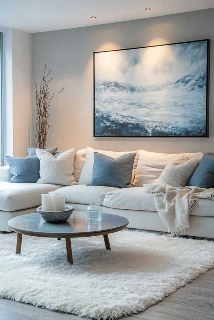

Natural light really brings pale blue to life. If your room gets good sun, this color will shine. I’d also pair it with white or soft gray trim to keep things crisp and clean. Works well in bedrooms, bathrooms, or any spot that needs a gentle lift.
5. Deep Charcoal: Bold Depth for Gray Floors
Deep charcoal paint brings in a strong, moody vibe that works really well with gray floors. It adds richness without looking too black, and it grounds the whole space. I’d say it’s perfect if you want something bold but still classy.
Since charcoal is kind of in the same family as gray, the transition between wall and floor feels smooth—not too sharp or loud. That’s what makes it feel polished instead of overwhelming.


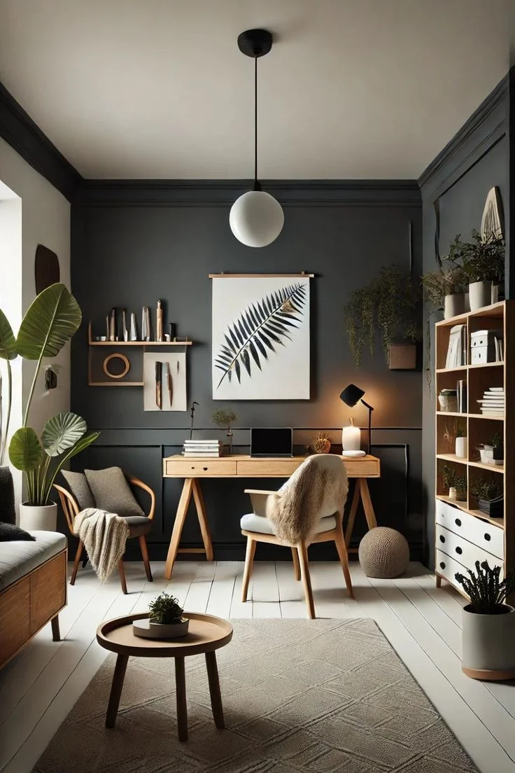
But here’s the trick: don’t go overboard. I’d use it on just one wall or maybe around built-ins or trim. Too much, and the room might feel small—unless you’ve got a lot of light or high ceilings to help balance it out.
My go-to picks? Wrought Iron by Benjamin Moore feels deep and dramatic but still soft. Iron Ore by Sherwin Williams is another solid choice—it’s bold and rich, great for making a statement. Try adding brass or gold accents nearby to warm things up.
6. Warm Cognac: Adding Inviting Warmth to Gray Floors
Warm cognac paint brings cozy energy to rooms with gray floors. It adds just the right amount of contrast—enough to feel inviting, but not too strong or overpowering. I’ve seen it work really well with terracotta-colored decor and natural wood pieces. It’s a great way to make cooler gray floors feel more balanced in open spaces.


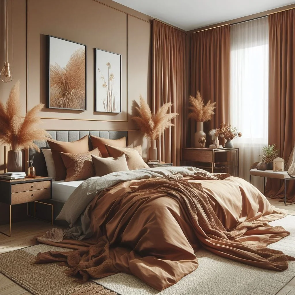
If you want something subtle, go for Alexandria Beige by Benjamin Moore—it’s soft, warm, and super livable. For a bolder vibe, Determined Orange by Sherwin Williams adds punch and brightness, especially in sun-filled rooms.
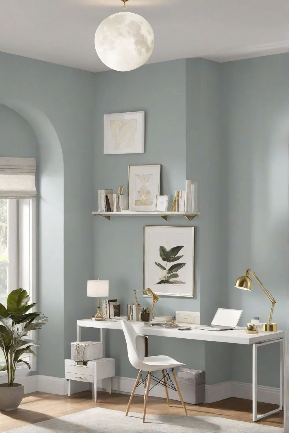
7. Slate Blue: Sophisticated Coolness for Gray Floors
Slate blue brings a soft, stylish feel to spaces with gray floors. It’s cool-toned but not cold—just the right mix of calm and class. I think it works especially well when you want the room to feel put-together without being too fancy.
It’s a great pick for north-facing rooms like bedrooms or home offices, where natural light is softer. The muted tone helps the space feel relaxed and focused.

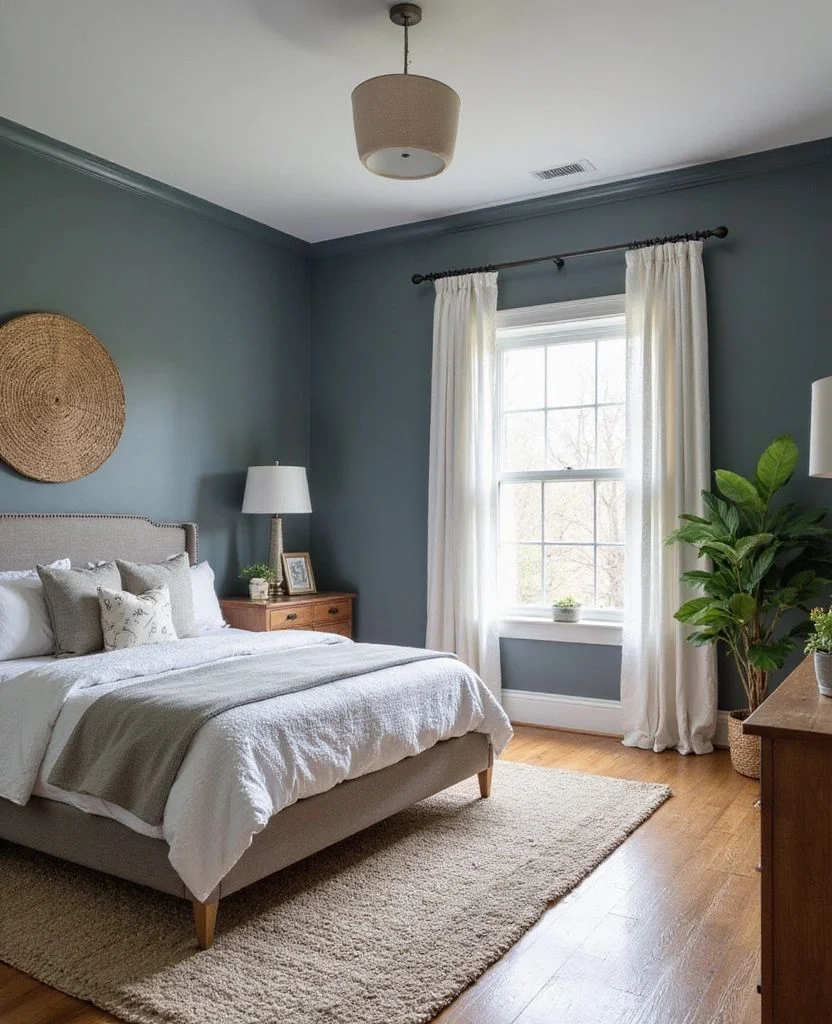

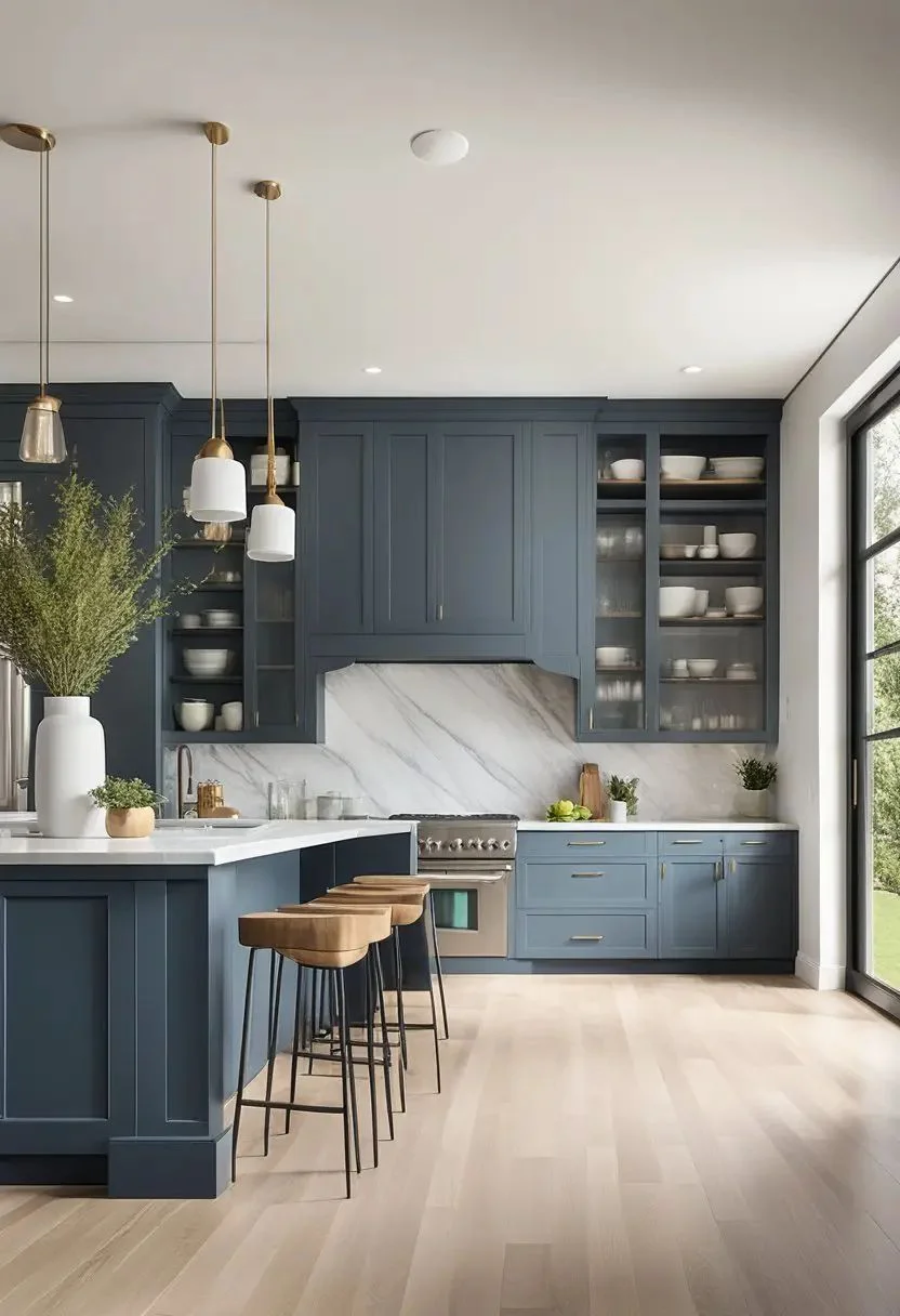
For paint, Slate Blue by Benjamin Moore keeps things balanced and neutral. Want a bit more character? Try De Nimes by Farrow & Ball—it’s got a little extra personality while still keeping that cool, cozy vibe. Pair either with light wood or white furniture to keep things fresh and open.
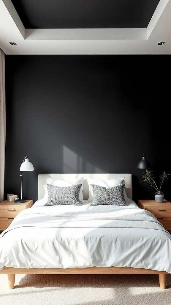
8. Soft Black: Chic Contrast for Gray Floors
Soft black walls can sound scary at first, but they actually pair beautifully with gray floors. The trick is picking the right shade—something that adds depth without making the space feel dark or heavy. When done right, it feels modern and super sleek.


I’d use soft black on an accent wall, especially behind a bed or a TV unit. It gives you contrast, but still plays nicely with the rest of the room. It’s a smart way to add drama without going full blackout.
For paint, Tricorn Black by Sherwin Williams is my go-to. It’s deep but clean—no weird undertones. Just make sure to balance it with light furniture or ceilings, and use warm lighting so it doesn’t feel cold. Soft textures like velvet cushions or matte finishes can also make it feel more cozy than stark.
9. Mushroom Taupe: Warm Neutral Elegance for Gray Floors
Mushroom taupe is one of those colors that just feels easy. It’s warm, earthy, and soft—all without trying too hard. When you pair it with gray floors, it brings in a cozy touch that still looks clean and stylish.


This shade works great in living rooms and bedrooms, especially if you want something timeless. The best part? It plays well with both cool and warm gray undertones, so you don’t have to stress about clashing tones.
Mushroom taupe also shifts a bit depending on the light—looking warmer during the day and more neutral at night. Try pairing it with natural fabrics like linen or wool to keep the vibe comfy and grounded. It’s a color that fits almost any style without stealing the spotlight.
10. Dusty Rose: Soft Warmth with Gray Floors
Dusty rose brings a gentle, muted warmth that works beautifully with gray floors. It has just enough pink to feel cozy, without looking too sweet or bold. I like how it softens up a space and gives it that relaxed, welcoming feel.

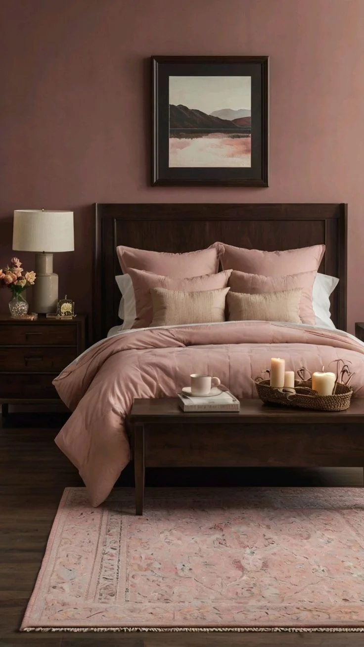

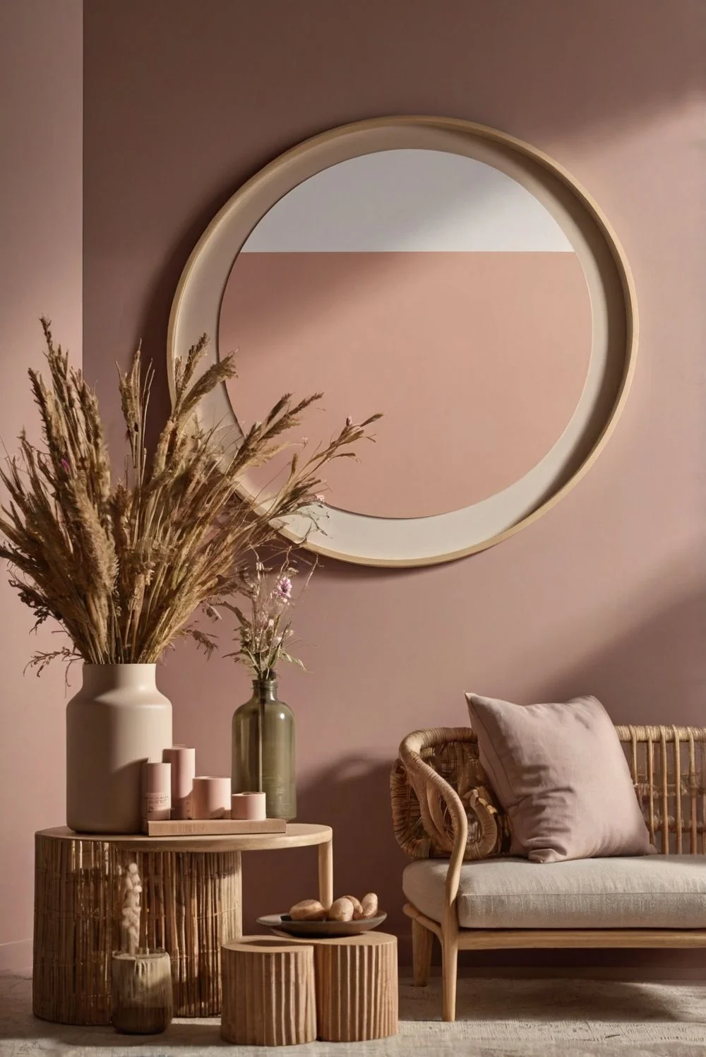
It’s a great choice for bedrooms or living rooms, especially if you want something warm that still feels modern. The color pairs well with both cool and warm gray undertones, making it super flexible.
Because it’s subtle, it won’t overpower the room—and it actually helps balance out the cooler vibe of gray floors. Want to dress it up? Try adding brass or gold accents. I’ve also seen dusty rose used a lot in modern farmhouse and transitional styles, and it always looks polished but comfy.
11. Creamy Yellow: Warm, Cheerful Pairing for Gray Floors
Creamy yellow is like a little bit of sunshine on your walls. It brings warmth and brightness that plays nicely with gray floors, making the whole space feel more cheerful and welcoming. The softness of the yellow keeps it from being too bold, so it still feels calm and cozy.

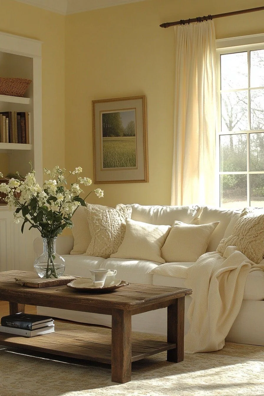

I’d use it in kitchens, living rooms, or even bathrooms—places where you want energy and light. It works in both cool- and warm-toned gray spaces, so you don’t have to worry about weird clashing.
One extra bonus? It helps lighten up darker rooms, especially if you don’t get much sunlight. Try pairing it with natural wood or rattan furniture to keep things feeling warm and homey. It’s a happy color that doesn’t try too hard.
Common Mistakes with Wall Colors For Gray Floors
- Picking walls that are too cool
I’ve seen this one a lot—pairing icy white or blue walls with gray floors. It can make the room feel cold and kind of lifeless, like a doctor’s office. - Using yellow or creamy beige that clashes
Warm beige tones can fight with cool gray floors. The mix can look off, even muddy, especially in natural light. - Ignoring undertones
Not all gray floors are the same. Some lean warm, some cool. If you don’t match the wall color to the floor’s undertone, the whole space feels a bit weird. - Skipping the lighting test
Paint looks different in every room. A wall color that looks great in the store might turn weird at home. Always test your sample in real light, on real walls. - Going too matchy-matchy
Walls and floors that are the exact same tone of gray? Feels flat. You need some contrast—even just a warmer or cooler shift—to make the room feel alive.
Real User Fixes & Community-Backed Solutions
In a popular r/HomeDecorating thread, a user shared their regret after choosing taupe wall paint to match their gray floors — only to find out it clashed badly. They admitted they were drawn to taupe but quickly realized gray floors, especially with subtle undertones, are tricky to pair. Frustrated, they turned to the community for paint color suggestions, even considering repainting everything white just to fix the mismatch.
The response was both supportive and practical. Users recommended richer hues like peacock green, navy blue, and even black — tones that surprisingly worked well with gray flooring. Others leaned into reliable whites and neutrals, suggesting favorites like Benjamin Moore’s White Dove, Simply White, Pale Oak, and Sherwin-Williams’ Eider White. One commenter nailed the core issue: the clash came from the floor’s red undertones fighting with the wall’s yellow ones. The takeaway? With gray floors, undertones matter more than you think — and the right paint can completely transform the vibe.
While browsing the r/DesignMyRoom subreddit, we came across a post from a user who was house hunting and struggling with one common dilemma: Can gray LVP (Luxury Vinyl Plank) floors be warmed up by painting the walls? They noted that every home they visited had the same cold combo of gray floors, gray walls, and gray furniture — which felt too sterile for their taste. Understandably, they were wondering if this was a dealbreaker or if there was a fix.
Fellow Redditors jumped in with helpful advice and personal experiences. Some suggested layering warm area rugs and repainting walls in warm tones or soft muted colors to balance the gray. One user shared that using colors like teal with rose gold and industrial accents gave their space a much cozier feel. Another mentioned how adding decor like cherrywood blinds, leather, warm woods, and desert sunset tones helped transform the vibe. The general consensus? Don’t let gray floors stop you — with the right paint and furnishings, you can definitely warm up the space without needing a full renovation.
Final Verdict For Wall Colors For Gray Floors
Honestly, gray floors can be amazing—but only if you treat them right. I’ve seen rooms totally fall flat just because the wall color didn’t match the vibe. Gray isn’t just gray—it can lean warm or cool, and if you don’t match that tone, things get weird fast. But when you do get it right? The space feels calm, stylish, and super put together.
My go-to rule? Don’t play it too safe, but don’t go wild either. Colors like greige, sage green, or even a deep charcoal on one wall can totally change the mood. Just test everything in real lighting and trust what feels good, not just what’s trendy. That’s what makes gray floors actually work.
People Also Ask
What color wall paint goes with a grey floor?
If you want your walls to really stand out next to gray floors, think in terms of complementary colors. On the color wheel, shades like yellow, orange, and blue-green sit opposite cool grays, which means they naturally bring contrast and balance. These colors don’t just match—they add personality.
How to compliment grey floors?
If your grey wood floors are cool (like with blue or icy undertones), don’t pair them with yellow-toned wall colors. The mix can feel off—almost like the colors are arguing. Go with soft taupe creams or beige neutrals instead. They sit nicely in the middle and won’t clash.
Should floors be darker or lighter than walls?
Most of the time, darker floors with lighter walls create a clean, balanced look—it just feels right. But if you’ve got light gray floors, going with darker walls can work too. Just make sure the undertones match, so nothing feels out of place. Either way, if it’s done right, you’re good.
How to brighten up a room with grey floors?
1️⃣ Add warm colors – Pair gray with rich tones like mustard, terracotta, or soft blush to stop the space from feeling flat.
2️⃣ Use warm lighting – Swap in amber bulbs or lamps for a cozy glow that softens the gray.
3️⃣ Bring in natural textures – Think wooden furniture, rattan baskets, or textured rugs to add depth and warmth.
How to make a grey floor look warmer?
Easy fix: add wood elements. Even a few pieces—like a wood coffee table or woven basket—can bring in natural warmth. Just make sure the wood tone matches your floor’s undertone. Cool gray? Use cooler woods. Warm gray? Stick with warm woods. That’s the trick.
What color brightens grey?
Yellow is your go-to. It brings a sunny, cheerful vibe that instantly lifts a gray space. Add yellow cushions, a throw blanket, or even a vase—small stuff works. The best part? It looks great with both light and dark grey.
What color brightens grey?
Yellow is the perfect match to brighten up any grey space. It adds a sunny, cheerful vibe that brings life to cool, neutral tones. Try it with cushions, throws, or a bright yellow vase—small touches go a long way. And the best part? It works with both light and dark grey, making the whole room feel warmer and more upbeat.
What wall colors go with gray?
Lots of colors pair well with gray—it’s super flexible. For a bold look, try forest green, rust, or mustard. If you want something softer, go with beige, white, or blush pink. Even black and white combos can look sharp. Gray walls work in every room, so you can switch up the vibe with just a splash of color.
What colors don’t go with grey?
1️⃣ Bright orange – It’s too loud and clashes with gray’s cool tone.
2️⃣ Bright red – Can feel harsh and jarring next to soft grays.
3️⃣ Brown – Too muddy; the mix often feels dull or heavy.
4️⃣ Warm neutrals – Like creamy yellows or peachy tones—they usually fight with gray’s undertone.
5️⃣ Gray on gray (bad match) – Using the wrong gray with another can feel flat or mismatched.
Which color combination is best with grey?
Grey and red – Bold and energetic; adds passion and drama.
Grey and mustard – Warm and stylish; brings in a cozy, trendy vibe.
Grey and green – Natural and calming; works great in living spaces.
Grey and teal – Fresh and modern; gives a pop without being too loud.
Grey and blush pink – Soft and elegant; perfect for a relaxed, cozy feel.
Grey and blue – Classic and cool; clean look for any room.