Sherwin Williams Tricorn Black vs Iron Ore: Choosing the Best
I’ve seen a lot of folks get stuck between these two — Tricorn Black vs Iron Ore. Honestly, I get it. They both look bold, deep, and kind of similar at first. But once you start painting, the little differences start to matter. Especially when you see them in real light.
And yeah, both are crazy popular for black exterior paint and moody accent walls inside. But they behave differently depending on light.
According to Interior Designing Blog, I’ve seen Iron Ore used a lot more in homes that want a softer touch. Tricorn Black? It’s for people who want bold and don’t mind a bit of drama.
If you’re still stuck, maybe test them on the wall first. Or check out real house pics online (trust me, seeing them in sunlight vs. shade helps big time).
Iron Ore vs. Tricorn Black: Key Differences Explained
I’ve used both of these paints in real projects, and they look close on a swatch. But once they hit the wall? Totally different feel.
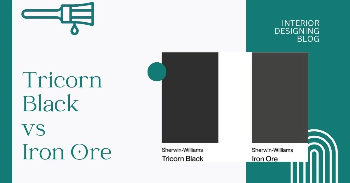
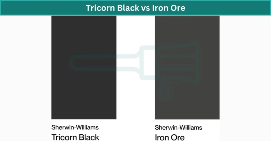
Iron Ore by Sherwin-Williams (SW 7069) is what I’d call a soft black. It’s deep, but not pitch black. Sometimes you’ll see a tiny greenish or brownish undertone depending on the light. It’s got an LRV of 6, which means it reflects just a little light — enough to not make a space feel super heavy. I like it for cozy rooms, farmhouse vibes, or even warm-toned exteriors.
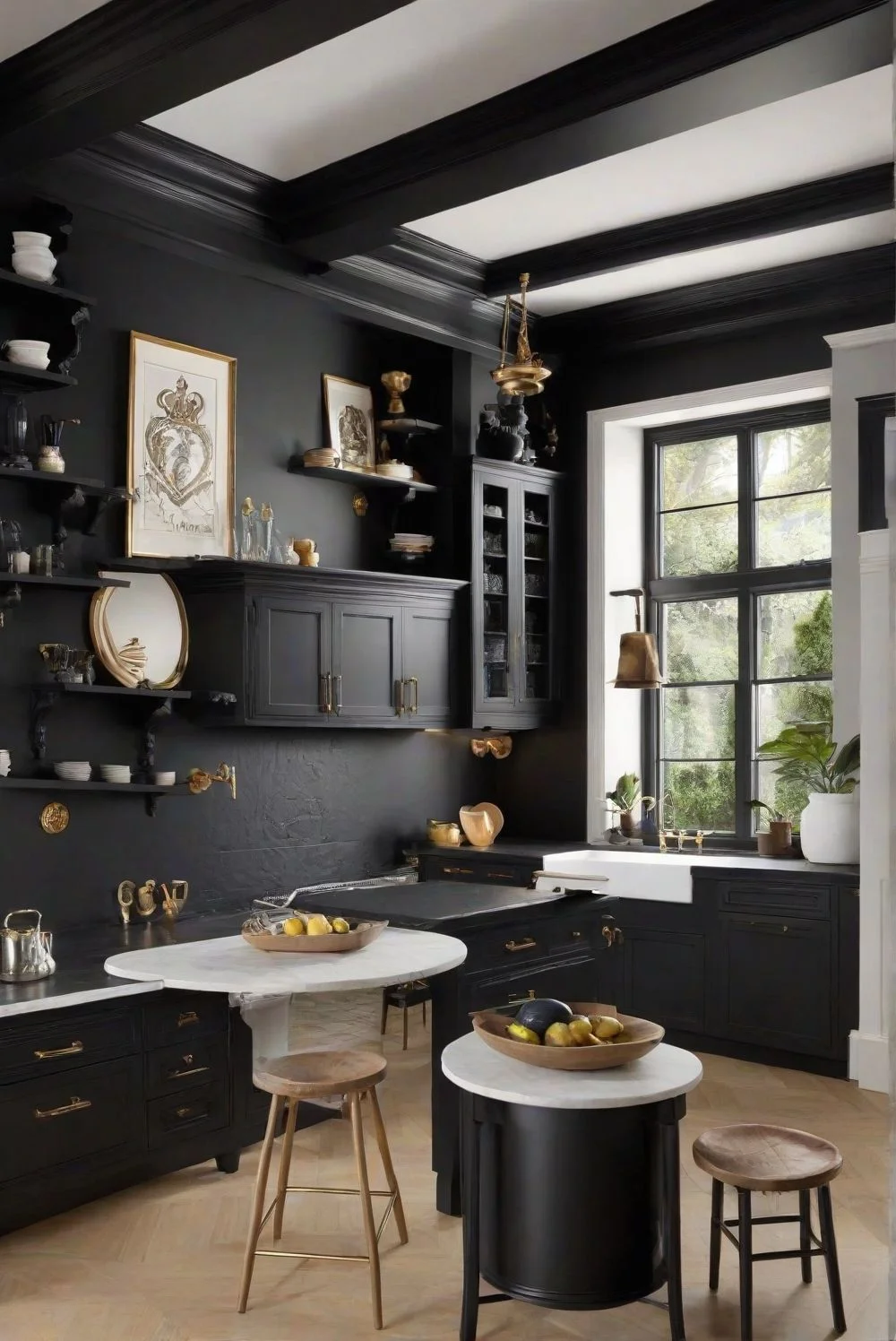
Tricorn Black paint (SW 6258) is much darker. It’s a true black with no weird undertones. Just pure, bold black. It has an LRV of 3, so it barely reflects light at all. That’s what makes it great for modern homes where you want serious contrast — like white siding with black trim or all-black doors.
Here’s a simple side-by-side to make it clear:
| Feature | Iron Ore (SW 7069) | Tricorn Black (SW 6258) |
|---|---|---|
| LRV | 6 (soft black) | 3 (true black) |
| Undertones | Warm, sometimes greenish | Neutral, no undertones |
| Best For | Cozy rooms, exteriors with brick | Trim, modern doors, sleek cabinets |
| Avoid Using | On low-light trim (may look muddy) | In already dark rooms (can feel flat) |
Quick Tips:
- Use Iron Ore if you want softness with depth. I’ve seen it shine in farmhouse kitchens and living rooms with natural light.
- Go with Tricorn Black if you want bold contrast. It pops next to white trim and works great for black paint for cabinets in a sleek kitchen.
- For interior walls, I’d say Iron Ore feels less harsh, especially if your lighting isn’t bright.
Honestly, they both work — just in different ways. One feels warmer, the other feels cooler. That’s kind of the deal. I’ve grouped the most common paint questions right here.
Tricorn Black vs Iron Ore: Undertones and Visual Impact
I’ve seen both these paints on real walls, and trust me, the difference shows once the light hits. On paper, they’re just two deep, dark shades — but the vibe they give off? Totally different.
Tricorn Black (SW 6258) is what I’d call a pure black. The kind that doesn’t lean blue, green, or brown. It’s got an LRV of 3, which basically means it sucks up almost all the light. But here’s what’s cool — it still doesn’t look flat or dead. In bright, open rooms or sunny exteriors, it gives this sharp, modern look. Some folks say it feels cool or warm depending on what’s around it. Like, put it next to warm wood and it softens a bit. Pair it with clean whites and chrome, and it gets icy and bold.
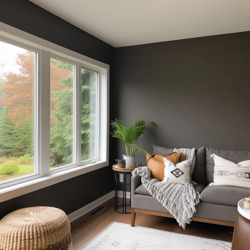
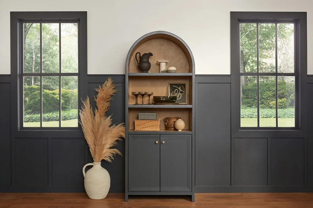
Iron Ore (SW 7069), on the other hand, isn’t a full black. It’s more of a deep warm charcoal. Its LRV is 6, so it reflects just a tiny bit more light — enough to feel less intense. What I like is how it shifts. In natural light, you might catch a hint of green or gray undertones. It doesn’t scream for attention. Instead, it kind of wraps a space in this moody, soft vibe. Perfect for home offices, bedrooms, or any space where you want that cozy feel without going pitch black.
If I had to sum it up?
- Tricorn Black = bold, clean, dramatic
- Iron Ore = soft, warm, relaxed
Design Tips:
- Use SW Tricorn Black with cool whites, marble, metal finishes. Great for exteriors that need bold contrast.
- Pair Iron Ore with light oak, beige, and warm earth tones. Works well indoors where you want depth without going full black.
- Designers often go with Tricorn Black for modern homes, especially for front doors and trim. Iron Ore? That’s the pick for soft drama inside the house.
Room-by-Room Comparison
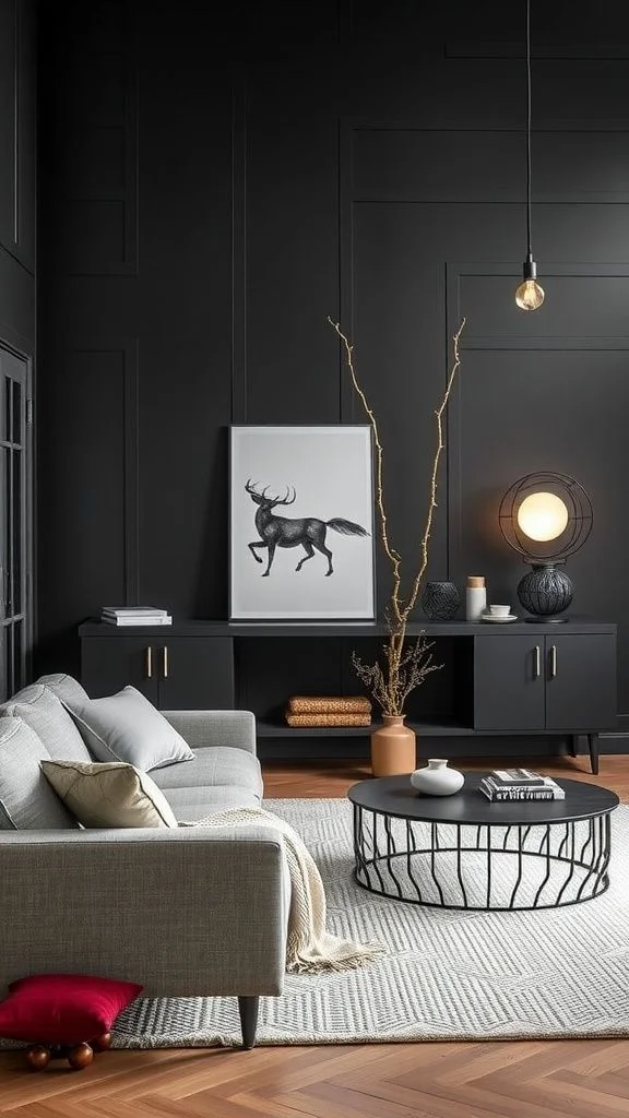
Using Tricorn Black vs Iron Ore in Living Rooms
I’ve seen Tricorn Black work really well in big, open living rooms — the kind with lots of natural light pouring in. It’s bold, no doubt about it. If you want something that really stands out, this one’s a top pick. I like it on a feature wall behind the couch, or even on window trim and shelving. It gives off that sharp, modern look — kind of like what you see in high-end magazine spreads. Just be careful in smaller rooms. It can feel too heavy if the space doesn’t get much light.

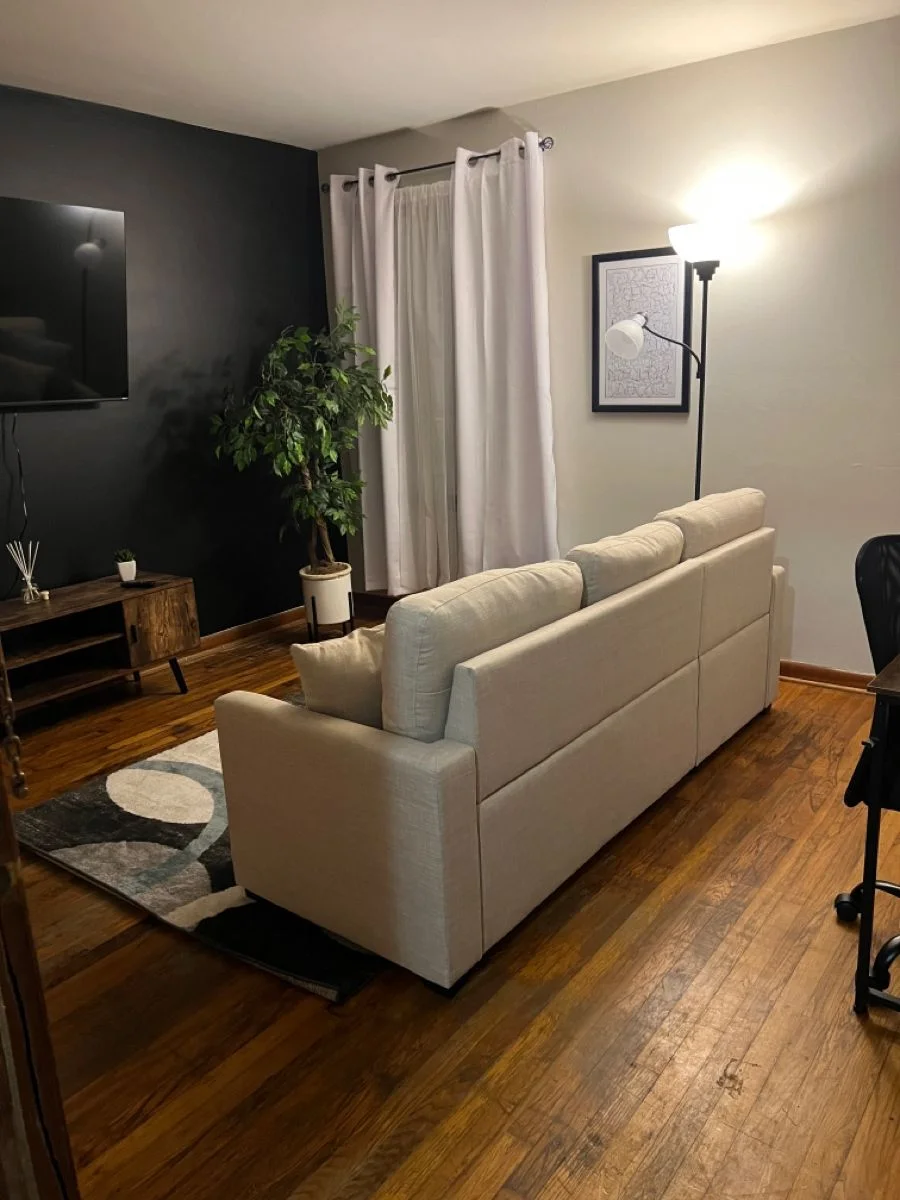

Now, Iron Ore is a totally different mood. It’s still deep and dark, but it’s got this warm black wall color thing going on. Perfect if you’re going for cozy instead of bold. I’ve seen it look amazing on fireplace walls or paired with soft beige couches. It plays nicely with wood furniture and warm lighting. Some people even use it on every wall in the living room — and it actually works without making the space feel closed in.


Design Tips:
- Use Tricorn Black with matte textures, metal light fixtures, and white trim for contrast.
- Pair Iron Ore with jute rugs, linen throws, and soft white curtains.
- For a modern rustic vibe, go Iron Ore with warm woods and natural fabrics.
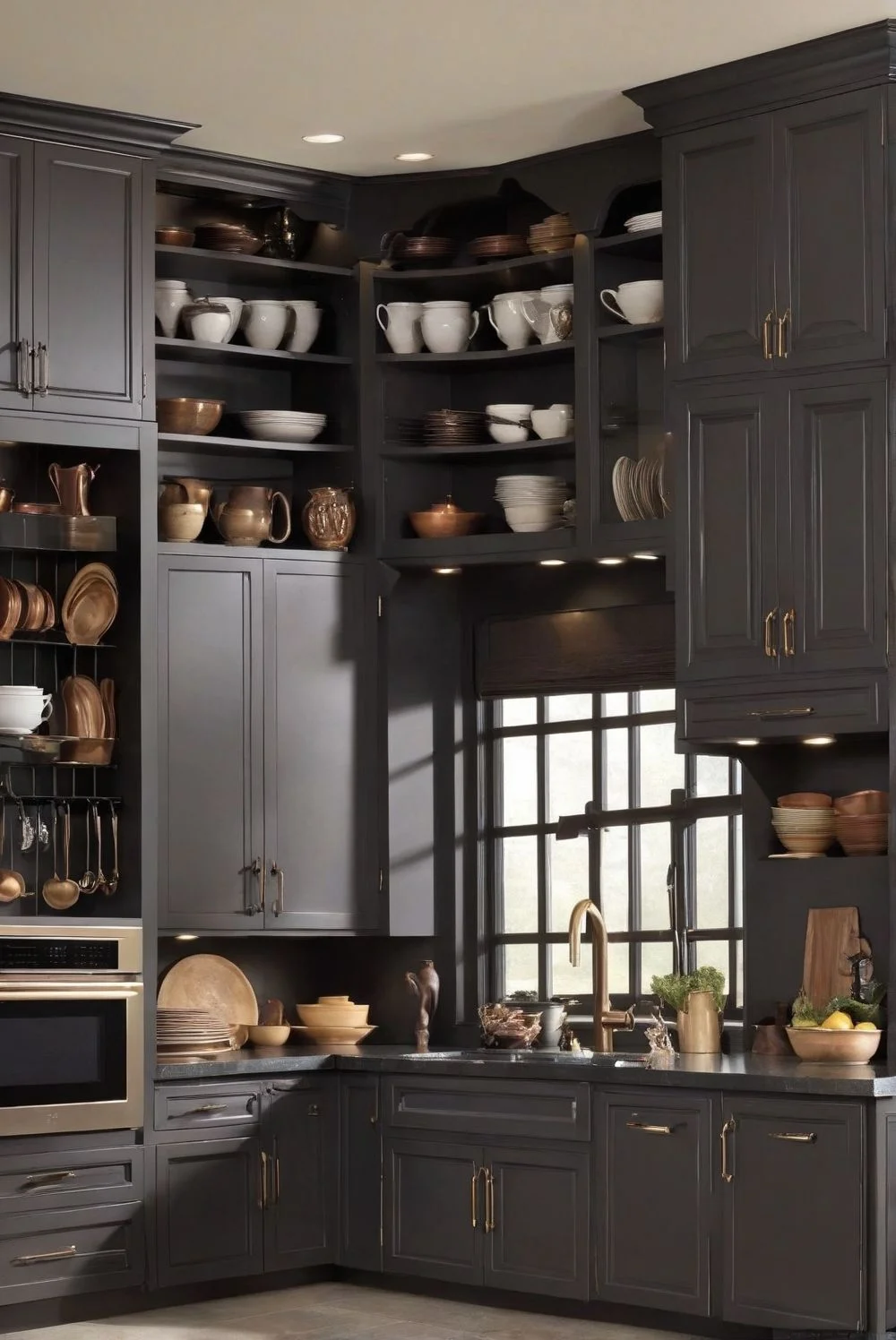
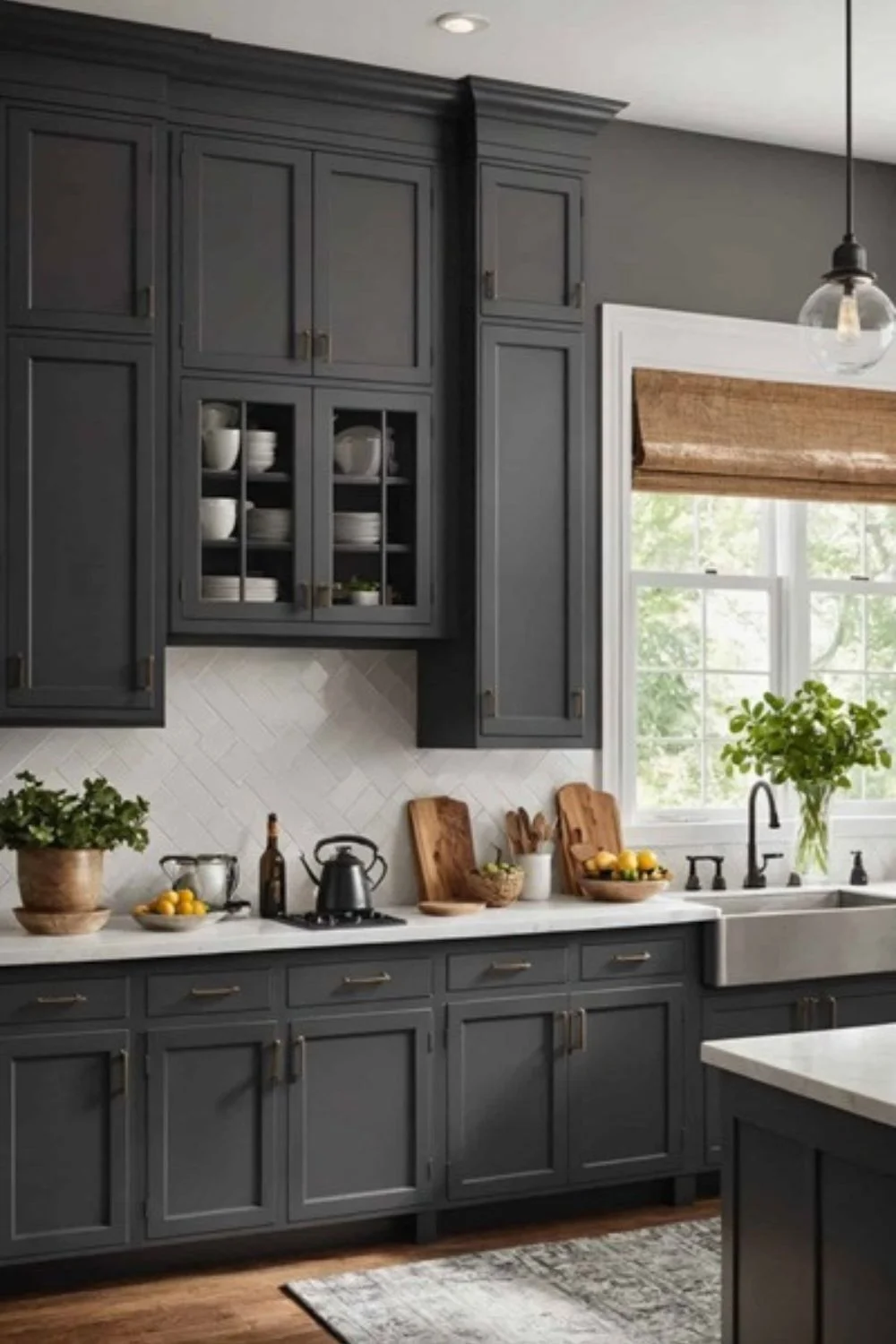
Tricorn Black vs Iron Ore in Kitchen Design
I’ve seen Tricorn Black kitchen cabinets look absolutely stunning — but only when the lighting is right. Since it has such a low LRV (3), it’s super dark. That makes it perfect for modern kitchens that get tons of natural light or have strong overhead fixtures. It brings a sleek, high-contrast vibe, especially when used on kitchen islands. But if your space is dim or narrow? It can cast a lot of shadows and make things feel a bit boxed in. I’d go with a satin finish here to soften reflections and give it that polished-but-not-shiny look..


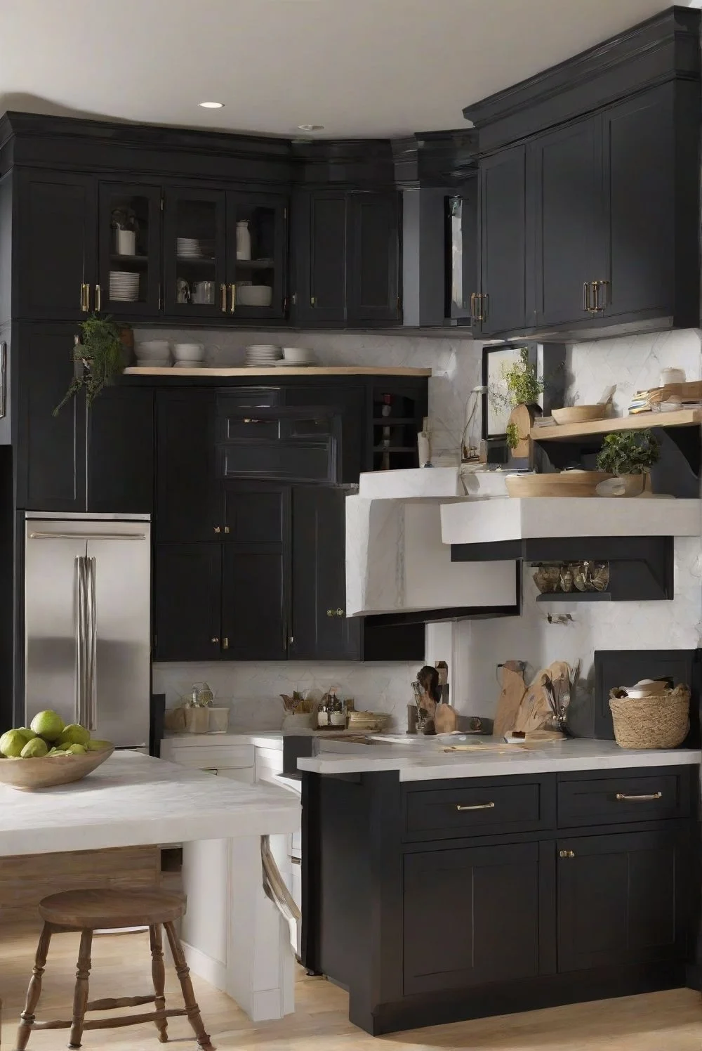
Iron Ore kitchen paint is more forgiving. It’s deep, but not pitch black — which makes it great for larger surfaces like full cabinet sets or wide islands. In natural light, it pulls in a bit of gray, giving the kitchen some texture without going too bold. I like it with wood floors or white countertops. It’s a cozy, grounded color that doesn’t scream for attention but still makes a statement. Sherwin-Williams Iron Ore pairs especially well with brushed nickel or soft silver hardware if you’re after a clean, quiet look.


Pro Tips:
- Try brass hardware with Tricorn Black for a bold, luxe finish.
- Go matte or satin for both colors to keep things modern and reduce glare.
- Use Iron Ore in kitchens with softer light—it plays better with shadows than Tricorn.
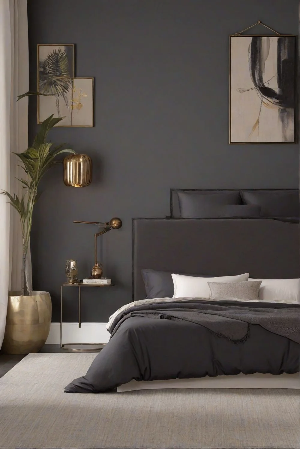
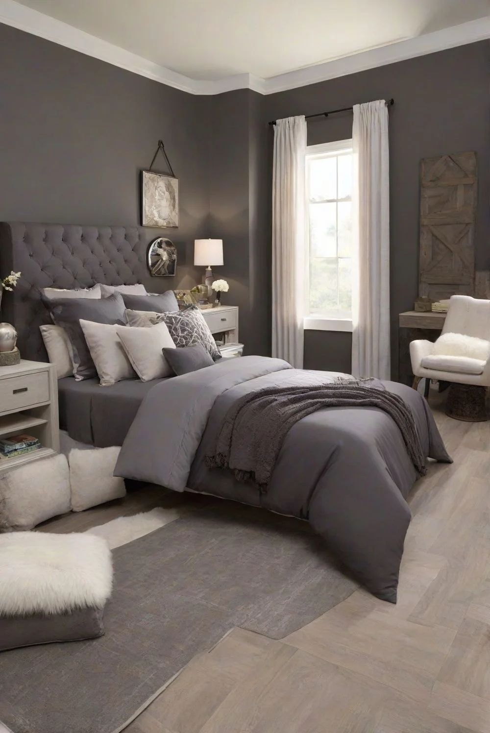
Tricorn Black vs Iron Ore in Bedroom Spaces
I’ve tried Tricorn Black in a bedroom once, and I’ll be honest — it’s a lot. This color is deep, dark, and super dramatic. If your bedroom is big and gets tons of sunlight, it can actually look pretty cool as a bold accent wall behind the bed. But in small rooms? Or places without good lighting? It can feel kind of overwhelming. Too intense. I’d only use it in little doses — like trims, doors, or one wall max. And you’ll definitely want warm, soft lighting to calm it down.

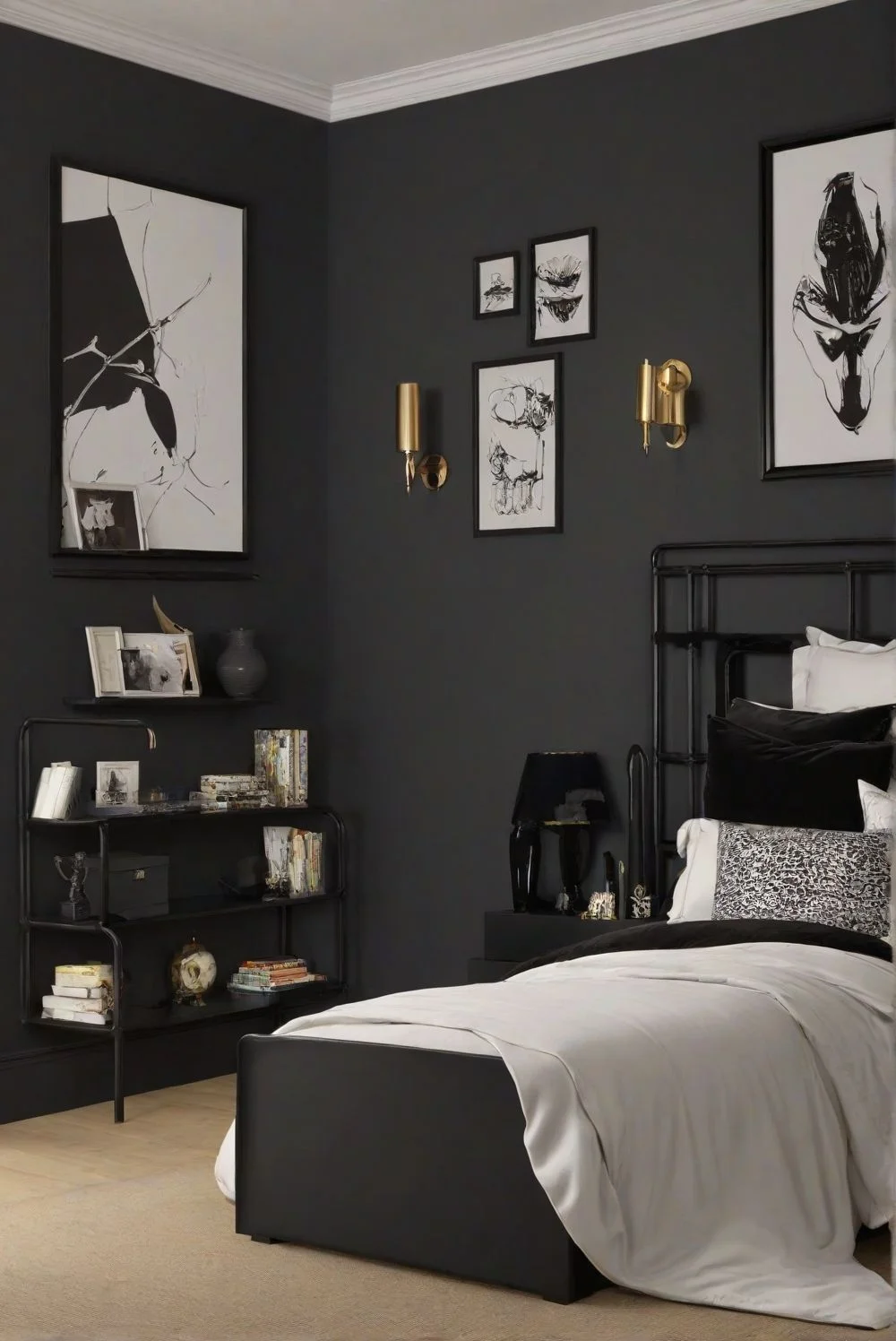

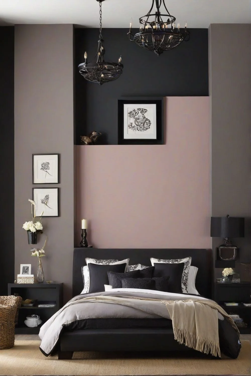
Iron Ore bedroom walls, though? Way more chill. It’s still a dark color, but it doesn’t feel harsh. The soft black undertones make it great for creating a cozy space, especially in rooms with warm wood furniture or creamy bedding. During the day, it leans grayish. At night, it darkens just enough to feel snug, not gloomy. It’s one of those cozy bedroom paint colors that works in both big and small rooms without making the space feel cramped.


Design Tips:
- Pair Tricorn Black with white or light gray bedding and add a warm bedside lamp to soften the vibe.
- Match Iron Ore with natural wood nightstands, beige linen, or textured blankets for a relaxing, layered look.
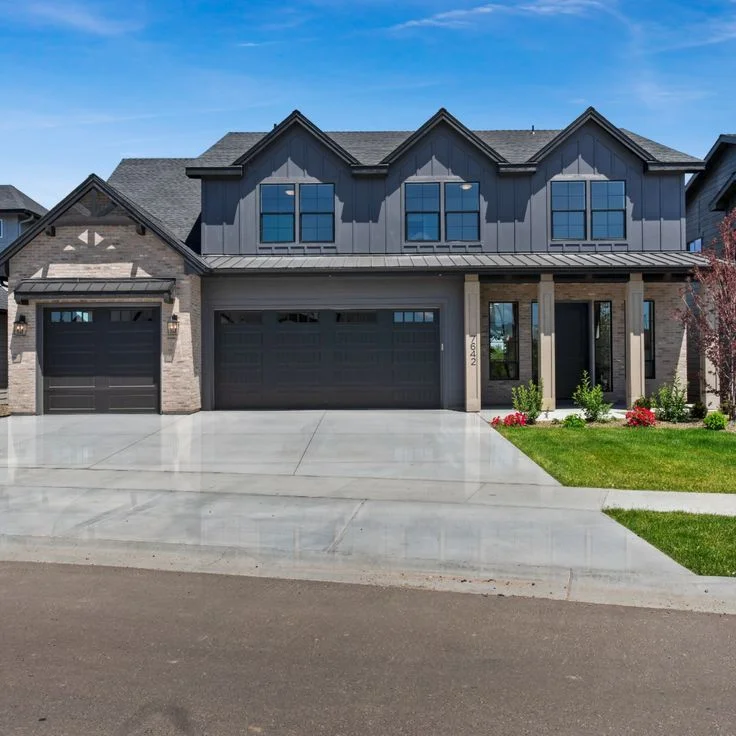
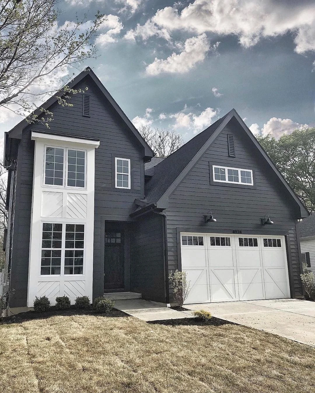
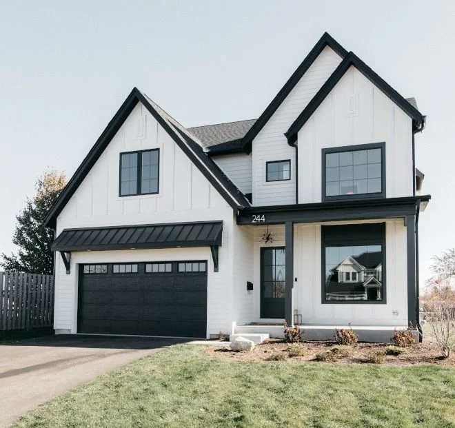
Tricorn Black vs Iron Ore for Home Exteriors
I’ve seen Tricorn Black exterior paint used on modern homes, and honestly, it looks stunning. It’s a bold, true black that gives the house a clean, dramatic edge. Especially when there’s white trim or big windows — the contrast is super sharp. This color works best on sleek, minimalist styles where you want those straight lines and shadows to really show up. It holds its depth even in bright daylight, making the whole house feel bold and structured. If your goal is strong curb appeal with a modern twist, this one nails it.


Iron Ore, on the flip side, brings a different kind of energy. It’s still dark, but softer — more like a warm charcoal paint. What makes it great for exteriors is how it changes with the light. In full sun, it feels lighter and almost earthy. As the day goes on, it deepens and gets cozier. It’s perfect for homes with stone accents, wood siding, or a farmhouse-style look. Instead of harsh contrast, Iron Ore gives you depth and warmth — like a blanket for your home’s outside.


Design Tips:
- Use Tricorn Black with light stone or crisp white trim for a bold, modern black exterior.
- Pair Iron Ore Sherwin-Williams exterior with wood textures, brown shingles, or warm landscaping for a natural, inviting vibe.
- Both are available in Sherwin-Williams Emerald or Duration lines, so durability’s covered too.
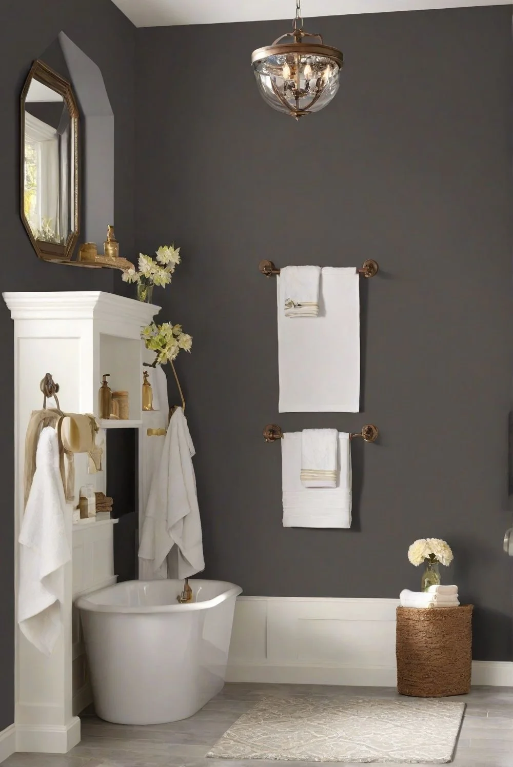
Using Tricorn Black vs Iron Ore in Bathrooms
I’ve seen Tricorn Black bathrooms look seriously upscale — but only when the lighting’s right. This color brings a high-end, dramatic vibe, especially when paired with gold or matte black fixtures. Think modern hotel style. But it’s not something I’d paint across all four walls.

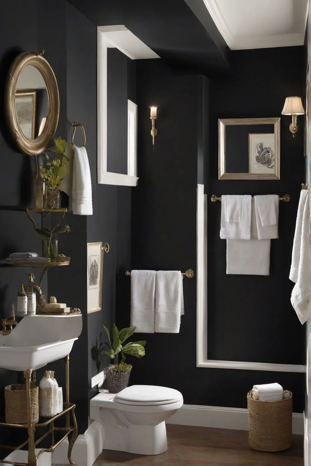

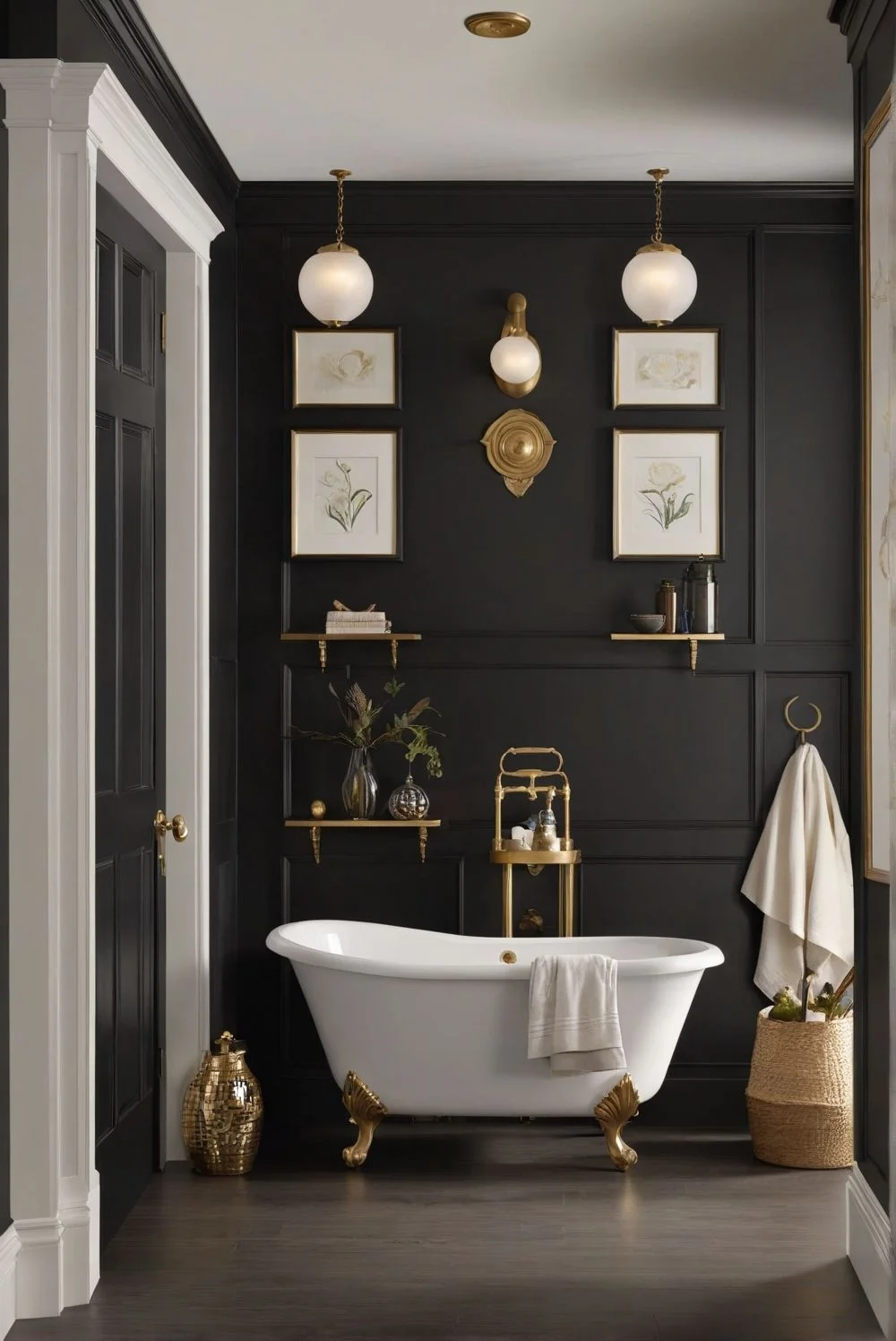
In smaller bathrooms, it can feel a bit boxed in unless you’ve got a big window or lots of layered lighting. I’d use it on a single wall — maybe behind the vanity or mirror — and keep the rest light. Add some reflective tile or a large mirror, and it’ll feel bold without being claustrophobic.
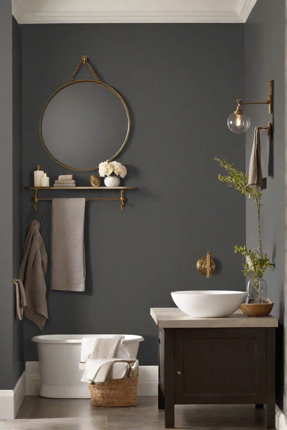
Now, if you want something dark but easier to live with, Iron Ore bathroom paint is a safer pick. It’s softer, warmer, and just feels more relaxed. I’ve seen it work beautifully on cabinets, full walls, and even all around a powder room. It plays well with natural wood vanities, beige tile, or stone counters. The warm undertones make it feel spa-like, not stark. Even in rooms without much sunlight, it gives you that moody look without going too heavy.


Design Tips:
- Use semi-gloss or satin finish for both colors to handle humidity.
- Pair Tricorn Black with marble and brushed gold hardware for a luxe feel.
- Match Iron Ore with warm wood tones and soft lighting for a cozy, grounded bathroom.
- Want to open up the space? Add a large mirror or glossy tile to bounce the light around.
Tricorn Black vs Iron Ore in Dining Room Design
I’ve seen Tricorn Black dining rooms that feel like something out of a design magazine. It’s bold and sharp — perfect for modern spaces where you want to make a real statement. I wouldn’t use it on every wall, though.
It’s more of a power move on one accent wall, or even on the ceiling if you want to try something daring. With the right pendant lighting and soft glow from dimmable fixtures, it turns the room into a sleek, moody hangout. Add some light-toned chairs or gold table decor, and the whole space pops without feeling too dark.
Now Iron Ore by Sherwin-Williams brings a completely different vibe. It’s deeper than gray but not quite black, and that’s what makes it perfect for cozy black dining wall setups. It’s warm, soft, and blends beautifully with wood furniture, woven textures, and things like linen napkins or a rustic centerpiece. This is the color you’d use if your style leans farmhouse or transitional — something between modern and classic. It’s also safe to use on all four walls without making the room feel tight.
Design Tips:
- Pair Tricorn Black with white wainscoting or metallics for a polished, modern dining room.
- Use Iron Ore with natural wood tables, woven chairs, and warm ambient lights to keep things relaxed and welcoming.
- No matter the shade, dimmable warm bulbs go a long way in making black tones feel inviting.
How Lighting Affects Tricorn Black vs Iron Ore
I’ve worked with Tricorn Black in a few spaces, and here’s the thing — this color needs light. A lot of it. It’s a deep, true black that doesn’t really shift with lighting, which can be a good or bad thing depending on the space. In bright rooms with big windows, it looks bold and clean, like a perfect shadow line around everything.


But in low-light rooms? It can turn into a flat, empty-looking space — kind of like a “black hole.” That’s why I only recommend it in rooms that get a lot of natural sunlight, or when it’s used as an accent color with strong overhead or layered lighting. Warm LED bulbs also help soften it, especially in spots like powder rooms or hallways.
Iron Ore, on the other hand, plays really well with light. In the morning, it often reads as a soft charcoal gray, especially near windows. As the sun moves or the room darkens, it deepens into that rich, warm black we love. You might even catch hints of blue or green under certain lamps — that’s the undertone doing its thing. It’s less dramatic than Tricorn, but way more forgiving in low-light spaces. That makes it a favorite in open floor plans where light changes from one room to the next.


Lighting Tips:
- Use Tricorn Black in rooms with big windows or pair it with warm LED lights to avoid harsh shadows.
- Iron Ore in natural light gives you more softness and mood, perfect for areas where light shifts throughout the day.
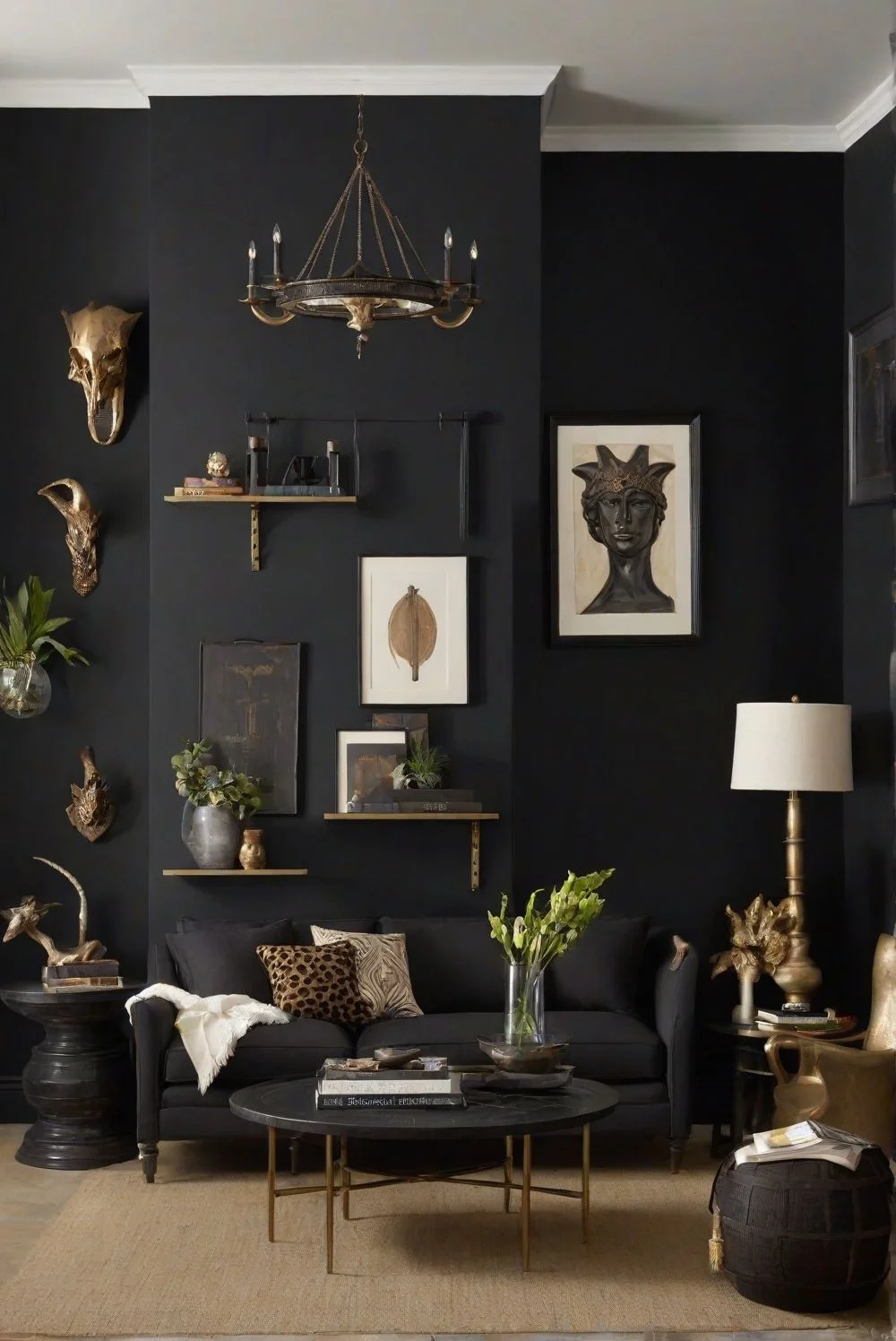
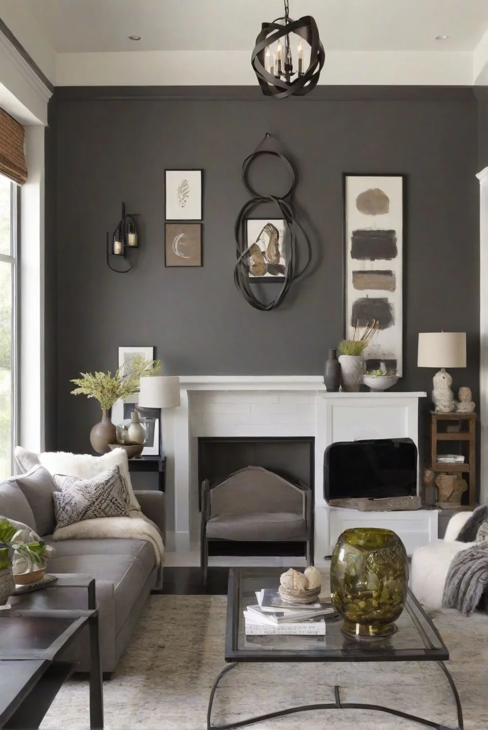
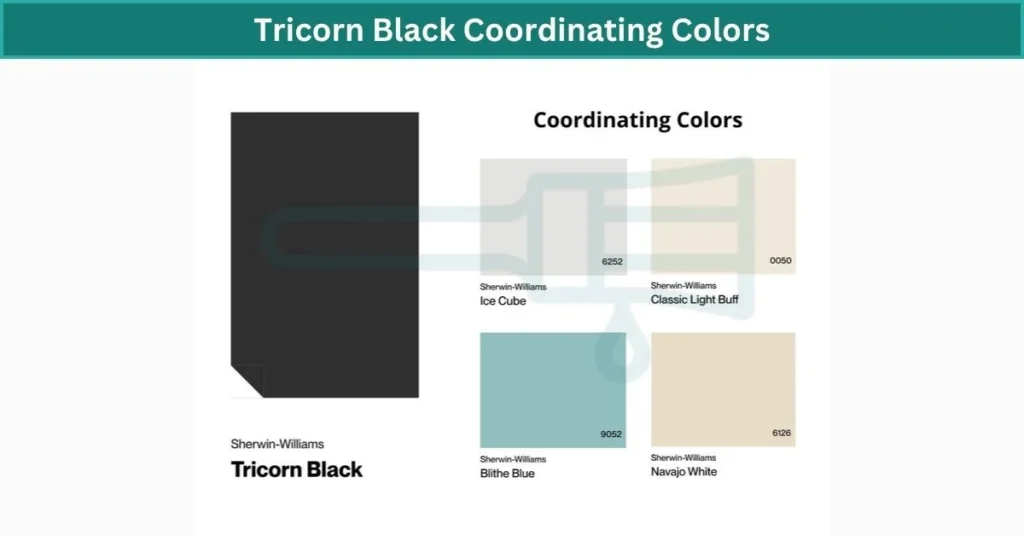
Coordinating Colors for Tricorn Black and Iron Ore
When I’ve worked with Sherwin-Williams Tricorn Black, the most fun part is picking what to pair it with. Because it’s a true, neutral black, it gives you a ton of freedom. Want bold? Jewel tones like emerald green, deep mustard, or even sapphire blue look stunning next to it — they literally glow against that inky backdrop.
For a more classic feel, go with warm whites or creamy ivories. The contrast is sharp but timeless. I’ve also seen it used with brass or gold finishes—think light fixtures, mirror frames, cabinet hardware—and it just elevates everything around it. Even earthy tones, like warm terracotta or soft camel leather, can tone it down and make it feel a little more grounded and casual.
Iron Ore, though, has a different energy. It’s rich and warm, but not too intense, which makes it ideal for softer, more natural palettes. It works beautifully with muted, dusty tones like sage green, lavender, or soft terracotta. These colors don’t fight for attention—they blend and layer gently, creating a calming, cozy atmosphere.
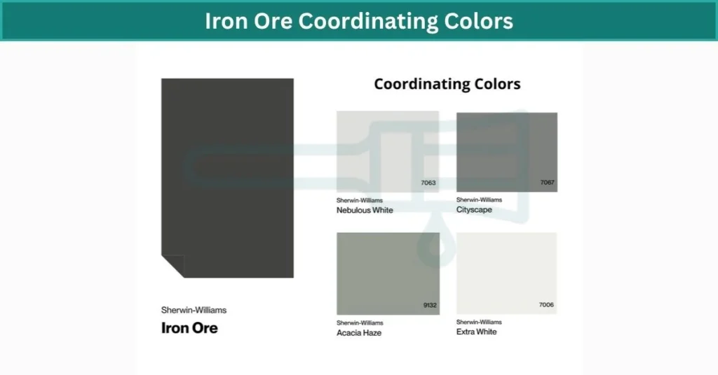
Pairing Iron Ore complementary colors with light woods like oak or maple adds a clean, modern-rustic look. It also loves matte metals—brushed nickel, aged silver, or even soft black hardware work perfectly. Unlike Tricorn, Iron Ore doesn’t need contrast to shine. It adds depth without stealing the show.
Designer Pairings to Try:
- Tricorn Black:
– Creamy White (like SW Alabaster)
– Emerald Green
– Warm Brass Finishes
– Terracotta Accents - Iron Ore:
– Dusty Lavender or Sage
– Brushed Nickel Fixtures
– Natural Oak Cabinets
– Soft Peach or Rose-Toned Decor
Real-Life Comparison: Tricorn Black vs Iron Ore on Walls
I’ve seen Tricorn Black on actual walls, and let me tell you — it’s intense in the best way. On a tall living room wall with lots of windows, it feels sharp and modern, almost like a museum backdrop. It doesn’t shift much in color no matter what time of day it is. What you see is what you get: a true, dramatic black that makes everything around it pop. White trim? Looks cleaner. Art? Stands out like crazy. But in smaller or darker rooms, it can feel a bit much. You’ll need good lighting or the space might feel like a cave.
Iron Ore, though, behaves totally differently on the wall. It still feels bold, but there’s this softness to it. In the morning light, it can look almost like a deep gray. Then by evening, it settles into this warm, cozy tone that wraps the room. I’ve seen it used in bedrooms, hallways, even kitchens — and it works in all of them without overpowering the space. It’s more forgiving and versatile, especially in homes with changing natural light throughout the day.
If you’re on the fence, here’s what I’d do: grab sample pots of both and paint large patches on your wall — one near a window, one in a darker corner. Let them sit for a day or two. You’ll start to see how different they really are once the light changes.
Finish Options: Matte, Satin, or Gloss?
Alright, choosing the right black paint is one thing — but the finish? That’s where things really change how it looks on your wall.
I’ve tried Tricorn Black in different finishes, and here’s the deal: matte gives it that soft, velvety vibe. No shine, just pure depth. Great for big, open walls where you don’t want any reflection. But keep in mind, matte shows smudges and fingerprints easier — not ideal for high-traffic spots like kitchens or kids’ rooms.
If you still want that deep black look but need durability, satin is the safer bet. It has just a tiny bit of sheen and is way easier to wipe clean. Gloss, though? Super shiny. It turns Tricorn into a bold, dramatic statement — good for doors or cabinets if you’re going for that high-end designer look. But it’ll show every little flaw on the surface.
Now with Iron Ore, I lean more toward satin or eggshell. Because it’s already a soft black, those finishes help it stay warm and subtle. Matte works too if you’re going for that cozy, chalky feel in a bedroom or reading nook. Gloss with Iron Ore feels a bit off — it loses that calming vibe and starts to look more industrial.
Quick Tip:
– Use matte for walls in low-traffic rooms
– Go satin for areas that need light cleaning (living rooms, hallways)
– Save gloss for small features like trim, doors, or built-ins if you want shine
Final Verdict: Tricorn Black vs Iron Ore
If you want something bold, crisp, and dramatic, Tricorn Black is the way to go. It’s a true black with no undertones, and its deep LRV makes it ideal for modern trims, front doors, or accent walls where you want serious contrast. Just make sure the space gets enough light — it can feel a bit heavy in dark rooms.
Iron Ore, on the other hand, is perfect if you’re after a softer, warmer black. It has more versatility indoors, feels cozy, and plays well with wood tones and natural textures. It’s great for full rooms, especially in homes with changing light. Between the two, it really comes down to whether you want sharp and bold — or deep and relaxed.
FAQs
Why is tricorn black so popular?
Tricorn Black is a true, rich black that stays deep and bold in any lighting. It’s darker than Iron Ore, with no undertones, making it perfect for sharp contrast and a modern, dramatic look. Just be sure the room has enough light so it doesn’t feel too heavy.
Is tricorn black too dark?
Tricorn Black is pretty dark—like, really dark. With an LRV of 3, it barely reflects any light, which means it absorbs almost everything around it. In the world of useable paint, that’s about as black as it gets. It doesn’t soften, shift, or lighten up in the sun—just stays bold, solid, and deep. If you’re looking for the blackest color you can actually paint on walls, this one’s it.
What color is closest to Iron Ore?
If you like Sherwin Williams Iron Ore but you’re not sure if it’s the right color, there are a few similar shades you might want to check out. Colors like Urbane Bronze, Kendall Charcoal, and Peppercorn all have that deep, moody vibe but with slightly different undertones. You might find one of them feels just right for your space.
What are the undertones of tricorn black?
Tricorn Black is one of the truest blacks out there—it’s a neutral black with no visible undertones, which makes it super easy to use in almost any space. It’s one of the darkest shades in the Sherwin-Williams lineup, and honestly, it’s kind of a jack-of-all-trades. Whether you’re painting trim, walls, doors, or exteriors, this go-to hue just works. It’s bold, clean, and somehow still manages to look amazing anywhere.
What is the difference between tricorn black and Iron Ore?
Tricorn Black is a true black with an LRV below 3, making it one of the deepest, darkest options you can get—sharp, bold, and without any noticeable undertones. Iron Ore, by comparison, has an LRV of 6, so it’s a bit lighter and reads more like a soft black. It’s not as stark as Tricorn and can sometimes show a slightly green undertone, especially in natural light. One gives you clean contrast, the other feels more muted and cozy.
What is the undertone of Iron Ore?
Iron Ore by Sherwin-Williams has subtle green undertones, especially noticeable in natural light.
Does Iron Ore look grey?
Iron Ore and Peppercorn by Sherwin Williams are both popular gray paint colors, but they’re not quite the same. Iron Ore is deeper and reads closer to a soft black, while Peppercorn is a few shades lighter with a fairly neutral undertone. If you want something bold but not too dark, Peppercorn might be the easier pick.
What paint is similar to tricorn black?
If you’re looking for something similar to Tricorn Black, Inkwell (Sherwin Williams 6992) is a great option. It’s a cool black that, especially in a high gloss finish, can look almost identical to Tricorn. The extra shine helps deepen the color, making the two nearly interchangeable in certain lighting.
What are the 4 types of Iron Ore Colour?
The four main types of iron ore are massive hematite, magnetite, titanomagnetite, and pisolitic ironstone. These ores can appear in a range of colors, including dark grey, deep purple, rusty red, and even bright yellow, depending on their mineral makeup.