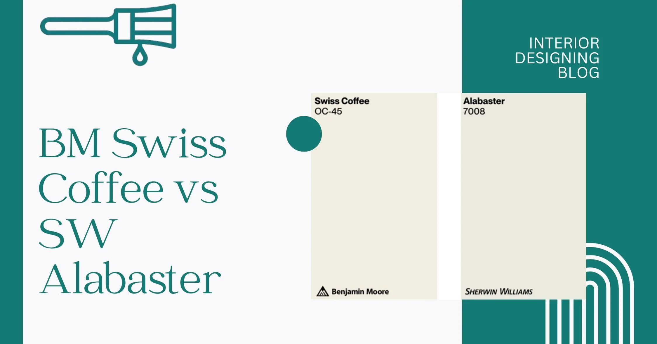
Swiss Coffee vs Alabaster: Which Creamy White Is Right for You?
I’ve seen this happen way too often—someone walks into the paint store, picks up two creamy off-white paint samples, holds them side by side of Swiss Coffee vs Alabaster, and says, “Wait… aren’t these the same?” Nope. Not even close.
BM Swiss Coffee and SW Alabaster both look soft and cozy, but they behave pretty differently once they hit the wall. Swiss Coffee has a slightly warmer vibe with more beige in it, while Alabaster feels a bit lighter and more balanced. And when you check their Light Reflectance Value (LRV), you’ll see Swiss Coffee sits at 83, while Alabaster is a bit brighter at 82—yeah, weird, but true.
Interior Designing Blog found that one does better in bright rooms, the other shines in low-light spots. So, what’s the real deal? I’ll walk you through the undertones, how they change with room lighting, where they work best, and how they play with other colors and decor. I made this paint color comparison library just for tricky shades.
Swiss Coffee vs Alabaster: A Quick Side-by-Side Comparison
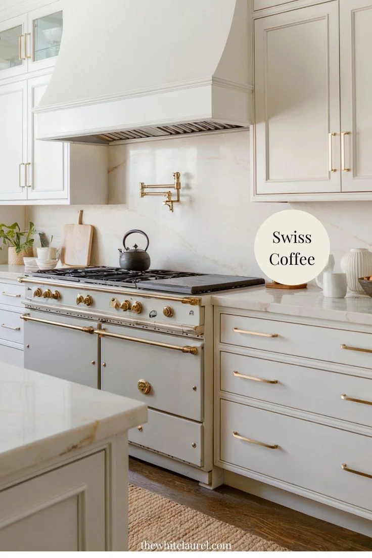
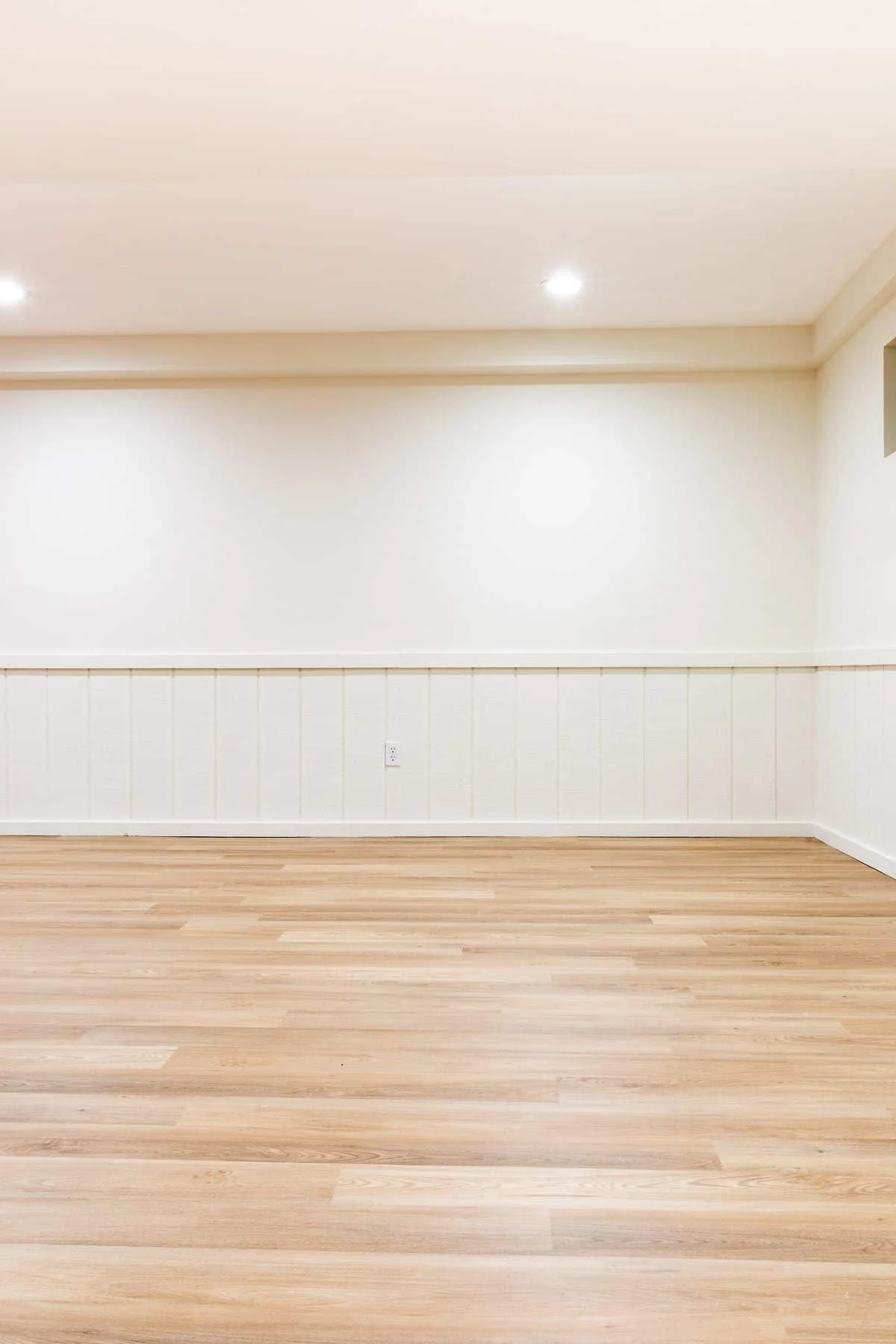
BM Swiss Coffee OC-45 is that cozy, creamy off-white paint people always call “safe”—but in a good way. It has soft yellow undertones that make rooms feel warm and comfy, especially in natural light. I’d say it works best in spaces where you want that relaxed, lived-in feel—like bedrooms or family rooms. Swiss Coffee looks great in eggshell or matte finishes, depending on how soft or slightly reflective you want it.
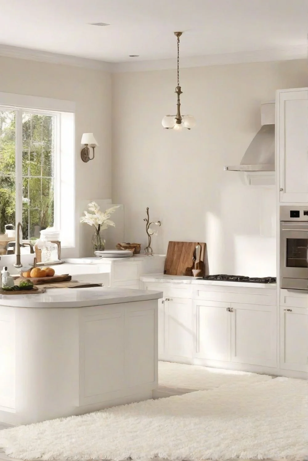
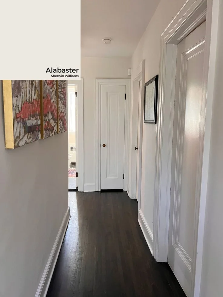
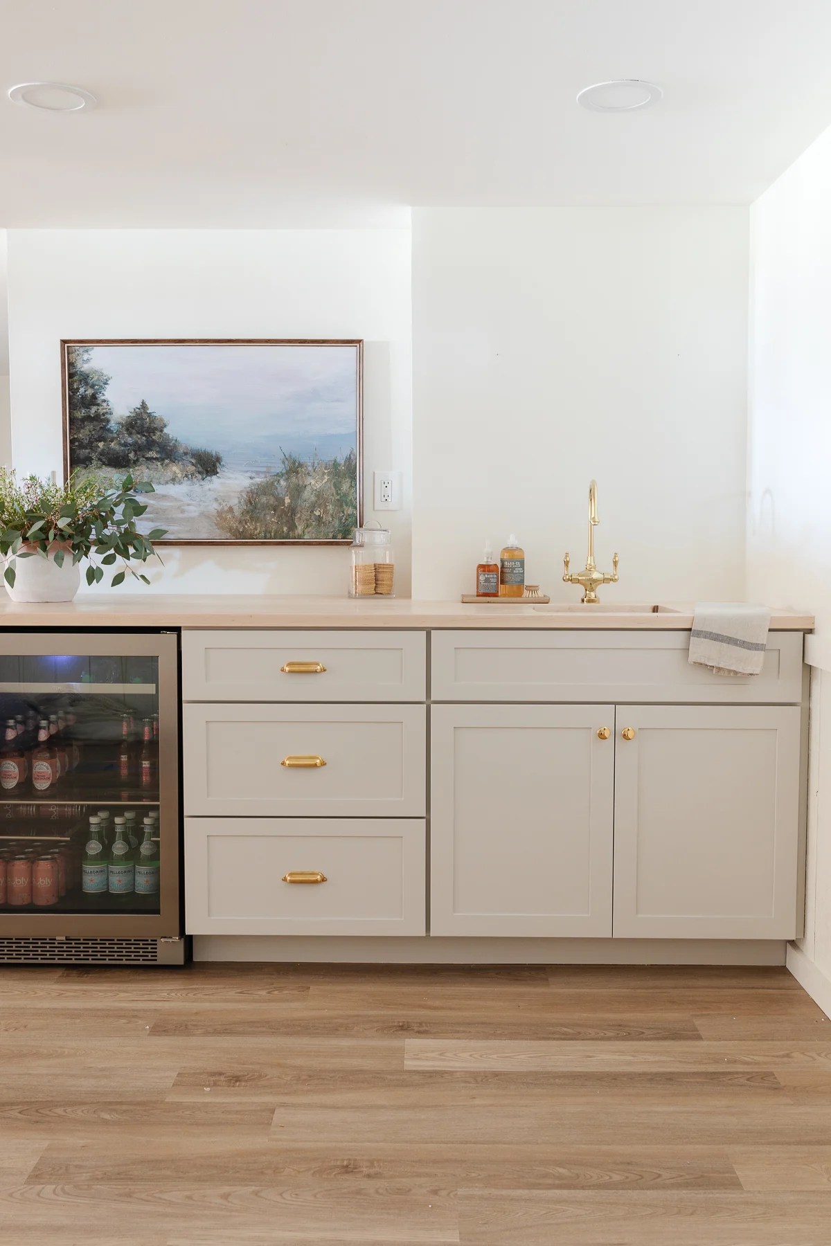
SW Alabaster SW 7008 feels a bit more balanced. It’s still creamy, but with more neutral undertones. It doesn’t lean too yellow or too gray. That’s why it’s one of Sherwin-Williams’ most popular whites. It handles different lighting like a champ—natural or artificial. Great for open spaces, kitchens, and even exteriors. And yep, it’s just as versatile in satin or flat finishes.
Here is the table of Alabaster vs Swiss Coffee
| Feature | BM Swiss Coffee OC-45 | SW Alabaster SW 7008 |
|---|---|---|
| Color Code | OC-45 | SW 7008 |
| LRV | 83 | 82 |
| Color Family | Creamy Off-White | Creamy Off-White |
| Undertones | Yellow Undertones | Neutral Undertones |
| Best Use Case | Bedrooms, Cozy Spaces | Kitchens, Living Rooms |
| Versatility | Warm + Great in Low Light | Clean + Works Anywhere |
Best Settings for Each Color: Swiss Coffee vs Alabaster
Where Swiss Coffee Shines in Your Home
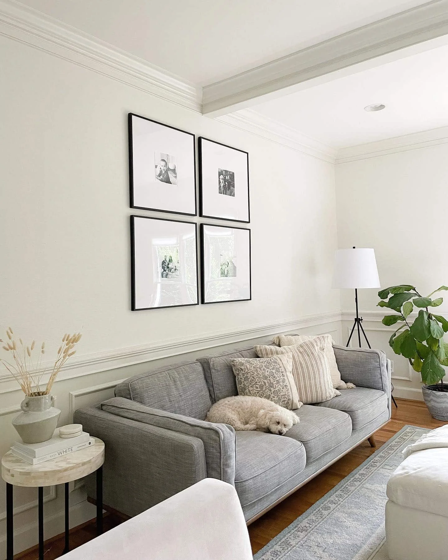
Benjamin Moore Swiss Coffee feels like a warm hug. It’s the kind of warm off-white that makes a room feel soft, safe, and lived-in—like your favorite blanket on a chilly morning.
Bedroom
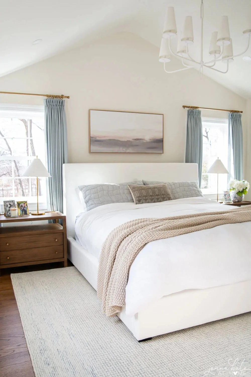
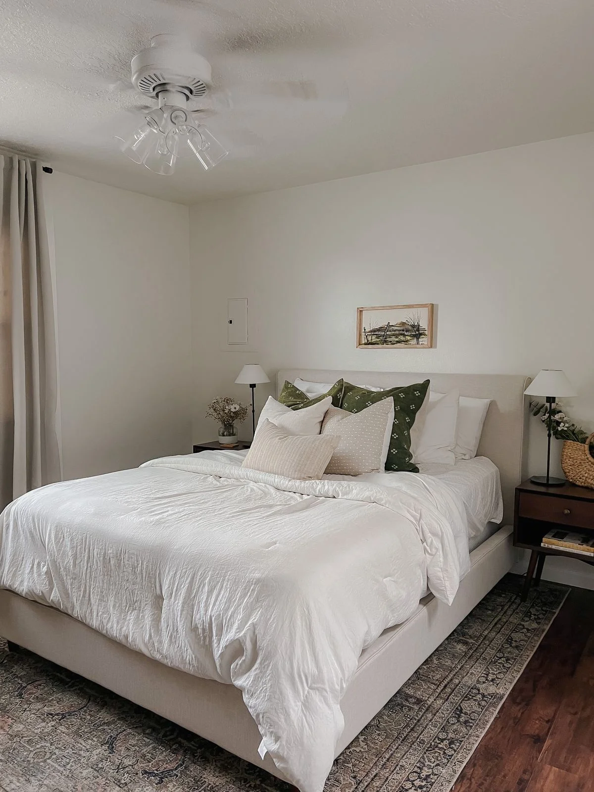
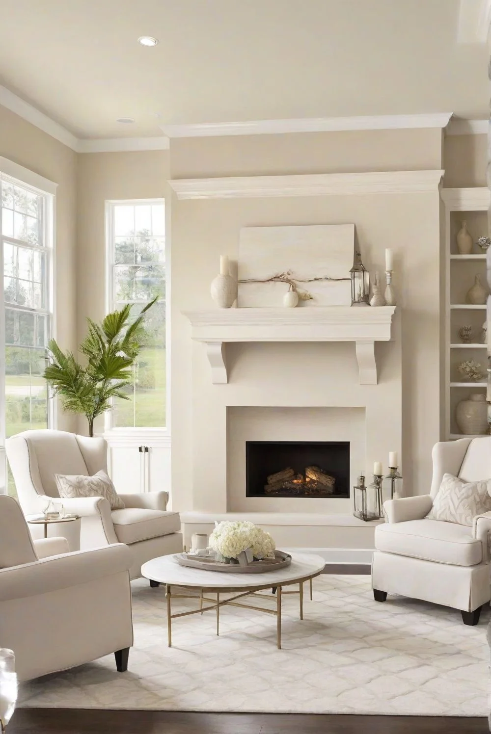
If you want cozy bedroom walls that help you unwind, Swiss Coffee paint does the trick. It has this soft, creamy look that makes the space feel calm without being dull. I’ve seen it work beautifully in farmhouse and Scandinavian-style rooms, especially with soft natural lighting or warm lamps.


Dining Room
For me, an inviting dining room should feel like a place where people want to linger. Swiss Coffee adds just the right amount of warmth to the walls—it doesn’t overpower, but it pulls everyone in. Picture Sunday dinners, wood furniture, and candlelight. That’s the vibe.


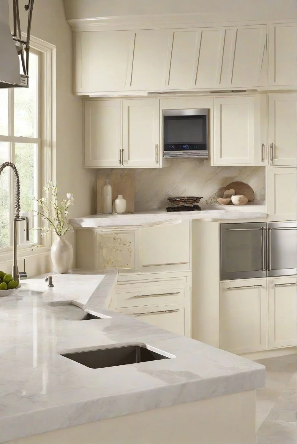
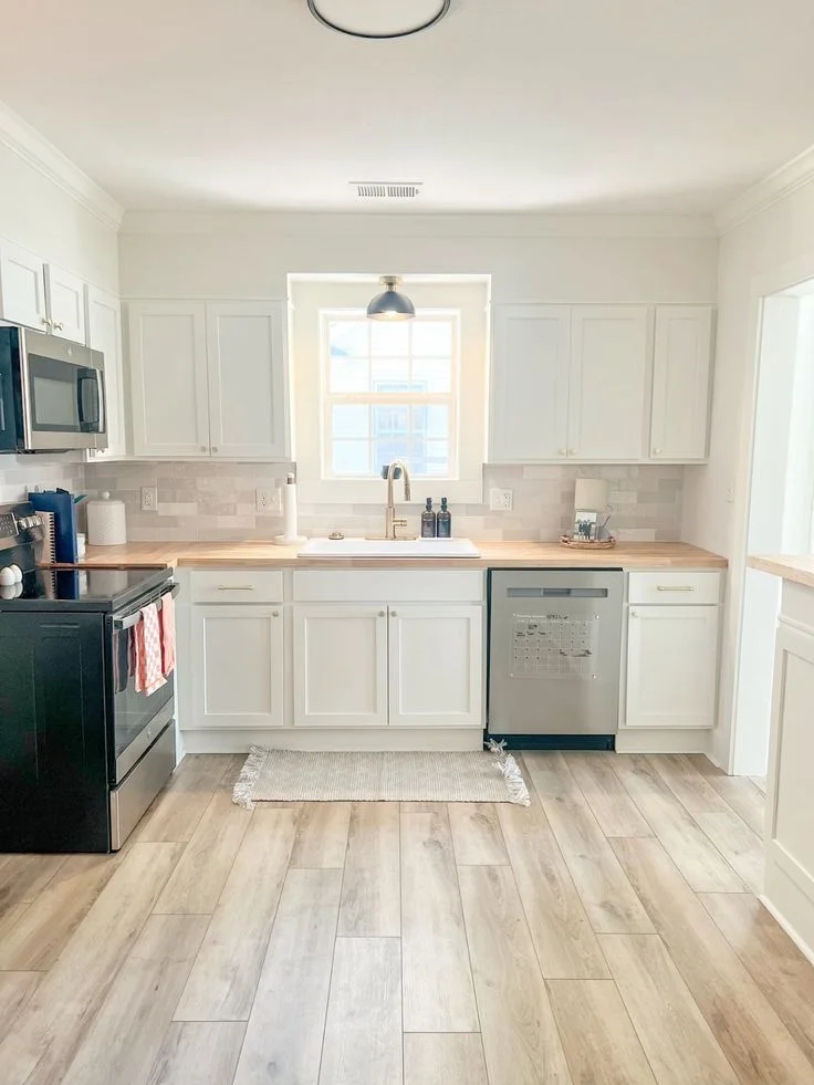
Kitchen
This paint makes a kitchen feel like home. Seriously. Think grandma’s kitchen kind of cozy. Swiss Coffee is a classic kitchen paint color that looks great with white cabinets, open shelves, and warm-toned metals. It plays well with both natural daylight and soft white bulbs, which helps it keep that creamy charm all day long.


Where Alabaster Works Wonders in Your Home
SW Alabaster is kind of like a crisp white tee—it goes with everything, always looks fresh, and never tries too hard.
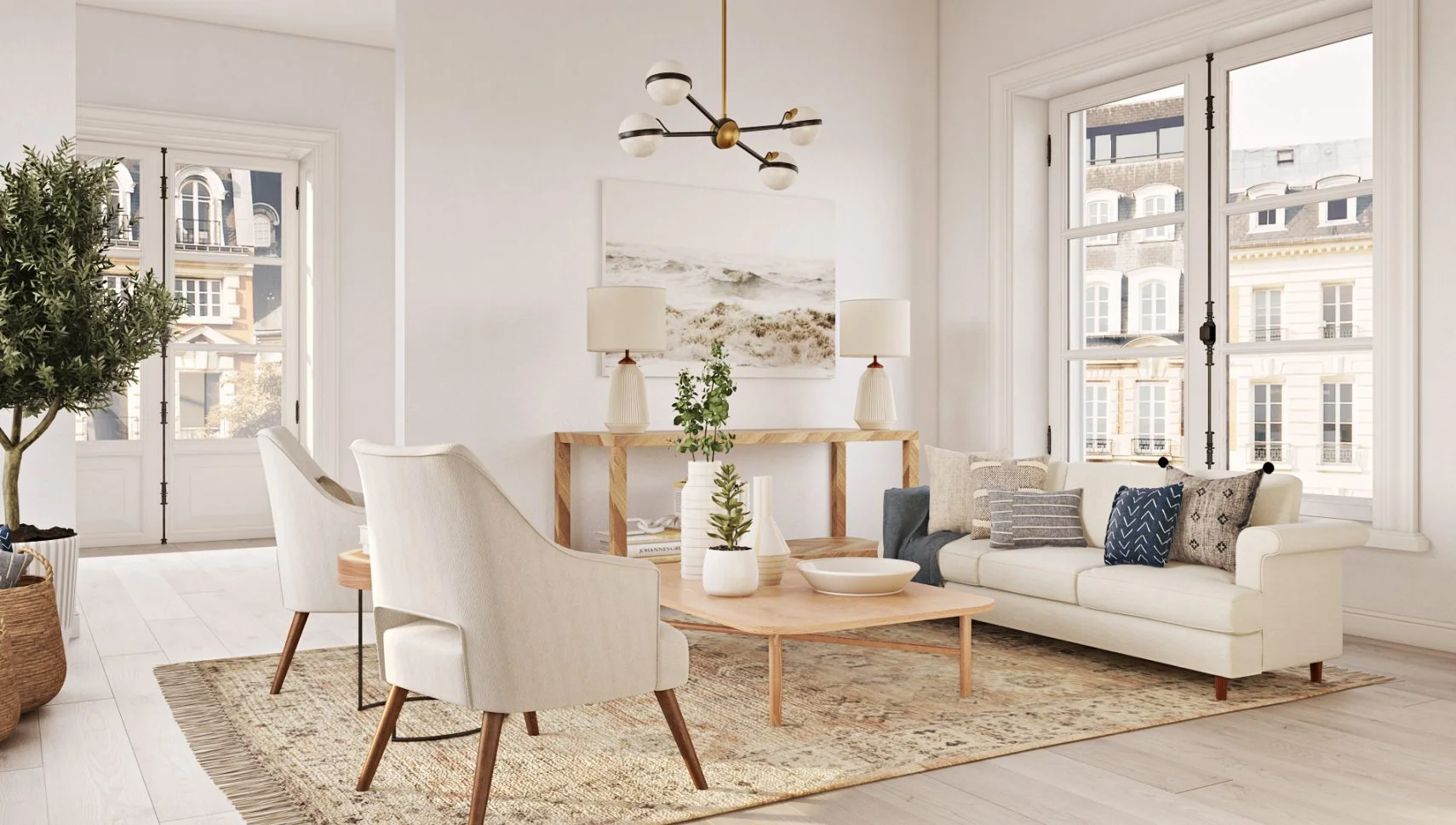
Living Room
Sherwin Williams Alabaster gives your living room that clean, designer look without feeling cold. It fits just as well with bold artwork as it does with soft, minimalist decor. I’d say it’s perfect if you want a space that feels open but not empty.


Kitchen
A kitchen painted in creamy white paint like Alabaster feels fresh and ready for action. Whether you’re cooking or just ordering takeout in style, it makes everything feel a little more put-together. Pair it with dark counters or light wood for a clean, balanced vibe.


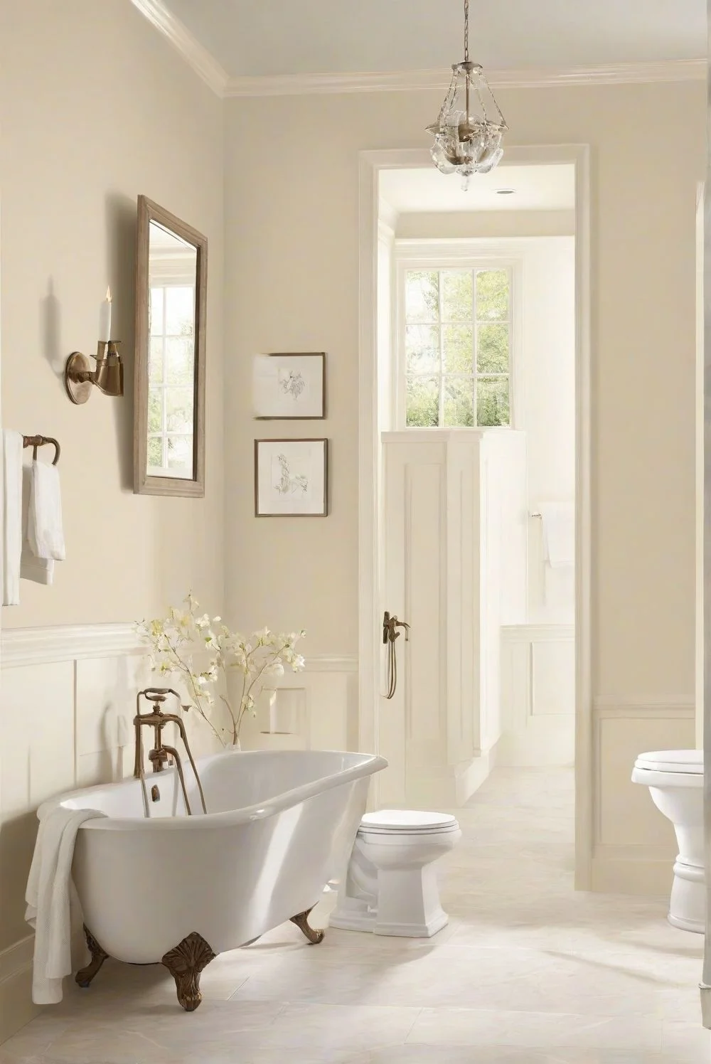
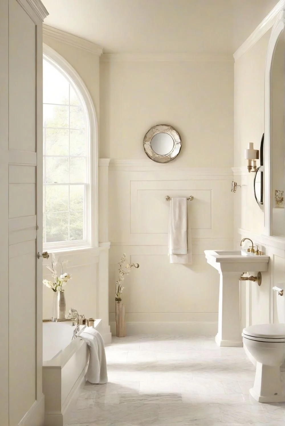
Bathroom
This color turns a bathroom into a quiet, spa-like bathroom space. It’s soft enough to feel calm but still bright enough to keep the room feeling open. Works great with matte black fixtures or soft gold tones.


Hallway or Foyer
Want that “wow” moment right when you walk in? Alabaster nails it. It’s an elegant, creamy white paint that makes even a small hallway feel a bit more upscale. Try it with bold trim colors or natural wood—seriously, it pops.

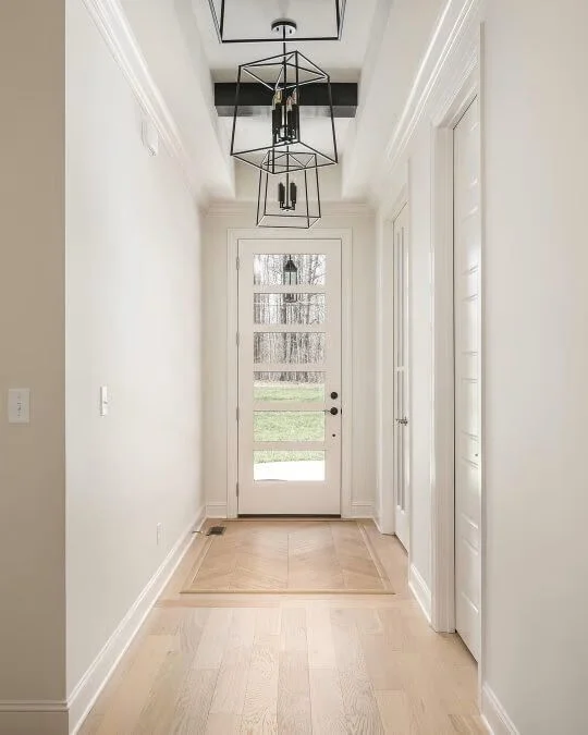

Pro tip: Alabaster plays really well with styles like Japandi and Modern Minimalism. And if you add some contrast—like black frames or navy blue accents—it really stands out.
Lighting
How Swiss Coffee Looks in Different Lighting
Swiss Coffee changes like your favorite sweater—sometimes bright and cheerful, other times soft and cozy, depending on the light.
Natural Daylight
In natural light, Swiss Coffee in natural light feels warm and full of life. The yellow undertones show up more here, giving your walls a soft, sunny glow. It’s a warm white paint that makes rooms feel bright but still relaxed.


Warm Indoor Lights
Under warm indoor lighting, like incandescent bulbs, Swiss Coffee gets deeper and a bit richer. It feels more like evening—comforting, mellow, kind of like sitting down with a book and some quiet. This is where it really shines in bedrooms and dining spaces.

Cool Lights
With cooler lights—like LEDs or on overcast days—Swiss Coffee shifts. It looks more neutral and calm, less creamy. Some of the warmth pulls back, and it gives off a cleaner, more modern feel.

Quick tip: Always test your paint samples in morning, afternoon, and evening light before deciding. Lighting affects paint color big time. And if you’re using Swiss Coffee in a warm-lit room, pairing it with soft taupes or warm woods helps keep everything feeling balanced.
How Alabaster Transforms Under Different Lights
Alabaster loves to show off—it changes its look depending on the light and still stays classy.
Natural Daylight
Alabaster in natural light feels bright and fresh. You might notice a slight gray undertone that makes the space feel open and airy. It’s perfect for modern interior paint looks that want a clean but soft vibe.


Warm Indoor Lights
Under warm indoor lights, Alabaster softens up and gets a bit cozier. The gray tones pull back, and it adds a gentle warmth that makes rooms feel relaxed and inviting, without losing its creamy white charm.

Cool Lights
With cool lighting, Alabaster looks crisp and sharp. It stands tall and pure, which is great for minimalist or modern spaces. Pair it with black or deep navy accents to make it pop even more.

Pro tip: Check Alabaster on both your walls and trims under different lighting before making a final call. The contrast can change how it feels in your space a lot.
Pairing Swiss Coffee & Alabaster with Decor and Accents
Wall color is like the stage where every piece of decor plays its part. Both Swiss Coffee and Alabaster act as a smooth backdrop, setting the tone for decor harmony. Their undertones—yellow in Swiss Coffee and gray in Alabaster—guide which woods, metals, and fabrics work best. Getting the lighting, paint, and furniture right helps the whole room feel balanced and connected.
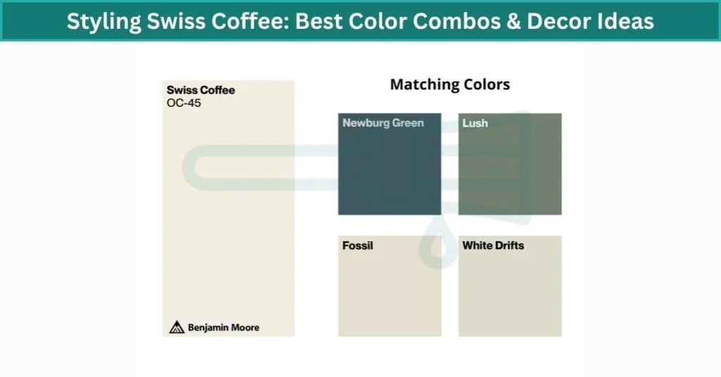
Styling Swiss Coffee: Best Color Combos & Decor Ideas
Swiss Coffee paint is like a soft whisper that lifts a room without stealing the show.
Matching Colors
Try soft beige, muted sage, or deep blue to keep things calm and balanced. These colors play nicely with Swiss Coffee’s warm, creamy tone and make the space feel peaceful.
Wooden Furniture
Swiss Coffee works great with wood furniture—whether it’s rustic oak or sleek modern maple. The warm white paint warms up the wood’s natural beauty, making rooms feel cozy and inviting.
Textured Decor
Add natural textures like linen fabric, jute rugs, or macramé wall hangings. These bring depth and softness that match Swiss Coffee’s cozy interior paint combinations perfectly.
Pro tip: Swiss Coffee looks especially good in an eggshell finish in living rooms. Also, pairing it with pure white trim—think Chantilly Lace—gives your space crisp edges and clean contrast.
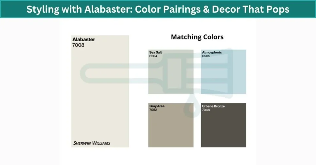
Styling with Alabaster: Color Pairings & Decor That Pops
Sherwin Williams Alabaster is like the quiet note that lets all the other colors shine—it’s versatile and always supportive.
Matching Colors
Soft grays, teal, and emerald green mix beautifully with Alabaster. These colors bring balance, whether you want a calm, muted look or bold pops of color that catch the eye.
Modern Accents
Think geometric patterns, black picture frames, and brushed metal finishes. Alabaster acts as the perfect backdrop to these sharp, modern details, making them stand out without feeling too busy.
Glass & Metallic Decor
Chrome, gold, or clear glass pieces really sparkle against Alabaster’s creamy white walls. Using a satin or semi-gloss finish helps reflect light softly, adding a subtle glow that lifts the whole room.
Pro tip: Alabaster works great on both walls and trims. Use it on trims in layered decor styles or all over in minimalist rooms to keep things fresh and clean.
Swiss Coffee vs. Alabaster: Key Differences and Which to Choose
Swiss Coffee vs Alabaster are both popular, timeless off-white paints that many people love. The big difference comes down to their undertones. Swiss Coffee has a warm white paint feel, with soft yellow undertones that make rooms cozy and inviting. Alabaster leans more toward a neutral off-white paint with subtle gray undertones, giving it a cleaner, more modern appearance. Both are versatile, but Swiss Coffee works best in spaces with warm wood and traditional or farmhouse styles, while Alabaster fits minimalist, transitional, and modern homes, especially those with black or cool-toned accents. So, if you want a cozy vibe, go Swiss Coffee; if you prefer a fresh, sleek look, Alabaster is your pick.
How to Choose Between Swiss Coffee and Alabaster for Your Room
Check the Lighting
Lighting changes how paint looks a lot. Test Swiss Coffee and Alabaster in your room during the day and at night, with natural and artificial light. You’ll see how Swiss Coffee feels warmer in soft light, while Alabaster stays clean and bright.
Think About the Room’s Purpose
Swiss Coffee works great for cozy spaces like living rooms or bedrooms where you want a warm, relaxing vibe. Alabaster is better for rooms that need focus and clarity, like a home office or kitchen.
Match Your Decor
Look at your furniture, fabrics, and finishes. Swiss Coffee pairs well with warm woods and brass accents. Alabaster suits cooler metals like chrome and fits modern or minimalist styles best.
Pro tip: Use large paint swatches or peel-and-stick samples on different walls to see how each color plays with your space before deciding.
Design Inspirations: Using Swiss Coffee and Alabaster in Your Home
Swiss Coffee
Imagine a cozy living room painted in Swiss Coffee living room color. Warm wood furniture and patterned textiles bring a soft, inviting feel. Add throw pillows in muted greens or deep blues to make the space pop. Soft, warm lighting makes everything feel even more relaxed and welcoming.
In the bedroom, Swiss Coffee is a calm bedroom paint color that pairs beautifully with neutral bedding and natural textures like linen or wool. It’s like wrapping yourself in a gentle hug every night. Using warm bedside lamps keeps the mood soft and soothing.
Alabaster
A bright modern kitchen with Alabaster kitchen design feels fresh and clean. Stainless steel appliances and sleek counters stand out against the creamy white walls. Try adding pops of color with teal or emerald green rugs or kitchen towels. Cooler lighting works well here to keep the space sharp and lively.
In a home office, Alabaster home office paint colors create a serene space. Light wood furniture and plenty of plants add warmth and life without clutter. Pair with soft gray accents and let natural light flood in to keep the room feeling open and focused.
Your Home’s Appeal with Swiss Coffee or Alabaster
Both Benjamin Moore Swiss Coffee and Sherwin Williams Alabaster come from trusted, high-quality paint brands known for their durability and low VOC formulas. These popular neutral paint colors are timeless and versatile, fitting well in almost any room or style. Choosing either will add lasting style and warmth to your home. Test samples today to find which timeless paint color feels just right for your space.
Best Uses for Swiss Coffee and Alabaster: Trim, Cabinets, and Walls
Picking the right paint for trim, cabinets, and walls can change how your room feels. Here’s a quick guide to help you choose between Swiss Coffee and Alabaster for each surface.
Trim
Alabaster is great for trim because it gives a crisp, clean look with its neutral undertones. It pairs well with both warm and cool wall colors, and a semi-gloss finish makes trims easy to clean and durable.
Cabinets
Swiss Coffee works well on cabinets if you want a warm, inviting feel. Its soft yellow undertones add coziness, especially with matte or satin finishes that resist fingerprints. Alabaster can also work on cabinets for a sleek, modern look but may show dirt easier.
Walls
Swiss Coffee’s warm tone makes walls feel cozy and welcoming, perfect for living rooms and bedrooms. Alabaster’s neutral off-white is ideal for walls when you want a fresh, bright, and modern atmosphere. Eggshell or matte finishes help hide imperfections on walls while keeping a smooth look.
Tip: For busy areas like kitchens or hallways, use durable finishes like semi-gloss on trim and cabinets to keep cleaning simple without losing style.
Pros and Cons Summary Table
| Swiss Coffee – Pros | Alabaster – Pros |
|---|---|
| – Warm undertones create cozy spaces | – Neutral undertones suit modern styles |
| – Works well in bedrooms and living rooms | – Brightens rooms with natural light |
| – Pairs nicely with warm woods and brass | – Great for trims and minimalist decor |
| – Popular choice from Benjamin Moore | – Low VOC, eco-friendly from Sherwin-Williams |
| – Looks great in eggshell or matte finish | – Easy to clean with satin/semi-gloss finishes |
| Swiss Coffee – Cons | Alabaster – Cons |
| – May look yellowish in cool lighting | – Can look too stark in low light |
| – Less suited for very modern spaces | – Shows dirt more easily on cabinets |
| – Matte finishes can be harder to clean | – Slight gray undertones may clash with warm woods |
| – Not ideal for very bright rooms | – May feel cold without warm accents |
Real User Fixes & Community-Backed Solutions
In r/InteriorDesign, a user sparked a lively discussion over an unexpected color issue: Sherwin-Williams’ Alabaster paint looking surprisingly yellow in a newly painted home. As a designer, they were baffled—Alabaster is a tried-and-true creamy white they and their clients have used often, but this time, it seemed off. The builder claimed it looked yellow only because it was placed next to bright white trim, but the OP had never seen such a strong contrast before and asked the community for input.
Several commenters chimed in with insights and similar experiences. One mentioned that big box stores like Home Depot sometimes mix formulas that don’t match Sherwin-Williams’ original exactly. Others pointed out how confusing paint names can be across brands—“Alabaster” from one company might differ noticeably from another. A few seasoned painters recommended confirming the formula with a swatch test or even matching finishes (like using semi-gloss Alabaster for trim) to reduce contrast. The consensus? Lighting, surrounding whites, and even the source of your paint can dramatically change how a “safe” neutral like Alabaster appears on the wall.
Final Verdict Swiss Coffee vs Alabaster
Choosing between Benjamin Moore Swiss Coffee vs Sherwin Williams Alabaster comes down to the mood and style you want for your space. Swiss Coffee leans warmer with creamy beige and soft yellow undertones, making it perfect for cozy, inviting rooms like bedrooms and living areas. It’s great if you love a classic, lived-in feel that pairs well with warm woods and soft textiles.
Alabaster, on the other hand, offers a cleaner, more balanced look with subtle greige and pink undertones. It works beautifully in modern, minimalist, or transitional spaces where you want a fresh, bright vibe without harshness. Swiss Coffee vs Alabaster both paints are versatile and timeless, so testing them in your room’s lighting will help you find the perfect creamy white for your home.
People Also Ask
What is the difference between alabaster and Swiss Coffee?
The main difference between Swiss Coffee and Alabaster is in their undertones and overall feel. Swiss Coffee leans more toward the creamy, beige family, giving rooms a cozier and richer vibe. It feels warm and inviting, perfect if you want a soft, comforting space. Alabaster, on the other hand, has subtle greige undertones that balance warmth without looking too yellow. It offers a warm, creamy white that’s cleaner and a bit more modern.
What is the SW equivalent of BM Swiss Coffee?
The closest Sherwin-Williams equivalent to Benjamin Moore Swiss Coffee (OC-45) is Dover White. Both have a similar creamy off-white look, but Dover White is slightly lighter with an LRV of about 83, compared to Swiss Coffee’s 83 as well, making them very close in brightness. However, Dover White’s undertones lean a bit more yellow. You can use them interchangeably in most rooms, especially where you want a warm, soft white that feels inviting.
What is the undertone of Benjamin Moore alabaster?
Benjamin Moore Alabaster has soft pink undertones that give it a warm and inviting feel. These subtle pink hints make the paint color blend beautifully with earth tones like browns and greens, helping create cozy and balanced interiors. Because of its gentle undertones, Alabaster works well in spaces where you want warmth without being too bold.
What undertones does BM Swiss Coffee have?
Benjamin Moore Swiss Coffee has soft yellow undertones that add a gentle warmth to the paint without making the walls look truly yellow. These subtle undertones help the color feel cozy and inviting while staying versatile enough to work well in different lighting and with many color schemes. That’s why Swiss Coffee adapts easily, making it a popular choice for warm, comfortable spaces.
Is alabaster warm or cool?
Alabaster is a soft, warm white with gentle undertones that give it more depth than cleaner, cooler whites. It feels inviting and adds warmth to a room without being overpowering.
Why is Benjamin Moore Swiss Coffee so popular?
Benjamin Moore Swiss Coffee is popular because it strikes a perfect balance between warmth and coolness. It’s not too yellow or too gray, making it a flexible choice for many rooms. Designers often pick it for living rooms and bedrooms because it creates a cozy yet fresh atmosphere that works well with lots of styles and colors.
What color is alabaster paint?
Alabaster paint is a warm white color with a soft, creamy feel. Its gentle warmth makes it inviting without being too bright or harsh.
Is Swiss Coffee a beige?
Swiss Coffee is a warm color with creamy beige undertones and a hint of yellow. These undertones give it a cozy, inviting feel, making it a popular choice for living rooms, kitchens, and bedrooms where you want a soft and welcoming atmosphere.
What accent color goes with Swiss Coffee?
Swiss Coffee is a warm, creamy white that brings a soft and inviting feel to any room. Its gentle tone makes it a great base color that pairs well with both bold and subtle accents.
For a classic, rich look, try deep hues like Hale Navy or Kendall Charcoal to create striking contrast. If you want a lighter, airier vibe, softer whites like Chantilly Lace or Simply White work beautifully alongside Swiss Coffee, keeping the space fresh and balanced.