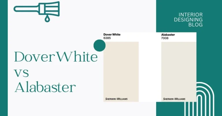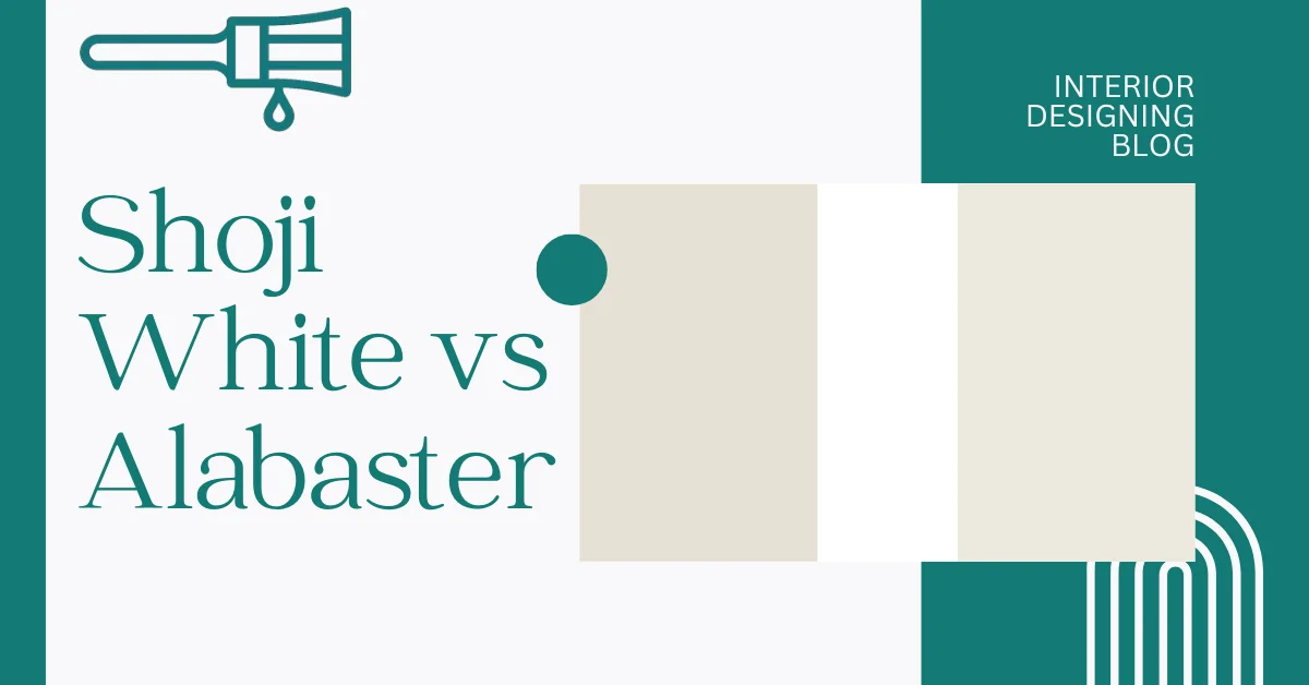
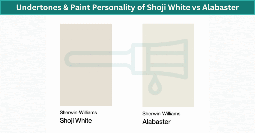
Shoji White vs Alabaster
I used to think picking white paint was the easy part. I mean, it’s just white, right? Nope. Total rookie mistake. When I had to choose between Shoji White vs Alabaster, I went down a full-on color rabbit hole. You might think all whites look the same—until you put them on the wall. Side by side, these two tell very different stories.
They’re both super popular Sherwin Williams white paint colors. According to Interior Designing Blog, they look kind of close in the can. But once they’re up on the wall, the difference between Shoji White and Alabaster shows fast—especially if the lighting changes.
I’d say the trickiest part is how undertones and light mess with your eyes. That’s where most people get tripped up. We’ll dig into that next. But if you’re comparing white paint colors for your home, this is one matchup you’ll want to get right. I’ve done all the paint color comparison work so you don’t have to.
Undertones & Paint Personality of Shoji White vs Alabaster
Shoji White has this soft, cozy vibe. It’s not too bright, not too yellow—kind of sits in that greige zone. I see some beige in it, with a tiny bit of gray sneaking in too. Morning light makes it look creamier, while in the evening, it leans a little more muted. It’s one of those soft white paint colors that feels warm without going full-on tan. I’d say it does great in darker rooms—like a north-facing bedroom or a space with small windows. It keeps things comfy, not cold.
Now Alabaster? It’s different. This one’s cleaner. Not icy white, but definitely softer and more neutral. It doesn’t scream “warm” or “cool.” It just… works. Especially in rooms with a lot of natural light. You don’t get that beige or gray pull like Shoji White. It’s simple and fresh. I’ve seen it used in kitchens and living rooms where people want a clean, relaxed look without feeling stark.
Put Shoji White and Alabaster side by side, and you’ll see it. Shoji White leans warm and cozy, kind of earthy. Alabaster is calm and balanced—less creamy, more classic. If your furniture leans rustic or earthy, Shoji might blend better. If your space is modern or all-white, Alabaster could feel right.
Little tip: Always test swatches on different walls during the day. Light changes everything.
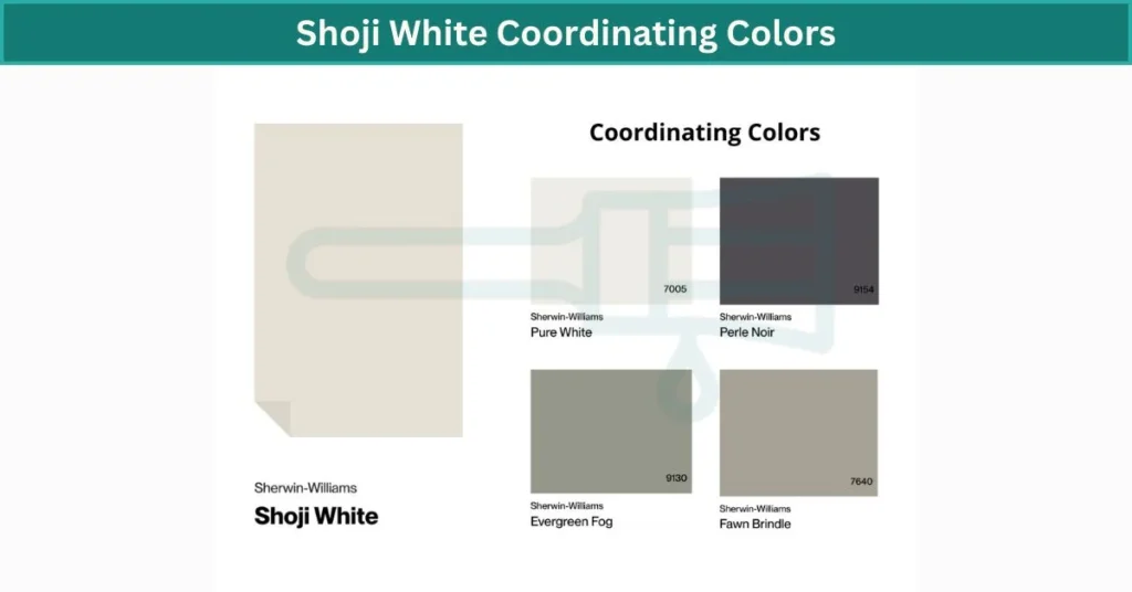
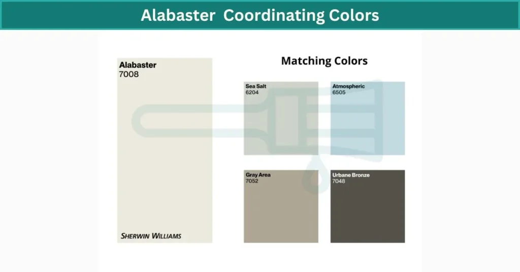
| Paint Color | Shoji White | Alabaster |
|---|---|---|
| LRV | 74 | 82 |
| Undertones | Beige + gray | Soft creamy white |
| Vibe | Warm, greige | Clean, neutral |
How Shoji White & Alabaster Look in Every Room
Let’s walk through how these two whites play out in real spaces—room by room.
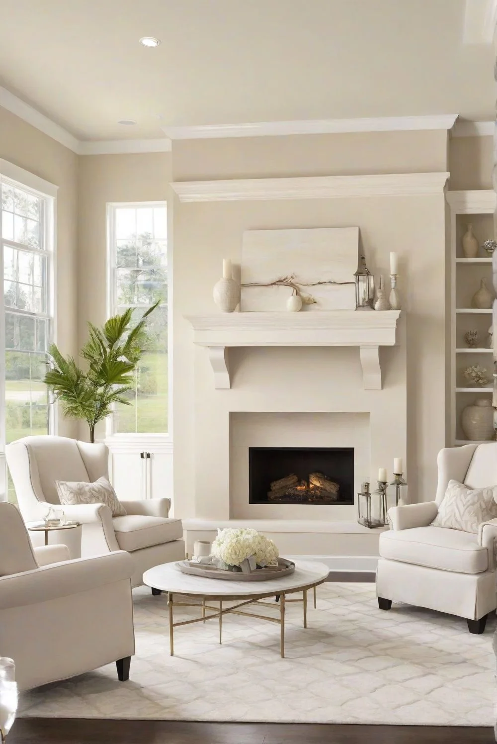
Living Room Vibes: Shoji White vs Alabaster
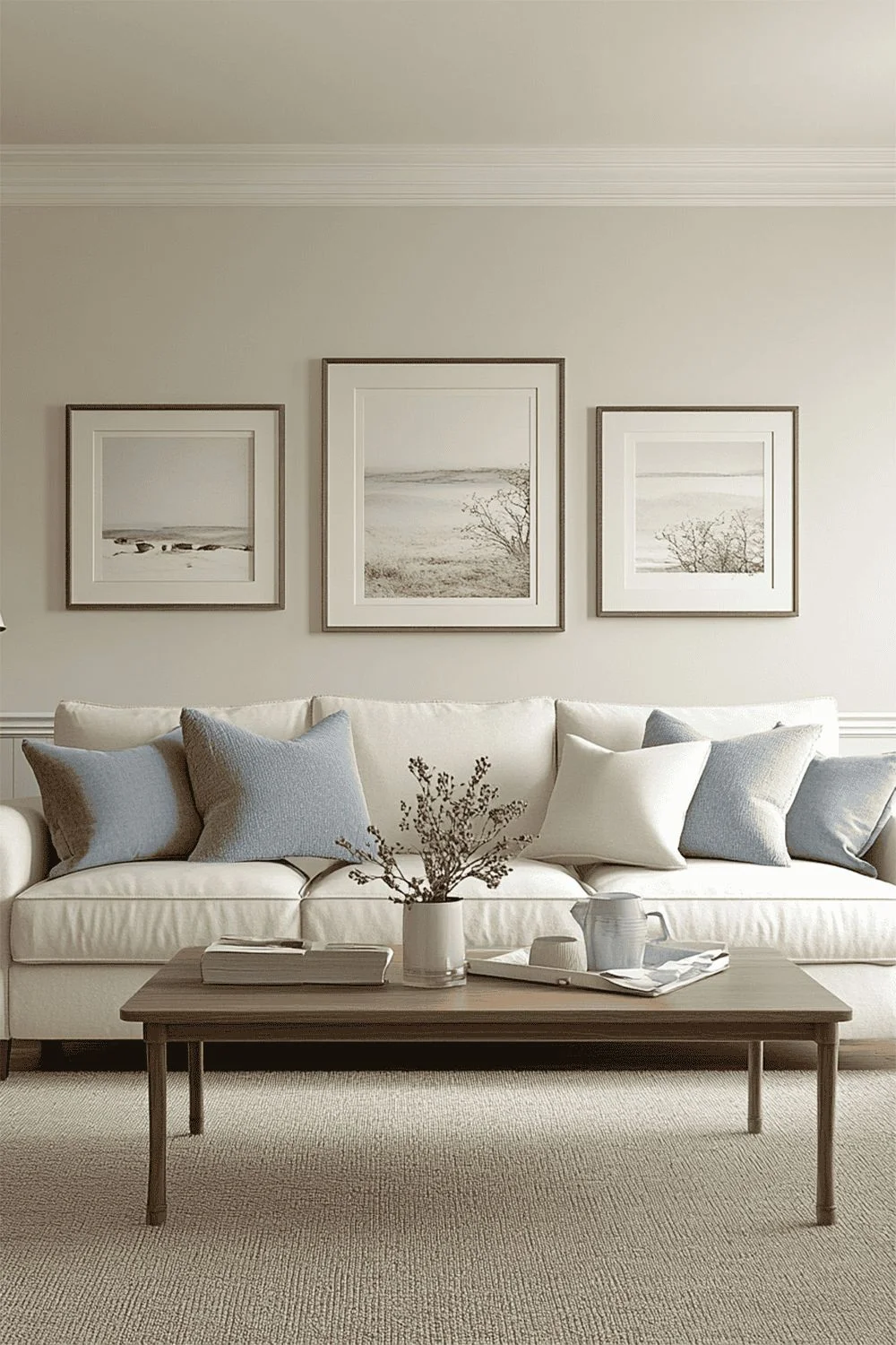
SW Shoji White in the living room feels kind of like your favorite blanket—it’s soft, cozy, and changes a bit through the day. In the morning, it looks creamy. By evening, it leans more sandy, especially under warm lights. I’ve seen it paired with oak furniture and leather couches, and it just works. It brings a comfy glow, like the room wants you to stay a while. Shoji White is that white paint for a cozy living room you don’t know you need until it’s on the walls.

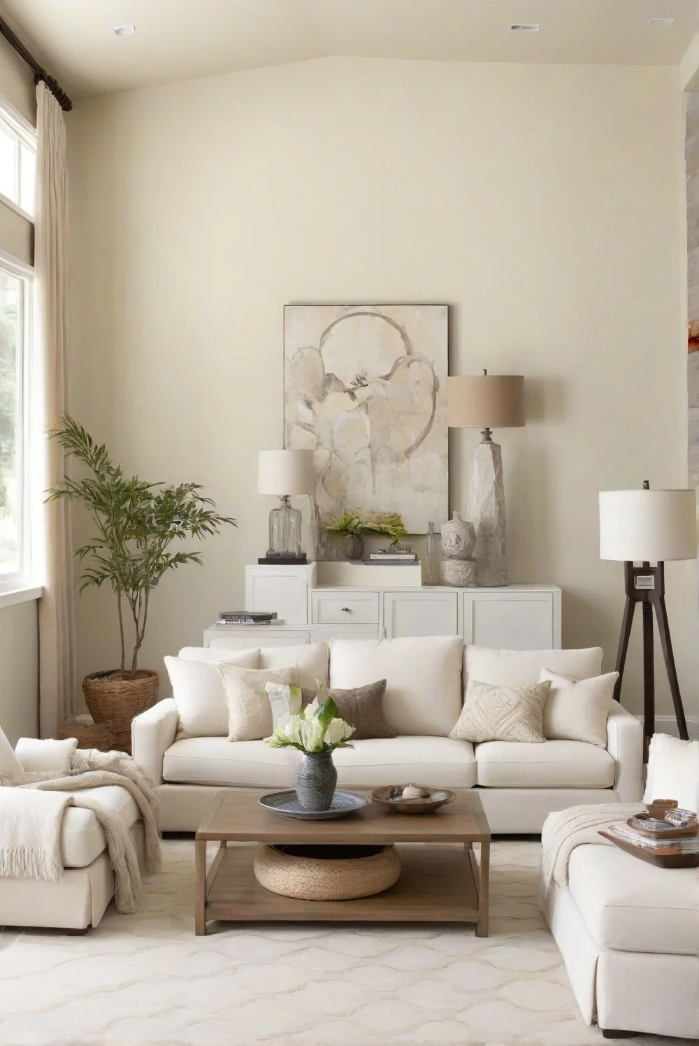

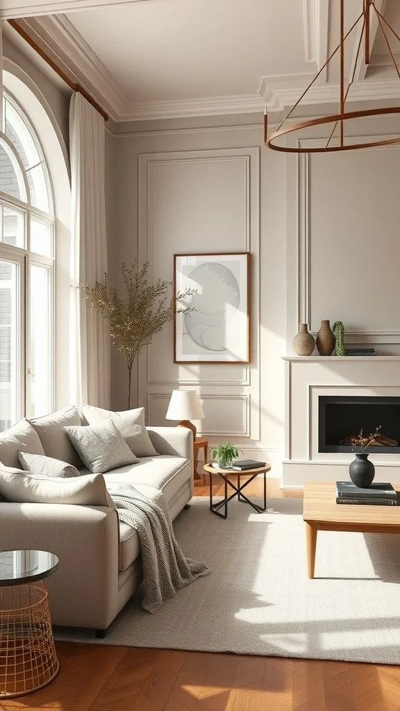
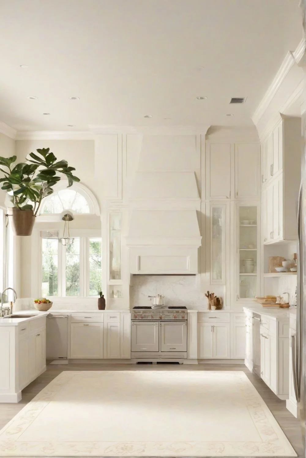
Now Alabaster—it’s the clean one. Think simple, bright, and calm. It makes small living rooms feel open without looking harsh. And even though it’s light, it doesn’t go cold. I’d say it’s great for a modern setup—Scandinavian decor, clean lines, that kind of thing. Alabaster living room paint keeps things fresh but still has enough warmth to feel homey. Works really well with natural light and light-colored floors.


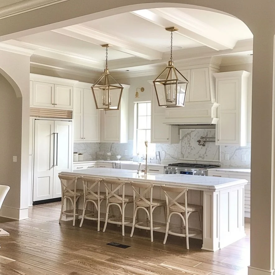
Shoji White vs Alabaster in Kitchen Design
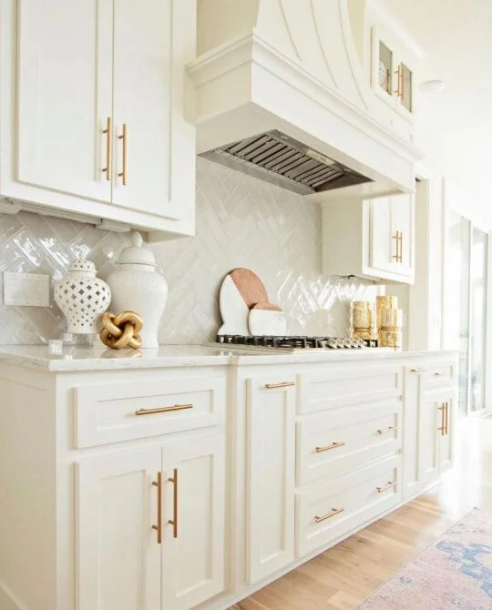
Shoji White kitchen cabinets feel warm without being too yellow. The beige undertones play really well with stainless steel appliances and marble counters. It’s one of those shades that hides little splashes and fingerprints, so you’re not always wiping things down. If your kitchen leans farmhouse or has natural wood, Shoji White adds a soft balance that still looks clean.

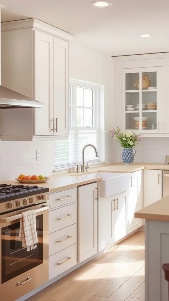

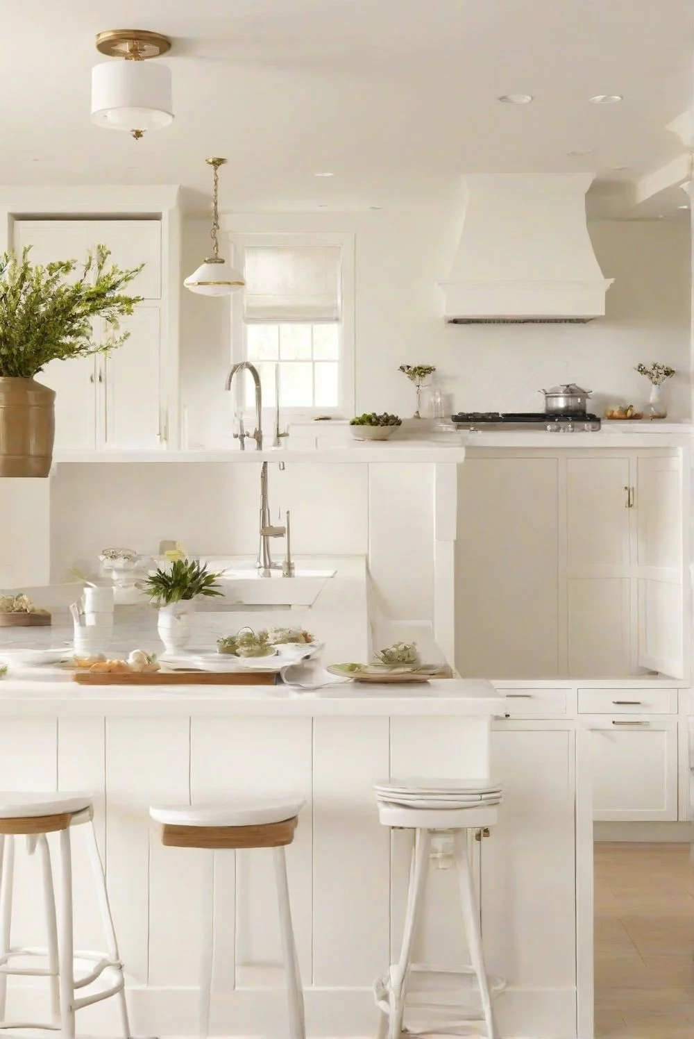
Alabaster kitchen walls are brighter and lean more modern. It’s the best white paint for kitchen walls if you’re after that seamless, open look—especially with white cabinets. It also pops nicely against dark stone or matte black fixtures. But heads-up: it shows smudges a little more. Still, if your kitchen doesn’t get much sun, Alabaster reflects light better and keeps things looking fresh and airy.


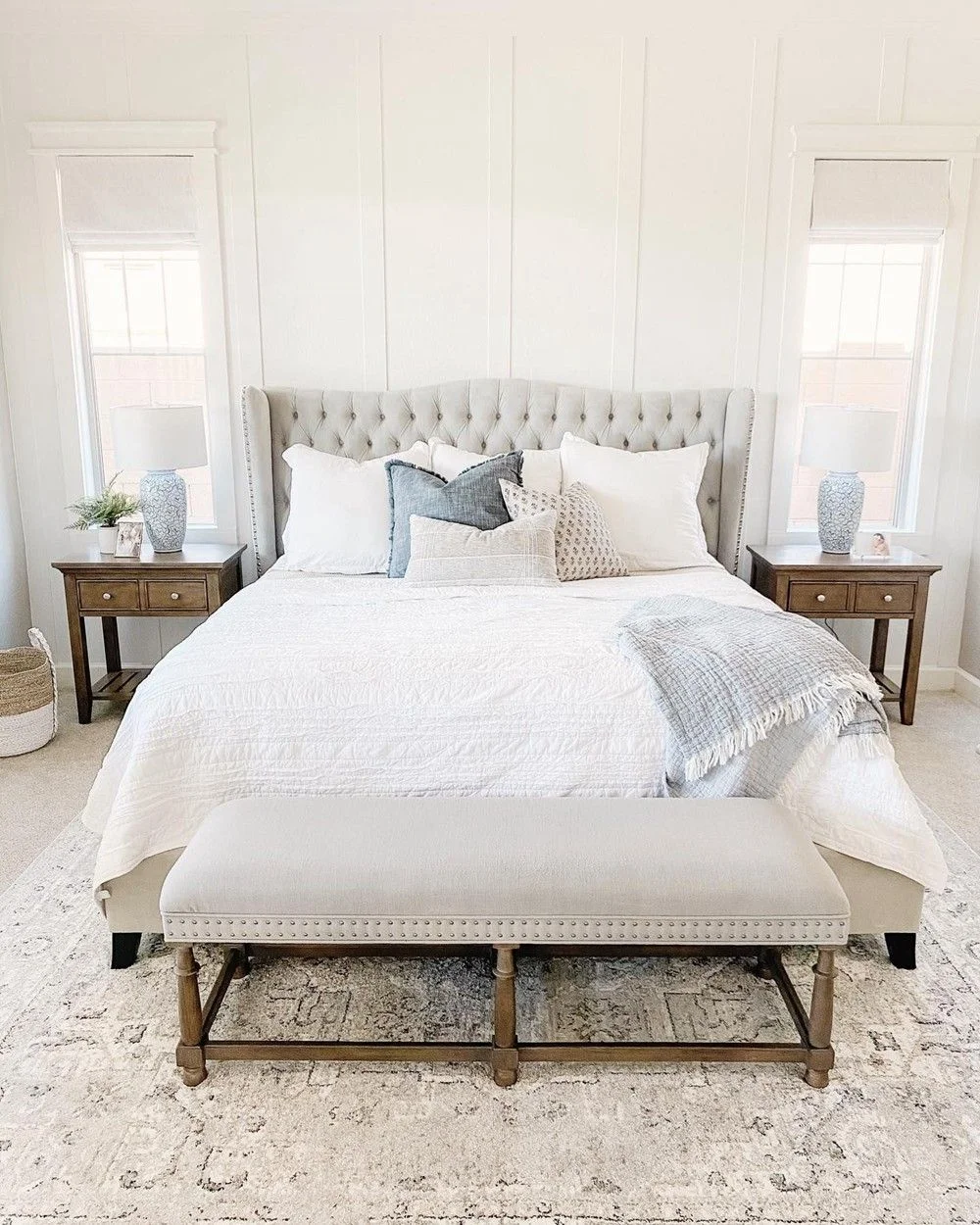
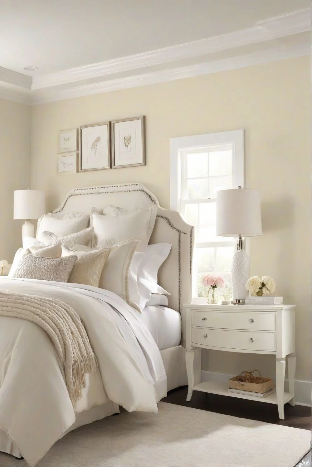
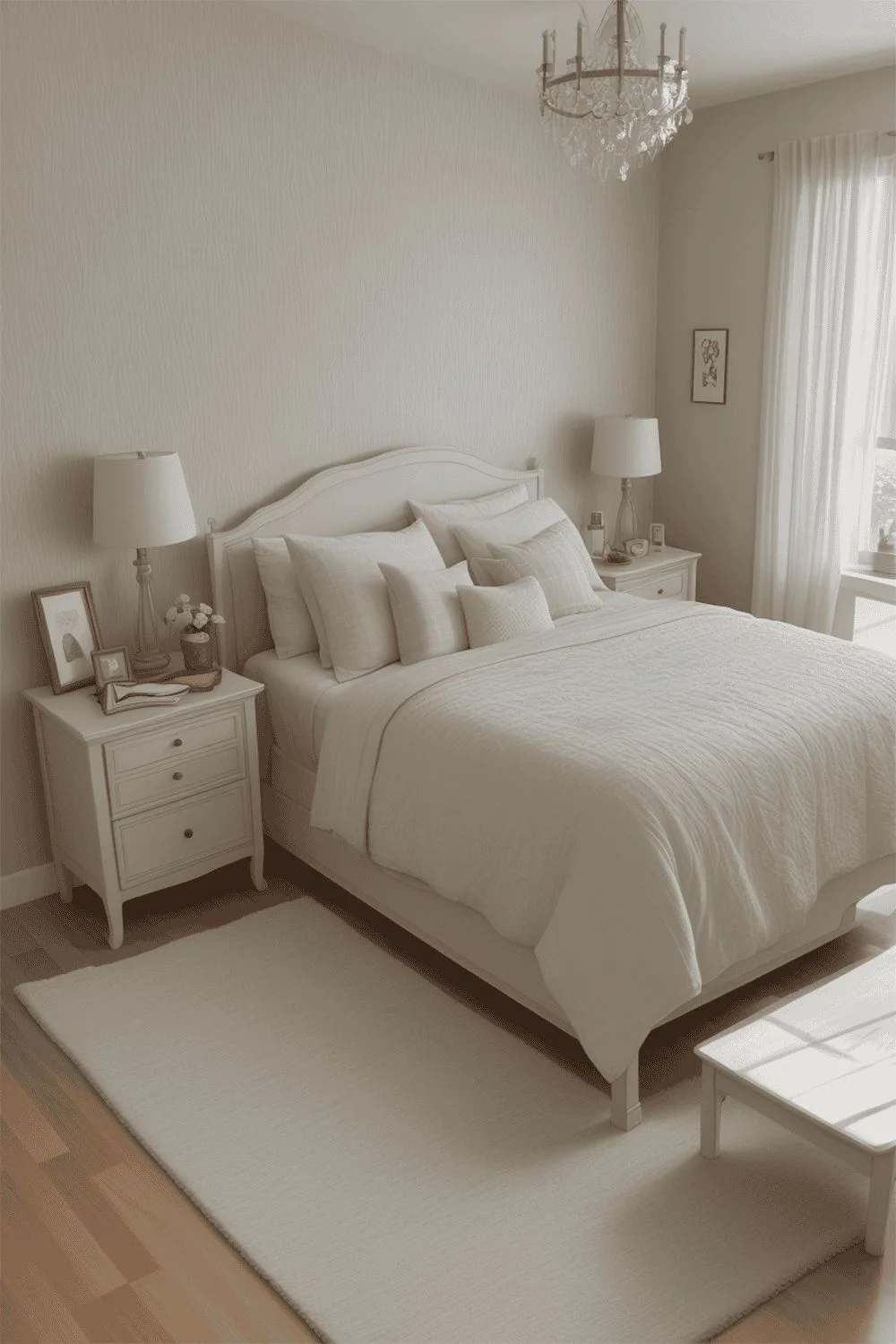
Shoji White vs Alabaster in the Bedroom
A Shoji White bedroom feels like a quiet hug. It’s soft, warm, and kind of melts into the background at night, especially with warm lamps or fairy lights. The beige-gray mix helps tone things down, so your eyes can rest. It also blends really well with vintage pieces or rustic wood, giving the room that cozy, tucked-in feel. Great for winding down.

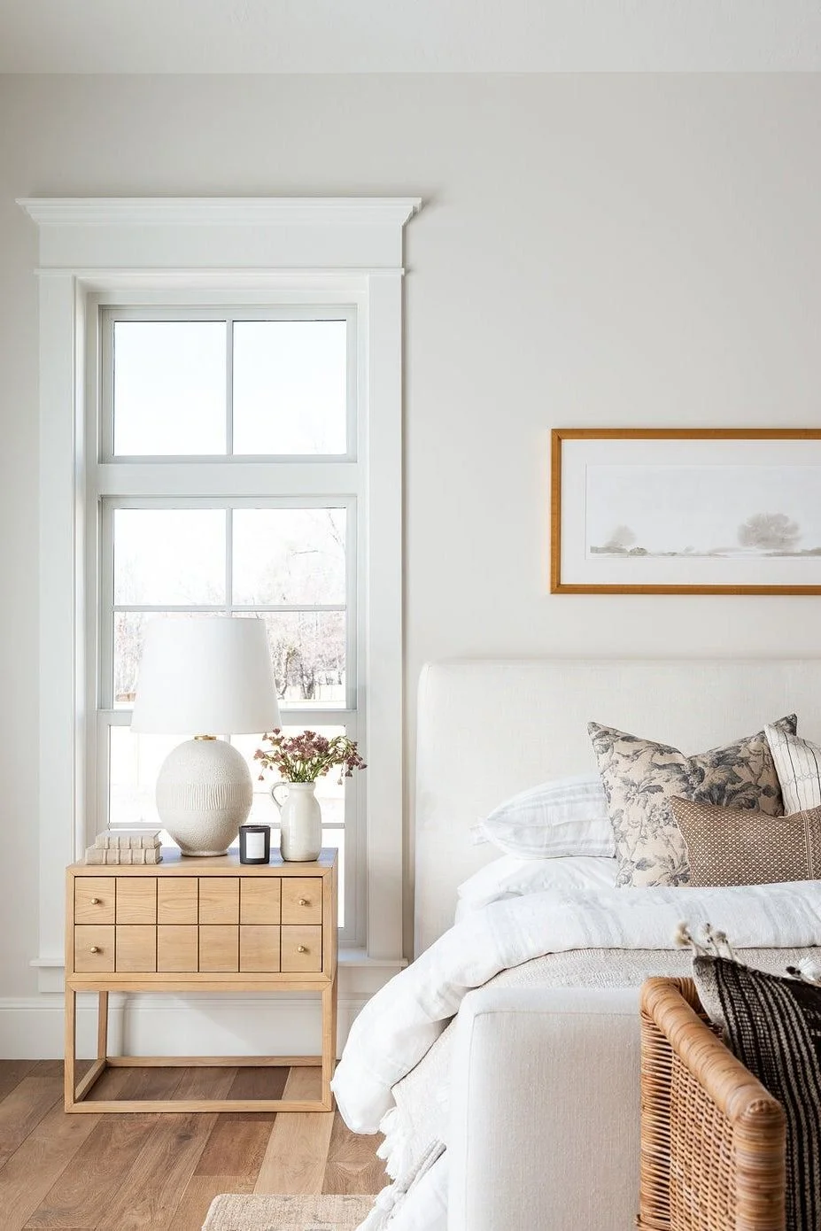

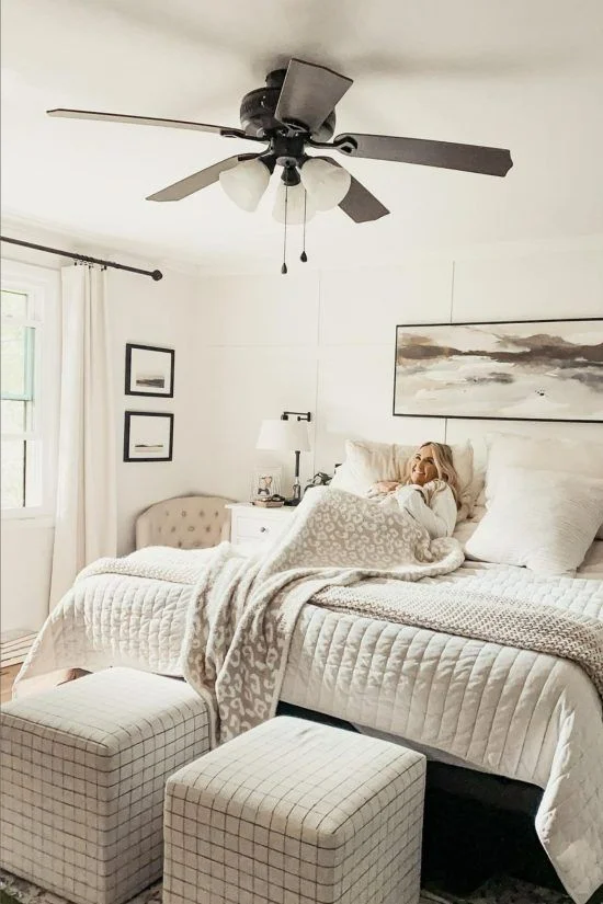
Alabaster in the bedroom feels lighter—like opening the window to a sunny breeze. It’s a bright paint for morning light and works beautifully with pale linens and light woods. If your style leans minimalist or calm, this one brings a gentle freshness without being cold.


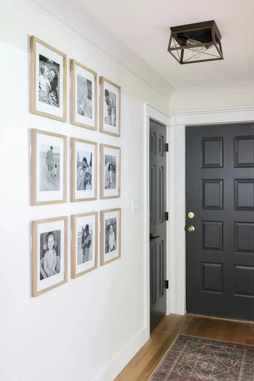
Shoji White vs Alabaster for Hallways & Entryways
Shoji White for entry spaces works really well if you’ve got wooden trim or doors—it brings out that warm, cozy vibe right away. Its soft beige tone helps hide scuffs, which is a big plus in busy hallways. If your hallway doesn’t get much light, Shoji still feels inviting instead of gloomy. Definitely a solid hallway white paint that’s low-fuss and easy on the eyes.

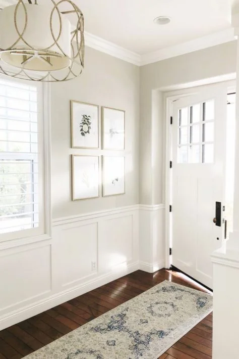

Alabaster hallway walls look cleaner and brighter, especially in narrow spots. It reflects light better, so it’s great if you’ve got a darker hallway or entry. Just know—it can show more smudges, so you might be wiping it down more often. Pair it with mirrors or glossy accents to make everything feel even more open.


How Lighting Affects Shoji White vs Alabaster
Shoji White in daylight has a cozy feel that shifts as the hours pass. In the morning sun, it looks soft and creamy—almost like a gentle beige. By evening, under dimmer natural light, it settles into a more neutral tone with the gray peeking through. The beige undertones show up more when sunlight hits, especially in bright rooms like living areas or sunrooms.


Artificial light plays a role too. Under warm bulbs, Shoji White leans into its warmer side, which makes it feel more inviting at night. It’s a great match for rooms where the goal is softness, not stark brightness. With an LRV of 74, it reflects a decent amount of light but still keeps things grounded.
Now Alabaster in artificial light is super steady. It doesn’t shift much, whether it’s morning or evening. That makes it great for rooms with less natural light—like basements, hallways, or north-facing bedrooms. It stays bright and doesn’t go yellow, even with warm bulbs.
Its higher LRV of 82 helps bounce light around, which makes tight or gloomy spots feel bigger. If you’re looking for a white paint for low-light rooms, Alabaster might be the safer bet.


Quick tip: Always test swatches in the morning, afternoon, and under both warm and cool bulbs—you’ll thank yourself later.
Best Color Pairings for Shoji White & Alabaster
Shoji White feels right at home with earthy, natural textures. Think terracotta pots, rattan chairs, leather sofas, and dark wood floors—it just blends in like it was meant to be there. It gives off a cozy, grounded energy that works perfectly in rustic or farmhouse spaces. You can almost feel the warmth through the walls.
It also plays nicely with warm metals like aged bronze or brushed brass. Add in some bamboo or woven baskets, and it starts to feel like a calm, collected retreat. When you’re looking for coordinating colors for Shoji White, reach for anything warm and organic.
Alabaster, on the other hand, has a cooler, cleaner vibe. It pairs beautifully with soft grays, light blues, or even a muted black for contrast. If your space leans Scandinavian or minimal, this is your go-to white.
It also loves smooth surfaces—glass, chrome, silver—all of those shine next to it. Colors that go with Alabaster usually stick to a more modern, crisp feel. And if you’re into monochrome layers, Alabaster makes a soft base for stacking whites and grays.
Can You Mix Shoji White and Alabaster in One Space?
Yes, using Shoji White and Alabaster together totally works. Try Shoji White on the walls and Alabaster trim with Sherwin Williams Shoji White walls for a soft, seamless contrast. Just know—Alabaster is lighter, so Shoji might look a bit more beige next to it. This wall and trim color combo fits best in neutral, transitional spaces. Both shades are part of Sherwin Williams’ “Timeless Whites” palette, so they’re made to layer well—just test them side-by-side first to see how the light hits.
Shoji White or Alabaster: Which One Feels Warmer or Cooler?
Between the two, Shoji White definitely feels warmer. Its beige and greige undertones give it that soft, cozy look—especially when paired with warm lighting or earthy finishes like brass or wood. It has a Light Reflectance Value (LRV) of 74, so it absorbs a bit more light, which adds to its warmth in dim or softly lit rooms.
Alabaster, while technically a warm white paint, leans more neutral. It looks brighter and cleaner, especially in daylight or next to cooler tones like chrome or light gray. Its higher LRV of 82 means it reflects more light, which makes it feel fresher and slightly cooler than Shoji.
Quick tip: Test both side-by-side under your actual lighting—it really changes everything.
Shoji White vs Alabaster on Walls vs Cabinets vs Trim
Walls:
On walls, Shoji White brings a cozy, warm vibe. It has more depth than a basic white, so it works well in living rooms or bedrooms where you want a soft, welcoming feel. Alabaster, on the other hand, feels lighter and more open. It’s a great choice if you want your space to feel airy and clean without going stark. Both are great white paints for walls, but the mood they create is pretty different.
Cabinets:
Shoji White on cabinets gives off a muted, almost vintage look. It pairs nicely with wood counters or farmhouse decor, especially in a warm white kitchen setup. If you’re after something fresher, Alabaster for cabinets is a solid pick. It looks crisp and modern, especially in bright kitchens or bathrooms. Alabaster reflects more light, so it feels cleaner—perfect if you want a polished, minimal style.
Trim:
Alabaster for trim is a favorite because it’s bright but soft—not harsh like a pure white. It works great with both warm and cool wall colors. Shoji White on trim is less common, since it doesn’t offer much contrast—but in tone-on-tone designs, it can look really elegant. Try Shoji White walls + Alabaster trim for a subtle contrast designers often use.
Pro tip: Use satin or semi-gloss for trim and cabinets, and matte or eggshell for walls—it really helps the contrast pop.
Pros and Cons Alabaster vs Shoji White
Shoji White vs Alabaster – Warm White vs Soft White Comparison
Shoji White – Pros & Cons
- LRV 74 – absorbs more light, adds warmth
- Warm greige tone – cozy and grounded
- Great for rustic, farmhouse, or vintage styles
- Hides smudges and marks well
- Can feel too beige in very bright rooms
Alabaster – Drawbacks & Benefits
- LRV 82 – reflects more light, feels brighter
- Soft white – clean and neutral
- Best for modern, minimalist, and Scandinavian rooms
- Shows more dirt on high-traffic walls
- Can look flat in very warm lighting
Best For: Cozy living rooms, warm bedrooms, and earthy kitchens
Best For: Bright kitchens, airy hallways, and neutral-toned trims
FAQs For Shoji White vs Alabaster
Will shoji white look yellow?
Shoji White has soft beige undertones that can look a bit creamier in natural light, especially in south-facing or west-facing rooms where the sun gives off a warmer, golden glow. But even then, it doesn’t go full yellow. It stays pretty balanced—just warm enough to feel cozy without leaning too far into golden or buttery tones. So while it has a creamy look, Shoji White isn’t what I’d call a yellow paint.
Why is Shoji white so popular?
The great thing about Shoji White is how flexible it is. It has a soft cream-yellow base with just a tiny hint of red, which gives it warmth without making it feel too bold or too yellow. What makes it stand out is that it doesn’t drift into taupe, gray, or beige—it kind of stays in its own lane. That’s why so many people love it—it’s warm, stable, and plays nice with a bunch of different styles.
What undertone is alabaster?
Alabaster has a soft beige undertone that gives it a warm, creamy feel without being too yellow. It’s neutral enough to work with lots of styles, which makes it a great option if you want something that’s not stark white but still feels light and fresh. If you’re after a cozy cream color that stays calm and balanced, Alabaster is a perfect choice.
Is shoji white too beige?
Shoji White is a warm off-white with a soft mix of beige and greige undertones, giving it a cozy but not overly warm feel. It leans slightly toward warmth, but stays neutral enough to work with a wide range of color palettes—from earthy tones to cooler grays—making it a super flexible choice for almost any room.
What is the difference between Shoji white and alabaster?
Shoji White has warm undertones with hints of beige and gray, which makes it feel soft and flexible—great for spaces like kitchen cabinets where you want a cozy, muted look. Alabaster also leans warm, but with a slight yellow undertone that gives it a creamier, brighter appearance. Side by side, Shoji feels more grounded, while Alabaster comes off lighter and a bit fresher.
Does Alabaster white look yellow?
Alabaster is a creamy white paint with soft yellow undertones, which gives it a warm and inviting look. In some rooms, especially those with lots of natural light or cool-colored fixtures, it can look like a clean, soft white. But in warmer lighting or next to warm-toned elements, those yellow undertones can show up more, making it feel a bit creamier or slightly golden. So yes, Alabaster white can look yellow—but it really depends on the light and what’s around it.