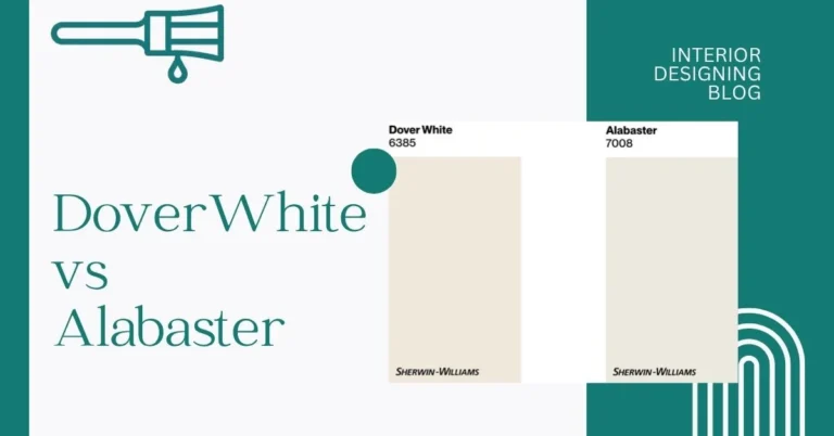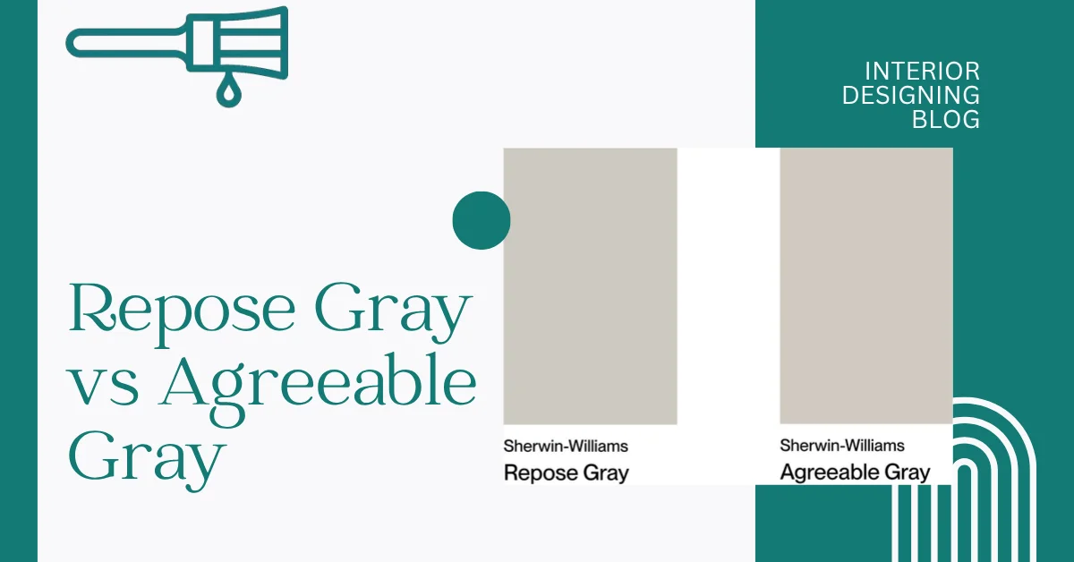
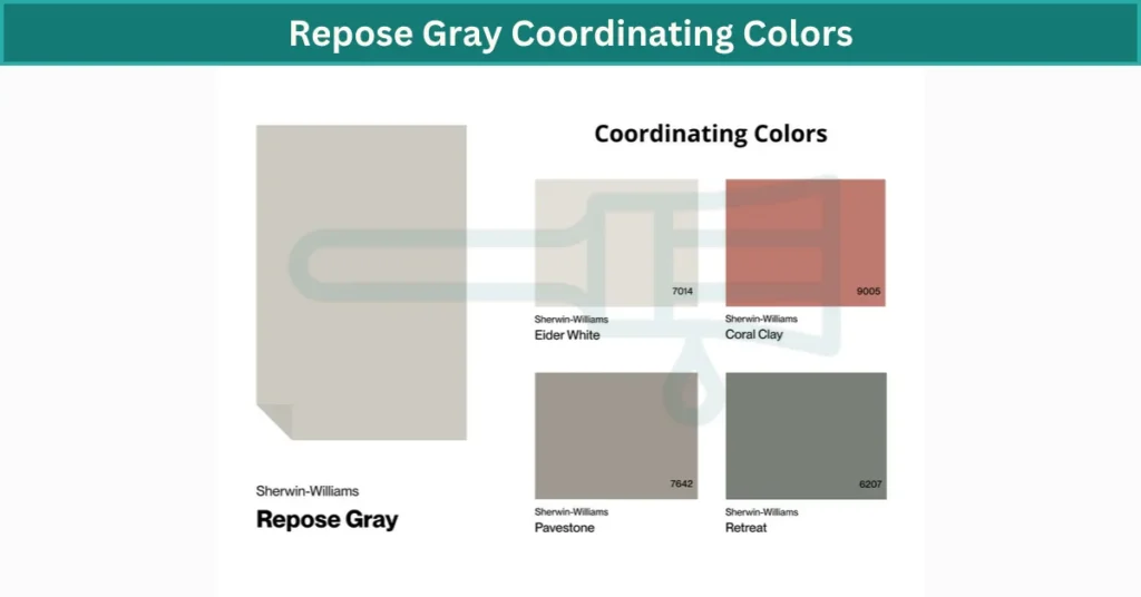
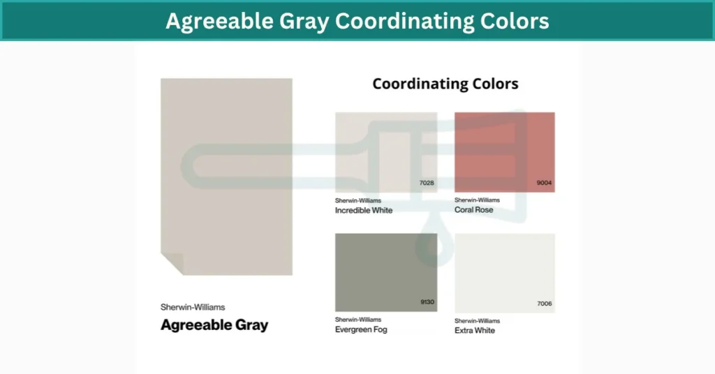
Repose Gray vs Agreeable Gray: Key Differences
I’ve seen a lot of folks struggle with picking between Repose Gray and Agreeable Gray. Honestly, it’s a fair question — both are from Sherwin-Williams, both are super popular, and yeah, they kind of look the same at first. But here’s the deal: they’re not exactly the same.
Agreeable Gray is more of a warm gray — I’d say it leans a bit beige-y. Kinda cozy. It feels soft, especially in rooms with warm light. Repose Gray, on the other hand, has cooler undertones. Not cold, just a little more crisp. It plays nicer in rooms with cooler or natural light.
Agreeable Gray has a Light Reflectance Value (LRV) of 60, while Repose Gray is 58. That just means they both reflect a good amount of light — not too dark, not too bright.
If you’ve got a home with warm wood floors and white trim, Agreeable Gray might feel more at home. But if your vibe is clean and modern, maybe with black accents or stainless steel, Repose Gray could work better.
Choosing between Repose Gray vs Agreeable Gray, It really depends on lighting and what’s around it. I’d say test both on your wall. Even a small swatch under your room’s lighting can show a big difference. These real shade comparisons helped me choose fast.
Undertones & Visual Personality of Repose vs Agreeable Gray
Alright, here’s what I’ve noticed. Repose Gray and Agreeable Gray might seem close at first glance, but once you look deeper—especially under different lighting—they show their true colors.
Repose Gray leans a little cooler. It’s got neutral vibes with soft beige undertones, and sometimes, if the lighting’s weird, you’ll spot a slight pink or even greenish tint. I’d say it’s more steady—doesn’t shift too much across different rooms. That’s probably why a lot of modern homes use it. It works well with clean lines, white trim, and even cool-toned floors like gray tile or light oak.
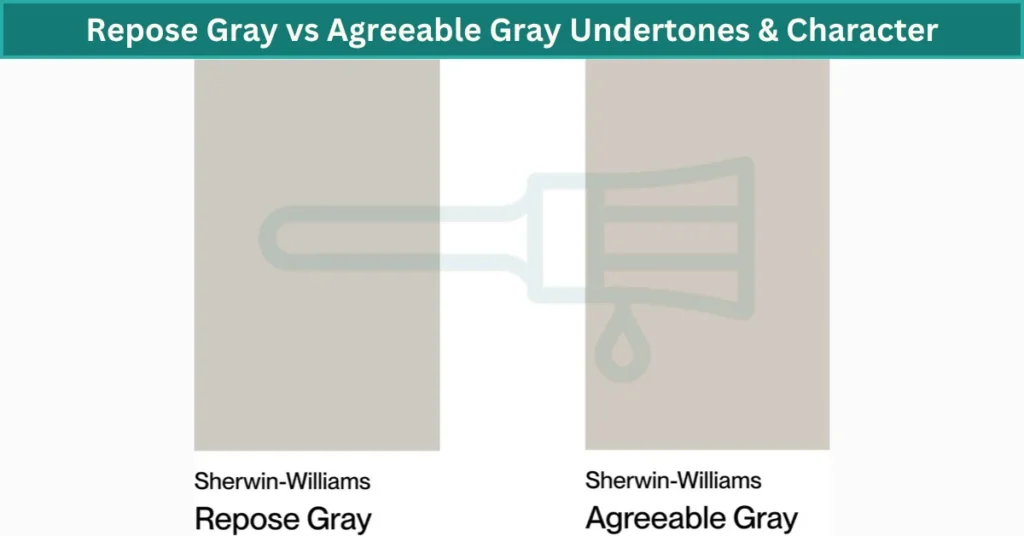
Agreeable Gray? Warmer for sure. It has more of that cozy beige base, plus a soft green undertone. In darker rooms, it can throw off a tiny bit of purple. Sounds odd, but it happens. It’s more flexible when it comes to pairing with stuff—wood floors, warm tiles, soft fabrics. I see it a lot in family homes and spaces that want to feel comfy, not cold.
If your space gets tons of natural light, both look nice. But in north-facing rooms where things feel cooler, Agreeable might help add warmth. Repose can feel a bit too flat there.
Repose Gray vs Agreeable Gray – Color Comparison Table
| Paint Color | Agreeable Gray | Repose Gray |
|---|---|---|
| LRV | 60 | 58 |
| RGB | 209, 203, 193 | 204, 201, 192 |
| HEX | #D1CBC1 | #CCC9C0 |
| Undertones | Warm beige, soft green, sometimes purple | Neutral base, hint of green/pink in shadows |
| Best For | Cozy, welcoming rooms with natural light | Modern, minimal spaces with mixed lighting |
Honestly, I’ve seen both work beautifully—but they give off totally different vibes. Depends on what you’re going for.
Room-by-Room Comparison
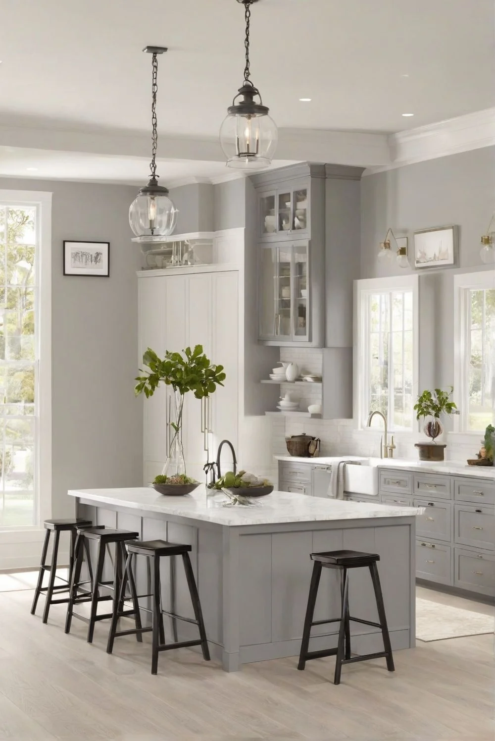
Best Gray Paint Choice for Living Rooms
I’ve seen Repose Gray work really well in living rooms that get good sunlight. During the day, it feels fresh and clean. But when it’s cloudy or the lights are on, you start to notice a bit of beige or even a soft greenish tint. It’s kind of cool that way—it shifts just a little depending on the light. I’d pair it with light wood floors, metal accents, and maybe even linen curtains. Soft daylight bulbs (around 4000K) make it feel balanced, not too cold or too yellow.

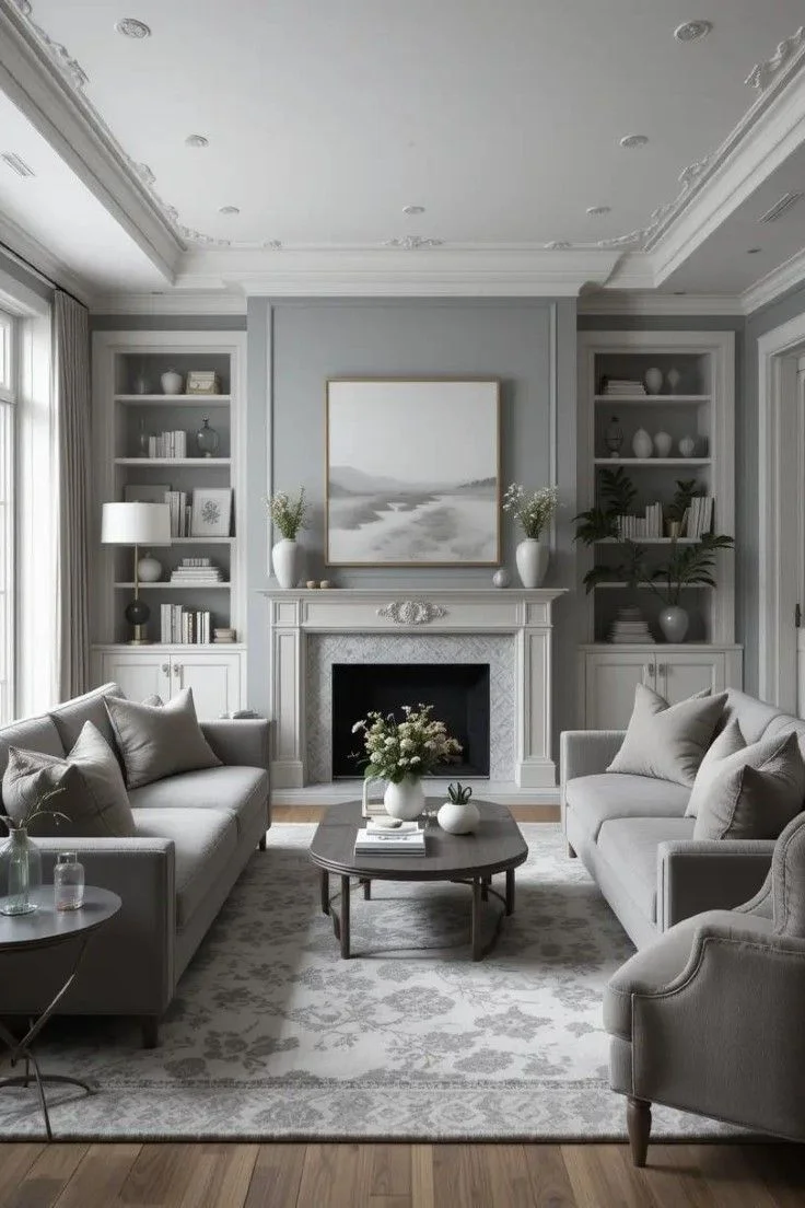

Agreeable Gray? That one’s a bit more warm and comfy. It adds a soft, cozy vibe right away—like your room’s giving you a hug. It blends in better with most furniture styles too. Dark leather couches, warm wood tables, even velvet pillows—this color just plays nice with all of them. I’ve seen it shine in open-concept layouts where the light changes throughout the day. Under warm white bulbs (2700–3000K), it looks extra inviting.


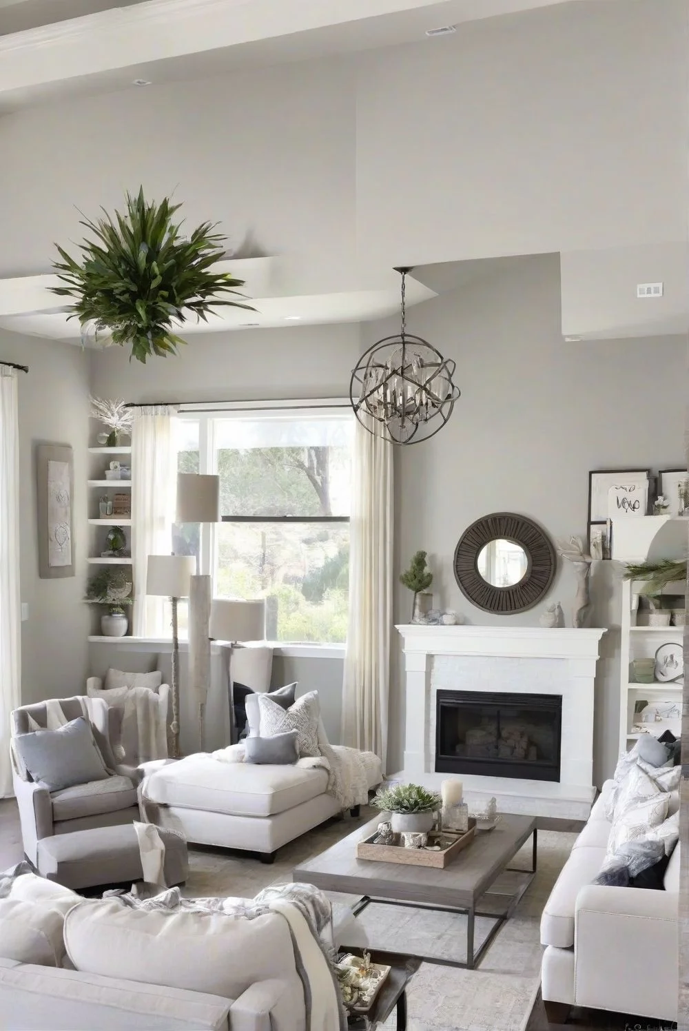
So yeah, both are solid gray paint choices for living rooms. Repose leans more modern and clean, while Agreeable feels more homey and flexible. Just depends on your style.
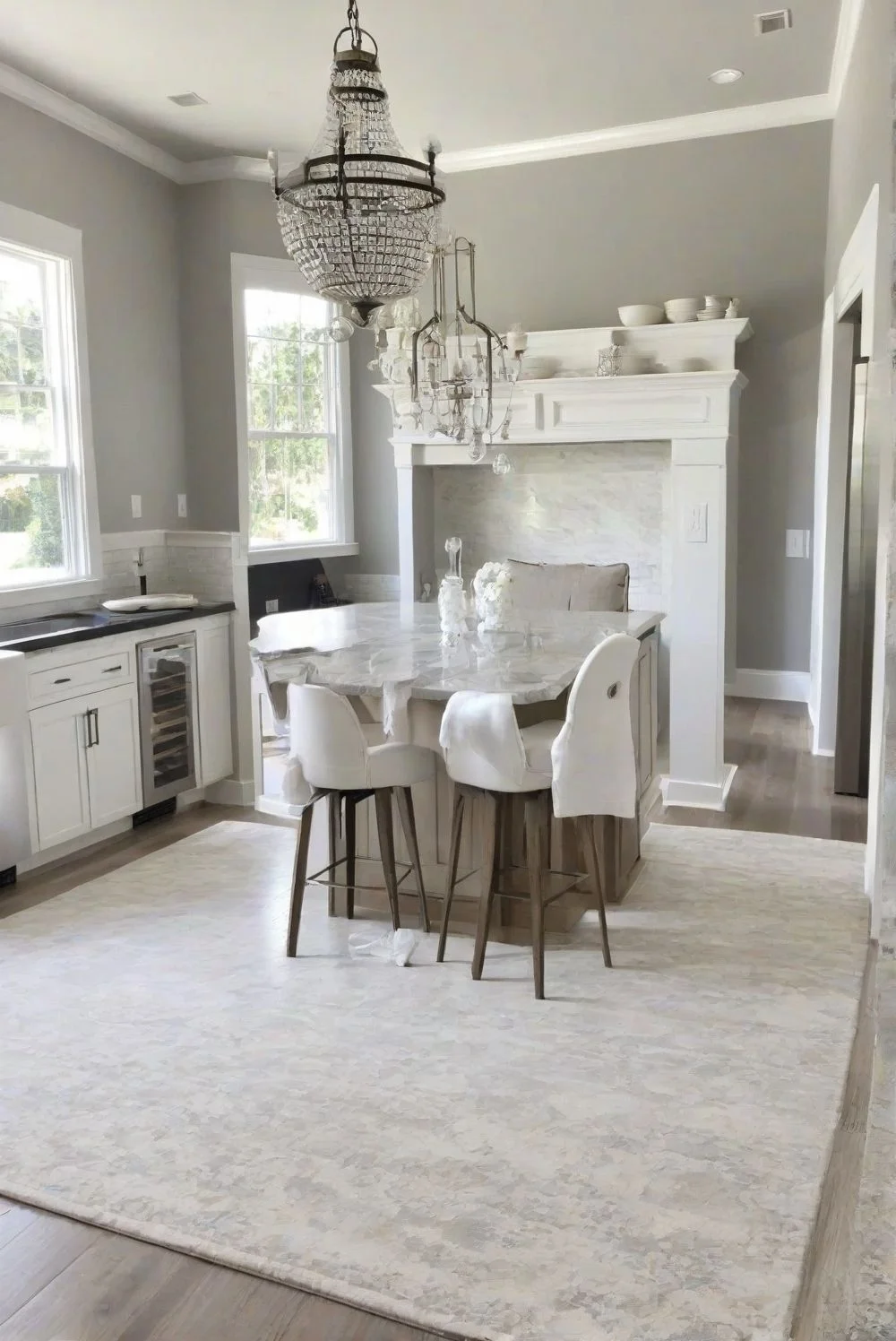
Which Gray Works Best in Kitchens?
Repose Gray feels super steady in a kitchen. Doesn’t matter if the light’s coming from the north or south—it stays pretty true. It works great with white cabinets, especially if you’ve got quartz or marble countertops. The color’s soft, but still modern. I’d pair it with brushed nickel handles or even matte black hardware if you want a sleek look. It also makes cool-colored backsplashes pop without clashing.

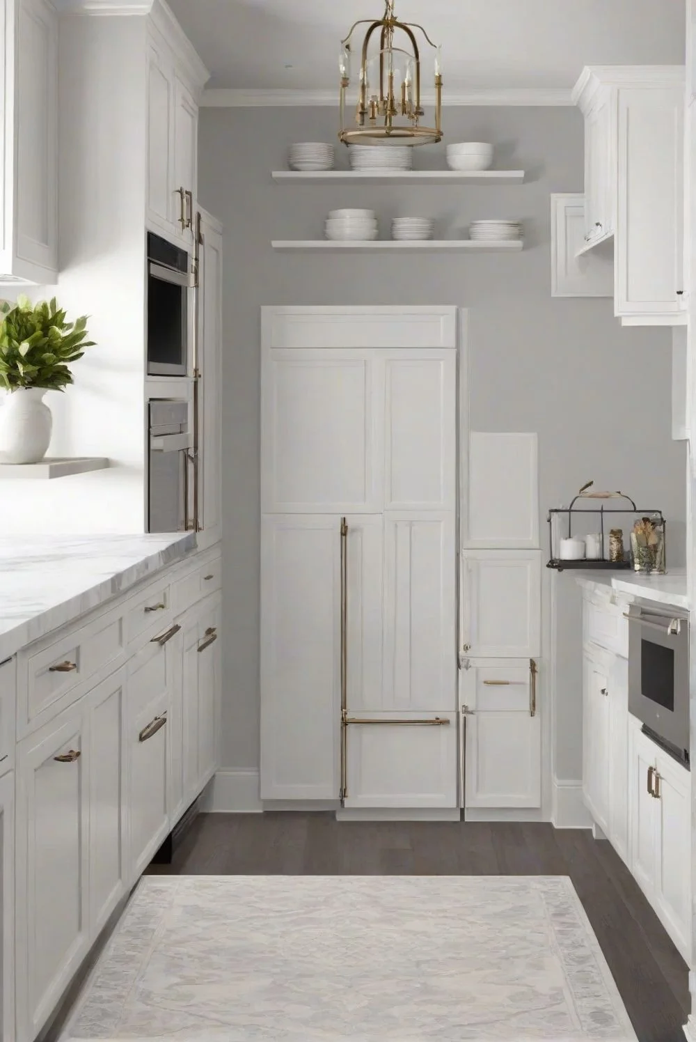

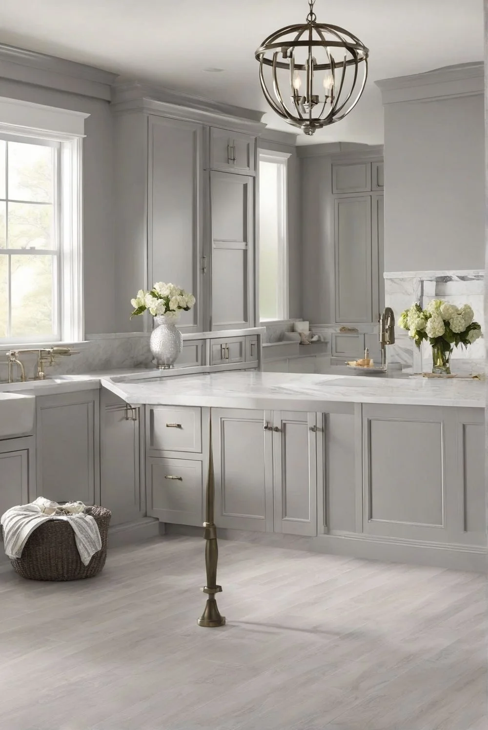
Agreeable Gray is a little warmer and has a slightly higher LRV, so it bounces more light around. That makes small or dark kitchens feel more open. It hides splashes and smudges better, which is nice if you cook a lot. I’ve seen it look amazing with warm wood cabinets and bronze or gold-tone hardware. In kitchens that get morning sun or are part of an open layout, this shade adds a cozy feel without being yellow or beige.


Honestly, both shades are strong picks. If you want something cooler and crisp, go with Repose. Want a warmer, softer kitchen vibe? Agreeable’s probably the better call.
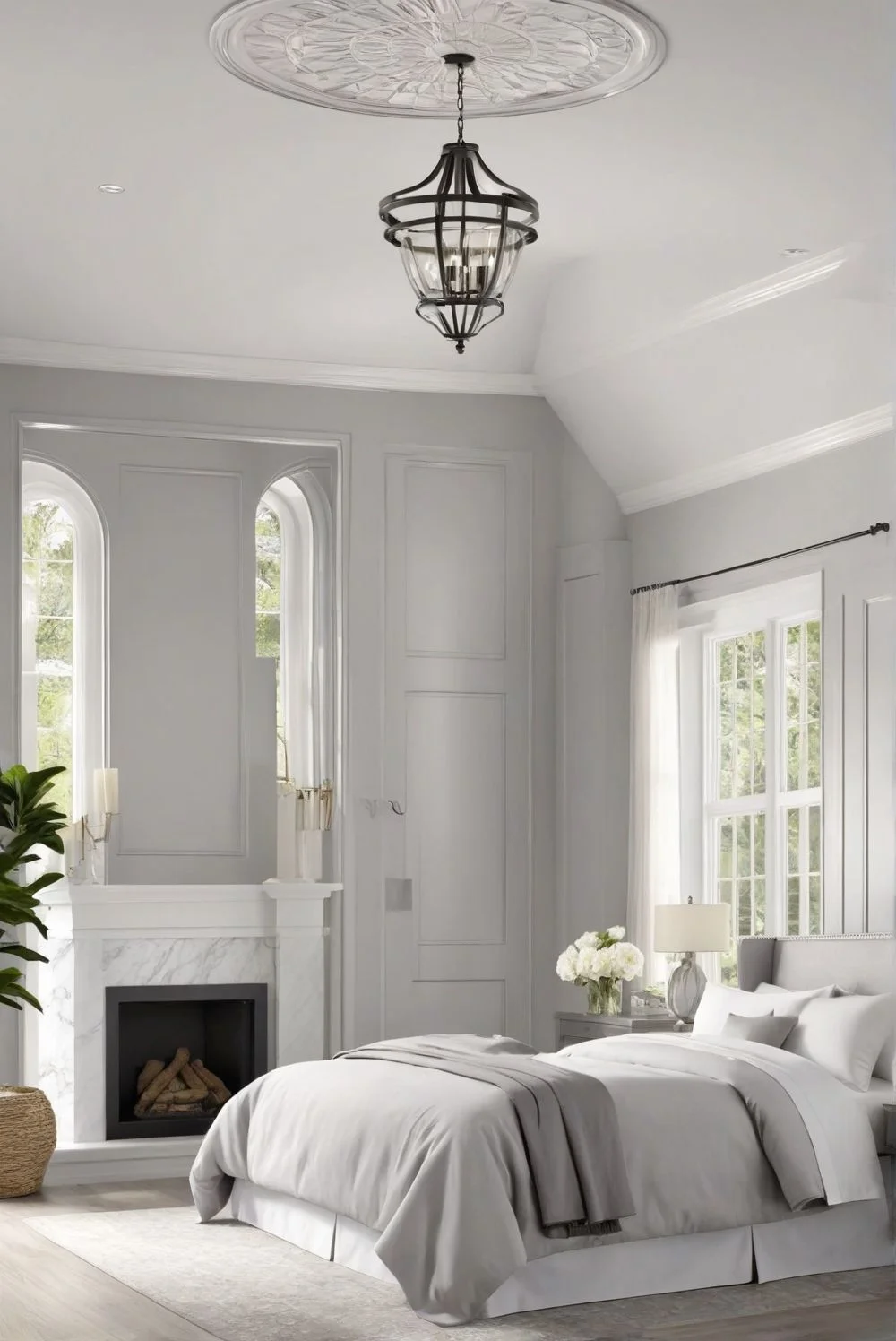
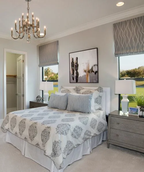
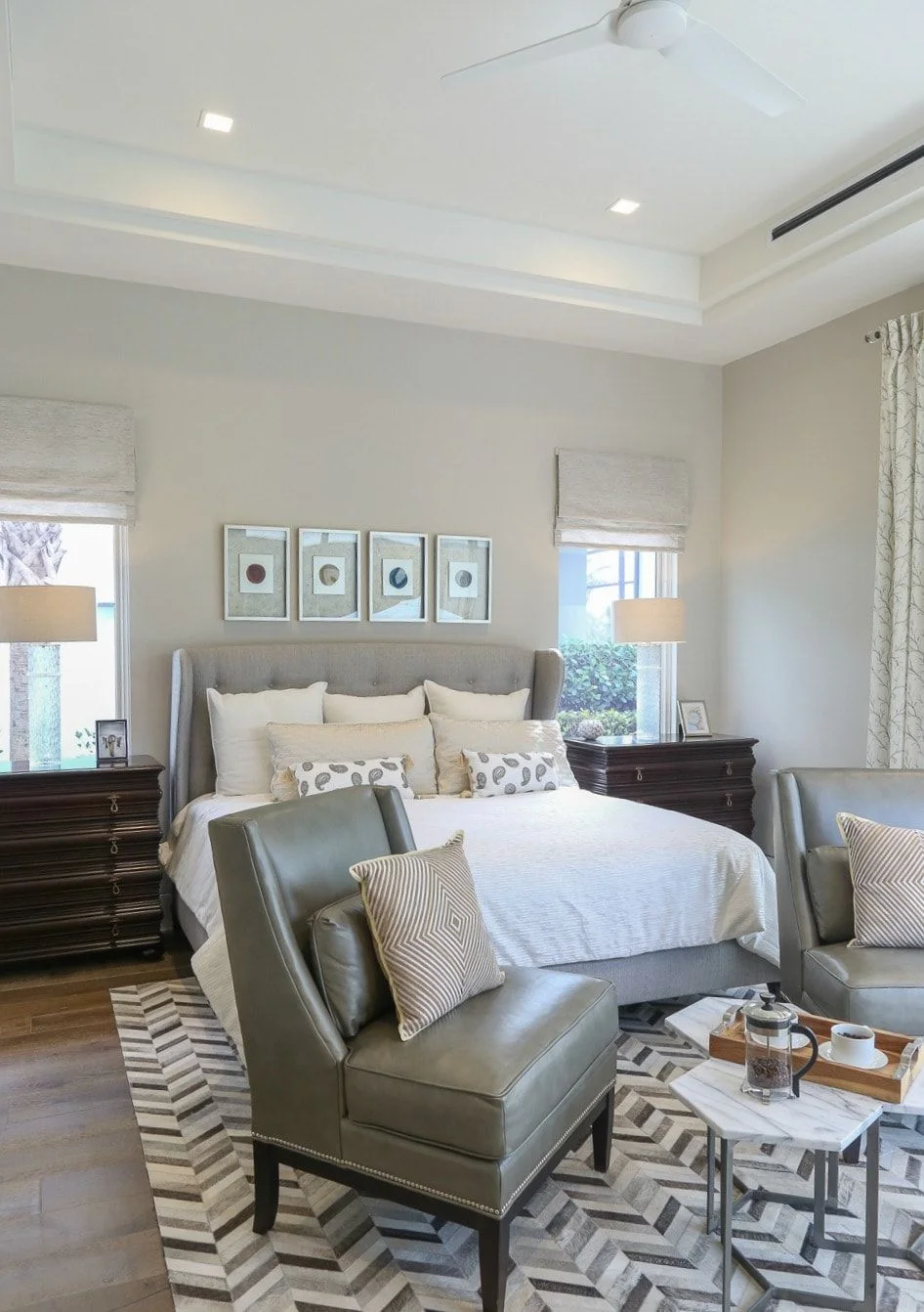
Which Gray Paint Works Best in Bedrooms? (Repose vs Agreeable)
Repose Gray feels calm and clean in a bedroom. It looks a little crisp in the morning, especially with natural light, and gets warmer in the evening with its soft beige undertones. If your room faces north, it might feel a bit cooler, but not too much. I’d pair it with light wood furniture and white trim for a peaceful vibe.


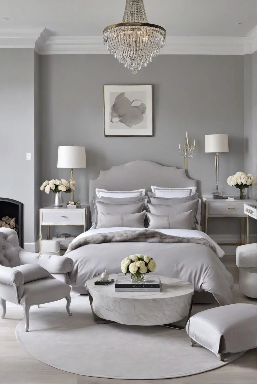
Agreeable Gray has a softer, cozier feel. It works really well with pastel bedding or light-colored blankets. The higher LRV makes small bedrooms feel a little bigger, which is nice. In the evening, it feels extra relaxed and gentle—kind of like a soft hug after a long day.


Repose Gray vs Agreeable Gray: Which Suits Exterior Walls Best?
Repose Gray is one of those steady gray shades that looks good almost anywhere outside. On a sunny day, it reads as a soft, neutral gray. But when the light fades or it’s in the shade, it picks up just a bit of warmth—nothing too strong. It gives off a clean, modern vibe, especially with white trim, black shutters, or a bold front door. If you’re going for a crisp, balanced look, this color holds up well. Satin finish works great—it gives a soft sheen without making the walls look shiny.

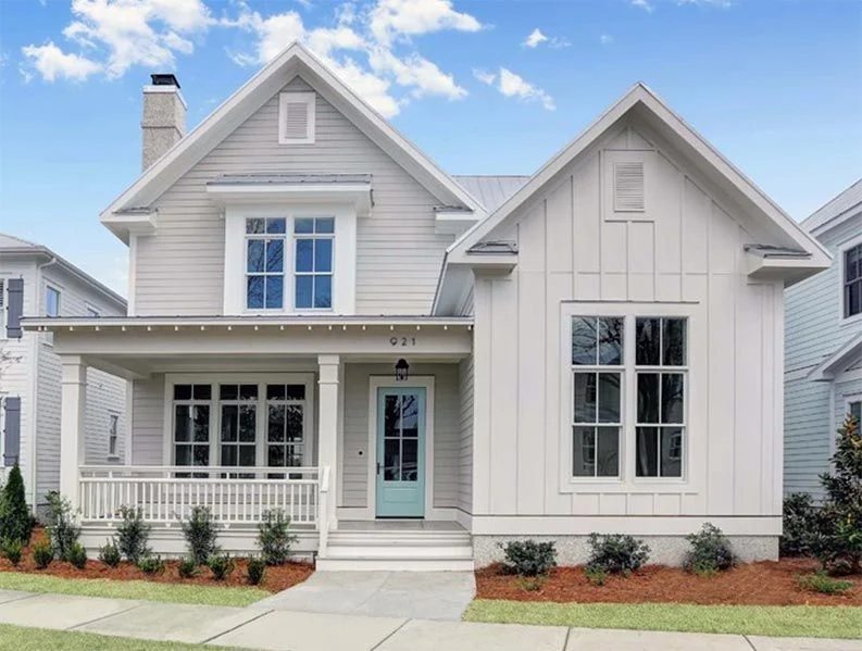
Agreeable Gray leans warmer and changes more depending on the sunlight. On big exterior walls, it can feel almost taupe or beige, especially in bright or humid areas. It’s cozy and inviting, but you’ll want to be careful with trim colors—something too creamy can make it all feel washed out. Stick to a clean white or very light gray for balance. This color fits best on traditional-style homes or anywhere you want a softer look. Matte or satin both work, but satin helps it reflect light better, making the outside feel a bit brighter.

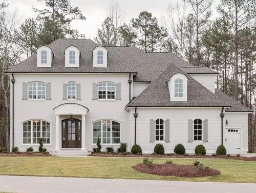
Both are solid picks for exterior gray paint colors—it really depends on your home’s light and vibe.
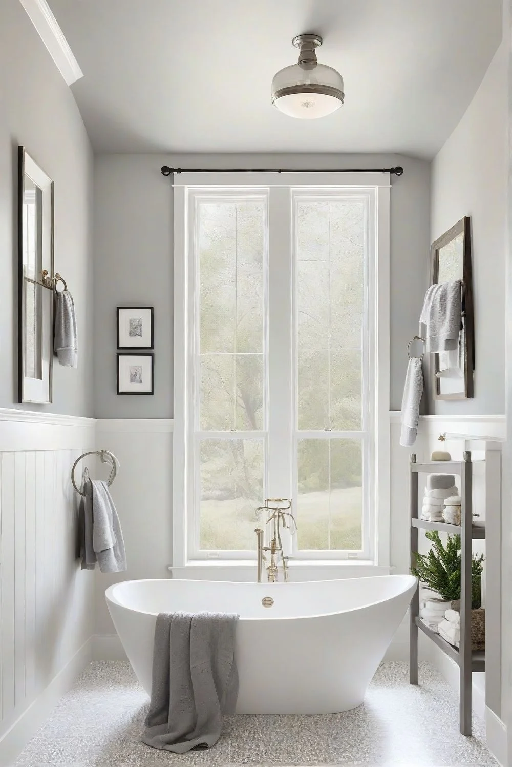
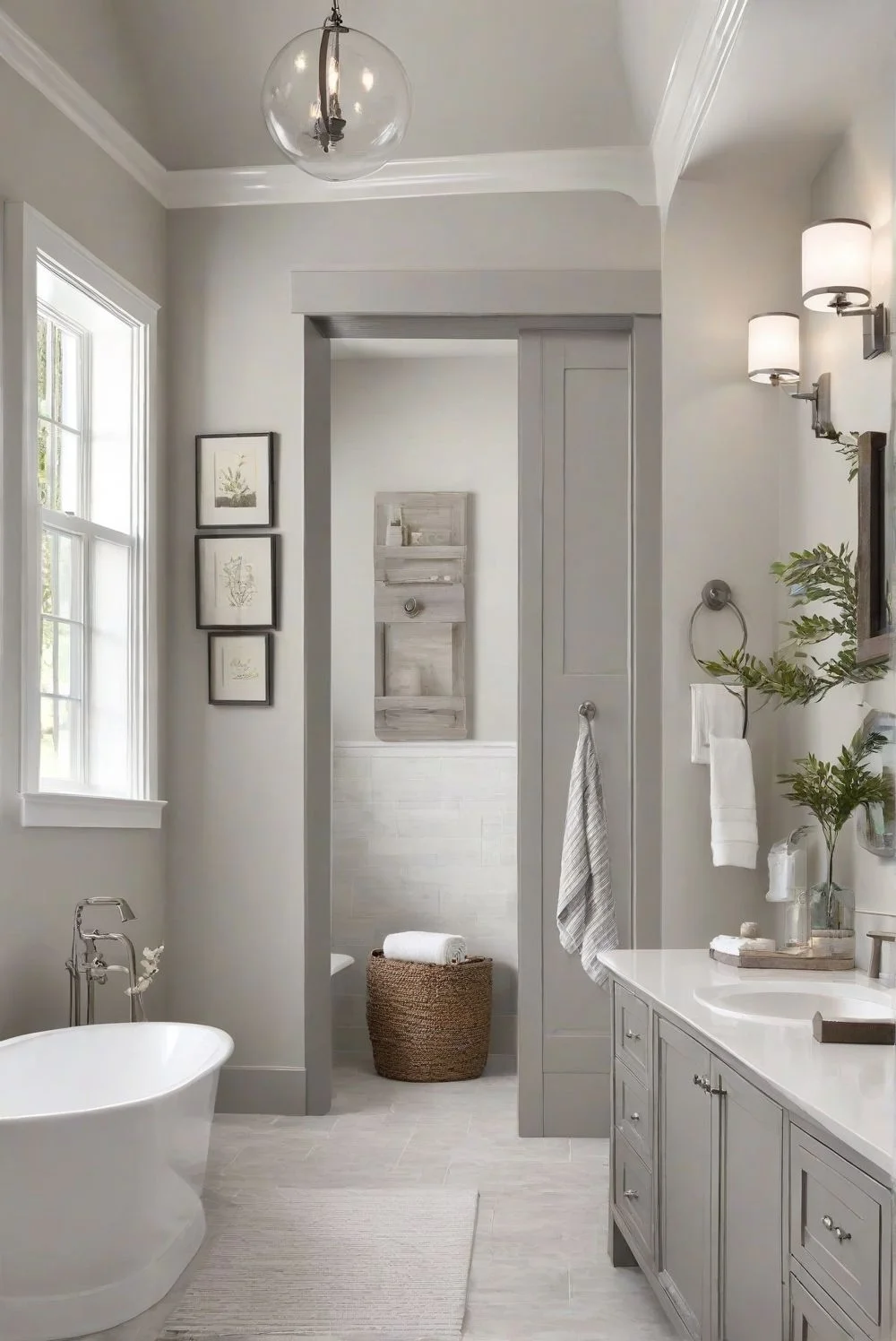
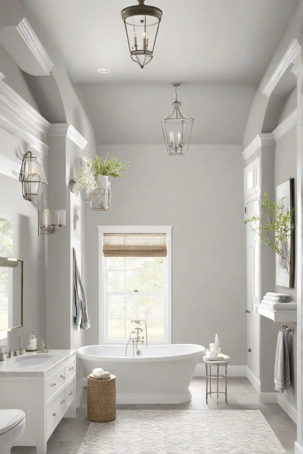
Best Gray for Bathrooms: Repose or Agreeable?
Repose Gray works really well in bathrooms, especially if you’re going for a clean, modern look. It has a slightly cooler tone that feels fresh, not cold. In rooms with white tiles and chrome or brushed nickel fixtures, it all ties together nicely. Even in small or windowless bathrooms, Repose Gray doesn’t feel heavy or dark. Under daylight LED bulbs, it stays crisp and balanced. For moisture-prone spaces like bathrooms, I’d go with a satin or semi-gloss finish—it helps protect the walls and keeps them easy to clean.

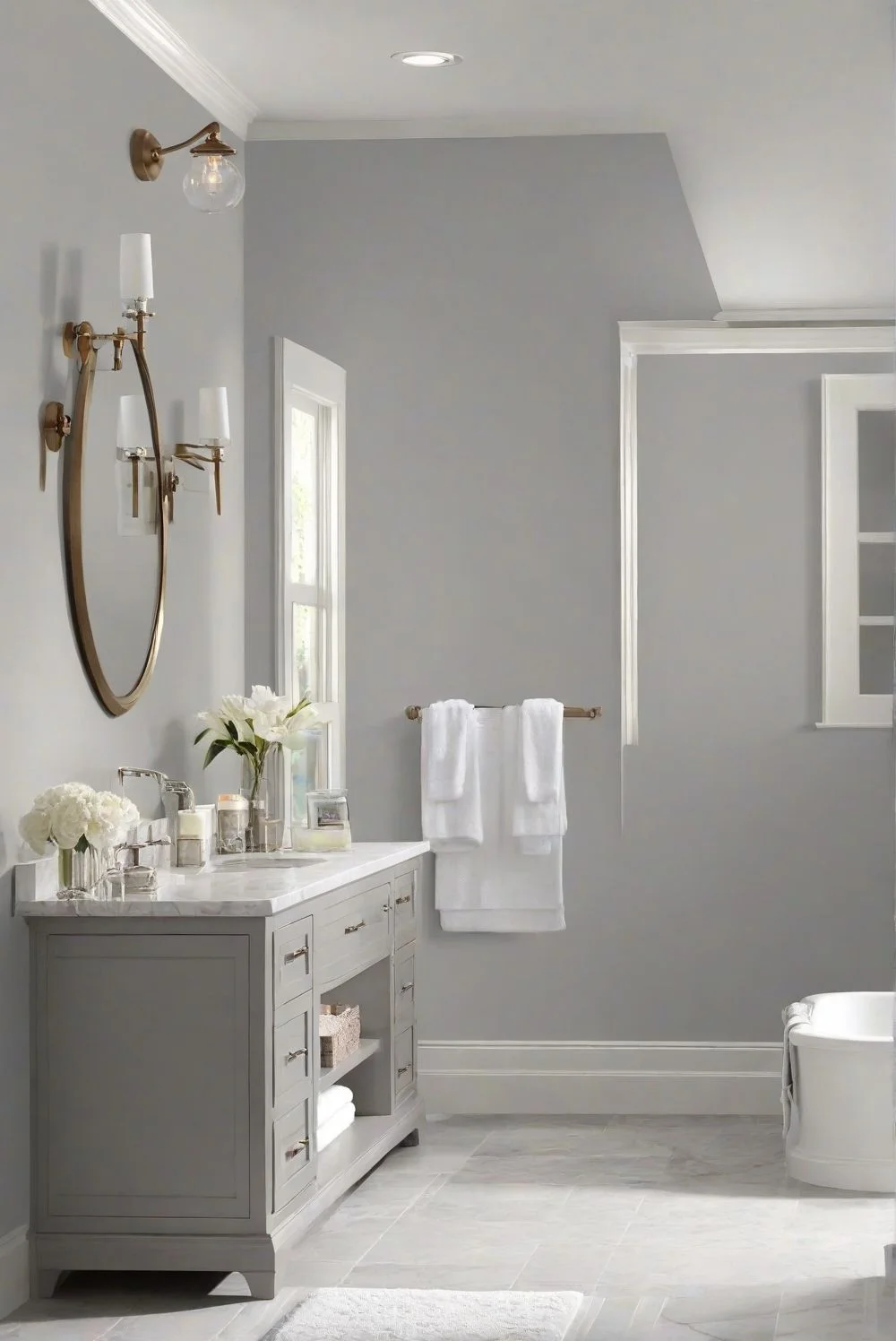

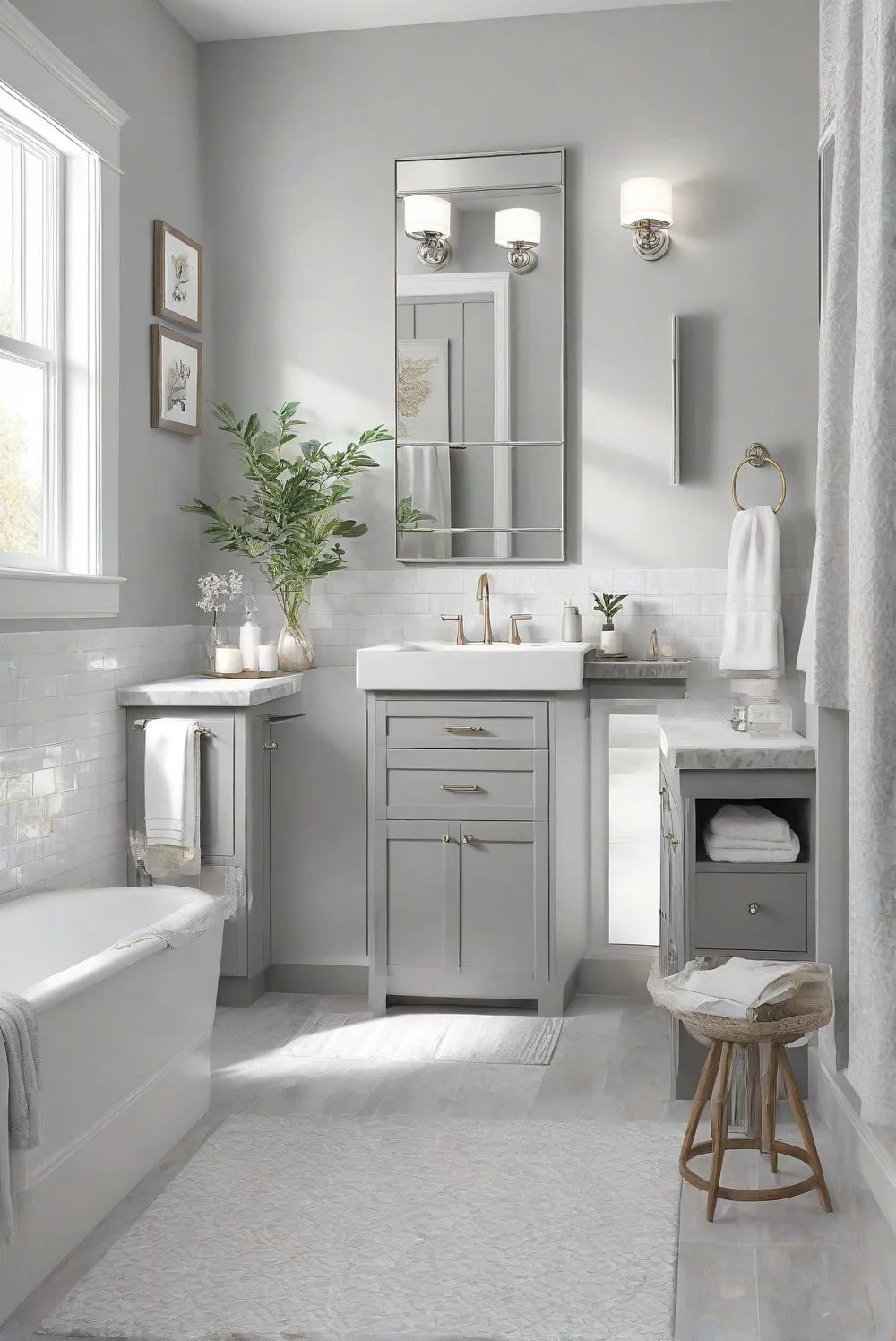
Agreeable Gray gives off more of a warm, spa-like feel. It’s great if you’ve got a bathroom with lots of natural light and warm touches like beige tiles or wooden accents. That soft warmth makes the space feel calm and cozy. But in a bathroom with no windows or poor lighting, it might lean a little too warm or dull. Under warm light bulbs, it can feel more beige than gray. Still, if you’re aiming for a relaxed, homey vibe, Agreeable Gray is a solid choice. Just be sure to pair it with lighter trim and bright lighting so it doesn’t get too shadowy.


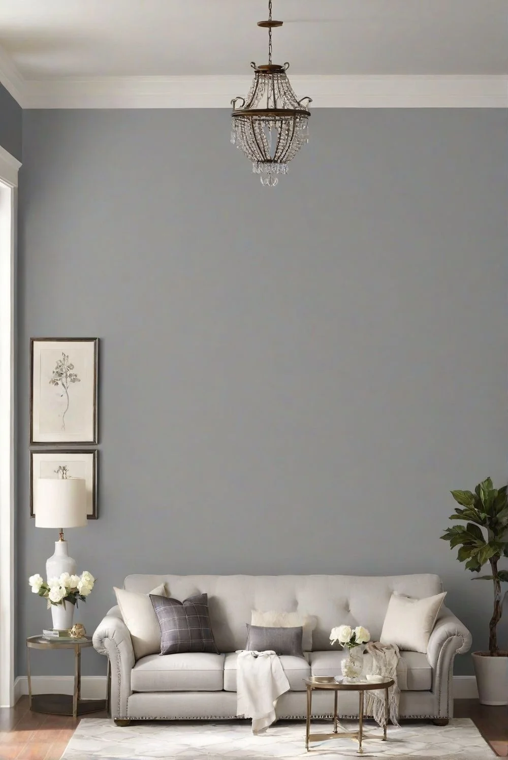
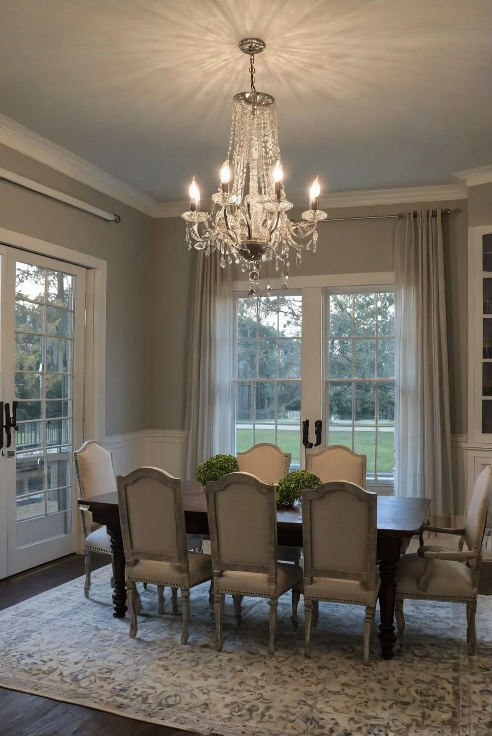
Best Gray for Dining Rooms: Repose vs Agreeable Gray
Repose Gray brings a cool, calm feeling to dining rooms. It works great if you’ve got modern furniture, clean lines, or metallic accents like silver light fixtures or brushed gold hardware. The color feels elegant without being too fancy, and it reflects natural light nicely. Even with light wood or neutral floors, it keeps the room feeling fresh. If you’re going for a formal or minimalist look, Repose Gray and a simple chandelier can really pull it all together.

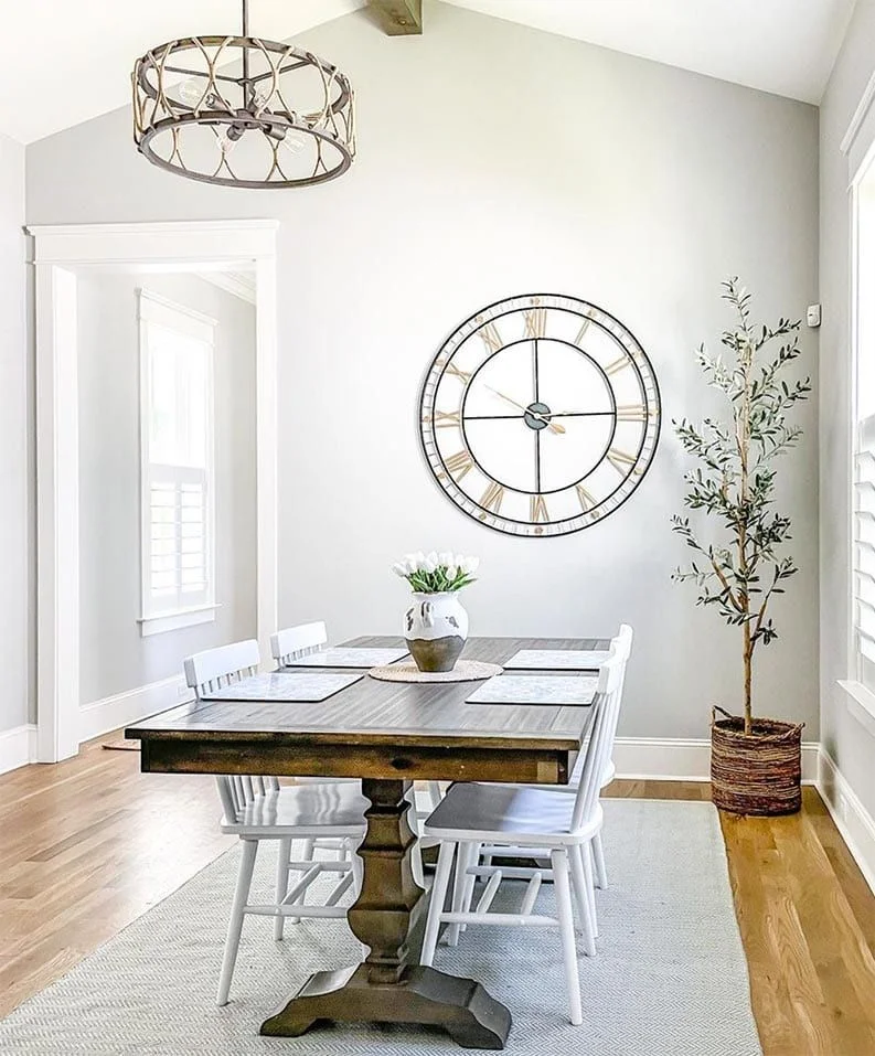

Agreeable Gray is more about warmth and comfort. It gives dining rooms that cozy, lived-in vibe—perfect for family dinners or rustic setups. It pairs well with rich wood tables, soft lighting, and earthy decor like beige curtains or woven rugs. Under pendant lights or warm bulbs, it feels even more welcoming. If your floor is darker wood, Agreeable Gray helps balance it out without clashing. It’s super flexible too—works with traditional, farmhouse, or even casual spaces without much effort.


How Lighting Affects Repose Gray vs Agreeable Gray
Repose Gray is one of those colors that changes just enough to keep things interesting. In bright natural light, it looks like a true, soft gray—pretty neutral. But once the light fades or shifts, you’ll start to see its undertones come out, usually a soft beige or even a touch of green. If you’re using warm bulbs around 2700K, it can feel slightly cozier, while cooler lights (4000–5000K) make it read cleaner and more crisp. In darker rooms or spaces with limited light, it might lean a little more beige than expected. Still, it’s pretty stable overall, which is why people trust it across different rooms.


Agreeable Gray plays things a bit safer. It feels lighter and more open in rooms with lots of sunlight, and its warm undertones are super subtle—so no big surprises. That makes it a good pick for homes that rely more on steady artificial light. Under warm white bulbs, it keeps that soft, welcoming tone without looking yellow or muddy. But in rooms where the natural light changes throughout the day—like east- or west-facing rooms—it can shift a bit, so testing a sample first is smart. I’d try swatching both paints on your wall and checking them at different times—morning, afternoon, and evening. That way, you’ll really see how the lighting impacts each gray paint’s vibe.


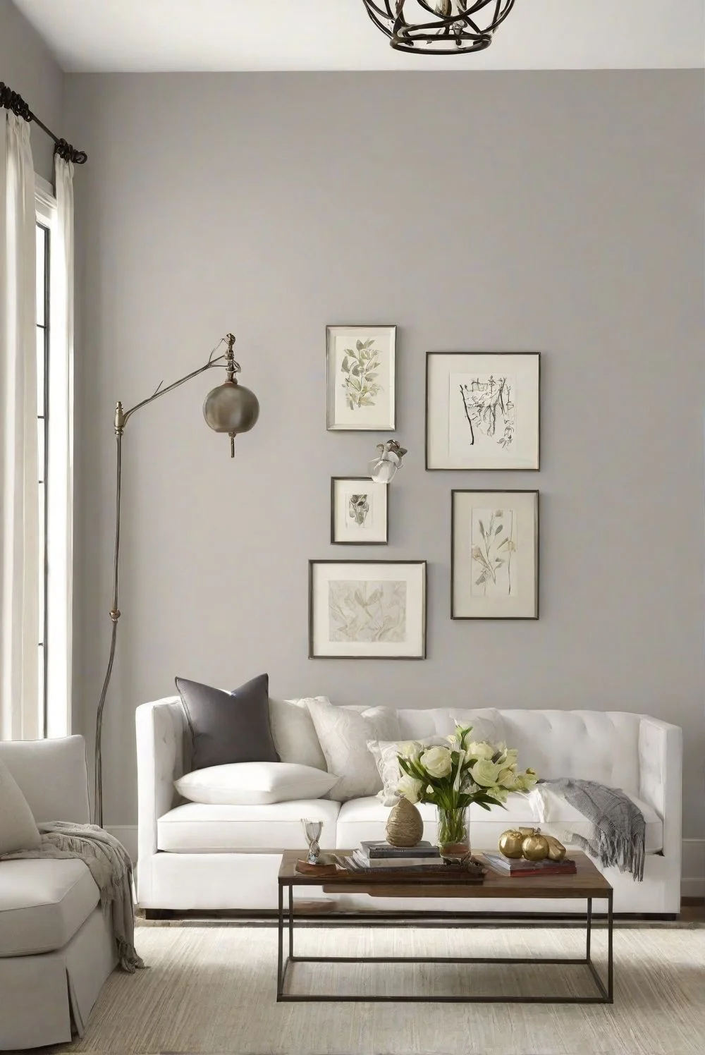
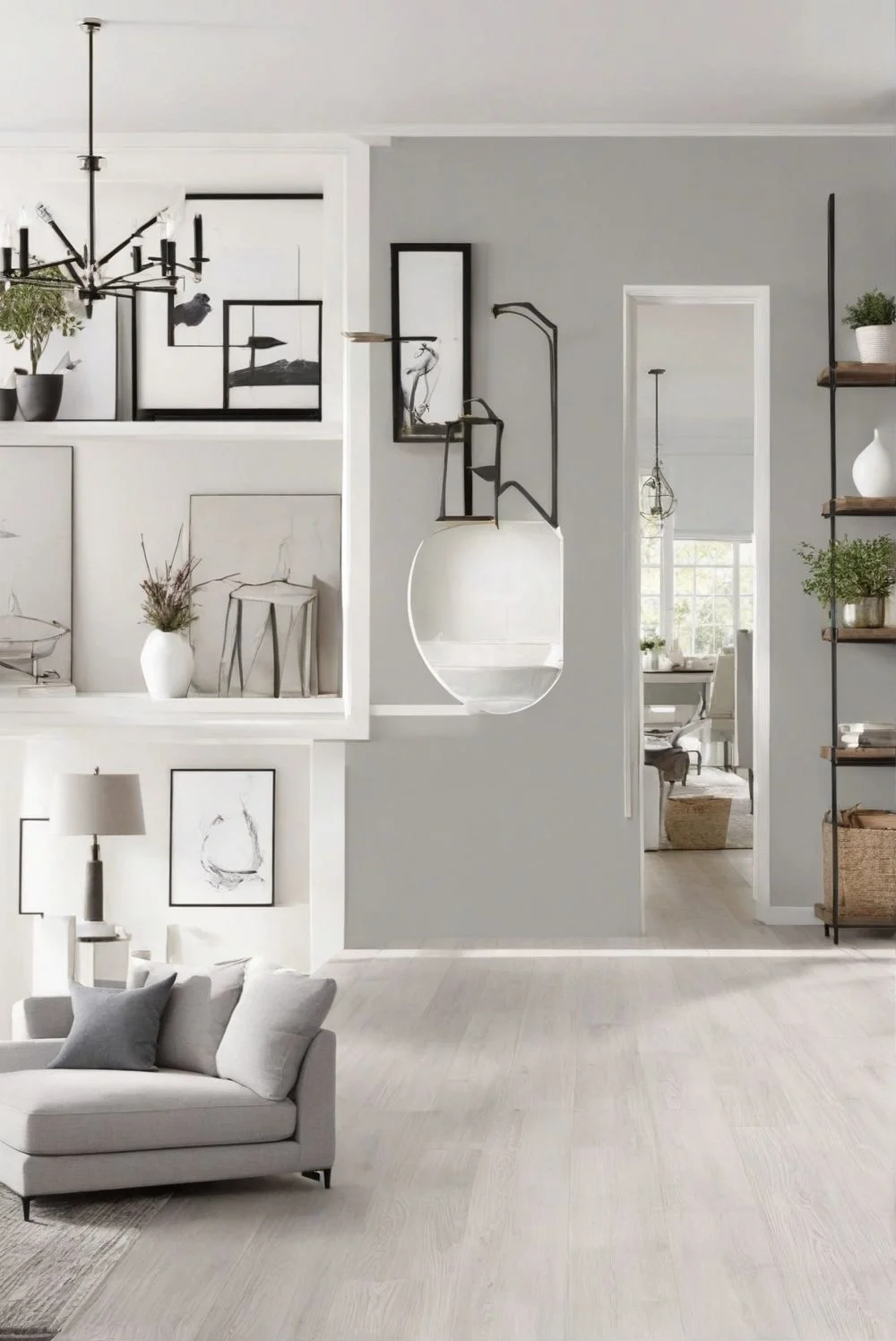
Best Color Pairings for Repose Gray and Agreeable Gray
Repose Gray has this cool, balanced vibe that works really well with bold and clean accents. I’ve seen it paired beautifully with dark wood floors, leather chairs, and black metal fixtures like aged bronze or brushed nickel. It also pops when used with crisp white trim—something like Sherwin-Williams Pure White keeps it looking sharp. If you’ve got deep navy throw pillows, forest green plants, or earthy art, they all look richer against a Repose Gray wall. It gives a polished feel—great for spaces you want to keep formal or calm but not too stiff.
Agreeable Gray, on the other hand, is more laid-back and forgiving when it comes to decor. It works with a wider range of colors—think soft pinks, muted sage green, beige, and even dusty blue. This color shines in homes with natural textures: woven baskets, light wood, linen curtains, ceramic vases—you name it. For trim, Sherwin-Williams Alabaster adds a gentle contrast without looking too stark. Just be a little careful with yellow tones. If you overdo it, the whole room can start to feel a little too beige. Agreeable Gray is perfect if you want that relaxed, cozy vibe where everything just feels easy and natural.
So yeah, Repose feels more elegant, while Agreeable leans warm and friendly. Just depends on the mood you’re going for.
Color Code & Light Reflectance Value (LRV) Table
Some folks like to go beyond just “how it looks” and check the numbers—especially when comparing gray paint colors side by side. If you’re one of them, here’s a quick breakdown of Repose Gray and Agreeable Gray using LRV, RGB, and HEX values.
| Paint Color | Agreeable Gray | Repose Gray |
|---|---|---|
| LRV | 60 | 58 |
| RGB | 209, 203, 193 | 204, 201, 192 |
| HEX | #D1CBC1 | #CCC9C0 |
Quick Tip:
LRV stands for Light Reflectance Value. It shows how much light a color reflects. Agreeable Gray reflects a bit more light than Repose Gray, which can make a room feel just a little brighter—especially in smaller or darker spaces.
Real Paint Sample Comparison: Repose vs Agreeable Gray (Indoor vs Outdoor Walls)
If you’re stuck between these two grays, I totally get it—they look nearly the same on the swatch. But in real rooms? Big difference. Seeing them side by side under actual lighting helps way more than guessing off a tiny paint chip.
Indoors, Repose Gray usually feels a bit cooler. In natural daylight, it shows as a soft gray with a hint of beige. But under soft white bulbs (around 2700K), it can lean warmer—almost creamy in some spots. Agreeable Gray, on the other hand, stays warmer overall. It’s more beige-forward, especially in evening light or rooms with warm LED bulbs. It feels cozier, less crisp.
Outdoors, Repose Gray keeps its cool. In direct sunlight, it holds that neutral gray tone really well. Agreeable Gray shifts a bit more—it can look warmer or even slightly taupe on large outdoor walls, especially in morning or coastal light.
So yeah, photos really help here. Try painting a sample of each on a few walls—one with lots of light and one with less. Check them at different times of the day. You’ll probably know which one feels right for your space just by looking.
Real User Fixes & Community-Backed Solutions
We came across a discussion on the r/paint subreddit where a user named Talelorm asked for help picking the right gray paint for their gray-and-white trim theme. Although they acknowledged gray isn’t everyone’s favorite, they personally love the trend and wanted to know which grays are most popular. The post sparked a wave of helpful replies from fellow paint lovers.
One user recommended Sherwin-Williams Agreeable Gray, calling it a common favorite. Others chimed in with Repose Gray, Worldly Gray, and Dorian Gray, while some leaned toward Revere Pewter by Benjamin Moore or even Farrow & Ball’s Purbeck Stone for a refined look. The consensus? Grays like these are timeless, but lighting, finish, and room type can completely change how they feel—so testing samples is key.
We also found a Quora thread where people were discussing the most popular Sherwin-Williams gray paint, and the consensus lined up with what Reddit users were saying. According to professionals—including current and former Sherwin-Williams employees—Repose Gray (SW 7015) continues to be a top favorite. It’s loved for its versatility and ability to balance both warm and cool tones. Another frequent mention was Agreeable Gray (SW 7029), which is slightly warmer and ideal for creating cozy, inviting spaces.
Experts warned that these popular grays can have subtle undertones—like a hint of purple or beige—that may clash depending on your lighting or nearby colors. So the advice was clear: always test before you commit. Some even suggested painting a large swatch on cardboard and moving it around the house to see how it looks in different rooms and times of day. Bottom line? Repose Gray and Agreeable Gray are crowd-pleasers, but real-world testing is the smartest move.
Final Verdict: Repose Gray vs Agreeable Gray
If you want a clean, calm, and slightly modern feel, Repose Gray is your best bet. It stays steady across lighting and looks great with cool tones, white trim, and minimalist decor.
But if you’re after warmth, comfort, and a flexible color that works in almost any room, Agreeable Gray is the one. It’s cozy, forgiving, and blends easily with both cool and warm accents.
Honestly, you can’t go wrong with either—but test both in your own lighting. That’s where the real difference shows.
FAQs
Which is better, agreeable gray or repose gray?
Agreeable Gray and Repose Gray are both top picks, but they behave a bit differently in light. Repose Gray handles different lighting like a champ, giving off a cleaner, more minimal look, while Agreeable Gray leans into a cozy, warm vibe that many designers reach for when they want a soft, inviting space. What you see is what you get—each has its own go-to feel depending on the mood you’re after.
When not to use repose gray?
Emily advises that in north-facing rooms with cooler light, Repose Gray might catch you off guard—it can appear more blue or green, especially if you’re expecting a true warm gray. It’s not necessarily a dealbreaker, but in rare instances, the shift does not work for everyone.
What is Joanna Gaines’ favorite grey color?
Joanna Gaines loves using grays in her main living spaces, often reaching for Sherwin Williams shades like Mindful Gray, Oyster Pearl, and Passive Gray. If you’re aiming for that Fixer Upper vibe in an open living space, Repose Gray—one shade lighter than Mindful Gray—would look fabulous too.
When not to use agreeable gray?
Agreeable Gray has an LRV of 60, which means it reflects a decent amount of light—but in northern-facing rooms or spaces with little natural light, it can skew darker or duller than expected. It’s something to keep in mind if you’re hoping for a brighter, airy feel.
What is the most popular light gray interior paint?
Best Light Gray Paint Colors
Dusky Dawn PPG1005-1
Elemental PPG1011-2
Thin Ice
Fog
Silver Feather
What is the closest match to agreeable gray?
If you’re looking for the closest match to Sherwin Williams Agreeable Gray (SW 7029), Benjamin Moore’s London Fog 1541 and Spectrum Paint’s Designer Gray SP21 are great alternatives.
Chameleon Gray – LRV 60
Everyday Gray – LRV 62
Fresh Beginning – LRV 61
White Sand – LRV 57
Thunder – LRV 48
What compliments agreeable gray?
White trim – A crisp contrast using Sherwin Williams Pure White gives it a clean, classic look.
Navy or dark blue accents – Adds depth and makes the gray feel richer and more grounded.
Natural wood tones – Enhance its versatility with warmth and a touch of organic texture.
What is one lighter than agreeable gray?
If you’re looking for a true 50% lighter version of Sherwin-Williams Agreeable Gray, SW White Heron is your best match. Manually lightening Agreeable Gray by 50% can significantly alter its tone, making it less accurate—White Heron gives you the truest, most consistent lighter alternative.
Does agreeable grey look beige?
Yes, Agreeable Gray has a soft beige undertone that gives it subtle warmth, which is why it can complement both warm and cool color schemes. It may appear more beige in warmer light and lean more gray in cooler or natural light, making it a versatile choice for many spaces.