Pure White vs Extra White: What’s the Real Difference?
I’ve seen this come up a lot—someone says, “Just paint it white,” and boom… 10 paint swatches later, we’re all confused. Pure White and Extra White by Sherwin-Williams seem super close, right? But once you put them on your walls, they really don’t act the same.
Here’s the thing: “just white” isn’t really a thing. White paint has undertones—those little hints of color hiding underneath. And those undertones? They mess with your eyes depending on the lighting. That’s why Pure White might feel soft and cozy in one room, while Extra White can come off kind of sharp or super crisp in another.
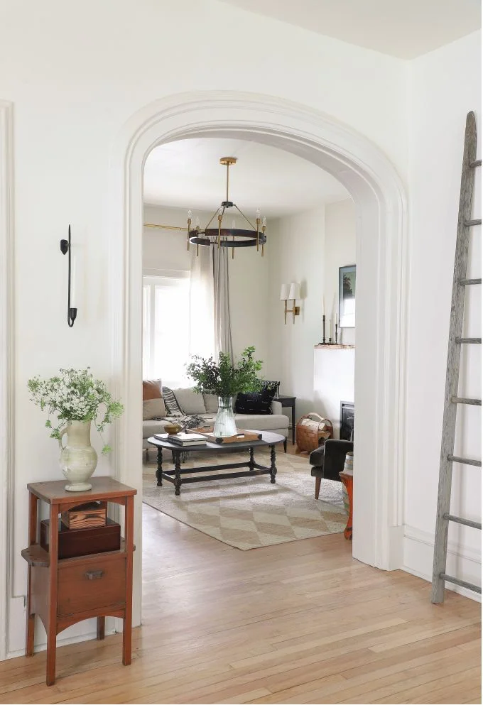
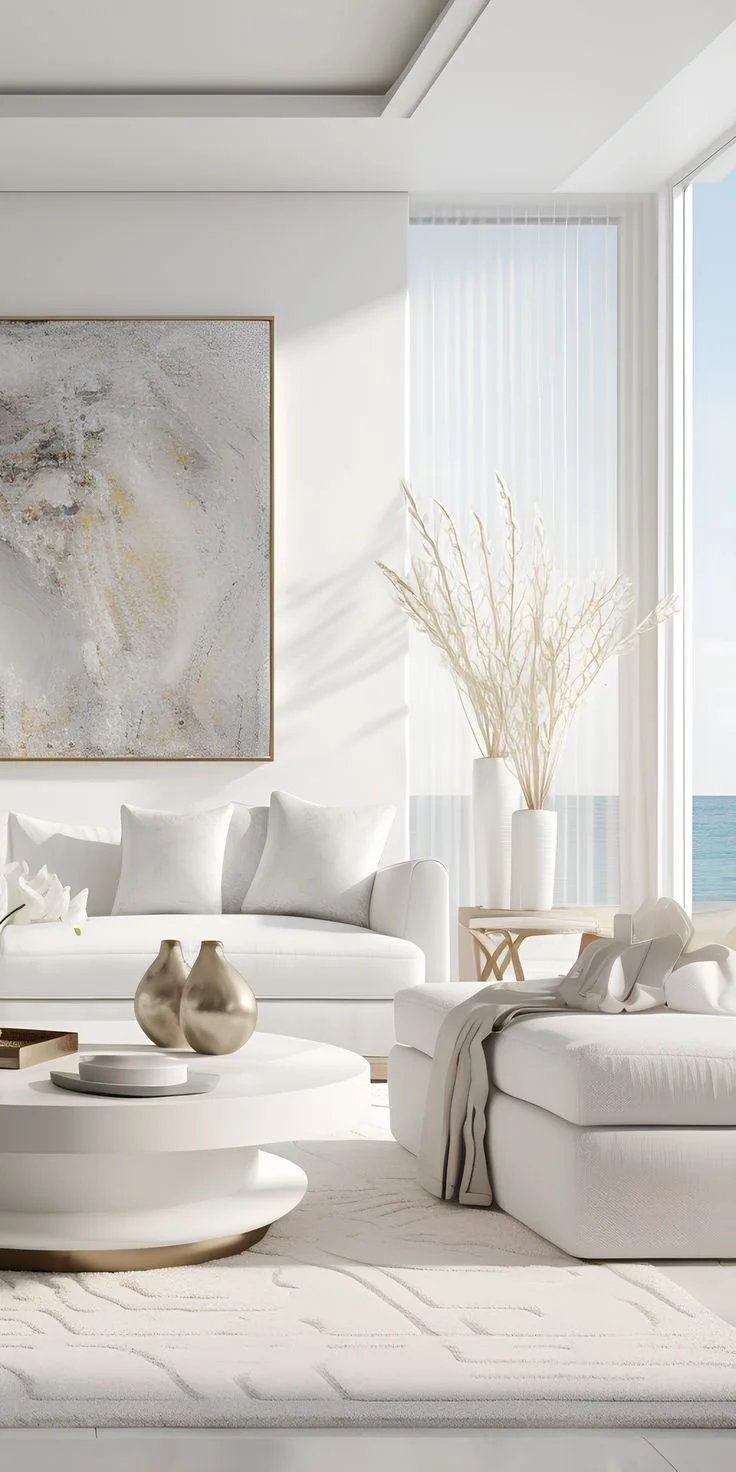
Pure White has a tiny bit of warmth tucked in, which makes it feel gentle. Not yellow or creamy—just enough warmth to keep things from looking too cold. Extra White? It’s cooler and brighter. More of a straight-up, true white with less softness. If you’re working with lots of cool-toned grays or sleek modern stuff, Extra White fits right in.
So yeah— Pure White vs Extra White while both are white, they don’t feel the same. And that feeling? That’s what matters when you walk into the room. Stick around—I’ll break down each room next to help you pick the right one. See our full paint color comparison guide for popular matchups.
Undertones and Overall Feel of Pure White vs Extra White
White paint’s not just white. I learned that the hard way. What looks clean in one room can feel weird in another—all because of undertones.
Pure White and Extra White from Sherwin-Williams are both super popular. But trust me, they don’t feel the same once they’re on the wall.
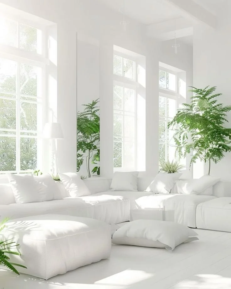
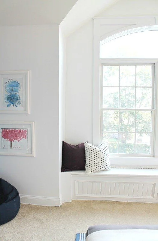
Pure White has a soft, warm vibe. It’s got a hint of yellow and a drop of black in it—kind of like someone added the tiniest splash of cream to tone things down. Its LRV is 84, so it reflects a good amount of light, but not too much. It doesn’t feel stark. I’ve seen it used in living rooms, bedrooms—even full-house repaints—and it just works. Especially in north-facing rooms or spots with softer light. It brings this natural, easygoing feel. Like it’s trying not to show off.
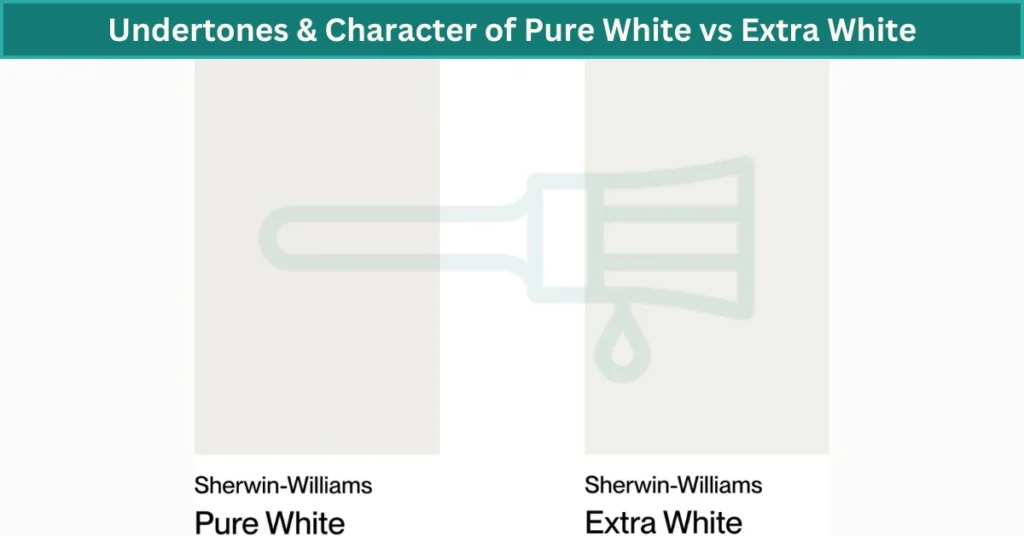
Now Extra White? Totally different feel. It’s sharper. Brighter. It has cool blue undertones that give it that crisp look. Think of it as white straight out of a snowstorm. No creaminess here. Its LRV is 86, so it bounces even more light back. That makes it awesome for dark rooms or trim where you want contrast. It pops more, but it can also feel colder—especially in shadowy corners.
If your room gets a lot of sunlight—especially from the south or west—Extra White can hold its own. It won’t look yellow or dull. But in dim or northern light? Honestly, it can look a bit harsh or even bluish. That’s where Pure White usually wins—it adapts better. I’ve seen people repaint because Extra White felt too “hospital-like” in low light.
Here’s a tip: try a sample swatch of each on different walls. Morning, afternoon, evening—it all changes how the color looks. Also, the gloss level matters. Extra White in a high-gloss finish on trim? Looks shiny and bold. Same color in matte? Not so much. And Pure White in eggshell across your walls? Super cozy.
Where I’d use them:
- Pure White: Full walls, ceilings, cozy spaces. Great for that soft, blended feel.
- Extra White: Doors, baseboards, modern kitchens, or anywhere you want a little “pop.”
Pure White vs Extra White Quick Comparison Table 👇
| Feature | Pure White | Extra White |
|---|---|---|
| Color Code | SW 7005 | SW 7006 |
| LRV | 84 | 86 |
| Undertones | Slight yellow + black | Cool blue |
| Best For | Walls, soft light rooms | Trim, sunny rooms |
| Overall Feel | Warm, cozy, natural | Bright, clean, modern |
Paint seems simple—until it’s on your wall. These two whites tested by Interior Designin Blog are close on paper, but once you live with them, the difference really shows.
How Pure White vs Extra White Perform Room by Room
Here’s something I’ve learned the hard way—white paint doesn’t stay the same in every room. The light, the furniture, even the time of day can totally change how it looks. Pure White and Extra White by Sherwin-Williams may be from the same family, but they behave real differently depending on where you use them.
Pure White vs Extra White Living Room
Pure White:
I like using Pure White in living rooms because it feels warm and easy. It works well with cozy stuff—like soft rugs, tan couches, or wooden floors. It doesn’t glare, and it kind of just blends in with everything in a soft way. Even when the sun moves, it stays calm. That makes it one of the best white paints for living rooms, especially if you want a natural look.


Extra White:
Extra White feels sharper in this space. It reflects more light, so it brightens the room like crazy, especially if you’ve got big windows. But if your living room faces north or gets gray light, it might look kind of cold or bluish. You’d probably want to warm it up with things like cozy throw blankets, warm-toned pillows, or brass lamps.


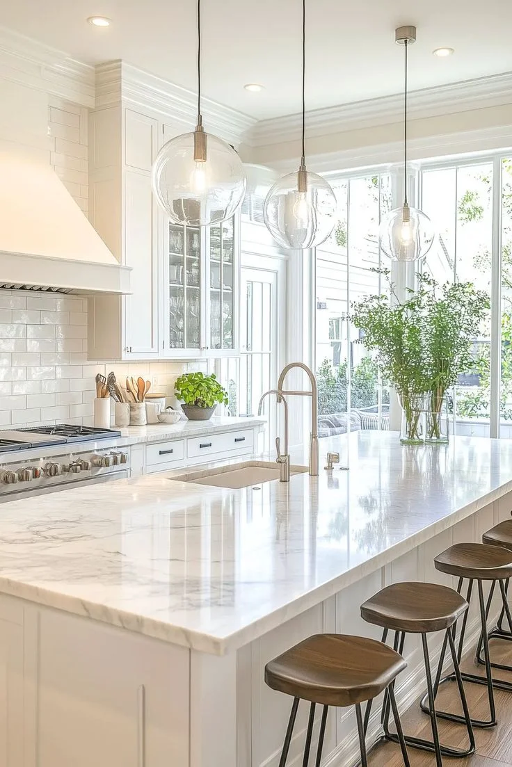
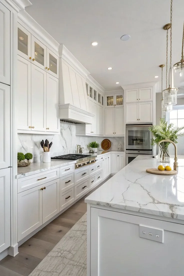
Pure White vs Extra White Kitchens
Pure White:
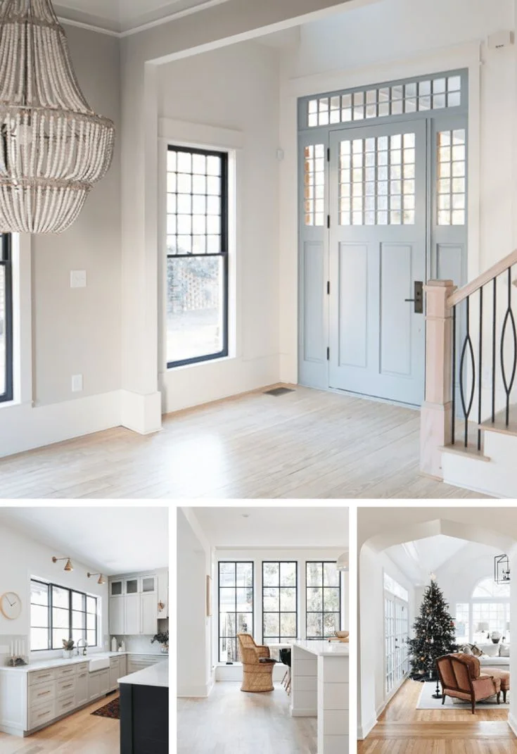
I’ve seen Pure White in kitchens where it just pulls everything together. It’s not flashy, but it makes white cabinets, wood shelves, and neutral countertops feel soft and lived-in. If you’ve got a farmhouse or warm modern style, this one fits right in. Bonus: it hides little smudges better than a super bright white.

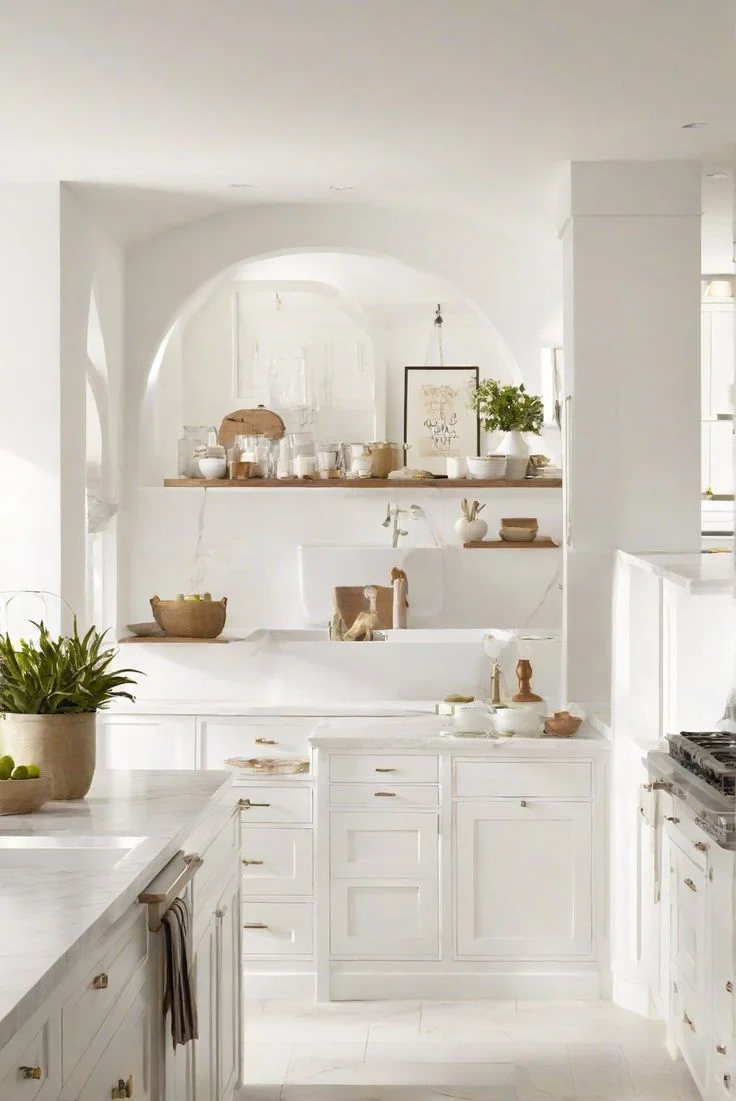

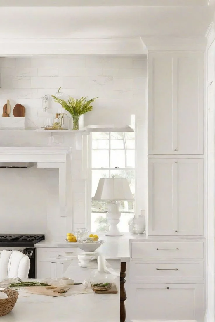
Extra White:
Extra White looks great in sleek, modern kitchens. If you’ve got glossy cabinets, stainless steel, or marble—this is the one. It adds that clean, crisp vibe. But again, if your kitchen doesn’t get much sunlight, it can feel a little sterile. Adding warm light bulbs can help make it feel more balanced.


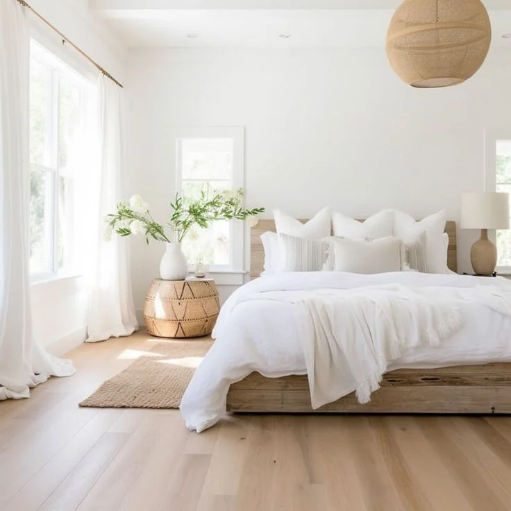
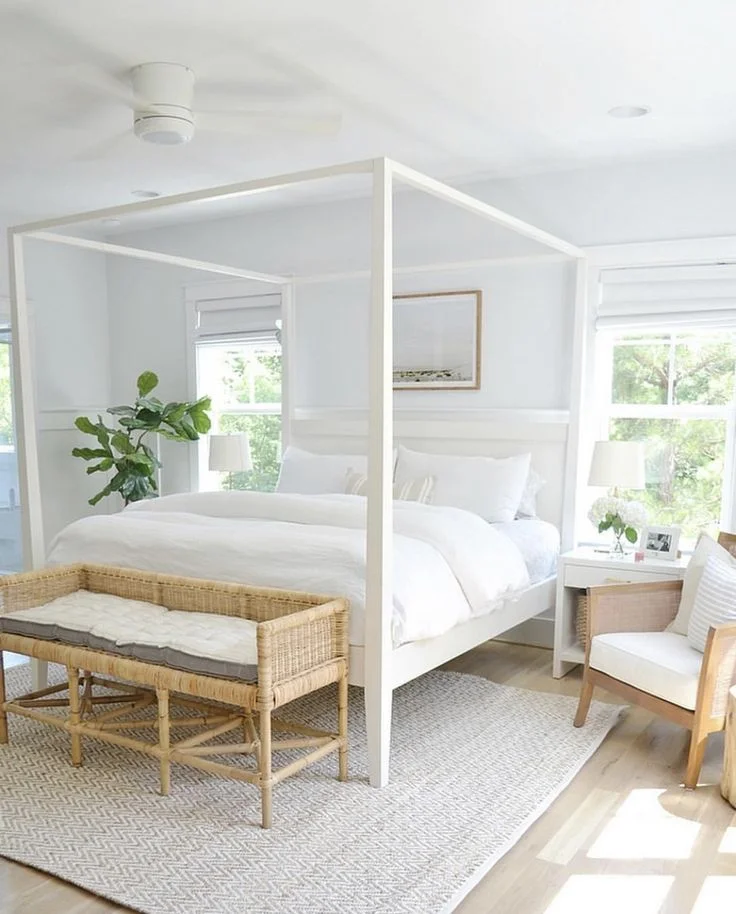
Pure White vs Extra White Bedrooms
Pure White:
Bedrooms are where I really like Pure White. It feels soft, peaceful, and kind of snuggly. Works great with fabric headboards, wood furniture, or even light-colored bedding. It gives off this calm energy that helps the room feel like a place to relax.

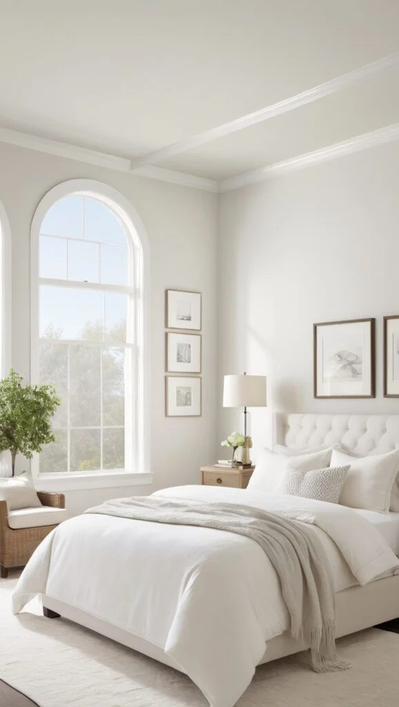

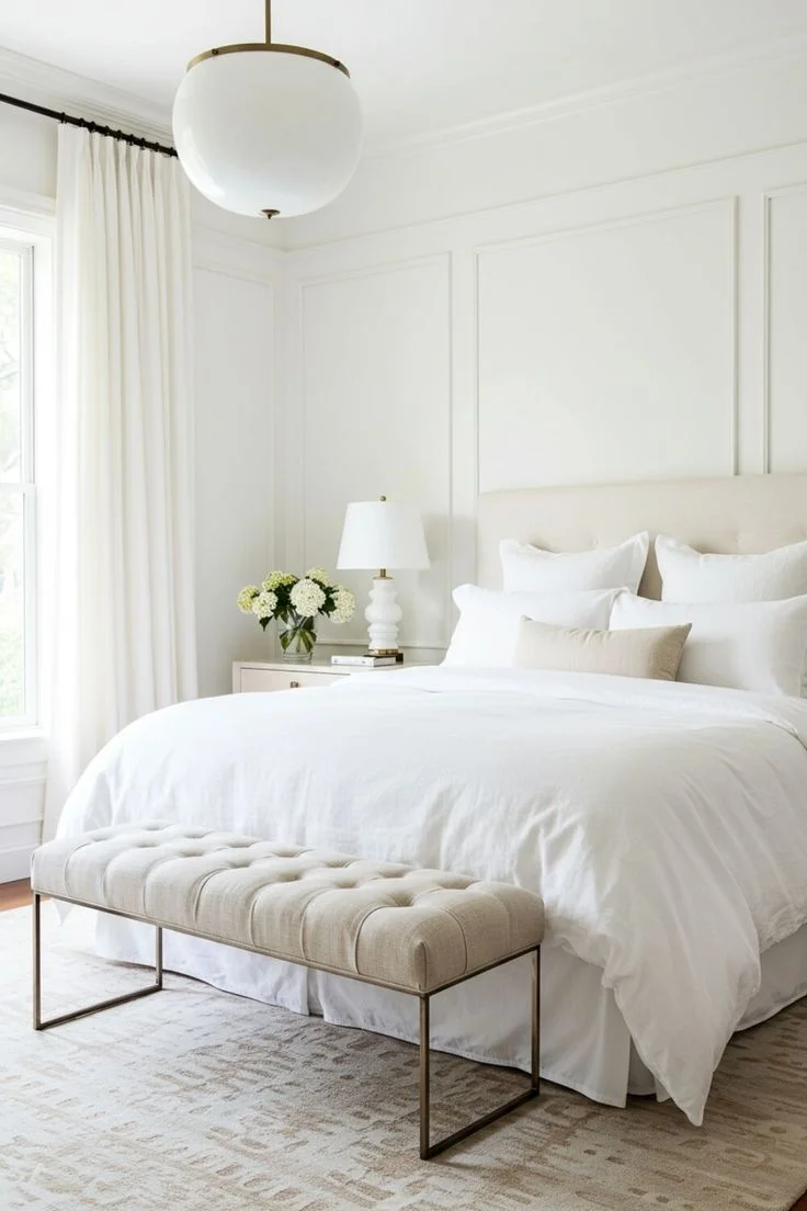
Extra White:
In a bedroom, Extra White can feel a bit too energetic, especially in rooms with cooler light. But if you’ve got a bright, sunny room and want that clean hotel vibe, it can work. I’d still mix in some warmer textures—like curtains, rugs, or warm-toned lamps—to keep it from feeling too cold.


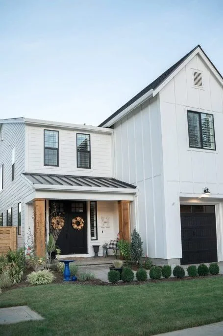
Exteriors
Pure White:
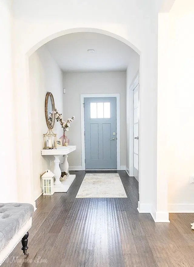
This one actually holds up really well outside. It doesn’t fade fast, and it plays nicely with brick, stone, or wood. Pure White gives that timeless, slightly soft look that feels welcoming—not too bright, not too dull.


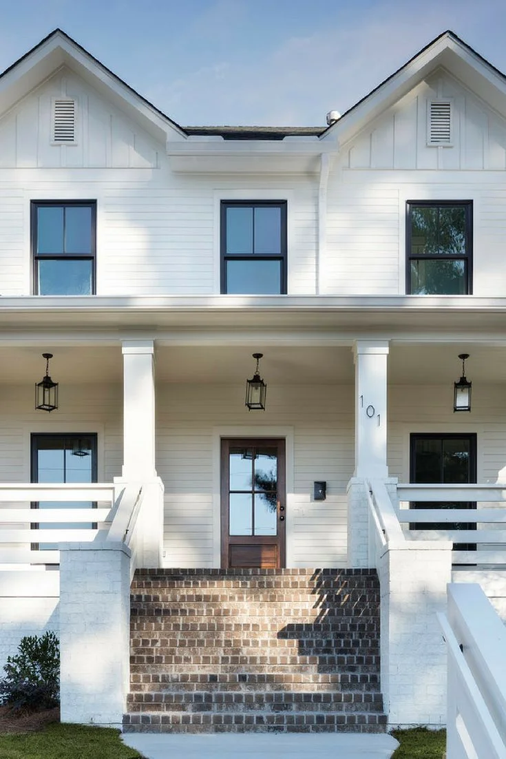
Extra White:
Extra White on exteriors pops more. It’s bright and super modern. If your home has black trim or metal accents, it can look really cool. Just be ready—it reflects a lot of sun, and on big walls, it might be really white. Still, for modern homes, it’s a solid pick.


Pro tip: If you’re stuck between these two, grab some paint samples and test on different walls. Look at them in morning light, afternoon sun, and with the lights on at night. That’s the best way to see how they’ll really behave in your space.
Quick Look: Pure White vs Extra White by Room
| Room | Pure White | Extra White |
|---|---|---|
| Living Room | Soft, cozy, works with wood/fabric | Bright, modern, may feel cool in low light |
| Kitchen | Warm and forgiving with cabinets | Crisp, clean, great with marble or steel |
| Bedroom | Calm and peaceful vibe | Fresh and clean but can feel cold |
| Exterior | Classic, holds color well | Sharp and bold, best for modern styles |
No white is perfect everywhere. But knowing how they act in different rooms? That makes picking one way easier.
How Lighting Affects Pure White vs Extra White
Here’s the deal—light messes with paint. I’ve seen a color look warm and soft in the morning, then totally different by evening. And when it comes to Pure White and Extra White from Sherwin-Williams, lighting really brings out their personalities.
Pure White
This one’s like the steady friend who never acts up. No matter if it’s morning light or late-night lamps, Pure White pretty much stays the same. It has just a tiny bit of warmth in it—enough to stop it from going cold when your room faces north. That soft yellow-black undertone? It helps balance out cooler light without looking beige. In the evening, under artificial lights, it still feels calm. Not too yellow, not too gray. It’s what I’d call a safe pick if you’ve got a mix of natural and fake light throughout the day.


Extra White
This one’s kind of moody. In strong daylight—especially from the south or west—it looks super bright and clean. But once that light fades or shifts? Those blue undertones peek through. In north-facing rooms or places with shadows (like big trees outside), Extra White can feel chilly. Almost icy. I’ve even heard someone call it “hospital white” when they used it in a low-light hallway. It really depends on what’s around it. A green lawn outside? You might see a green-ish bounce. Gray couch? It might pull more blue. It’s super reactive.


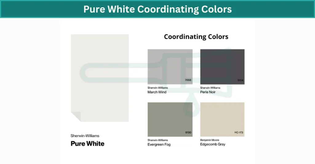
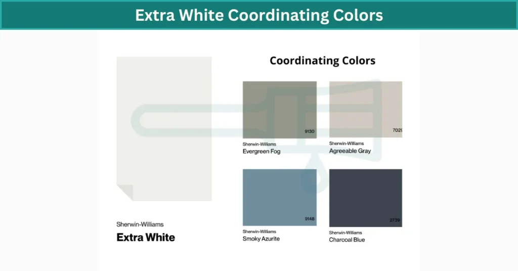
Best Coordinating Colors for Pure White vs Extra White
White paint doesn’t sit alone—it changes depending on what’s around it. The right color palette can make Pure White or Extra White feel cozy, sharp, or even bold. Here’s what I’ve noticed from seeing them in real homes.
Pure White
This one’s super flexible. I’d call it a balanced neutral, because it plays nice with both warm tones and cool tones. You can pair it with deep navy, soft olive green, or even rusty orange and it still looks great. I’ve seen it with coral pillows and dark wood shelves—it just works. Even when you go bold, like burgundy or black, Pure White keeps the vibe soft instead of harsh. That’s why a lot of designers like it for transitional styles—you can mix old and new, warm and cool, and it holds everything together. If you’re unsure, this is the one I’d test first.
Extra White
Extra White is a little pickier. Since it’s a cooler white with blue undertones, it fits better with cooler shades—think slate gray, icy blue, silver, or even crisp black. But be careful with warm creams or beiges—they can clash and make Extra White look kind of cold or off. I’ve seen it in modern homes with black metal and glass—it’s sharp. But without something to warm it up, it can feel a little too clean. That’s why I’d throw in accent colors like copper, leather, or natural wood to soften the edges. It’s all about finding that balance.
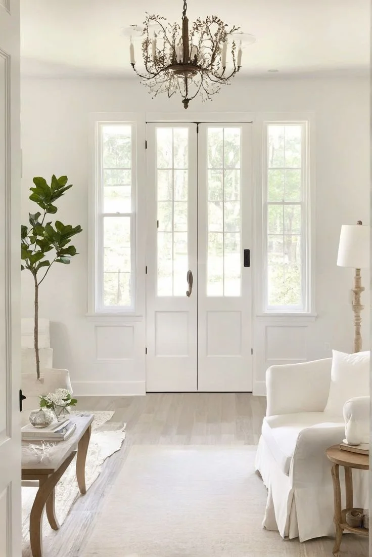
Pure White vs White Dove: Which Soft White Works Best?
If bright white feels too harsh but you still want something clean, soft white paint is the way to go. Two of the most-loved choices? Pure White by Sherwin-Williams and White Dove by Benjamin Moore. They look pretty similar on a swatch, but they act different once they’re up on the wall.
Which one is brighter?
Pure White wins here—barely. It has an LRV of 84, while White Dove sits at 83.16. Not a huge gap, but Pure White bounces just a little more light. So if you’re working with a darker room or lower ceilings, that tiny boost might help.
Which one feels warmer?
That goes to White Dove. It’s got more creamy softness, with stronger warm undertones—almost like someone added a wee wink of beige. Pure White, on the other hand, feels more neutral. It’s still a warm white, just less creamy and a bit crisper.
Which looks better in modern homes?
Pure White, hands down. It pairs great with cool-toned countertops, sleek finishes, and chrome fixtures. I’ve seen it used with white quartz and black hardware—it nails that fresh, clean look without going too cold. White Dove leans traditional. It loves earthy tones, warm wood, and brass accents.
How do they handle natural light?
In south-facing rooms, White Dove can get a bit too warm. Almost yellow, depending on the time of day. Pure White handles bright sunlight better—it stays soft without looking golden. That makes it a safer bet if your room gets tons of natural light.
Which one is more flexible?
Tough call. Both are pretty easy to work with, but they shine in different styles. Want cozy and traditional? White Dove fits right in. Going for crisp and updated? Pure White feels more at home. It really depends on what else is going on in your room.
Quick Tip: Even though the undertones are close, don’t forget—Sherwin-Williams vs Benjamin Moore paints can look different in the same finish. Their sheens, bases, and texture all play a role. Always try a sample first.
Where They Work Best:
- White Dove → With brass hardware, warm-toned floors, beige or olive walls
- Pure White → With modern tile, white quartz, chrome or black accents
At a Glance:
| Feature | Pure White (SW) | White Dove (BM) |
|---|---|---|
| LRV | 84 | 83.16 |
| Undertone | Soft, neutral warm | Creamy, warm beige |
| Best For | Modern, clean spaces | Traditional, cozy rooms |
| Works With | Chrome, cool tones | Brass, earth tones |
| Natural Light | Stays balanced | Can feel yellow in strong light |
So yeah—Pure White vs White Dove is less about which is “better” and more about what fits your style. Both are lovely. It just depends on the vibe you’re going for.
Which White Wins?
Not sure whether to choose Pure White or Extra White? Take this quick quiz and find out!