15+ Best Mauve Paint Colors
I’ve seen mauve pop up a lot lately—and honestly, it just works. It’s soft but not boring, cozy but still fresh. Whether you like vintage vibes or something more modern, mauve has a way of fitting in without trying too hard.
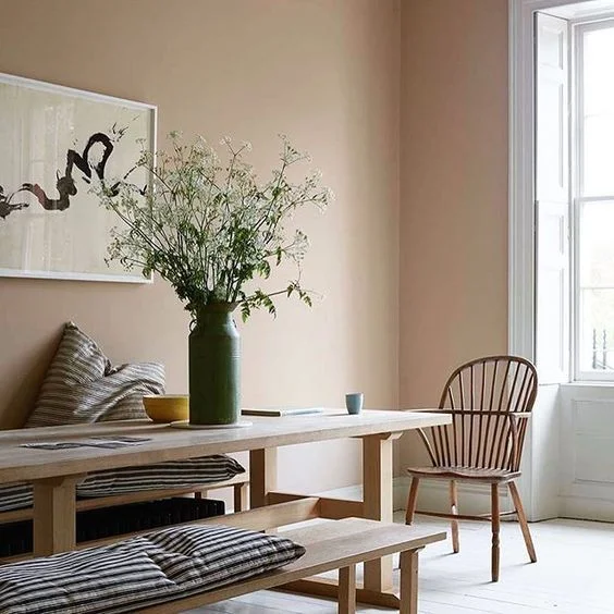
Designers love it because it’s super flexible. You can use mauve paint for walls in bedrooms, bathrooms, or even kitchens. It’s one of those versatile paint colors that somehow feels calming and stylish at the same time. Kind of like a favorite sweater you never want to take off.
Here’s a list of the best mauve paint colors for 2025 by Interior Designing Blog. I’d call it a solid mix of cozy, trendy, and just plain pretty shades.
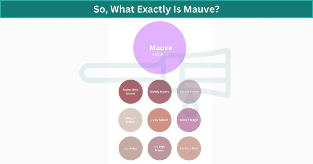
So, What Exactly Is Mauve?
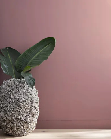
I’d say mauve is like the quiet middle child between pink and purple. Not too loud, not too sweet—just soft, calm, and kind of classy. It’s got this faded, dusty vibe that makes it feel grown-up without being boring. Think of it like the soft echo of purple after it’s had a long nap.
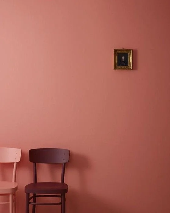
The cool thing about mauve paint colors is how much they can change a space. Lighter mauve shades feel calm and gentle—almost like a soft blanket on the wall. Darker ones lean a bit dramatic, more moody, like something you’d see in a cozy reading nook or a fancy dining room.
Now, is mauve warm or cool? Well… both. That’s what makes it one of the most versatile paint colors out there. Some mauves have pink or beige undertones, so they feel warm and cozy. Others pull more blue or gray, giving off a cooler, modern feel. It really depends on the light in your room. Natural light can bring out the warmth. Artificial light might make it feel cooler and crisper.
And just a quick fun fact—mauve got its name back in the 1800s from a flower called the mallow (which is “malva” in French). It was actually one of the first synthetic dyes ever made. Kinda cool, right?
Whether you’re going for soft and peaceful or rich and bold, mauve shades can totally shift the mood of a room without trying too hard.
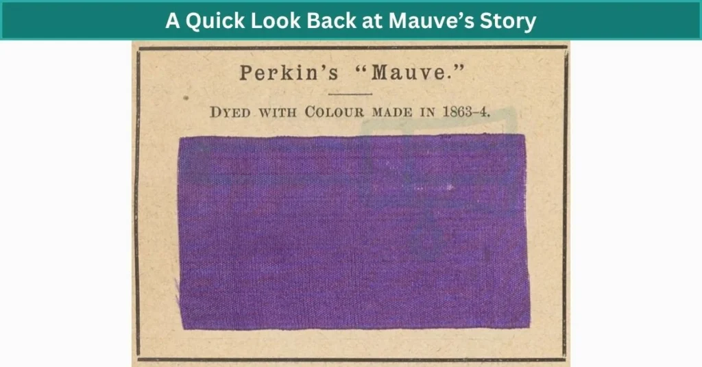
A Quick Look Back at Mauve’s Story
Mauve actually started out in a lab. Back in 1856, a young chemist named William Perkin was trying to make medicine—and ended up creating the first-ever synthetic dye by accident. It turned fabric this soft purple-pink color, and that’s how mauve was born. Pretty wild, right? It was a big deal back then because it made colored fabric cheaper and easier to get. Before that, people had to use stuff like crushed bugs or plants to dye things.
The name “mauve” comes from the French word malva, which means mallow flower. That flower has petals in the same soft, dusty purple shade.
Mauve really had its moment in the 1980s—think makeup, dresses, even furniture. Then it kind of faded out. But now? Mauve is making a big comeback in design trends. It’s showing up in everything from paint colors to home decor. There’s something about it that feels both classic and fresh.
Honestly, the history of mauve shows how one little color can go from a lab accident to a full-on style icon.
15 Best Mauve Paint Colors for 2025
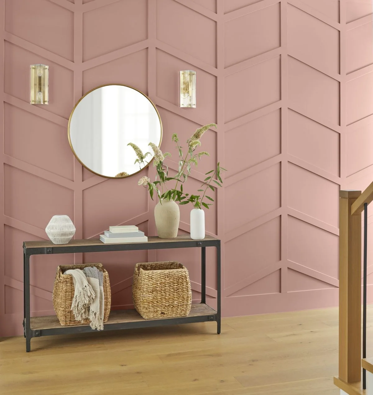
PPG’s Make Mine Mauve – A Soft Favorite
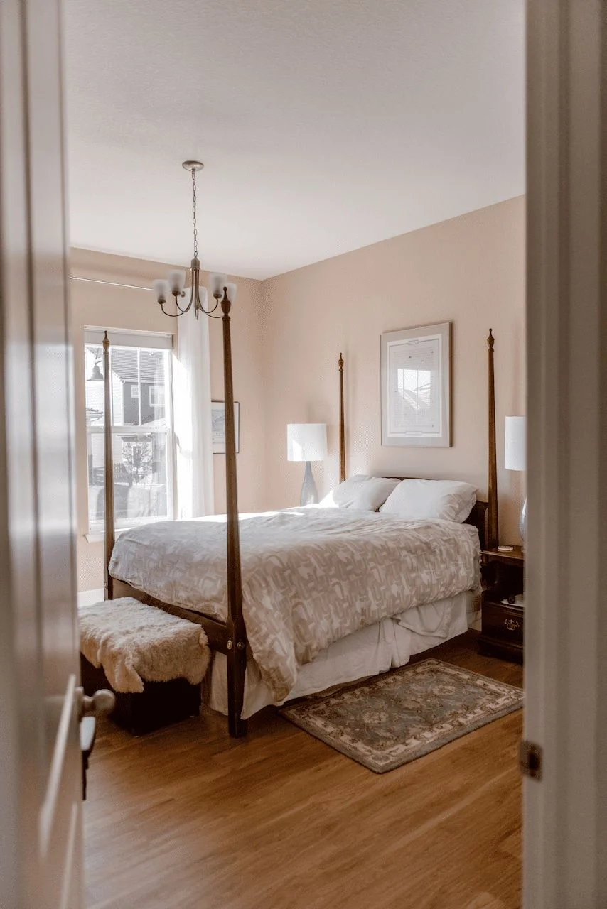
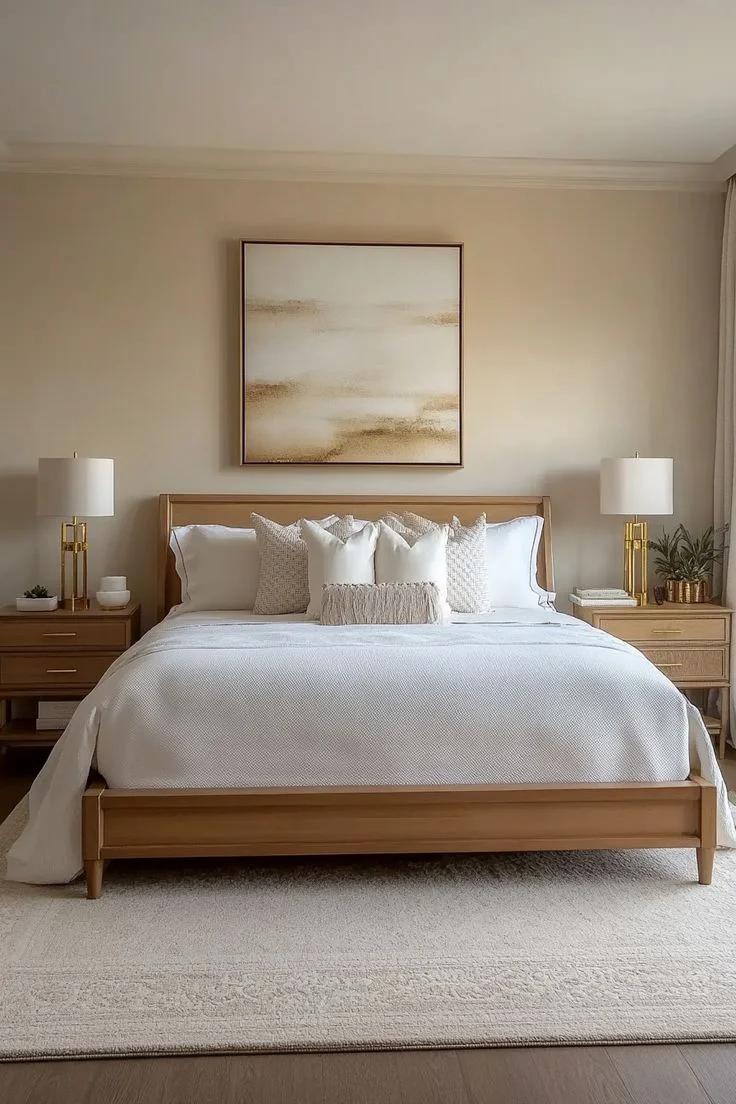
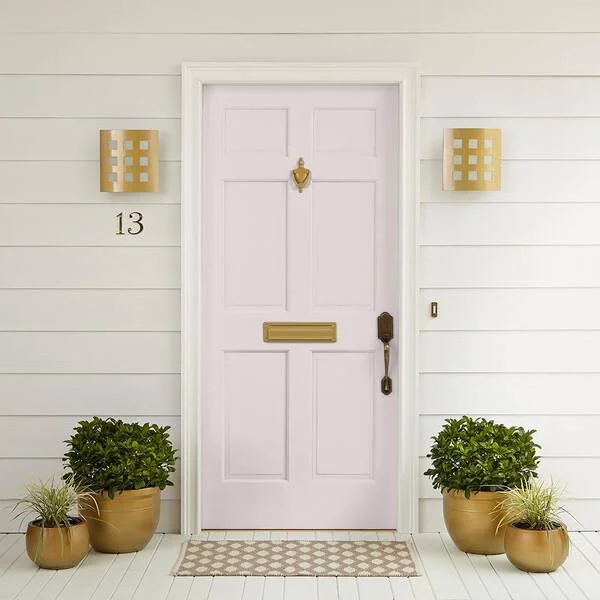
Make Mine Mauve by PPG is one of those mauve paint colors that feels warm and a little dreamy. It’s a medium shade—not too dark, not too light—which gives it a soft, romantic vibe without making the room feel heavy.


Its LRV (Light Reflectance Value) is around 45, so it reflects a decent amount of light. That means it won’t make your space feel dark, but it still adds mood. I’d say it works great for living rooms or bedrooms, especially if you want a cozy, inviting feel. You could also use it as an accent wall with neutral tones around it.
Coordinating colors:
- Creamy white
- Warm taupe
- Dusty rose
- Soft olive green
This versatile mauve paint looks really nice next to wood furniture and natural fabrics like linen. Kind of gives that calm-but-stylish look without trying too hard.
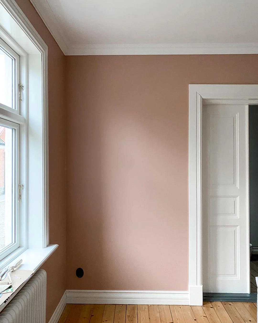
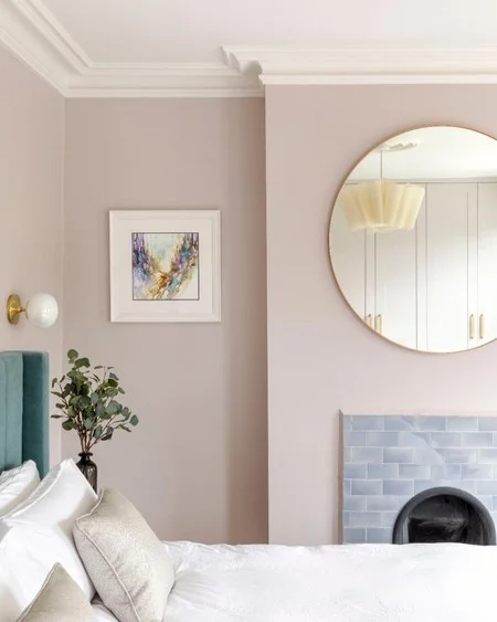
Setting Plaster by Farrow & Ball – Soft with a Twist
Setting Plaster from Farrow & Ball isn’t your average mauve paint color. It’s got this soft, faded pink tone with a touch of mauve in it—and what makes it special is how it feels warm and cool at the same time. That mix means it works in just about any space, no matter the light. In sunny rooms, it leans warm and cozy. Under soft bulbs, it feels calm and slightly muted.


It’s a super versatile mauve paint you can use in bedrooms, hallways, or even living rooms if you want a subtle, elegant vibe.
Coordinating colors:
- Wimborne White
- Light Gray
- Earthy clay tones
I’d say it looks best with matte finishes or soft textures like linen or velvet. Just has that lived-in, modern feel without being loud.
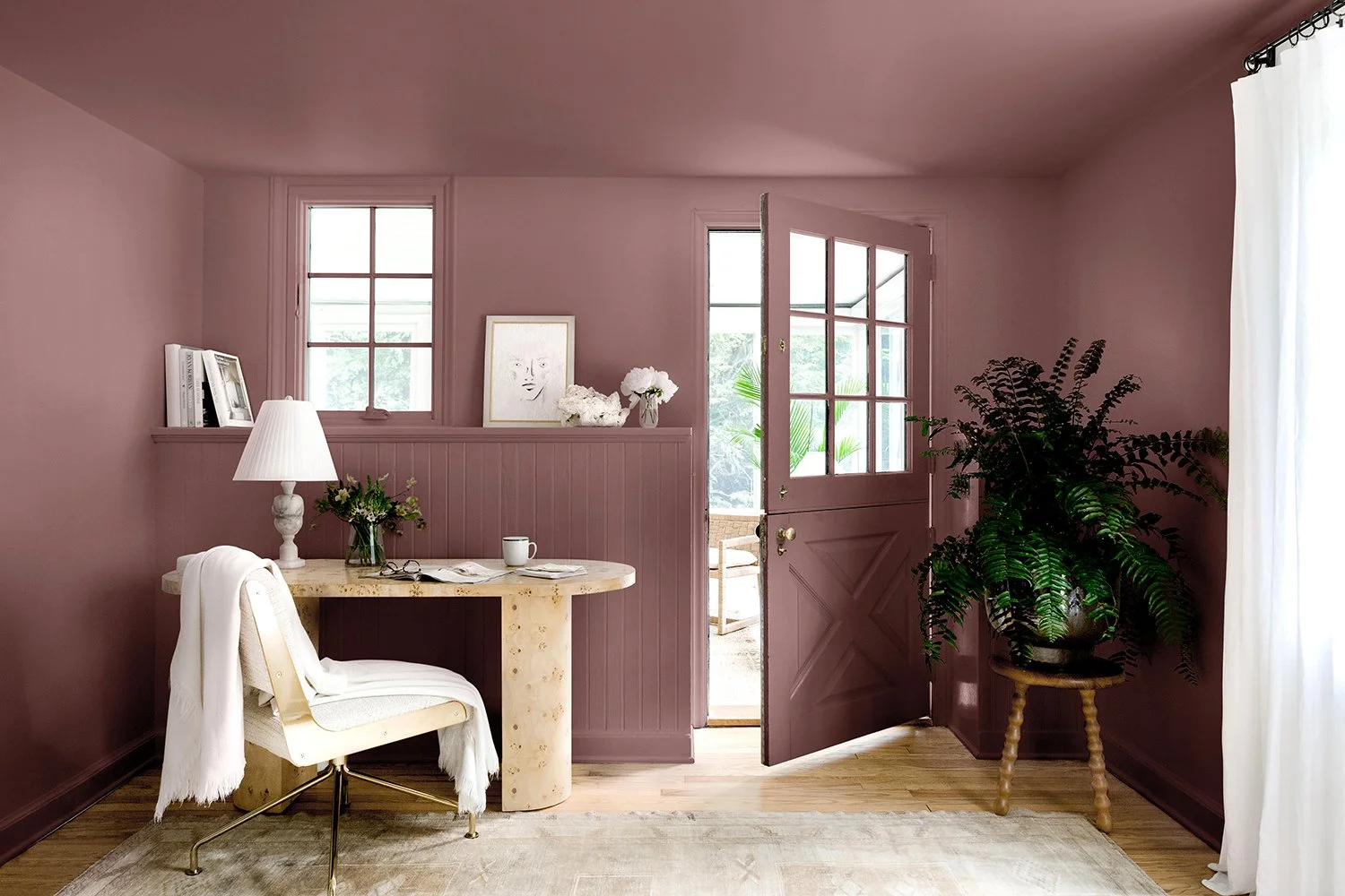
Moody Mauve by PPG – Deep, Cozy, and a Little Dramatic
Moody Mauve by PPG sounds like it’s hiding something—and in a good way. It leans more into the plum side of mauve, which gives it a rich, cozy feel. I’d call it the kind of color that makes a room feel warm and tucked in, like a soft throw blanket.

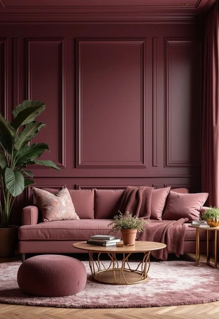

This one’s perfect for a dining room or home office where you want a little mood without going full dark. Add some soft lighting and it really shines.
Coordinating colors:
- Warm ivory
- Soft gold
- Deep charcoal
Moody Mauve is one of those cozy paint colors that makes spaces feel thoughtful and styled without trying too hard.
Mauve Finery from Sherwin-Williams – Soft, Warm, and Welcoming
Mauve Finery by Sherwin-Williams feels like that friend who’s always dressed just right—polished but never trying too hard. It has warm undertones that make a space feel inviting and calm, with just enough elegance to stand out. There’s a softness to it, but it still holds its own in busy spaces.


This warm mauve paint works great in kitchens and living rooms, especially where you get a lot of daylight. The color catches the light in a cozy, flattering way.
Coordinating colors:
- Creamy white
- Muted sage
- Brushed gold
Pair it with wood cabinets or stone accents to really bring out its cozy, refined feel.
Wisp of Mauve by Benjamin Moore – Light, Cool, and Calm
Wisp of Mauve from Benjamin Moore is like a soft breeze—light, airy, and just calming to look at. It’s one of those light mauve paint shades with cool undertones that instantly makes a room feel fresh and open. Not too pink, not too gray—just a soft whisper of color that doesn’t overwhelm.


This calming paint color works best in bedrooms or bathrooms where you want a peaceful, spa-like vibe. It’s also great for making smaller spaces feel a bit more open.
Coordinating colors:
- Crisp white
- Pale gray
- Cool lilac
Pair it with soft towels, sheer curtains, or light wood for that clean, relaxed look.
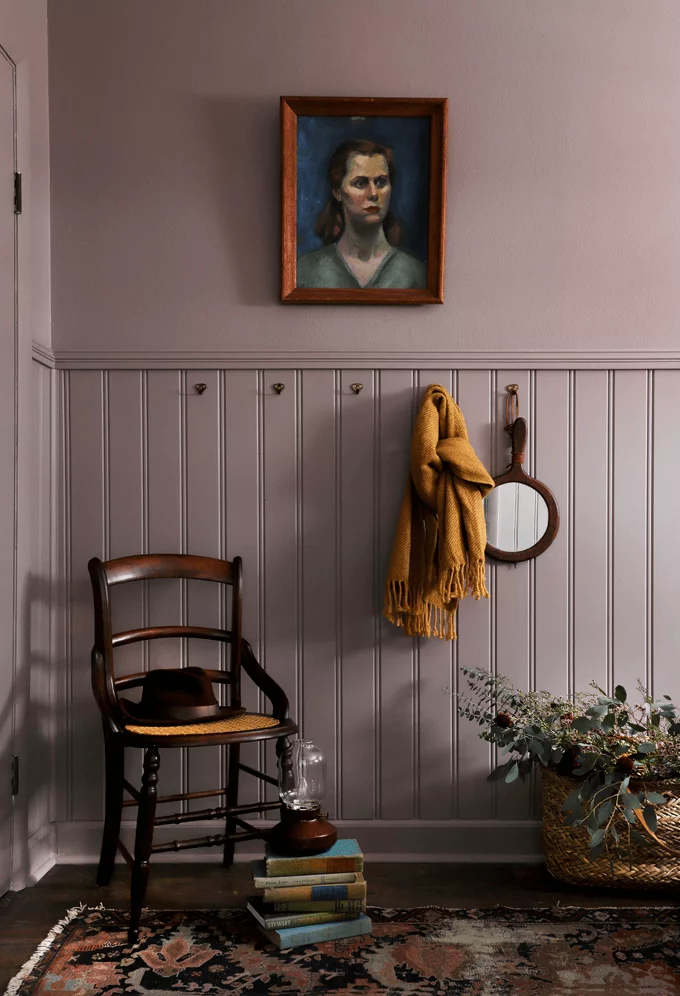
Dusty Mauve by Benjamin Moore – Soft, Vintage, and Timeless
Dusty Mauve by Benjamin Moore feels like it came straight out of an old photo album—in the best way. It’s a soft, muted mauve paint with that gentle, worn-in look. There’s something about it that feels a little vintage but still fits perfectly in modern homes. It gives off a warm, nostalgic vibe that’s super cozy without being too bold.


This vintage mauve paint pairs well with rustic or farmhouse-style spaces, especially alongside warm wood furniture or antique pieces.
Coordinating colors:
- Soft cream
- Weathered oak
- Dusty blue
It’s one of those nostalgic paint colors that makes a space feel relaxed and full of quiet charm.
Mauve Magic by PPG – Bright, Fun, and Full of Personality
Mauve Magic by PPG is one of those colors that just makes you smile. It leans more pink than purple, with a playful pop that feels cheerful and creative. If you want a room to feel full of life, this pink mauve paint totally brings the energy.


It’s a great pick for kids’ rooms, playrooms, or any creative space where you want the vibe to stay light and fun. Even a small wall in this color can lift the whole mood.
Coordinating colors:
- Soft white
- Light gray
- Pale peach
Playful paint colors like this work best when balanced with simple décor, so the color can do all the talking.
Just Beige by Benjamin Moore – Simple Name, Subtle Mauve Twist
Just Beige by Benjamin Moore might sound plain, but there’s more going on beneath the surface. It’s a neutral paint color with a soft touch of mauve in the undertones. That hint gives it a gentle warmth and makes it feel a little more refined than your everyday beige.


It’s a great choice if you want a subtle mauve paint look without going full-on purple or pink. Works well in living rooms, hallways, or anywhere you want a calm, put-together vibe.
Coordinating colors:
- Classic white
- Warm greige
- Soft mauve-gray
This one pairs beautifully with warm wood and simple décor—it blends in but never feels flat.
It’s Your Mauve by Kelly-Moore – Light, Soft, and Surprisingly Deep
It’s Your Mauve by Kelly-Moore is a gentle, light mauve paint that quietly adds depth without demanding attention. At first glance, it seems simple—but the more you look, the more you notice the soft layers of color. There’s a quiet richness to it that makes even a plain room feel thoughtful.


This subtle mauve shade works beautifully in living rooms or spaces where you want a soft backdrop with a little personality.
Coordinating colors:
- Soft white
- Taupe gray
- Dusty plum
Pair it with natural textures like rattan or light woods to keep things balanced and inviting.
Art Deco Pink by Behr – Bold, Glam, and Full of Energy
Art Deco Pink by Behr brings a splash of vintage charm straight from the roaring 1920s. It’s not your usual mauve—it leans more coral, with a warm glow that feels upbeat and stylish. This energetic paint color adds instant personality, especially in social spaces like living rooms or home bars.


The coral undertones give it a lively warmth that works great with metallic touches like gold or brass for that true Art Deco vibe.
Coordinating colors:
- Pale gold
- Warm cream
- Deep navy
Art Deco Pink is a fun twist if you want something with history and flair.
Shadow Mauve by Sherwin-Williams – Deep, Quiet, and Rich in Mood
Shadow Mauve from Sherwin-Williams is one of those deep mauve paint shades that speaks in a soft, steady tone. It’s muted, slightly dusky, and brings a calm elegance to any space. The color leans moody without feeling heavy—perfect for when you want the room to feel quiet, cozy, and just a bit luxe.


This one works beautifully in bedrooms, studies, or living rooms, especially with warm lighting and soft textures like velvet or wool.
Coordinating colors:
- Warm ivory
- Muted plum
- Soft charcoal
If you’re into moody paint colors that still feel polished, Shadow Mauve is one worth trying.
Mauve Mist by Behr – Light, Airy, and Calm
Mauve Mist by Behr is a soft, light mauve paint that feels fresh the second you see it. It has a gentle, airy tone that brings a quiet elegance to any space. There’s nothing loud about it—it’s the kind of color that makes a room feel open, peaceful, and easy to be in.


Perfect for bedrooms or bathrooms, especially if you’re going for a clean, calming look. It works really well in small spaces too, making them feel just a bit bigger and brighter.
Coordinating colors:
- Crisp white
- Soft blush
- Pale gray
If you’re into calming paint colors that feel like a deep breath, Mauve Mist is a safe, soothing pick.
Soft Mauve by Farrow & Ball – Warm, Muted, and Soothing
Soft Mauve by Farrow & Ball lives up to its name—it’s a gentle, muted mauve paint with a hint of warmth that makes any room feel relaxed and welcoming. It’s not flashy or bold, just quietly cozy. The kind of color you’d want around when you’re winding down with a book or cup of tea.

It works beautifully in bedrooms or living rooms, especially with soft lighting and natural fabrics like linen or wool. Great for both classic and modern styles.
Coordinating colors:
- Creamy beige
- Dusty rose
- Soft taupe
If you’re after a warm mauve paint that feels peaceful but still has personality, this one’s a solid choice.
Antique Mauve by Benjamin Moore – Rich, Timeless, and Full of Charm
Antique Mauve by Benjamin Moore is a classic mauve paint that brings a vintage elegance into the room. It’s rich without being overpowering—like an old velvet chair that still feels special today. There’s a warmth to it that adds comfort, but it also feels refined and thoughtful.


This vintage mauve paint is perfect for living rooms, studies, or any space where you want a little depth and nostalgia. It pairs beautifully with traditional decor, antique pieces, or even a touch of gold.
Coordinating colors:
- Warm ivory
- Deep walnut
- Aged brass
If you’re into colors that feel like they’ve been around forever (in a good way), Antique Mauve might be the one.
Lavender Gray by Sherwin-Williams – Calm, Cool, and Gracefully Balanced
Lavender Gray by Sherwin-Williams is a soft mix of purple and gray that feels calm without being dull. The lavender adds a gentle touch of color, while the gray keeps things grounded and modern. It’s the kind of shade that instantly relaxes a room but still feels put-together.


This calming paint color works beautifully in bedrooms, living rooms, or any space where you want a quiet, sophisticated mood. It’s also super flexible—great for pairing with both cool and warm decor.
Coordinating colors:
- Soft silver
- Warm beige
- Dusty mauve
Lavender Gray’s mix of elegance and ease makes it a smart pick for almost any room.
What Colors Pair Nicely with Mauve?
I’ve always thought of mauve as a bit of a chameleon. It’s soft and calm, but it knows how to play nice with lots of other colors. Whether you’re working with a warm or cool version, mauve has a way of fitting in without fighting for attention. It’s one of those shades that’s easy to match—but a few combos really stand out.
🟣 Whites & Grays
These are your safe bets. Clean white and soft gray help mauve feel fresh and balanced.
Great for: Bedrooms, bathrooms, or anywhere you want a calm, airy vibe.
🟢 Greens
Sage green or olive brings out mauve’s earthy side. The combo feels natural but still stylish.
Great for: Living rooms or kitchens with wood or brass touches.
🔵 Blues
Dusty blues or navy pair well with mauve’s softness, adding a cool contrast that still feels relaxing.
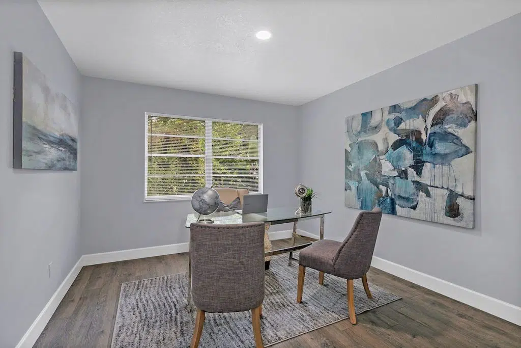
Great for: Studies, home offices, or modern bedrooms.
Room Ideas with Mauve Paint Colors:
- Living Room: Try mauve walls with creamy trim and soft green or tan furniture.
- Bedroom: Mauve and light gray make for a cozy, peaceful combo—easy on the eyes.
- Kitchen: Go for mauve lower cabinets with white uppers and touches of natural wood.
Quick Tip:
Lighting changes everything. Mauve looks warmer in natural sunlight and a bit cooler under artificial lights. Try swatching near a window and a lamp to see how it behaves.
Also, think about texture—glossy finishes feel crisp, while matte adds softness to your mauve color combinations.
Fresh Mauve Color Combos to Try in 2025
Lately, I’ve been seeing mauve pop up in some pretty cool pairings—and 2025 looks like it’s going to keep the trend going. Mauve isn’t just a side color anymore. It’s front and center, and designers are mixing it with shades you wouldn’t expect. Some combos feel soft and chill, others feel bold and moody. Depends on the vibe you’re after.
Here are a few trending mauve color combinations that are catching eyes this year:
🌾 Mauve + Warm Neutrals
Think creamy beige, taupe, or warm gray. These tones keep things soft and grounded.
Feels like: A cozy café or a quiet weekend morning.
🌿 Mauve + Muted Green
Dusty olive or sage greens balance out mauve’s sweetness. Together, they feel earthy and peaceful.
Feels like: A nature-inspired retreat.
🖤 Mauve + Charcoal or Black
Add some edge by pairing mauve with darker tones. It gives drama without going full gothic.
Feels like: A modern loft or moody reading nook.
🌸 Mauve + Pale Pink or Blush
Stay light and romantic with barely-there pinks. Super soft, super gentle.
Feels like: A dreamy bedroom or nursery.
🔷 Mauve + Soft Blue or Slate
This combo is calm but still has contrast. Great for a modern yet inviting feel.
Feels like: A stylish home office or hallway.
These mauve color combinations work great across walls, fabrics, and furniture. You don’t have to go big—just a pillow here, a painted cabinet there, and it starts coming together.
Easy, Budget-Friendly Ways to Add Mauve at Home
You don’t need a full room makeover to bring mauve into your space. I’ve found that even small touches can totally shift the vibe. Mauve is one of those colors that looks fancy—but doesn’t need to cost a lot to work. You just have to be a little creative.
Here are a few low-cost ways to use mauve paint or mauve home decor without blowing your budget:
🎨 Paint Just One Wall
Instead of painting a whole room, try a mauve accent wall. It adds color without needing tons of paint.
🛏 Swap Out Your Textiles
Pillows, throw blankets, or curtains in mauve shades can warm up a space fast—and you can find budget-friendly options almost anywhere.
🖼 DIY Art or Prints
Grab a cheap canvas or frame and paint something abstract with mauve and a few coordinating colors. Looks high-end, costs next to nothing.
🪑 Repaint Small Furniture
Got an old chair or nightstand? A coat of mauve paint can give it a fresh, updated feel.
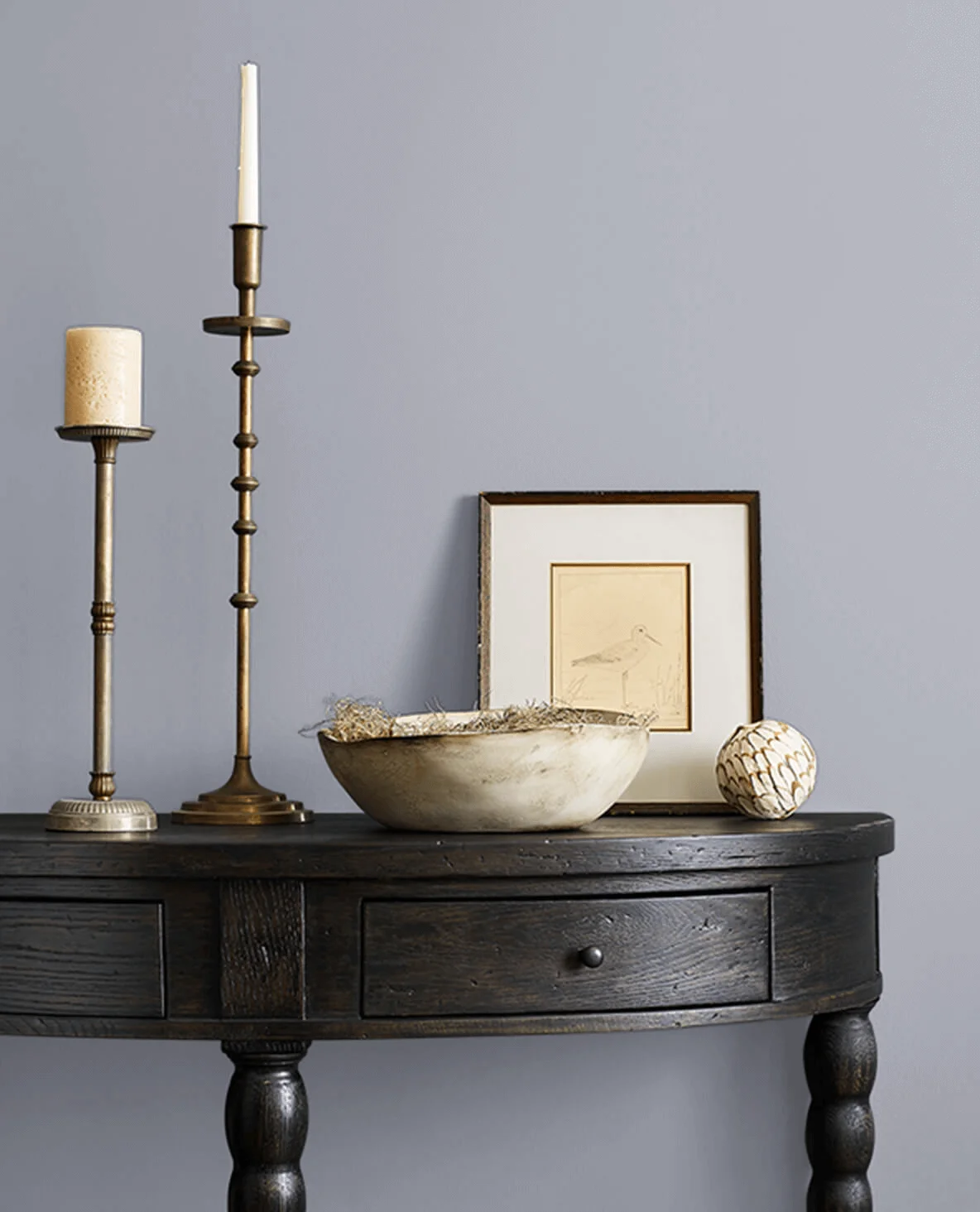
🕯 Use Accessories
Think candles, vases, lamp shades—even a mauve-toned flower arrangement. Little things go a long way.
How to Paint with Mauve (Without Messing It Up)
I’ve seen mauve go wrong real fast—not because the color’s bad, but because the finish or technique didn’t match the space. Mauve is soft and flexible, but how you paint it really changes the feel. So before you grab a brush, here’s what I’d keep in mind.
🎨 Matte Finish
Matte mauve feels cozy and calm. It softens the room and hides little wall flaws. Best for bedrooms, living rooms, or anywhere you want chill vibes.
✨ Eggshell or Satin
These finishes have a little glow without being shiny. Great for bathrooms or kitchens where you need something wipeable but still soft.
🌟 Semi-Gloss
If you’re painting trim or doors, semi-gloss mauve can be super sleek. Adds just enough contrast without going overboard.
🖌 Soft Blending Techniques
For a more creative look, try color washing or ombré styles. Fades from mauve to white or gray can add texture and depth, especially in accent areas.
🖼 Two-Tone Walls
Pair mauve with a lighter neutral on the top or bottom half of a wall. It breaks things up without making the room feel busy.
Quick Tip:
Test your mauve in natural and artificial light before painting the whole wall. Mauve can shift—sometimes it looks warmer, sometimes cooler—depending on time of day and bulbs used.
Real User Fixes & Community-Backed Solutions
In r/femalelivingspace, a user poured their heart out over a surprisingly tricky decision — finding the perfect mauve to paint their dining room. They were aiming for a romantic, moody vibe but had already gone through 10+ paint samples and still couldn’t commit. With swatches all over the wall and a little decor scattered around for inspiration, they admitted to feeling overwhelmed and just wanted the process done.
The community jumped in with humor, empathy, and tons of advice. Some favored the swatch closest to the mirror or piano, calling them the ideal balance of pink, purple, and neutral tones. Others gently warned about going too brown or too light, suggesting nighttime photos for better judgment. A few users joked that the wall of swatches looked like accidental art — and maybe she should embrace it as a “patchwork wallpaper.” In the end, most agreed: narrow it down, test in better light, and just pick one. Mauve madness is real, but the right shade is out there.
Final Verdict OF Mauve Paint Colors
Mauve isn’t just a passing trend—it’s one of those colors that keeps coming back because it simply works. It sits right between pink and purple, with just enough warmth to feel cozy and enough coolness to stay fresh. Whether you’re into vintage charm, modern simplicity, or a bit of both, mauve fits in without stealing the spotlight. It’s calm, soft, and surprisingly versatile.
If you’re thinking about using mauve at home, there’s a shade for every vibe—light, moody, playful, or rich. It pairs easily with both warm neutrals and cool accents, and it plays well in any room—from bedrooms to kitchens. Honestly, it’s that one color that quietly pulls everything together.
People Also Ask
What color goes best with mauve?
Mauve pairs beautifully with both warm and cool colors, which is why it works so well in so many spaces. On the warm side, it complements soft tones like beige, ivory, gold, and rich browns—especially when used with natural materials like wood, linen, or woven textiles. If you’re leaning toward a cooler palette, mauve also looks great with silver, slate gray, and deep navy. Its balanced undertones make it feel almost neutral, allowing it to blend seamlessly with a wide range of interior color schemes without clashing.
What is the hint of mauve paint color?
Hint of Mauve is a midtone, neutral paint color that leans into a dusty violet purple, softened with gentle mauve undertones. It brings a calm, muted elegance to interiors, making it a great fit for dining rooms or modern urban living spaces. When paired with deep burgundy, it creates a rich, layered look—perfect for a wine country-inspired theme that feels both cozy and refined.
Is mauve a trending color?
Yes, mauve is definitely trending again—especially in 2025. Once known as an ‘80s favorite, mauve has made a strong comeback in modern interiors thanks to its soft, balanced tone that feels both calming and stylish. Designers are using it in everything from bedrooms to living rooms, often pairing it with earthy neutrals or muted greens for a fresh, modern look. If you’re thinking about trying the mauve trend, trusted paint colors like Mauve Finery by Sherwin-Williams or Dusty Mauve by Benjamin Moore are great places to start.
Is mauve warm or cool?
Mauve sits between pink and violet on the color wheel, leaning toward the cooler, pastel side. Its soft blend of red’s warmth and blue’s calm creates a balanced, inviting hue that works well in both warm and cool palettes.
Is mauve a feminine color?
Mauve is often seen as a feminine color, but it carries a quiet strength—soft yet confident, never weak or overly delicate.
Is mauve a romantic color?
Mauve sits gently between pink and purple on the color wheel, blending the sweetness of one with the richness of the other. Its soft, muted tone often feels romantic and nostalgic, making it a favorite for cozy, intimate spaces. Unlike bold purples, mauve brings warmth and tenderness without overwhelming the room. The name comes from the French word for the mallow flower—malva—whose petals share the same delicate hue.
Is mauve a royal color?
Mauve gained royal attention when Queen Victoria wore a silk gown dyed with mauveine at the Royal Exhibition in 1862. Before synthetic dyes, mauve was rare and costly, making it a color linked to wealth and aristocracy.
What color is mauve Kiss?
Mauve Kiss 105 by LIVE is a hair dye that blends orange tones with subtle purple areas.