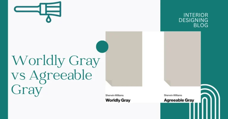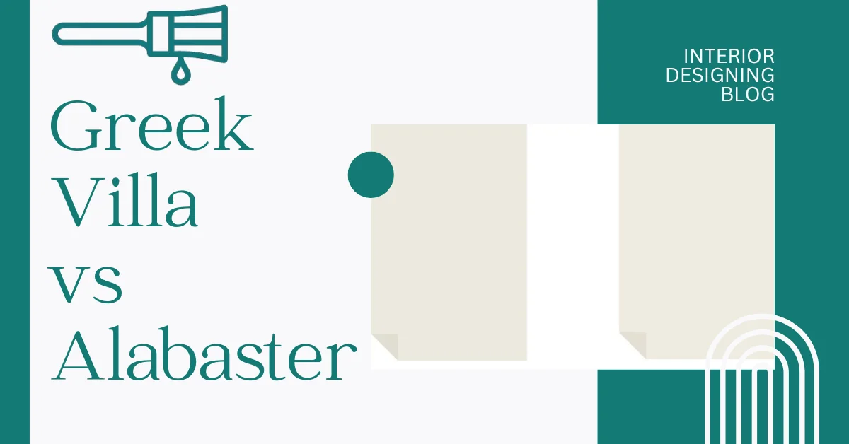
Greek Villa vs Alabaster? A Close Call Between Two Warm Whites
Picking between Greek Villa vs Alabaster can feel tricky—they look almost the same at first. Both are soft, warm white paint colors that designers love. But there’s a small difference that actually matters. Greek Villa has an LRV of 84, while Alabaster sits at 82. That just means Greek Villa reflects a little more light, which can make it feel a bit brighter in your space.
But it’s not just about numbers. Greek Villa leans a little warmer and creamier, while Alabaster feels more neutral with just a hint of beige. That tiny shift can make a room feel totally different depending on where you use it. For example, Greek Villa can help warm up a cool, north-facing room.
You really need to see these paints in real homes to notice the difference—photos and real-life examples will make it way easier to choose. Let’s look closer by Paint Comparison of Interior Designing Blog.
Undertones and Feel: What Makes Each Color Unique Greek Villa vs Alabaster
When I’ve worked with Sherwin Williams Greek Villa, it always comes off as a cozy, creamy white. It has soft yellow undertones that warm up a space, especially in natural light. I’ve found it works beautifully in north-facing rooms where you want to fight off that cool light. It’s also a favorite in Mediterranean-style homes—adds a sun-kissed vibe without being too bold. In satin or eggshell finishes, Greek Villa gets even creamier, which can feel rich and inviting.
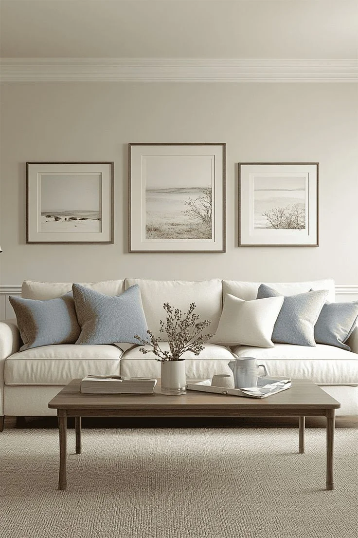
On the other hand, Sherwin Williams Alabaster is more of a neutral soft white. Its undertones mix warm beige with just a touch of greige, which makes it stay balanced across different lighting. I’ve used it on ceilings, cabinets, even darker rooms—and it always stays calm, not too warm or cold. What I like most? It doesn’t shift much, even under warm LED lights. That kind of stability is rare with warm white paint.
Difference
Greek Villa feels warmer and more golden, while Alabaster sits in the middle—still soft, but more grounded. If you’re choosing based on light, go with Greek Villa for sunny rooms or when you want a cozy glow. Alabaster’s better for rooms that get a mix of light or if you want something a little more subtle.
| Feature | Greek Villa | Alabaster |
|---|---|---|
| Code | SW 7551 | SW 7008 |
| LRV | 84 | 82 |
| Undertone | Creamy, warm yellow | Soft beige with greige hints |
| Best Used In | North-facing rooms, exteriors | Cabinets, ceilings, dim rooms |
| Lighting Behavior | Warmer in artificial light | Stays neutral in all lighting |
How Sherwin Williams Greek Villa vs Alabaster Feel in Every Room
Greek Villa and Alabaster might look super close, but their small differences show up big when you use them in different rooms. Greek Villa (LRV 84) is a bit brighter and warmer, giving off a soft, creamy glow. Alabaster (LRV 82) leans more muted and balanced—it doesn’t change much in different lighting. That makes a real impact depending on the mood and direction of light in your home.
Whether you want a cozy living room, a clean kitchen, or a peaceful bedroom, picking the right warm white paint makes a huge difference. Let’s break it down, room by room.
Living Rooms
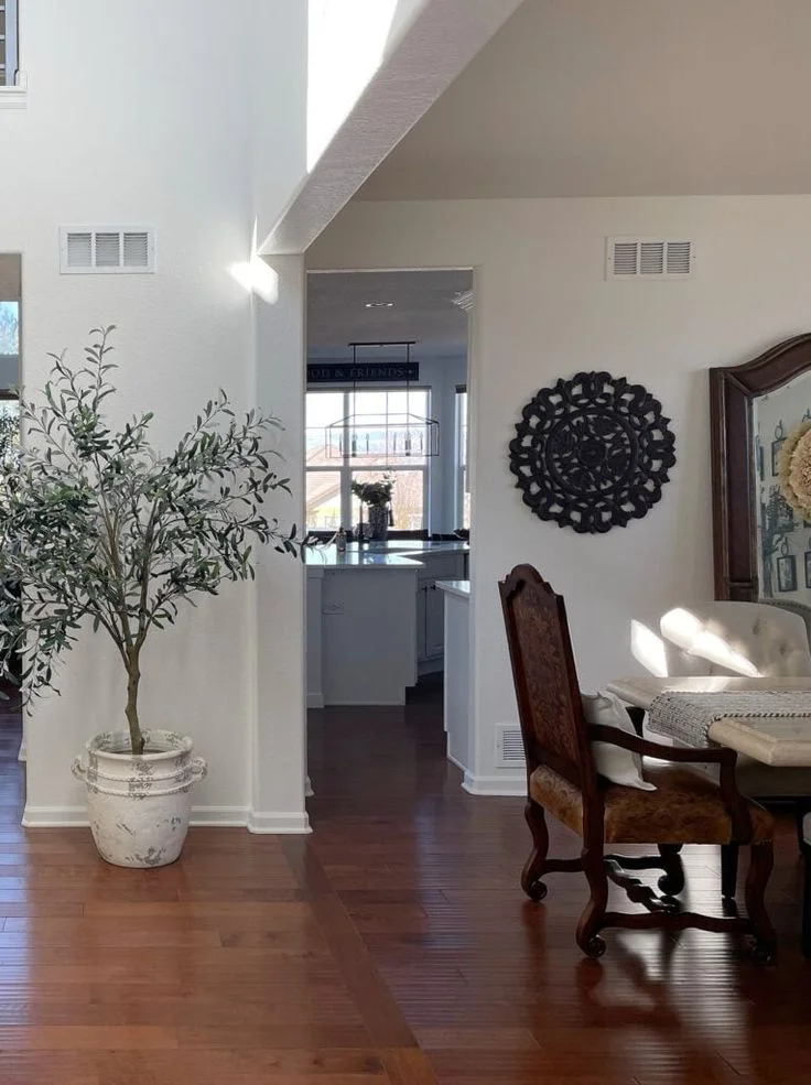
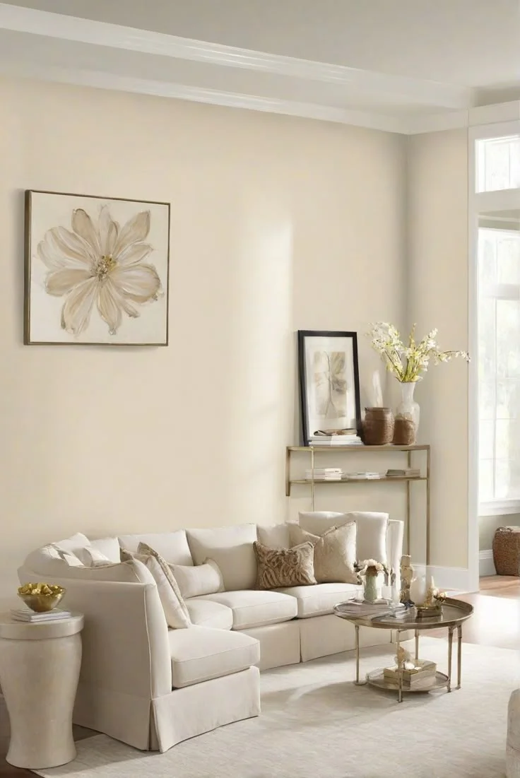
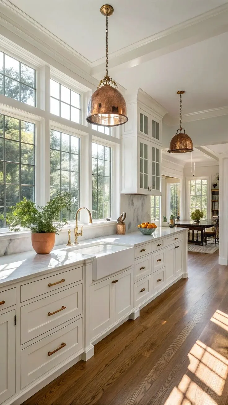
Greek Villa is that cozy white paint that really shines in north-facing living rooms. It feels soft and bright at the same time, giving off a creamy warmth that makes a space feel inviting. But I’ll be honest—on big walls, especially with lots of daylight or warm lamps, it can start to look more yellow than you’d expect. Still, if your living room has wood floors, tan leather, or a lot of natural textures, Greek Villa blends right in.


Alabaster, on the other hand, is a more stable choice. It doesn’t shift around much, no matter the time of day. I’ve seen it hold its own in both dark and light rooms, and it pairs nicely with bold furniture—think black sofas or modern white frames. It’s also one of those whites that works great on ceilings too, keeping the room light but not too bright. If you want a balanced, calm vibe, Alabaster is hard to beat.


Kitchens
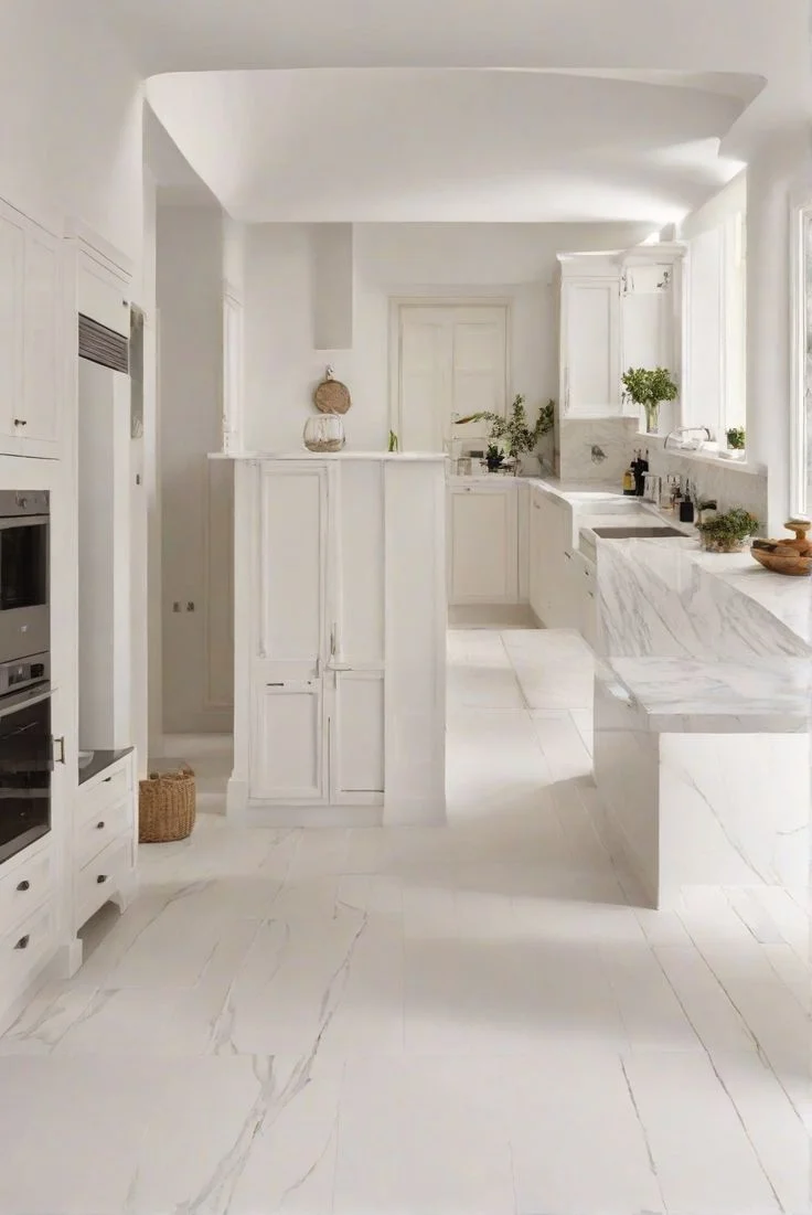
Greek Villa feels like a hug in kitchen spaces with lots of natural or even soft, neutral lighting. I’ve used it on both walls and cabinets, and it brings a cozy, welcoming feel. It looks especially nice with wood countertops or tan backsplashes. But heads-up—if your kitchen has strong warm bulbs (like 2700K), Greek Villa can turn a bit too yellow. I’ve found switching to cooler lighting keeps it feeling just right.

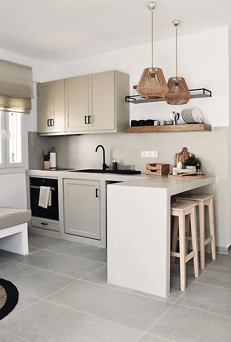

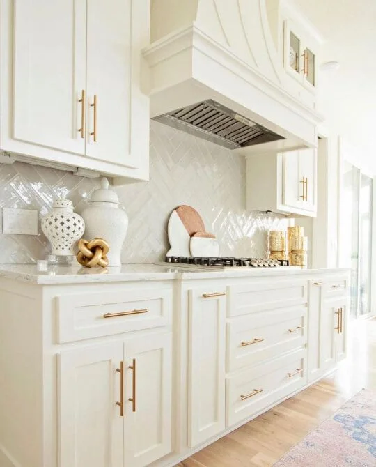
Alabaster is my go-to for kitchens where you want clean but not cold. It hides smudges better than Greek Villa, especially on lower cabinets. It also works great in two-tone designs—I’ve used it on upper cabinets with navy or sage green on the bottom, and it always looks soft and balanced. Plus, it’s a hit in farmhouse kitchens, where that calm, creamy white plays perfectly with rustic wood and black fixtures.


Bedrooms
Greek Villa brings a soft, cozy glow to bedrooms. I’ve seen it look especially lovely with natural linens, warm wood tones, or even rattan accents—it gives off that gentle, lived-in charm. In north-facing rooms or under warm bedside lighting, it wraps the space in comfort. But in sun-filled, south-facing bedrooms, it can lean a bit too creamy during the day. At night though, it settles into a soft, dreamy white that feels calm and restful.


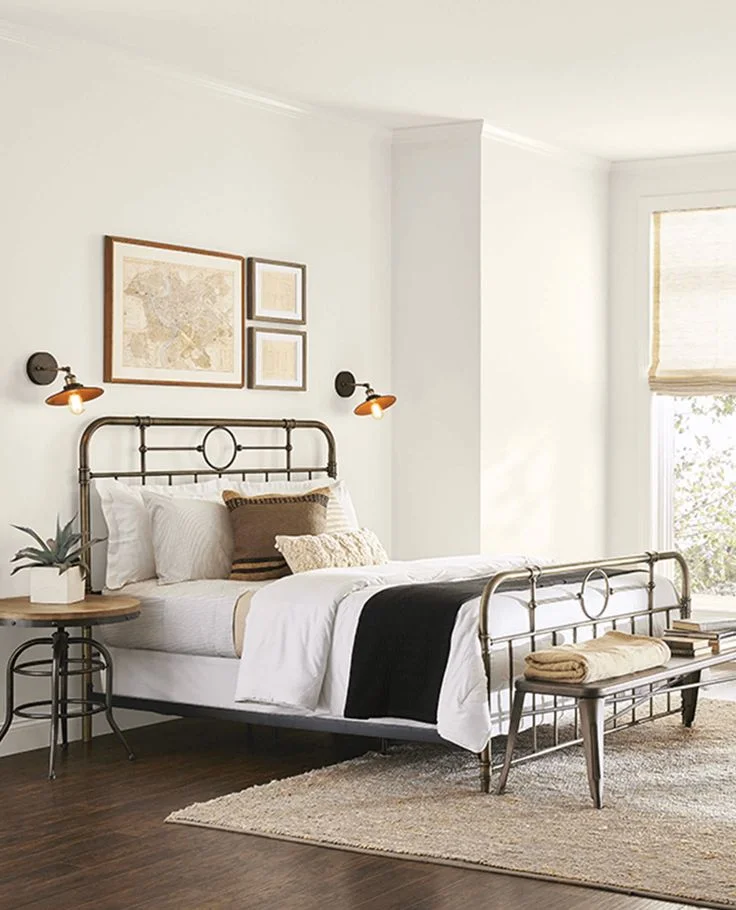
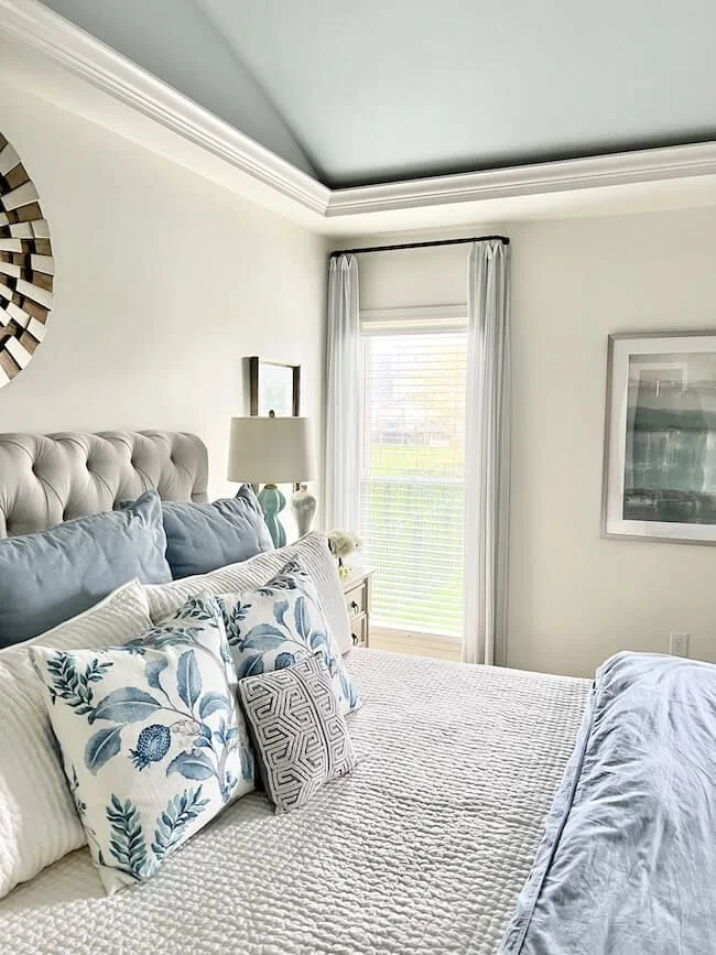
Alabaster is more on the clean and quiet side. It’s perfect if you’re going for a peaceful, airy bedroom. I like how it holds steady, whether it’s morning light or evening lamp glow. It’s a good pick for north-facing rooms that might feel dull otherwise. I’ve even used it in an eggshell finish—it adds a hint of softness without any glare, which is perfect for relaxing spaces.


Exteriors
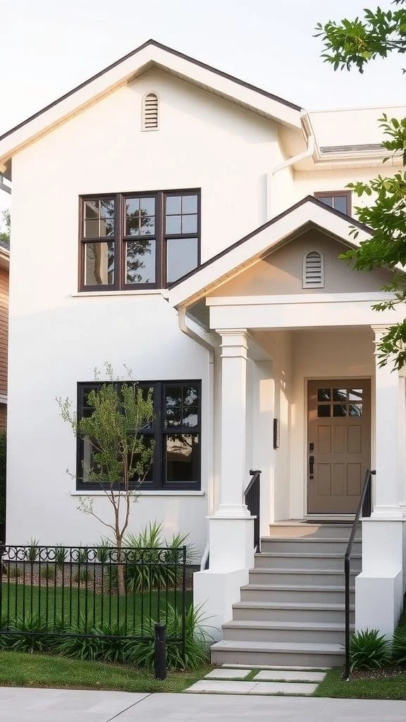
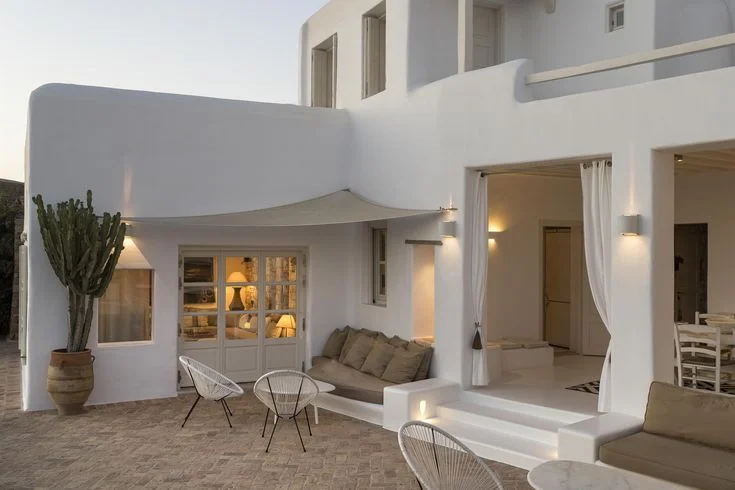
Greek Villa on the outside of a home feels like sunshine in paint form. It’s an absolute dream on stucco or brick, especially in shaded areas where that warm, creamy tone can shine without turning too yellow. I’ve seen it give homes a soft Mediterranean-style charm that fits beautifully in warmer climates like the Southwest. Just a heads-up—on super bright, modern exteriors, it might pull a little too golden under full sun. But if your home has some natural shade or earthy materials, Greek Villa brings it to life.


Alabaster, though, is the calm and steady choice. It keeps its cool outdoors, even near green landscaping or heavy sunlight. I love how it gives a fresh, clean look without feeling stark. It’s especially great if you’re using black, charcoal, or deep green trims—it makes them pop without trying too hard. Whether it’s wood siding or painted brick, Alabaster exterior paint just works. Simple, timeless, and always balanced.


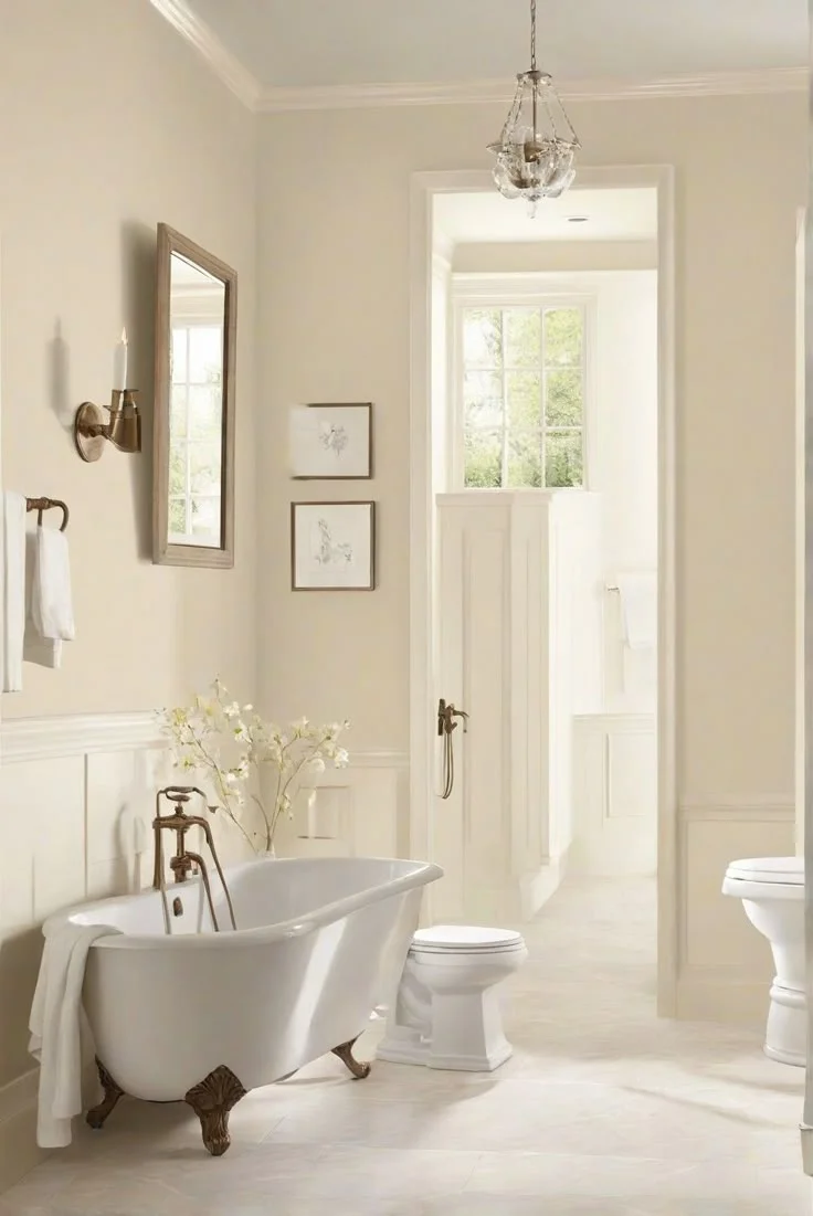
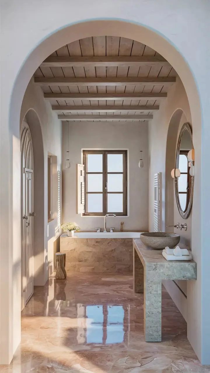
SW Greek Villa vs Alabaster in the Bathroom
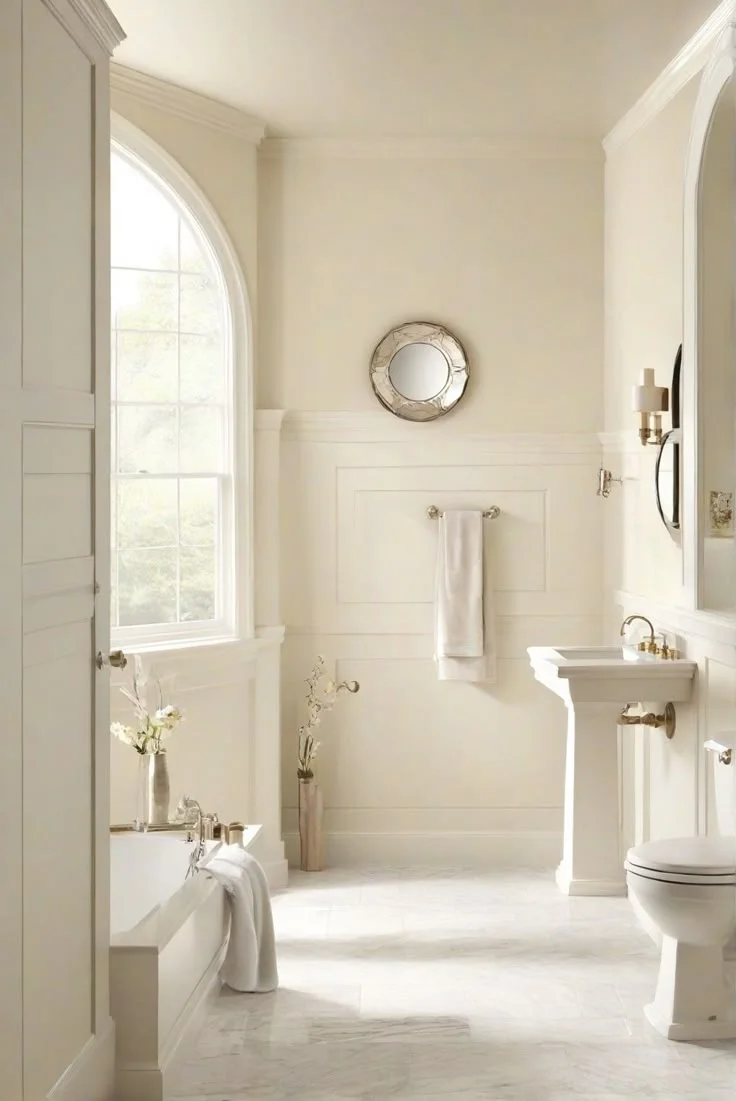
Bathrooms are where light, trim, and tile can totally change how white paint looks—and the difference between Greek Villa and Alabaster is almost unbelievable in tight, moisture-heavy spaces. These rooms usually have smaller windows and more artificial lighting, so undertones become way more noticeable. The kind of trim you use, especially Extra White or warmer tones, also shifts the way these two colors read.
Greek Villa in a bathroom feels creamy right away. I’ve noticed that when it’s next to cooler whites or bright trim, it can lean toward a soft orange-beige tone. In a space with warm tiles or muted trim, though, it brings out a cozy, spa-like vibe. Just know that in bathrooms without good ventilation, the extra humidity can make the warm tones pop even more. I’d stick to using it where you have earthy tile or natural light to balance it out.

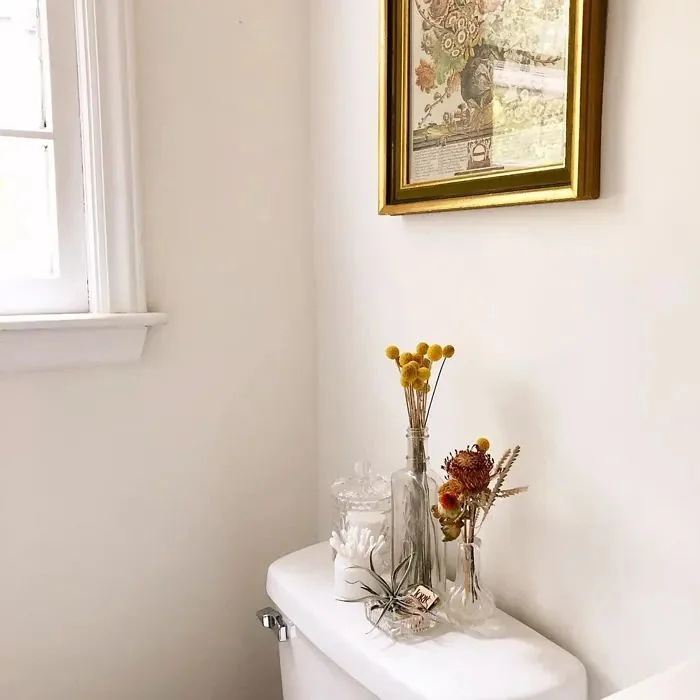

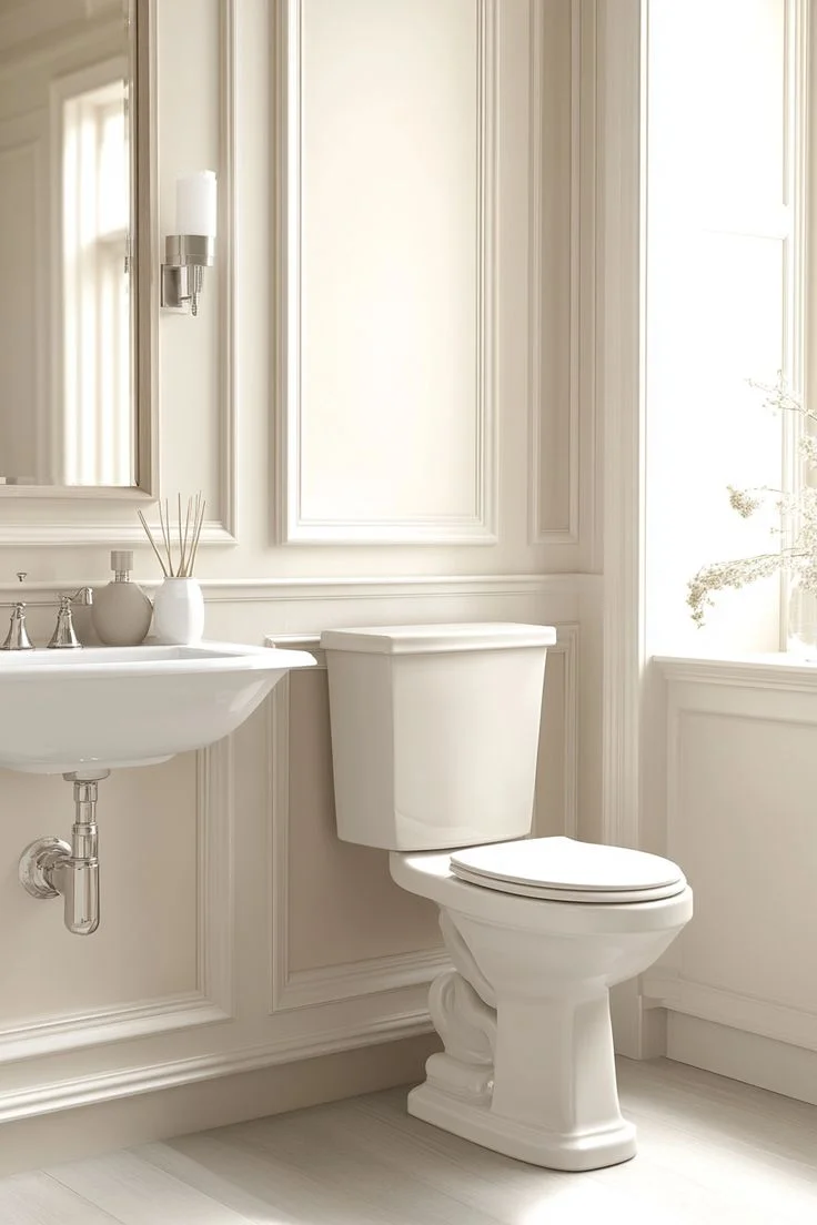
Alabaster, on the flip side, gives off a clean, soft white feel—especially when it’s not sitting next to super bright whites. Alone, it looks calm and simple. But if you pair it with something like Extra White trim, you’ll start to notice that slight yellow-beige warmth come through. That’s actually what makes it great for spa-style bathrooms. I recommend using either color in a satin or semi-gloss finish—it handles steam well without being too shiny.


Comparing Greek Villa vs Alabaster on Cabinets
When it comes to kitchen cabinets, Alabaster is the more popular pick by far—and for good reason. It gives off a soft, creamy white that feels clean but never cold. I’ve seen it paired with warm wood hoods, butcher block counters, even black handles, and it just works. It plays nicely with natural light, and in a satin or semi-gloss finish, it holds up well while still feeling soft and cozy. If you’re going for that farmhouse or soft-modern look, Alabaster kitchen cabinets are a solid go-to.

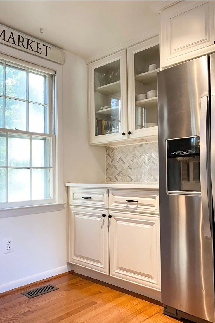

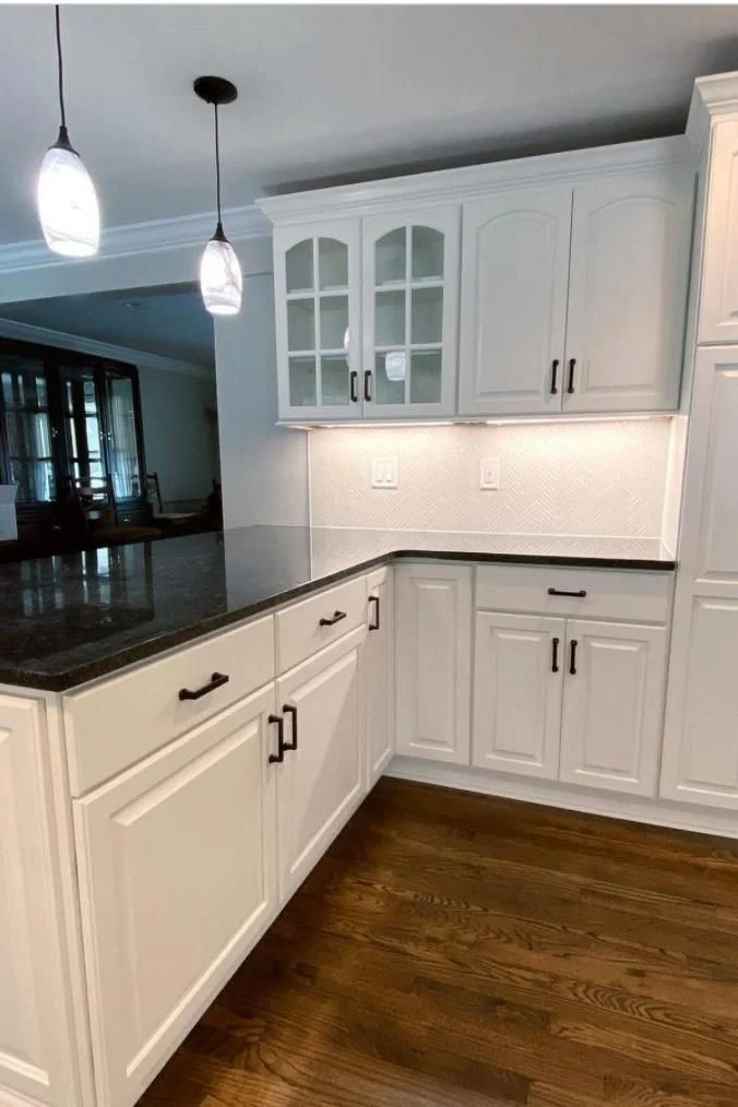
Greek Villa doesn’t show up on cabinets as often, but that doesn’t mean it can’t look great. It leans a little warmer—more beige than Alabaster—especially when you place it next to darker walls or black trim like Tricorn Black. That extra warmth can feel deeper in some lighting, so it’s important to test it first. I think it works best in kitchens with dark floors or bold contrasts. Use a satin sheen to keep it practical without making the creaminess too shiny.


Both colors are creamy white paints from Sherwin Williams, and honestly, lighting and pairings make all the difference. On cabinets, Alabaster is safer and softer, while Greek Villa brings a richer, warmer vibe if you want a touch more depth.
Lighting Impact
Greek Villa really shifts with the light, which can be a good or bad thing depending on your space. I’ve used it in a south-facing room with big windows, and the yellow warmth really came through—almost too much during the brightest parts of the day. But in a north-facing room, it feels just right. The creamy undertone balances out cool shadows and makes the space feel cozier. If you’re using it with warm LED bulbs, try something around 3000K—it helps tone down the yellow without making the color feel cold. I also love how Greek Villa looks next to dark wood floors or heavy trims—it brings a nice, grounded contrast.


Alabaster, on the other hand, stays calm no matter the light. Whether it’s a cloudy day or late afternoon sun, it holds onto that soft white tone. In darker rooms, like a hallway or a bathroom with no window, it still reads clean—not too creamy, not too stark. I’ve also used it near a garden-facing wall, and it doesn’t pick up green reflections like some other warm whites can. It pairs beautifully with white oak flooring or cool gray tiles, and that kind of steady behavior under shifting light makes it one of my go-to paints for rooms with mixed lighting.


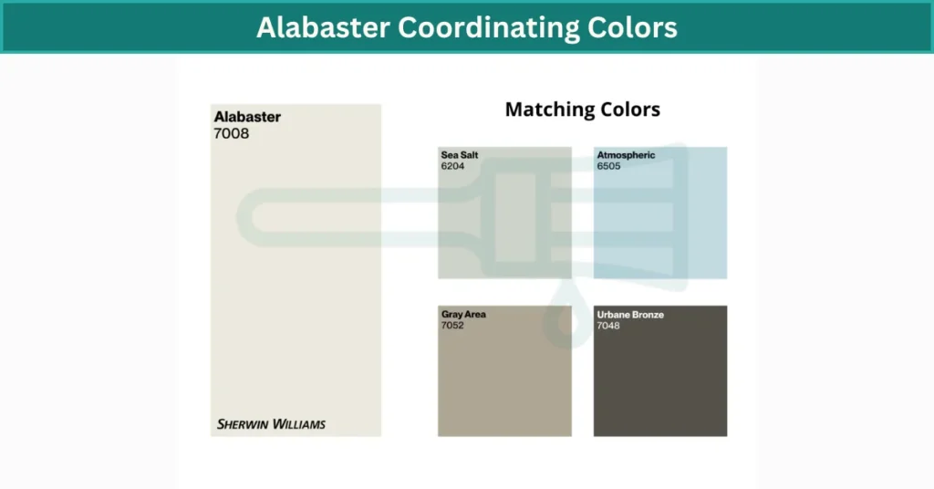
Coordinating Colors
What I love about Greek Villa is how well it plays with bold and classic elements. Its subtle yellow undertone brings warmth that looks amazing next to brass hardware, walnut or red oak floors, and deep blues or greens—like Navy or Pewter Green. I’ve also paired it with black-framed mirrors and iron light fixtures for a more modern vibe, and it still held that soft, creamy balance. Whether you’re going for a cozy farmhouse look or a cleaner transitional style, Greek Villa makes it easy to build a warm, stylish palette. It especially shines in homes with rich textures like wood beams or leather furniture.

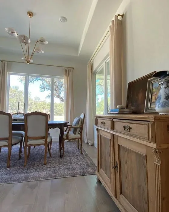
Alabaster is a bit more flexible thanks to its beige-gray undertone. I’ve used it in two-tone setups with Sherwin Williams Useful Gray or Pewter Green, and the results always feel soft and elegant. It blends beautifully with natural stone counters and light wood flooring, especially pale engineered oak. You can even use it on both the trim and walls—just vary the sheen. Satin on the walls and semi-gloss on the molding creates dimension without changing the color feel. If you want a quiet, pulled-together space that still has warmth, Alabaster makes it effortless.
Technical Differences Between Greek Villa vs Alabaster
While Greek Villa and Alabaster are both creamy whites from Sherwin Williams, they behave a little differently when you look closer. Greek Villa has a slightly more beige undertone, which makes it feel a bit warmer in most settings. Alabaster, on the other hand, can shift between a soft yellow or even a touch of gray depending on the lighting. It’s more neutral overall, but less warm than Greek Villa side by side.
In terms of brightness, Greek Villa comes in with a Light Reflectance Value (LRV) of 84, which means it reflects more light and can make a room feel a little more open and airy—especially in spaces with less natural light. Alabaster has a slightly lower LRV of 82, so it reads just a bit more muted or grounded. If you’re trying to brighten up a small, dim space, Greek Villa may give you that slight edge.
What is LRV?
LRV stands for Light Reflectance Value. It’s a number between 0 and 100 that shows how much light a paint color reflects—0 is pure black, 100 is pure white. Most interior paints fall somewhere between 3 and 93. Higher LRV colors like Greek Villa help bounce light around, which can reduce your need for artificial lighting in tight or darker rooms.
What Interior Designers Say About Greek Villa vs Alabaster
From what I’ve seen—and heard—Alabaster tends to be the designer favorite, especially for clients who want a safe, timeless white that works just about anywhere. Many pros call it their “no-fail” white because of how steady it looks across all lighting conditions. Whether it’s going in a modern farmhouse kitchen or a soft-toned bedroom, Alabaster is often the first choice because it plays nice with wood, stone, metal—you name it.
Greek Villa, though, has its fans too—especially among designers working with warmer palettes or Mediterranean-inspired interiors. A few designers I’ve followed love it for its richer, creamier vibe and say it feels more personal and inviting than Alabaster. One mentioned it works beautifully in north-facing spaces that need a little boost of warmth. But many also note it needs to be tested on-site, since that extra warmth can feel too yellow in some lights.
So while both paints have strong design backing, the general advice is: go with Alabaster if you want balance and flexibility, or choose Greek Villa if you’re after warmth, depth, and a little extra glow.
Common Mistakes People Make When Picking Between Greek Villa vs Alabaster
One big mistake I see all the time is skipping the sample test. These two look super similar on a screen or in the can—but once they’re on your walls, the undertones show up fast. Greek Villa can turn way too creamy in rooms with warm bulbs or tons of sunlight, especially if you’ve got white trim nearby. People often don’t realize how much light and surroundings can change the way a color looks.
Another slip-up? Not checking the other elements in the room. Alabaster might seem like a soft white, but next to cooler tones or stark whites like Extra White, it can suddenly feel more beige than expected. On the flip side, using Greek Villa in a cool-toned, modern space without enough warmth to balance it can make things clash. It’s also easy to forget that higher LRV paints like Greek Villa can reflect a lot more light—which might not be ideal in bright, south-facing rooms.
Moral of the story? Always swatch first. And always think about lighting, trim, flooring, and even your bulb color before you commit.
Which Paint Works Best: Modern or Traditional Interiors?
If you’re leaning modern, Alabaster usually wins. It has that clean, soft-white look that fits perfectly with sleek lines, black accents, and minimalist decor. I’ve seen it used with concrete floors, matte black fixtures, even light oak furniture—it stays calm and balanced without pulling too warm or yellow. That makes it a great backdrop for modern styles where you don’t want your walls to steal the spotlight.
But if your style is more traditional or cozy, Greek Villa feels like a better match. It brings a warm, creamy glow that works beautifully with crown molding, antique woods, or rich textiles. It’s the kind of paint that adds character to classic spaces without feeling too heavy. I’ve seen it paired with brass fixtures, deep green trim, and vintage rugs—and it looks right at home.
So here’s how I’d put it: Alabaster keeps things simple and smooth for modern looks. Greek Villa brings depth and charm if you’re after that timeless, traditional feel.
Got it! Here’s a more detailed, designer-style comparison table that not only summarizes Greek Villa vs Alabaster but also gives visual and practical cues—perfect for helping readers make a confident choice and boosting featured snippet value.
Greek Villa vs Alabaster: In-Depth Comparison at a Glance
| Feature | Greek Villa (SW 7551) | Alabaster (SW 7008) |
|---|---|---|
| LRV (Light Reflectance Value) | 84 – reflects more light, making spaces feel brighter and more open | 82 – slightly less reflective, gives a softer, grounded look |
| Undertone | Warm, creamy with subtle yellow-beige base | Warm with soft beige-gray (greige) undertones |
| Overall Appearance | Feels rich, cozy, and sun-kissed in well-lit spaces | Feels calm, balanced, and clean in all lighting conditions |
| Best For | North-facing rooms, Mediterranean styles, warm interior palettes | Farmhouse styles, trim/molding, spa-like or minimalist interiors |
| Lighting Behavior | Can look more yellow in southern light or with 2700K bulbs | Holds neutral tone in both natural and artificial light |
| Room Fit | Ideal for bedrooms, shaded exteriors, and kitchens with earthy tones | Great for bathrooms, kitchens, and dark rooms |
| Trim & Ceiling Pairings | Works well with Extra White or creamy trims | Pairs beautifully with Accessible Beige, Pewter Green, or cooler whites |
| Common Material Matches | Walnut floors, brass hardware, warm tiles | Light oak flooring, black hardware, natural stone counters |
| Finish Suggestions | Satin for walls, semi-gloss for trim (enhances creaminess) | Eggshell or satin for walls, semi-gloss for cabinetry/trim |
| Vibe / Mood | Warm, welcoming, classic and traditional | Clean, soft, timeless and modern |
Greek Villa vs Alabaster Which is Better for You? Let’s Sum It Up
When it comes to exteriors, Greek Villa and Alabaster are incredibly close—so close that in similar lighting, they often look almost identical. Both read as creamy white, especially when paired with neutral materials like stone, light brick, or wood. On a sunny day, you might barely notice a difference unless you’re really looking for it.
Still, each color has its little quirks. Greek Villa leans slightly more beige, which becomes noticeable on overcast days or in shaded areas—it gives off a soft, earthy warmth. Alabaster, by contrast, can pick up a gentle yellow tint depending on the surrounding elements, like nearby greenery or brightly colored trims. Both pair beautifully with black or dark bronze trim, though Greek Villa may show a hint more contrast due to its warmer undertone.
In the end, there’s no wrong choice—just different vibes. Greek Villa might suit you better if you’re aiming for a richer, sun-warmed feel, while Alabaster is perfect for a soft, fresh look that stays neutral. I always tell people: test large swatches on your exterior walls in morning, noon, and evening light. That real-life look will tell you more than a paint chip ever can.
FAQs Greek Villa vs Alabaster
Which is better, Greek Villa or Alabaster?
It depends on your space. Greek Villa is warmer and creamier—great if you want a cozy, sunlit feel. Alabaster is more balanced and neutral, making it better for all kinds of lighting. If you’re unsure, test both in your room. There’s no one “better”—just what works best in your home.
When should you avoid using Greek Villa?
Avoid Greek Villa in very bright, south-facing rooms or under warm LED lights—it can start to look too yellow. It may also feel too warm in modern spaces with cool tones or bright white trim. Always test it first to make sure the warmth works for your design.
Does Joanna Gaines use Alabaster?
Yes, she does! Alabaster is one of Joanna Gaines’ go-to whites. It fits her farmhouse style perfectly—soft, warm, and timeless. She’s used it on walls, trim, and even exteriors.
Is Alabaster too yellow in certain lighting?
Sometimes, yes. In rooms with warm lighting or a lot of wood tones, Alabaster can pick up a soft yellow-beige tint. But it usually stays calm and creamy. If you’re using cool lighting or pairing it with crisp whites, it reads more neutral.
What color does Joanna Gaines use the most?
Alabaster is definitely one of her favorites, but she also uses colors like Shiplap, Magnolia Home True White, and Gatherings. Still, Alabaster is often the top choice in her home makeovers for that soft, lived-in white look.
Is Alabaster more gray or more beige?
Alabaster leans more beige than gray. It has a subtle mix of warmth and softness, with just a hint of greige in certain lights. But overall, it feels more like a creamy off-white than anything gray.