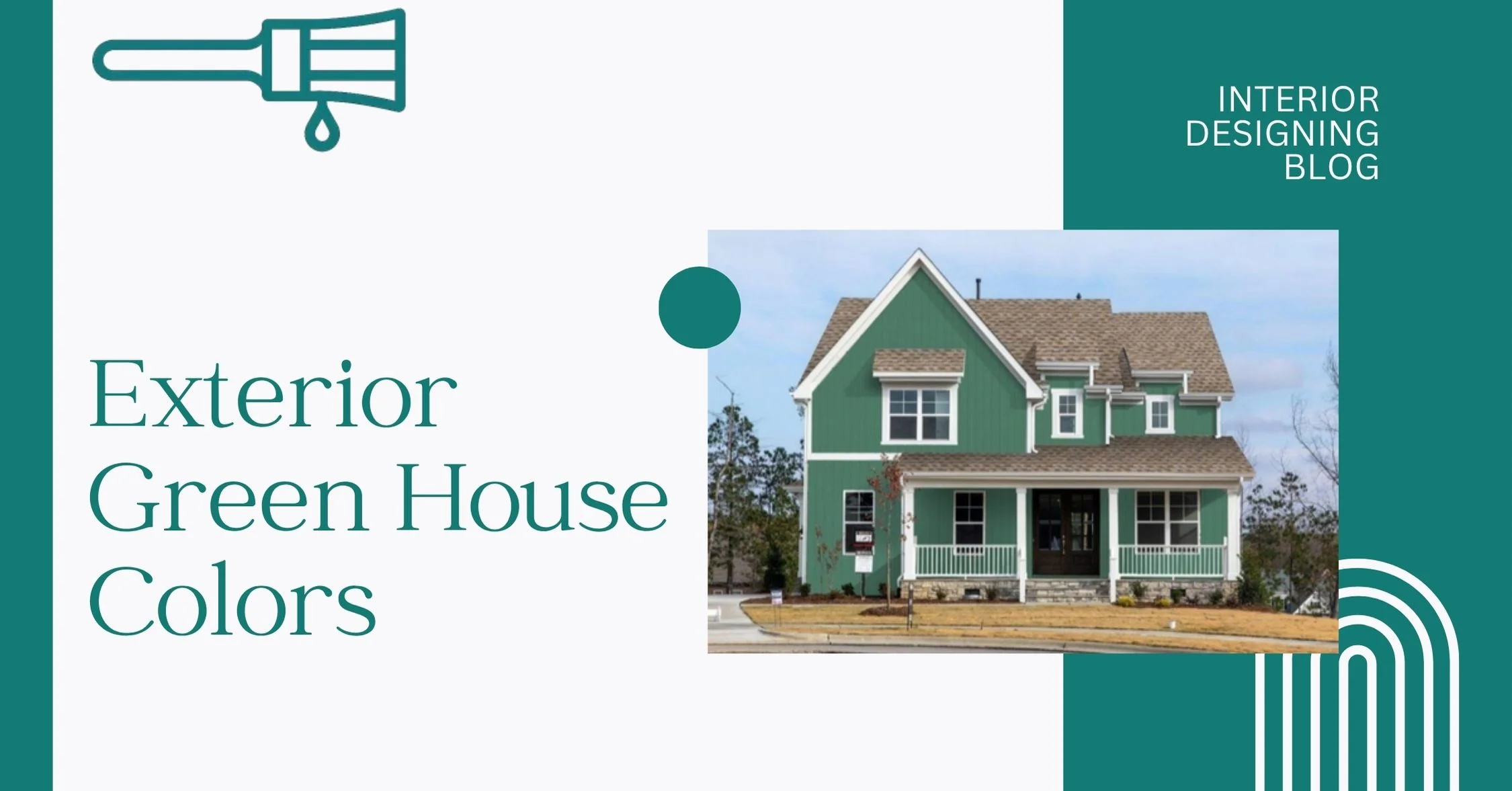
15+ Best Exterior Green House Colors
Picking the right Exterior Green House Colors? Yeah, that’s not as easy as it sounds. I’ve seen people stare at paint chips for days—because one wrong shade and the whole vibe’s off.
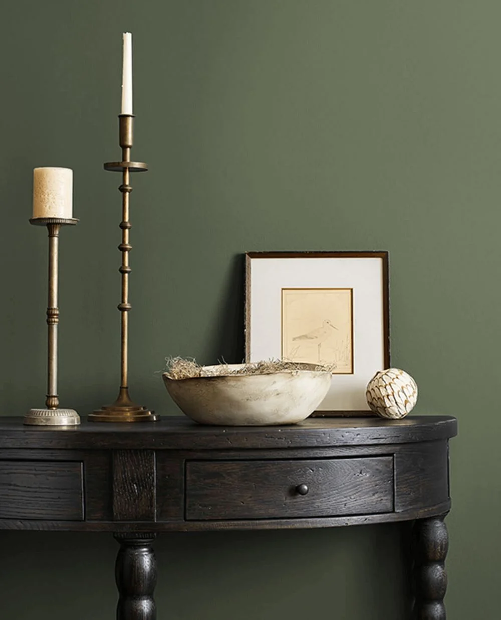
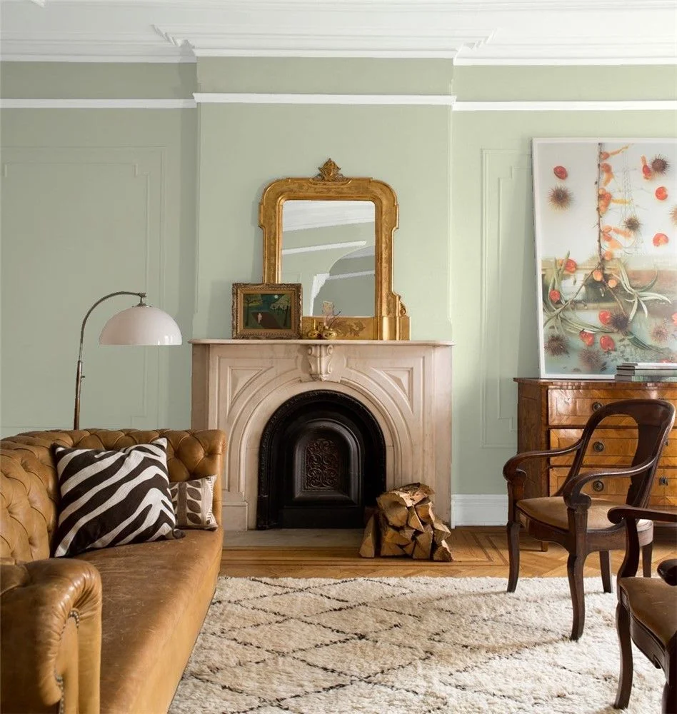
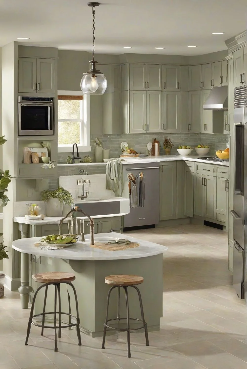
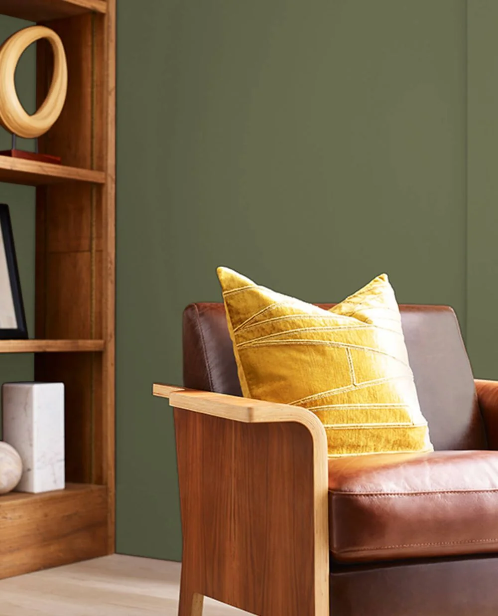
Green is cool because it kind of fits in anywhere. Want that soft, cozy feel? Go sage. Want bold and fancy? Try something deep and dark. Some of the best green paint colors for house exterior can make your place look calm, rich, or even a little modern—depends on how you use it.
I’ve also noticed that exterior green shades blend super well with trees, plants, and stone. Feels natural but still polished. Some folks even say upscale green paint tones like olive or sage help with resale. Not sure if that’s 100% true everywhere, but honestly—it makes sense.
Anyway, Interior Designing Blog put together a list of green house color ideas that range from soft and safe to bold and showy. So whether you want a calm cottage look or a modern green exterior paint color look, there’s something here that might just work for you.
Best Exterior Green House Colors
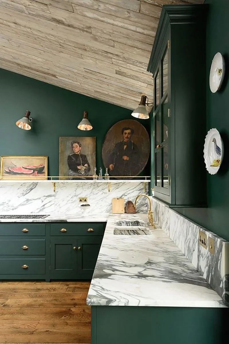
1. Deep Elegance: Black Forest Green by Benjamin Moore
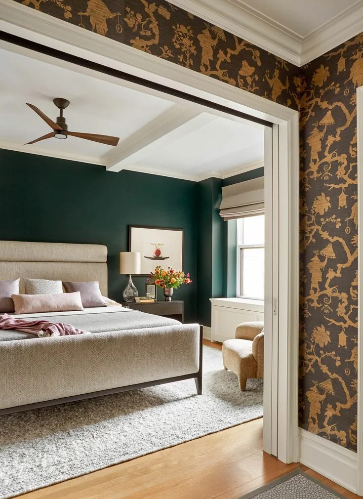
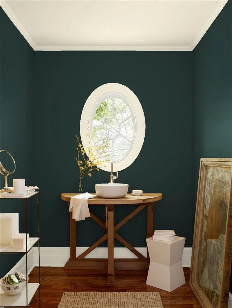
Black Forest Green is one of those colors that feels rich the second you see it. It’s a deep green paint with black undertone and just a hint of blue mixed in. Honestly, I’d say it looks almost black in the shade—but step into the sunlight, and that deep forest green starts to shine through.


Because of its super low LRV of 2.72, this color stays moody and dramatic. That makes it perfect as an exterior green paint for wooded homes or places surrounded by tall trees and lots of shade. I’ve seen it look stunning with white trim—it cuts the darkness just enough to give your home that upscale, clean look.
It also pairs really well with stone paths, cedar siding, or dark roofing. Think cozy cabin, but way more polished.
If you’re looking through Benjamin Moore green exterior colors, this one pops up on a lot of “top picks” lists. No surprise there. It works with almost any house style—craftsman, farmhouse, even modern—and gives off serious dark green house color ideas vibes without being boring.
2. Classic Drama: Rookwood Dark Green by Sherwin Williams
Rookwood Dark Green has that strong, moody look at first—but once it’s on the house and hits the sunlight, it softens up a bit. Outside, it turns into this rich, almost velvety green that feels super elegant without trying too hard. It’s part of the Sherwin Williams green paint Historic Color Collection, so yeah—it’s got some real street cred for older homes.


I’ve seen it look amazing on Victorians. It brings out all the little details and gives them that classic, timeless vibe. But it also works on sleek, modern houses too. Pair it with white trim or light wood—something to break up the dark. That contrast really helps it pop. If you’re going for Victorian house green paint or want a more modern dark green exterior, this one does both.
Now, heads up—on north-facing walls, it might feel a bit too dark. If that’s your situation, maybe try a lighter green paint for those sides. And definitely test it first. Peel-and-stick samples or swatches help avoid surprises. This is one of those green paint for north-facing walls decisions where testing saves regret.
3. Earthy Elegance: Saybrook Sage by Benjamin Moore
Saybrook Sage is one of those colors that just feels right. It’s a soft green house paint with a little gray mixed in, so it doesn’t shout—it whispers. I’d say it works beautifully on Colonial and modern home color styles. It’s calm, clean, and never too trendy.


Because of the green with gray undertone, it kind of blends into nature. Looks great if your place is near trees or even close to the coast. There’s just enough green to keep things interesting, but the gray keeps it grounded. That balance makes it feel natural but still fresh.
Want to make it pop a little? I’d go with white trim, stone paths, or some light natural wood. Those touches bring out the best in it. And yep, it’s part of the Benjamin Moore sage green Classic® Color Collection—so you know it’s been tested by real pros. A safe, stylish bet for an Saybrook Sage exterior that won’t age out.
4. Timeless Depth: Studio Green by Farrow & Ball
Studio Green is one of those colors people skip over at first—but man, they’re missing out. It doesn’t jump off the sample card, but once it’s on a house? Totally different story. A Studio Green exterior feels rich, bold, and kind of mysterious in the best way.


This one’s a dynamic exterior green that plays tricks with the light. In full sun, you’ll catch a deep green that feels alive. But once the clouds roll in or shade hits? It shifts into this near-black tone that adds serious drama. That’s thanks to its super low LRV of 6—it just doesn’t reflect much light, which makes it so moody and cool.
Pair it with white trim if you want contrast. Or go full earthy and use stone, raw wood, or even copper details. I’ve seen it on cottages and big old houses—it works either way. It’s bold but not loud.
And here’s the fun part—Farrow & Ball paint created this shade in their original studio. That’s where the name comes from. It’s a traditional green paint color with roots, and it shows. If you’re after a green that shifts to black and tells a quiet design story, this one nails it.
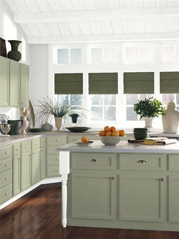
5. Grounded Elegance: Aegean Olive by Benjamin Moore
Aegean Olive has this calm, earthy vibe that I really like. It’s a blend of deep green and brown—nothing too bold, just soft and steady. That mix gives it a grounded feel. If you’re after a Benjamin Moore green-brown paint that doesn’t scream for attention but still feels rich, this one’s solid.


As an Aegean Olive exterior paint, it works best when your house is wrapped in trees, gardens, or stone paths. It blends right into the landscape, almost like it was always meant to be there. I’d say it’s a great pick for folks who want a natural exterior house color that plays nice with the environment.
It’s not flashy, but that’s the point. This is a foundation color—a background that makes everything else look better. The soft brown in it adds just enough depth to keep things interesting. For a peaceful green facade, this one hits the mark.
And yep, it’s part of the Historical Color Collection, which makes it a trusted pick for restorations or timeless builds. Add some copper lights or warm wood shutters, and you’re good to go. Feels classic without trying too hard.
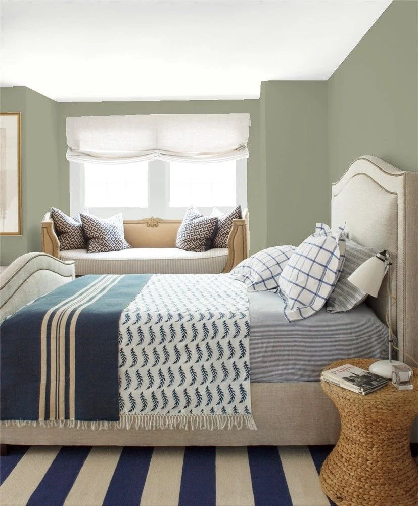
6. Subtle Charm: Sage Mountain by Benjamin Moore
Sage Mountain is a Benjamin Moore earthy green that keeps things soft and natural. It’s a muted green exterior paint with just a hint of warmth—perfect with dark shutters, wood doors, or even green with copper accents. The combo feels cozy but still put-together.


What’s great is how easy it is to work with. The color has a mellow tone that slides right into HOA-approved house colors, making it safe for neighborhoods with strict paint rules. As a Sage Mountain exterior color, it’s calm, clean, and works well on ranch homes or quiet suburban streets.
With a mid-range LRV (around 25–30), it doesn’t get too bright or too dull—just stays grounded. A safe pick that still feels special.
7. Bold Sophistication: Salamander by Benjamin Moore
Salamander is one of those shades that keeps you guessing. In bright light, it shows off as a deep, bold green siding color. But in the shade? It shifts to almost black. That’s because of its super low LRV of 5.64—this Benjamin Moore green-black absorbs light like crazy.


What sets it apart, though, are the yellow-green undertones. That bit of warmth keeps it from feeling too cold or heavy. It’s dramatic, sure—but also kind of welcoming. You get that deep moodiness without the harsh, flat look some dark greens give. It’s a green with yellow undertones, and it totally changes the vibe.
You can go all-in and use Salamander exterior paint for full siding, or just hit key spots like shutters, trim, or the front door. Either way, it makes a strong style statement without feeling over the top.
Quick tip from experience—if you want more of the green to show, use it on spots that get direct sun. In shady areas, it leans dark—almost like you painted it black. Super cool, but worth testing first.
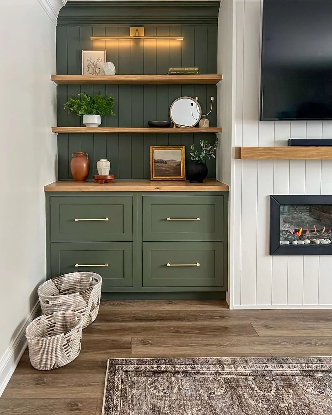
8. Soft & Versatile: Louisburg Green by Benjamin Moore
Louisburg Green is one of those colors that just works. It’s soft, a little muted, and super livable. Think of it as a green with gray undertone—not too bold, not too plain. It feels calm but still has personality. That’s why I like it as a natural green house color for homes that don’t want to shout.


In shade, it leans toward a soft pine green paint—cool and cozy. But in full sun, it deepens into something richer and more vibrant. It pairs great with wood siding, stone paths, or even clay roof tiles. Really good for folks going for that grounded, earthy feel. Add some muted bronze lights and you’re golden.
Now, heads-up—on north-facing walls, it can look a bit cooler than expected. So if you’re picky about warmth, maybe test it out first. Try a sample patch and check at different times of day. This Louisburg Green exterior is charming, but like any good green, it changes with the light.
9. Nature’s Neutral: Oakmoss by Sherwin Williams
Oakmoss (SW 6180) is one of those colors that just feels right in nature. It’s a warm green with gray undertones, plus a soft hint of yellow that makes it feel earthy and grounded. If your house is surrounded by trees, stone, or a big garden, this shade blends in without trying too hard. A great pick for green for wooded homes.


What’s cool about it is how it shifts. Depending on the light, it moves between a gray-green and a soft brownish green. That subtle change makes it super flexible. I’ve seen it on everything from traditional farmhouses to modern craftsman homes, and it fits all of them. Definitely one of those Sherwin Williams green paint shades that’s easy to work with.
It also works great as a green neutral exterior color—meaning, it won’t steal the spotlight but still gives your home personality. A nice solid base.
If you want to finish it off clean, I’d say go with white trim. It adds that classic balance and keeps everything feeling fresh. Oakmoss SW 6180 is part of the Living Well™ collection, too—so yeah, calming and homey, just like it sounds.
10. Forest Depth: Jasper by Sherwin Williams
Jasper (SW 6216) is one of those colors that tricks you—in a good way. On the chip, it might seem like just another deep green. But once it’s on your house? Totally different story. It’s a deep forest green exterior with serious mood. With a low LRV green paint rating of 4, this one reads almost black in the shade, but still keeps a sense of richness.


In full sun, you’ll catch little shifts—sometimes a warmer green, sometimes it leans a little cool or bluish. It’s kind of like looking into a forest at different times of day. That changing tone keeps it interesting without being loud. Definitely a true green-black house color, but it never feels cold or flat.
You can use Jasper SW paint as a full exterior shade if you’re going bold, or just hit the front door or shutters if you want a statement moment. It works for both modern builds and traditional homes. And if you want it to feel balanced? Add matte brass or brushed nickel fixtures. That contrast makes everything feel just right.
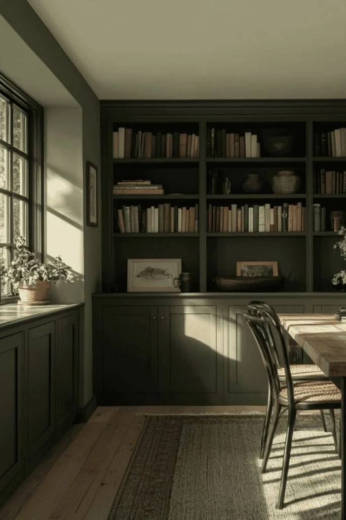
11. Timeless Contrast: Hunter Green by Benjamin Moore
Hunter Green has that classic charm that never really goes out of style. It’s a Benjamin Moore dark green with a subtle cool undertone, which gives it a bit of depth and makes it feel more layered than flat. I’d say it’s perfect if you want something bold but not overwhelming.


Pair it with white trim, and you’ve got that classic green house color look—like those picture-perfect Colonial or Cape Cod homes. The cool undertones really come through on cloudy days, which keeps your exterior from feeling dull or heavy.
With a low LRV green paint rating of 6.39, it’s definitely on the darker side. But even in full sun, it holds its richness and doesn’t wash out. That’s one of the reasons Hunter Green exterior paint is a go-to for designers who want that deep, timeless feel.
If you want to bring out the best in it, try a satin or low-lustre finish. It makes the color feel even richer and helps the walls stay cleaner over time.
12. Modern Drama: Vintage Vogue by Benjamin Moore
Vintage Vogue is that cool in-between color when black feels too harsh and brown feels too safe. It’s a Benjamin Moore dark green with an upscale vibe—perfect if you want an alternative to black exterior without losing that bold, dramatic look. It’s moody but still has depth.


During the day, Vintage Vogue exterior paint shows off its green side—rich and confident. But as the sun drops, it shifts toward this sleek, graphite-like tone that feels super refined. It’s the kind of color that changes with the light, keeping things interesting without being loud.
What keeps it balanced is the pigment mix. It’s made with green, black, and just enough yellow oxide to soften it. That blend keeps it from feeling too sharp or cold. With an LRV around 11, it’s dark enough to add drama, but not so deep that it sucks up all the light.
Want a sharp finish? Try pairing with matte black windows, cream trim, or natural wood accents. This is that upscale green house color that quietly steals the show.
13. Warm & Balanced: Green Onyx by Sherwin Williams
Green Onyx is one of those shades that just feels easy. It’s a muted green house color with a soft, warm vibe—never too much, never too plain. With an LRV of 31, it sits right in that sweet spot where it holds color but doesn’t feel heavy. If you’re after a Sherwin Williams medium green that brings calm without being dull, this is a solid pick.


In super sunny spots—think Arizona or Florida—it lightens up a bit, almost like a soft warm sage exterior. But it still holds onto its warmth when the clouds roll in. That’s what I like most—it’s steady. Doesn’t go flat, doesn’t look cold.
As a Green Onyx SW exterior paint, it blends right in with trees, shrubs, and stone. So if your house is wrapped in gardens or natural stuff, it fits without fuss. That’s why it’s a green that blends with nature, not fights it.
It’s also part of the Timeless Color collection, so it’s designer-trusted. Try pairing it with white stucco or tan brick if you want that clean, Mediterranean look.
14. Organic Tranquility: Lichen by Farrow & Ball
Lichen by Farrow & Ball takes its name straight from nature. Think moss-covered stones or the soft green of tree bark after a rain. It’s a soft green house color that feels calm, lived-in, and earthy. Nothing too sharp, nothing too showy—just quiet charm.


This shade has a green with gray undertone, which gives it balance. In the sunlight, it warms up a bit and feels inviting. In the shade, it turns more muted and settled. That natural shift makes it feel like part of the landscape, not something sitting on top of it.
The Lichen Farrow & Ball exterior works beautifully on cottages, garden homes, and older houses with character. Pair it with white trim, stone paths, or wood accents for that timeless, storybook feel. It’s also a great earthy green paint for cottage lovers who want softness without going pastel.
Lichen is part of the Estate Collection—Farrow & Ball’s eco-friendly, heritage-grade line. For an extra touch, try adding clay pots or brushed brass lights. It all ties together in that traditional green exterior look that just feels right.
15. Muted Sophistication: Pewter Green by Sherwin Williams
Pewter Green (SW 6208) has become a quiet favorite for a reason. It’s a muted green house paint that feels calm, grounded, and just a little moody. With green with gray undertones and a soft slate finish, it gives off that relaxed, designer look—without trying too hard.


It holds up beautifully in all kinds of lighting. In the sun, the color deepens and shows more richness. In shade, it cools down and feels more reserved. That flexibility makes it super easy to live with. With an LRV of 12, it’s dark enough to feel dramatic, but not so deep that it goes black. A great pick if you want something in between.
Pewter Green SW 6208 fits in just about anywhere. I’ve seen it on farmhouse exterior green siding, craftsman-style bungalows, and even sleek, urban remodels. It works full-body or as a sharp accent on shutters, garage doors, or trim.
Pair it with warm wood tones, creamy whites, soft tan brick, or even off-black for contrast. Want a touch of luxe? Add brushed gold or copper lights by the door. This Sherwin Williams deep green exterior shade knows how to keep things stylish but simple.
Real-Life Exterior Examples of Green Paints
I’ve seen green paints totally change the look of a house—sometimes in a good way, sometimes… not so much. But when it’s done right? It feels warm, natural, and kind of timeless. Let me give you a few real-life takes I’ve come across:
- One homeowner used Black Forest Green on their cottage near the woods. With white trim and a stone chimney, it looked bold but still blended in. They said it looks black at night, green in the morning—pretty cool.
- A couple in Florida painted their bungalow in Green Onyx. Under that bright sun, it turned into a soft sage tone. Paired with tan brick and a clay roof? Super cozy and bright.
- A Victorian home I spotted online had Rookwood Dark Green siding with crisp white trim. The contrast brought out all the little design details. It looked rich without feeling too heavy.
- A newer modern build used Pewter Green across the full siding, with black windows and wood garage doors. Simple, but classy. It had that “I’ve got good taste” vibe without going overboard.
If you’re ever unsure, drive around and check what’s working in your neighborhood. Sometimes seeing a green with gray undertone or a bold green siding color in person is what makes it click.
How Green Paint Looks in Different Lighting
Here’s the thing with green paint—it doesn’t stay the same all day. I learned this the hard way when what looked like a soft sage on the sample turned into army green once it hit the shady side of my house.
In direct sunlight, greens tend to brighten up. Lighter greens like Saybrook Sage or Green Onyx can look almost pastel in strong sun. Darker ones like Salamander or Jasper show more of their green side and feel richer.
In the shade or on north-facing walls, greens often go cooler or more muted. A color like Louisburg Green might look soft and piney in one spot but lean almost gray in another. And something deep like Black Forest Green? Might look straight-up black in low light.
Cloudy days pull out undertones too. If there’s any yellow or brown in the mix (like Aegean Olive), it shows up more when the light is soft.
So yeah—green paint for house exteriors is a little unpredictable. Always test patches in different spots and check them morning, noon, and evening. Trust me—it saves you from a lot of “wait, why does it look like that now?” moments.
Tips for Testing Green Paints on Your Exterior
Testing green paint? Yeah, don’t skip this step. What looks great on the swatch might look totally different once it’s outside.
1. Always test outside, not indoors.
Sounds obvious, but a lot of folks test in their garage or inside the door. Natural light hits way different outside—especially for green shades.
2. Try big swatches.
Little paint chips lie. Go at least 2’x2′ if you’re brushing it on, or use peel-and-stick samples. You’ll get a better feel for how the color plays on a bigger surface.
3. Test on multiple sides of the house.
Green can shift big time depending on light. Test on a sunny side and a shady side. For example, a muted green house color like Sage Mountain might look warm in sun but cooler in shade.
4. Look at different times of day.
Morning light is soft. Midday is harsh. Evening adds shadows. Greens like Pewter Green SW 6208 or Lichen Farrow & Ball exterior can change tones as the light moves.
5. Check it with trim and roof colors.
Don’t just look at the green alone. Put it next to your actual roof, brick, or trim. Something like Hunter Green exterior paint pops with white trim but might clash with a warm-toned roof.
Bottom line? Take your time. A little testing now saves you a lot of regret (and repainting) later.
Mistakes to Avoid When Choosing Exterior Green House Colors
I’ve seen a few green paint jobs go sideways—and usually, it’s not the color’s fault. It’s how it was picked. Here’s what to watch out for:
1. Choosing from a paint chip alone
Those tiny samples lie. A Sherwin Williams deep green exterior might look fresh on paper but turn almost black on your wall. Always test big swatches outside.
2. Ignoring lighting
This one’s huge. Green with gray undertones can look soft and elegant in sun, but go dull in shade. Or worse—turn weirdly blue or too brown. Test on all sides of the house and at different times of day.
3. Forgetting about trim and roof
Green needs good backup. If your trim is too creamy or your roof has red tones, some greens can clash hard. Make sure your muted green house paint plays nice with what’s already there.
4. Going too bold without balance
Colors like Salamander or Jasper are gorgeous—but dark. Without white trim or warm accents, they can make a house look flat or gloomy.
5. Not considering the neighborhood
If you live in a strict HOA or a row of beige homes, a bold green-black house color might stand out too much—and not in a good way.
Play it smart. Green’s tricky but worth it when you get it right.
Real User Fixes & Community-Backed Solutions
While scrolling through r/ExteriorDesign, we found a post from a frustrated homeowner searching for the perfect dark green exterior paint. They had already tested a bunch of shades from Sherwin-Williams and Benjamin Moore — like Jasper, Forest Canopy, Essex Green, and Black Forest Green — but nothing looked right in full sun. Each sample seemed to lean too blue or washed out under daylight, even though they looked perfect on swatches or in low light.
Fellow Redditors chimed in with sharp observations. Many agreed the tested colors appeared too teal or blue in tone, especially in bright sunlight. One user nailed it by identifying the mystery shade in the original photo as Benjamin Moore Chrome Green, which has the deep richness the OP was after. Others suggested getting a custom mix or choosing “green-tinted black” shades for that bold, moody look that holds up in sun. The takeaway? With green exterior paints, lighting changes everything, and sometimes the best solution is a custom blend that dials in just the right undertones.
We came across a lovely thread on r/centuryhomes where a homeowner asked for help choosing the perfect green shade to repaint their 1920s house. They were leaning toward historic colors and planned to remove the shutters for a cleaner look. With so many greens out there — from bold forest tones to soft sage — they turned to the community for ideas that would respect the home’s character and charm.
The responses were full of thoughtful suggestions. Many users pointed them toward Benjamin Moore’s Historic and Williamsburg color collections, with shades like HC-130 getting special praise. Others recommended Sherwin-Williams’ period-appropriate greens such as Roycroft Bronze Green, Pewter Green, and Rookwood Shutter Green. One user even suggested skipping green altogether and going for contrast with a creamy yellow or powdery blue, given the lush greenery surrounding the home. Overall, the thread was a great mix of aesthetic advice and historical appreciation — exactly what you’d hope for when repainting a century-old gem.
Final Verdict for Exterior Green House Colors
Green is one of the most flexible and natural-looking exterior paint choices out there. Whether you lean into soft sages, deep forest tones, or muted olive shades, green has this rare ability to feel cozy, classy, and timeless—all at once. It pairs effortlessly with stone, wood, and white trim, and it fits in just as well on a modern build as it does on a century-old cottage.
But here’s the deal—green isn’t a one-shade-fits-all color. Lighting, trim, roofing, and even your surroundings can totally shift how it looks. So take your time, test in real daylight, and make sure it works with your home’s vibe. Get it right, and green might just be the best paint decision you make.
People Also Ask
What is the best color for a green house?
The best colors for a greenhouse are soft, nature-inspired tones that help it blend into the outdoor space. Popular options include leaf greens for a natural look, stone shades like gray or off-whites for an earthy feel, and bright white or neutral tones for a clean, light-filled finish. These greenhouse paint colors reflect the surrounding environment and create a calm, timeless vibe.
Is green a good color for house exterior?
Yes, green is a great choice for an exterior. It gives off a woodsy, outdoorsy vibe that feels calm and welcoming. From dark green to light green, the tones mimic colors found in nature, making the house feel like it belongs in the landscape. Pairing it with chestnut brown trim, tree bark shingles, or natural stone helps create a forest-friendly appearance that’s both stylish and grounded. Whether you’re tucked into the woods or just want a peaceful, natural look, green exterior house colors get the job done beautifully.
What is the most beautiful shade of green?
Many people consider Pine Green the most beautiful shade of green. It has that deep, muted tone that feels like a quiet walk through evergreen forests—serene, grounded, and full of timeless beauty. The mix of blue and green undertones gives it a soft richness that’s never too loud. It’s a color that feels stable and confident, perfect for someone who wants their home to show quiet sophistication without shouting for attention.
What is the best color for an outside house exterior?
If you want something that looks good and hides stuff like dirt or small scratches, go for medium to dark shades. Light colors show dirt pretty fast, especially near the bottom of the house. Medium to dark blue is a solid pick—it’s classic, easy to keep clean, and doesn’t show every little scuff. Same goes for earthy greens or warm grays. At the end of the day, the best color for exterior really depends on what kind of vibe you want—but if you don’t want to be out there scrubbing your siding every week, skip the super light tones.
How do I choose the color of my exterior house?
Start by looking at your natural surroundings—trees, sky, stone, or even the dirt around your home can help guide the vibe. Then check what colors your neighbors use; you’ll want something that fits without blending in too much. If you like to play it safe, grays and neutrals are always in style. Want something with more personality? Go with bolder colors that show off your taste. Think of your home exterior palette as an expression of your style, but make sure it still works with the landscape and any neighborhood rules. And hey, trends come and go—personal preferences last way longer.