Dover White vs Alabaster: How to Choose Between Two Popular Whites
Picking a white paint sounds easy… until you’re standing in the aisle staring at what feels like 47 shades of snow. Been there. And honestly? Dover White vs Alabaster are two of the most talked-about picks — and yeah, they look super similar at first. Both are warm white tones. Both show up on design blogs and Pinterest boards. And both are called the “best white paint” by someone, somewhere.
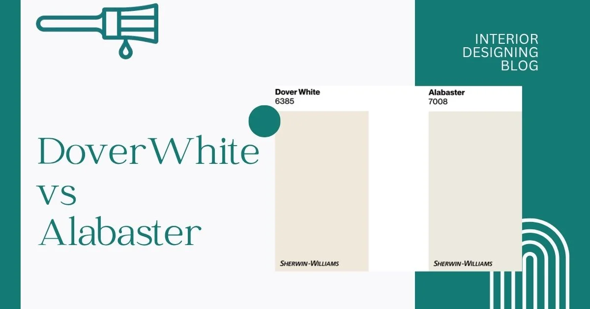
But here’s the thing from interior designing: they’re not exactly the same. Dover White has an LRV of 83, Alabaster is 82 — pretty close, but that tiny change can matter depending on your space. I’ll break down how they look, where they work best, and which one might actually fit your home. Check out my personal paint color comparison picks here.
Dover White vs Alabaster: Key Differences Side-by-Side
These two colors — Alabaster and Dover White — pop up everywhere. Scroll through Pinterest or peek inside a designer’s portfolio, and chances are, you’ll spot one (or both). They’re both warm white paints from Sherwin Williams, and honestly, I get the hype. They feel soft, not stark. And they go with pretty much everything.
Alabaster leans a bit more modern and clean. It’s the kind of white that works in open spaces and newer homes. SW Dover White, on the other hand, brings a bit more creaminess and a cozier, lived-in look — kind of like your grandma’s warm hug in paint form. They’re both lovely, but they don’t do the same job.
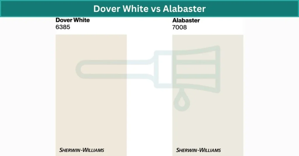
Now, what makes them different? It comes down to LRV and undertones. LRV, or Light Reflectance Value, tells you how much light a color bounces around. Alabaster has an LRV of 82, and Dover White sits just a bit higher at 83 — not a huge jump, but noticeable in bright rooms. Then there’s undertone. Alabaster Sherwin Williams has a soft greige-beige feel, while Dover White shows more creamy yellow. And yes — things like lighting, paint finish, and even what direction your room faces can shift how they look. For example, north-facing rooms might make Alabaster feel cooler, while south-facing windows bring out more warmth in Dover White.
Alabaster vs Dover White
| Feature | Alabaster | Dover White |
|---|---|---|
| LRV (Brightness) | 82 – soft and slightly muted | 83 – a bit brighter but still cozy |
| Undertones | Greige-beige, calm and soft | Creamy yellow, feels warmer and richer |
| Style Fit | Transitional, modern, minimalist | Traditional, farmhouse, vintage |
| What to Watch For | Can look dull in dark rooms | May look yellow in certain lighting |
| Best Use Cases | Open spaces, walls with black or wood accents | Cozy bedrooms, trim, homes with warm decor |
💡 Bonus Tip: Sheen matters too — a satin or eggshell finish on Alabaster can make it feel brighter, while a matte Dover White keeps things extra soft.
Undertone Showdown: Dover White vs Alabaster
Alabaster has really soft undertones — a mix of beige and greige. It’s warm, but not too warm. Kind of in that sweet spot where it doesn’t look yellow or peachy. That’s why so many people trust it for whole-house color. It plays well with most trims and flooring, and it almost never shifts in weird ways. Even in different lighting, Alabaster keeps its calm, balanced look. It’s a creamy white paint, but very gentle.
Dover White leans warmer. You’ll notice a creamy yellow undertone that feels richer and more traditional. It gives off a cozy vibe, but yeah — it can look more yellow if your trim is super bright white or if the lighting is warm. So, it’s beautiful, but a bit more noticeable. If you’ve got cool tile or gray floors, you might want to test it first to make sure it doesn’t clash.
Quick take? Choose Sherwin Williams Alabaster for a soft, easy warmth. Pick Dover White if you’re after a warm, welcoming feel with a hint of color.
Best Settings for Dover White vs Alabaster
Where Dover White Works Best
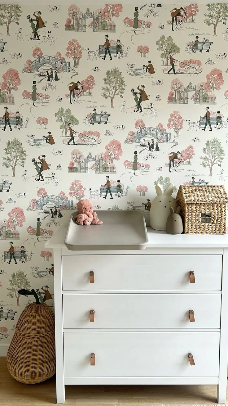
Dover White by Sherwin Williams is a creamy white with a gentle yellow undertone. It feels warm and soft — like wrapping your space in a cozy blanket. It’s not the kind of white that feels stark or cold. It’s more of a “sunset glow” kind of white that brings comfort wherever it goes.
Nurseries and Kids’ Rooms
This color feels nurturing, almost like a warm hug. It gives off a cheerful vibe without being loud. Perfect for creating a calm, happy space where little ones can rest or play. Think stuffed animals, soft lighting, and pastel accents.


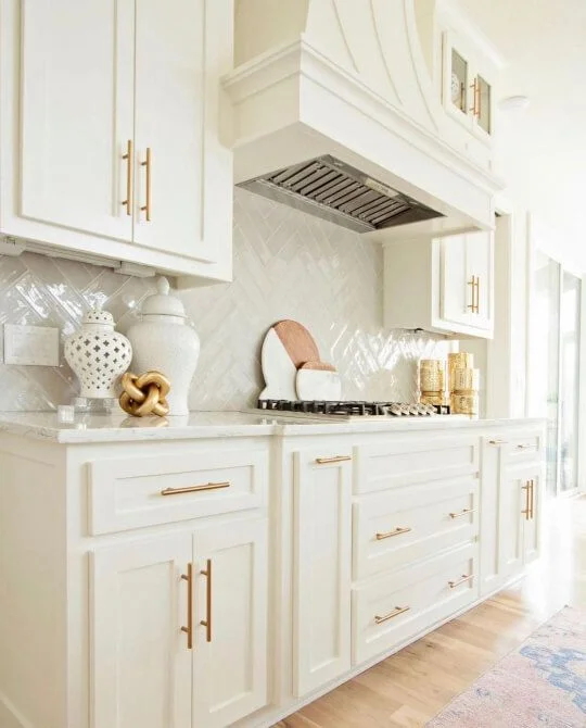
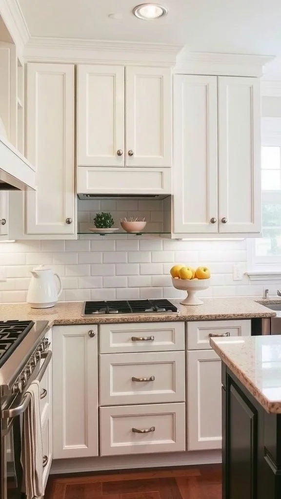
Kitchen Cabinets
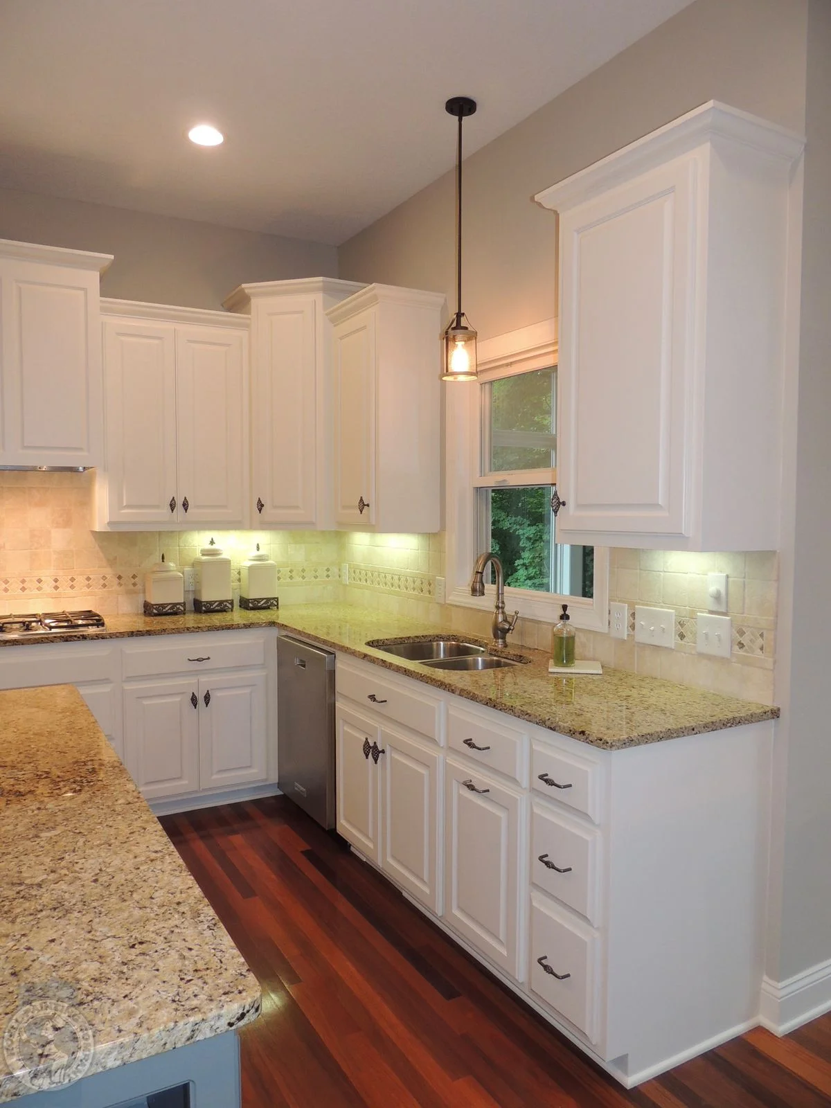
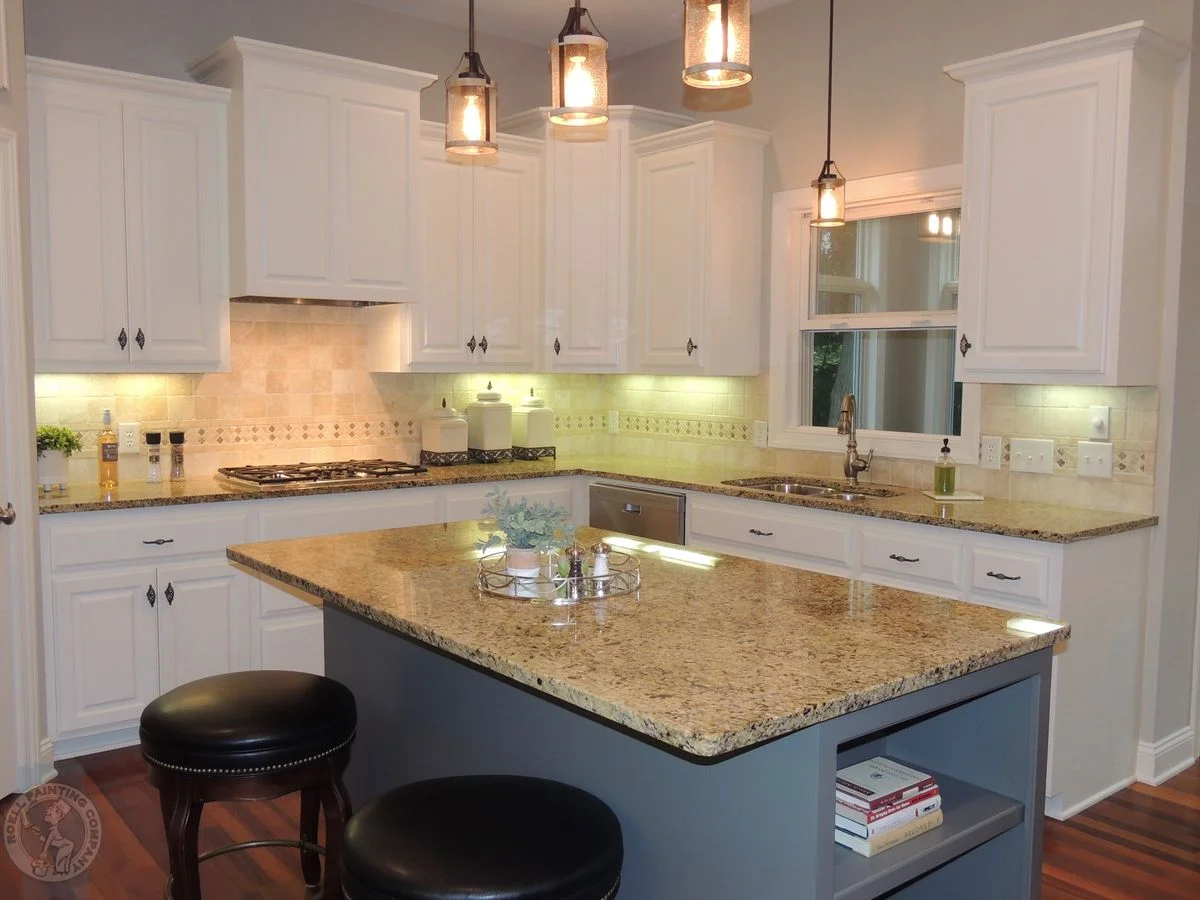
Dover White adds a soft depth to cabinets, especially if you have wood floors or warm countertops. It brings a bit of richness without going too yellow. I’d go with a satin finish here — it keeps things soft but still easy to clean. And heads up: in west-facing kitchens, the yellow undertones can glow a bit more in the afternoon.


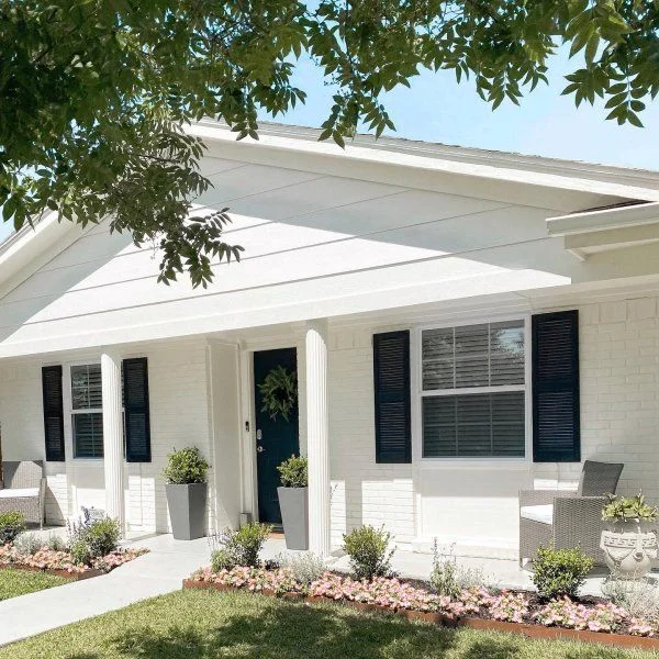
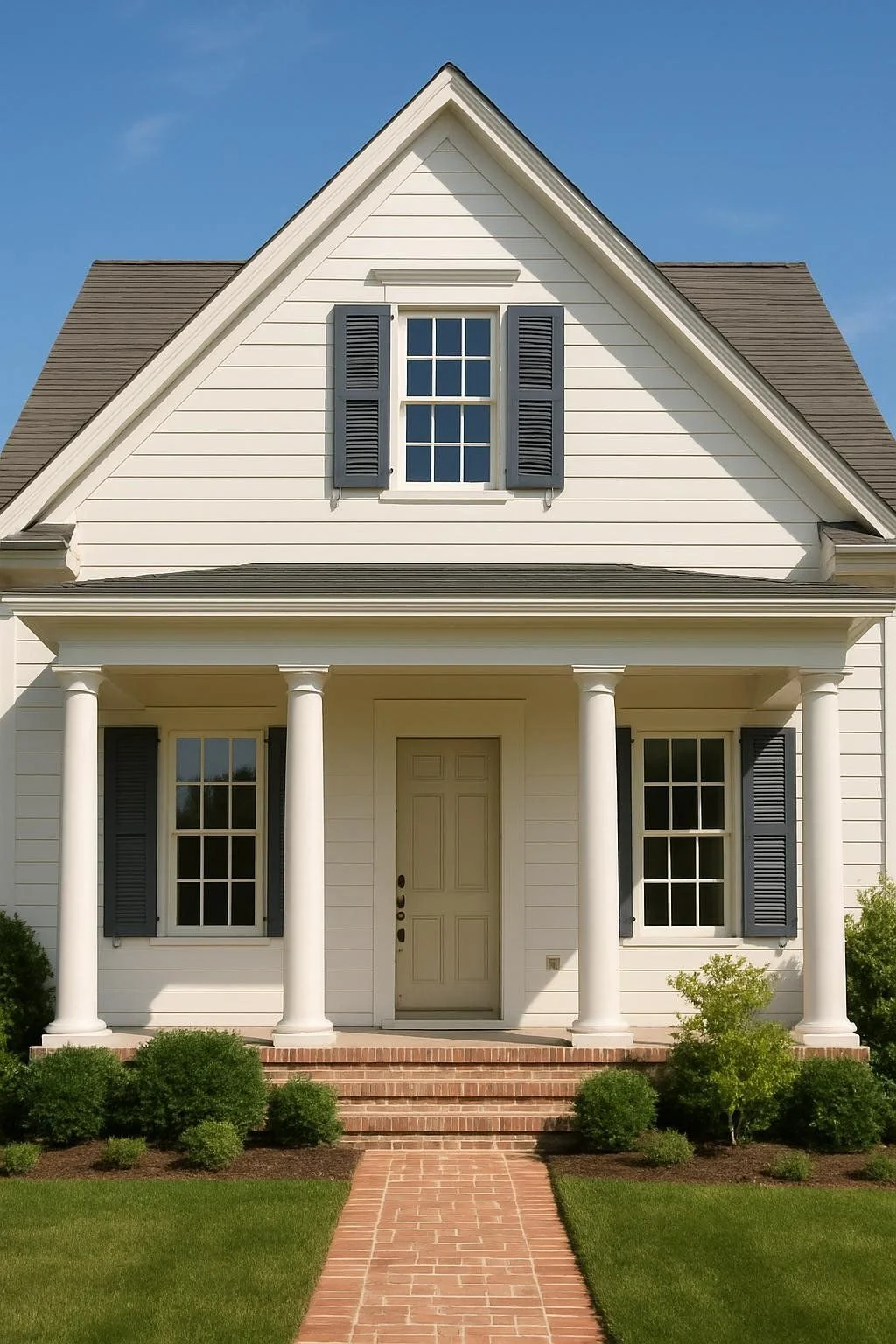
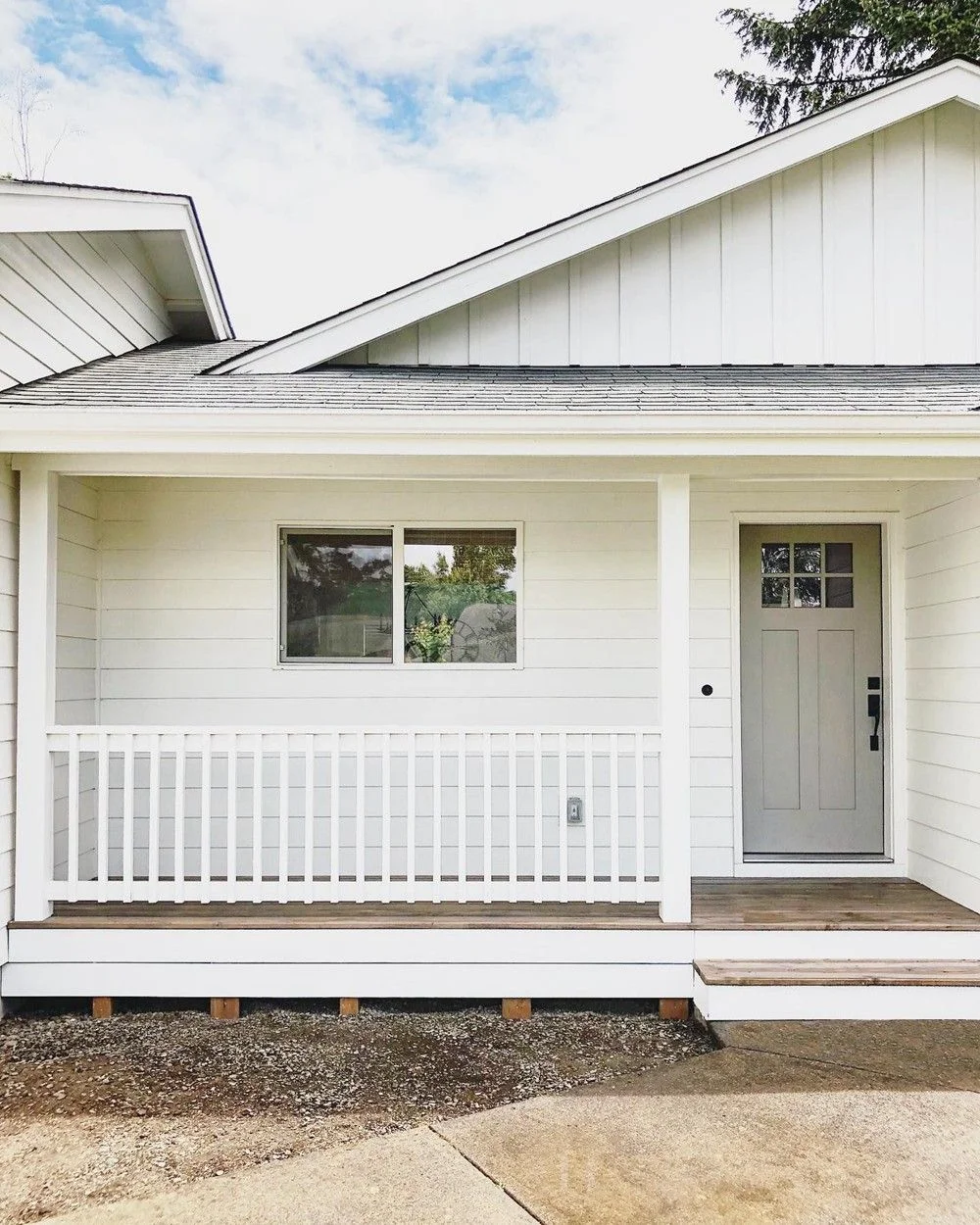
Exteriors in Warm Climates
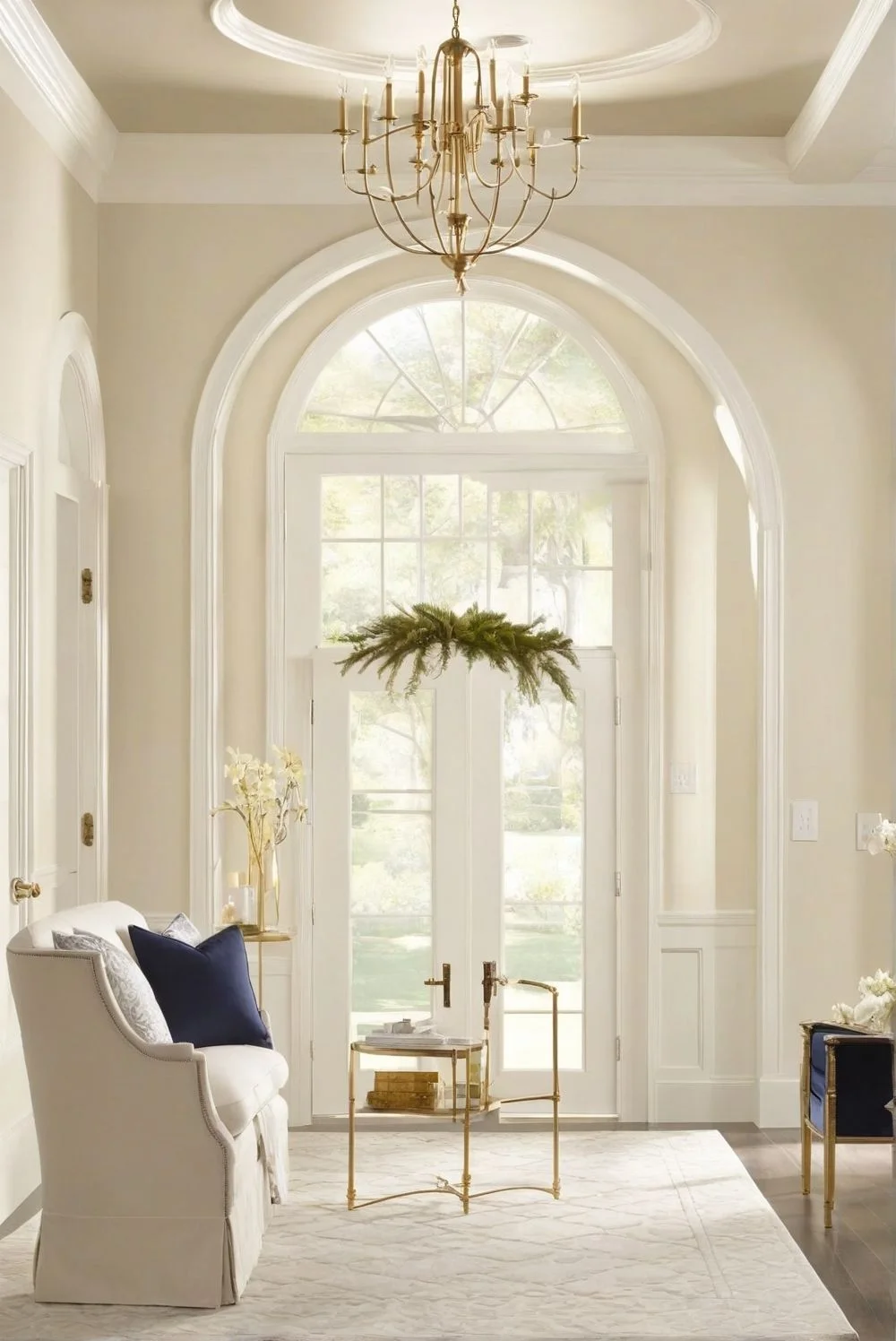
It’s a classic for Mediterranean or Spanish-style homes. Against stone, clay, or greenery, Dover White looks sun-washed and timeless. Like it’s been there forever — in a good way.


Tip: Lighting really matters with this color. The more warm light you have, the creamier it looks.
Where Alabaster Paint Truly Shines
Sherwin Williams Alabaster is one of those rare whites that just fits in. It’s soft, neutral, and knows how to adapt — kind of like the perfect host at a party. It doesn’t try too hard, but it always looks right.
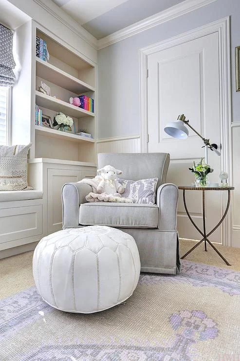
Living Rooms
Alabaster brings warmth without being obvious. It creates a relaxed, elegant feel that works with almost any style — boho, traditional, or modern. I’d use a matte or eggshell finish here to keep that softness steady. It makes a great backdrop for wood tones, soft fabrics, and natural light.


Kitchens
Whether your kitchen is full of clean lines and stainless steel or farmhouse shelves and warm brass, Alabaster fits right in. It’s a neutral white paint for kitchens that keeps things calm, not sterile. Plus, it gives your backsplash or countertops room to shine without competing.


Exteriors
On the outside, Alabaster shifts gently with the light. Morning sun makes it feel fresh and crisp. In the evening, it leans a little warmer — just enough to feel cozy. It pairs beautifully with dark window trim or earthy-toned shutters.


Tip: Natural light makes a big difference with SW Alabaster white. South-facing spaces bring out its warmth, while north-facing ones show off its soft cool side.
Coordinating Colors for Dover White vs Alabaster
Choosing the right coordinating colors can really pull a room together. It’s not just about matching — it’s about setting the tone. The colors you pick alongside your white paint help bring out its undertones and shape the mood of your space. Whether you’re going for a soft farmhouse look or something like a modern coastal vibe, matching your colors the right way makes everything feel more intentional.
For Alabaster, its soft, creamy base with greige undertones plays well with cooler or neutral shades. This helps balance its warmth without making the room feel yellow. Some great pairings include:
- Sherwin Williams Stardew – a soft blue-gray
- Agreeable Gray – a warm greige that blends effortlessly
- Iron Ore – for a bold contrast on trim or doors
- Evergreen Fog – a muted green that adds calm depth
Dover White, on the other hand, has stronger yellow-cream vibes. It looks best when paired with other warm tones to keep the harmony going. Try:
- Navajo White – for a layered creamy look
- Spicewood – a muted terracotta for cozy depth
- Renwick Beige – earthy and grounding
- Latte – a warm brown that adds contrast without clashing
Pro tip: Always consider what’s already in your space — like flooring or countertops. That can make or break how well these palettes work.
How Lighting Affects Alabaster and Dover White
Paint colors shift with the light — kind of like how the sky changes from morning glow to evening gold. What looks soft and creamy at noon might feel rich and yellow by sunset. That’s why lighting is such a big deal when choosing between Dover White and Alabaster.
Dover White in Different Light
In bright daylight, especially in west-facing rooms, Dover White shows off its warm side. The yellow undertones wake up and glow — almost like a field of daffodils in the afternoon sun. It feels cozy, but it’s definitely more creamy than crisp.


When the sun goes down and you flip on warm artificial lights, those yellow tones become even stronger. Dover White can feel richer, toastier — like a buttery candle-lit space. Great if you want warmth, but maybe too much if you’re after a clean white look.
Alabaster Under Changing Light
Alabaster is more of a steady player. In daylight, it keeps its soft warmth without tipping into yellow. Thanks to its subtle beige and greige mix, it stays balanced and clean — even in rooms with shifting light.
At night, under artificial bulbs, Alabaster still holds its tone. It doesn’t turn peachy or yellow. That’s why it’s often called one of the best white paints for lighting changes. It works in almost any room, no matter where the sun hits.


👉 Lighting tip: South-facing rooms stay warm all day. East-facing rooms get cool morning light. Always test paint on a few walls at different times to see the real deal.
Pairing Alabaster and Dover White with Decor & Colors
Picking a white paint is kind of like picking jeans — you want the right fit, the right tone, and something that goes with everything in your closet (or your room). Alabaster and Dover White are like your go-to neutrals, but what you pair them with — your “scarf” or “shoes,” so to speak — makes all the difference.
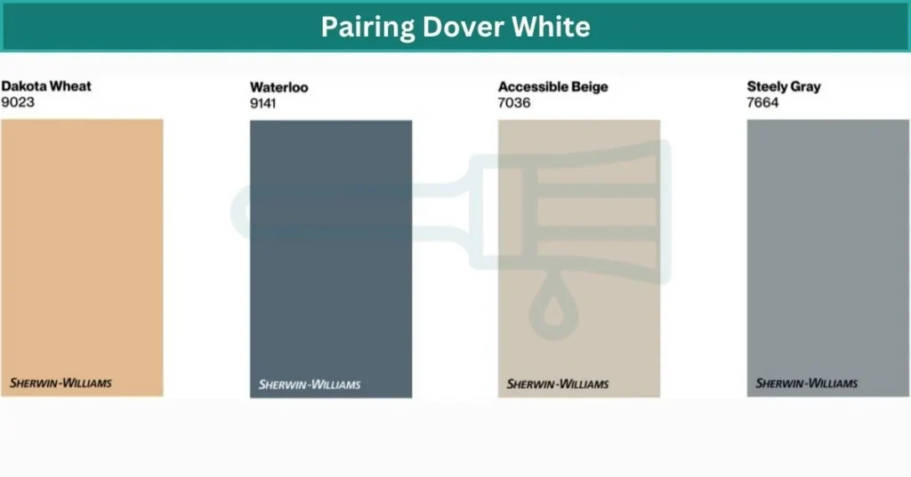
Dover White
Dover White has a warm, cozy vibe, so it plays really well with earthy colors. Think Sherwin Williams Dakota Wheat for a golden accent, or Waterloo for a soft, dusty blue contrast. Add in textures like jute rugs, rattan chairs, or dark wood floors and you’ve got a space that feels grounded and comforting. It’s kind of like pairing a chunky sweater with brown boots — soft, warm, and welcoming.
One thing to watch out for: Dover White can lean yellow when paired with the wrong trim. If you use a creamy trim, it might all blur together. Try something crisper — like Pure White or Extra White — to create just enough contrast.
Alabaster
Alabaster is your classic, goes-with-everything piece. It looks great with both warm and cool tones — Sea Salt (a soft green-blue), Repose Gray, or even a bold choice like Urbane Bronze. It’s great for spaces where you want flexibility to swap decor over time. Linen curtains, light wood tones, and black metal fixtures all look great against it.
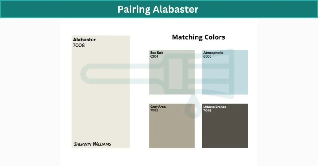
Because it’s so soft and neutral, Alabaster adds calm to busy rooms or brings subtle elegance to minimalist ones. It’s that white that doesn’t scream, but still pulls the whole outfit together.
💡 Pro Tip: Using warm ambient lighting? Pair Dover White with darker woods for depth. With Alabaster, add contrast — like matte black hardware — to keep things visually interesting.
Daylight vs Bulb: How Alabaster and Dover White Shift Throughout the Day
Paint doesn’t stay the same all day — it shifts with the light, kind of like the sky. What looks fresh in the morning might feel warmer or deeper by evening. With colors like Alabaster and Dover White, those small changes can really affect the overall mood of a room.
In Daylight
Alabaster holds steady pretty well. In the morning, it feels soft and warm — almost like sunlight bouncing off linen. As the day goes on and light becomes stronger, Alabaster shifts a bit more neutral. But it never looks cold or yellow, which makes it easy to live with in rooms that get lots of natural light.
Dover White is more of a shapeshifter. It starts off bright and creamy in the morning, especially in east-facing rooms. But once the afternoon sun hits — especially in west-facing spaces — those yellow undertones start to show. It can feel richer, even buttery, under that golden light.
Under Artificial Light (Bulbs)
Warm bulbs (2700K–3000K), like standard incandescent or Edison-style lamps, bring out the yellow in Dover White even more. In small rooms, it might feel a bit too golden. Alabaster, on the other hand, stays more controlled. Its beige undertones keep it from going overly warm.
With cooler bulbs (4000K+), both colors settle down. Dover White looks softer, less yellow. Alabaster shifts slightly cooler too, but stays balanced.
🪄 Lighting tip: Always test swatches during the day and under your evening lighting. What looks perfect at noon might surprise you by 7 p.m.
Pro Tips for Testing Alabaster and Dover White Paint Colors
Before you commit to painting a whole room, testing your color is a must. What looks soft and pretty on a paint chip or Pinterest photo can feel totally different once it’s on your walls. Alabaster and Dover White are both beautiful — but lighting, fixed elements, and even your paint finish can change the way they read in your space.
Here’s how to test paint colors like a pro — even if you’ve never done it before:
- Use Real Paint Samples, Not Just the Swatch Cards
Printed samples are helpful, but real paint behaves differently. Use actual sample pots or large peel-and-stick options like Samplize to see the real color. - Paint (or Stick) Samples on Multiple Walls
Light hits each wall differently. Try your sample on at least two walls in the room — especially one near a window and one opposite it. - Check at Different Times of Day
Paint changes with the light. What looks creamy at 10 a.m. might feel yellow by 6 p.m. Morning, afternoon, and evening views matter.
Place Samples Near Permanent Elements
Put swatches next to your floors, cabinets, or countertops. These surfaces can pull out hidden undertones — for better or worse. - Test Sheens if You Can
A color in matte might look softer than in satin or semi-gloss. If you’re painting trim, try a glossier finish to see how it affects the color.
💡 Pro Tip: Use removable foam boards or poster paper for testing. That way, you don’t have to paint the wall directly — and you can move them around the room to catch different lighting angles.
Now you’re ready to pick with confidence. No guessing, no surprises.
Where to Use Dover White vs Alabaster in Your Home
Choosing the right white paint isn’t just about liking the color — it’s about matching it to the mood, lighting, and function of the room. Some whites feel cozy and soft, while others stay calm and neutral no matter where you use them.
🟠 Dover White – Best Rooms + Why
- Nurseries & Bedrooms: Dover White has a warm, creamy tone that makes these spaces feel soft and nurturing — great for rest and comfort.
- Dining Rooms: That yellow undertone brings a cozy, candlelit vibe — especially in west-facing rooms with evening sun.
- Warm-Climate Exteriors: This color pairs beautifully with stucco or clay roofing. It gives off a classic Mediterranean feel.
- North-Facing Rooms: Dover White helps counter cool light by adding gentle warmth.
⚠️ Trim Tip: Avoid using Dover White for trim — it may look too yellow next to pure white walls. Pair with Extra White for contrast.
🟢 Alabaster – Best Rooms + Why
- Living Rooms: It gives a calm, inviting tone without overpowering the space. Great for mixed-use areas or open floor plans.
- Kitchens: Works with both modern and farmhouse designs. A neutral canvas that lets your cabinets or tile shine.
- Home Offices & Bathrooms: Holds its color under all types of lighting — steady and clean from morning to evening.
- Whole-House Color: Because of its subtle undertone and stability, Alabaster flows smoothly from room to room.
💡 Designer Tip: Use Alabaster in small rooms to keep things bright without feeling sterile — it adds softness without shrinking the space.
Kitchens, Bedrooms, Bathrooms & Living Areas: Which White Works Best?
Kitchens
Alabaster is the better pick here. It stays clean and warm without looking yellow — perfect for both modern and farmhouse kitchens. Dover White, on the other hand, can feel too creamy under warm lights unless you’re pairing it with wood tones or rustic finishes.
🪄 Tip: With cooler LED bulbs, Alabaster holds its balance better than Dover.
Bedrooms
Dover White feels like a cozy blanket — great for bedrooms where you want a relaxing, snuggly vibe. Alabaster also works well if you’re layering neutral decor and want a soft, easy backdrop.
🎨 Finish Tip: Go with eggshell or matte in bedrooms for a calming, non-shiny look.
Bathrooms
Alabaster wins here. It keeps bathrooms looking fresh without being stark. Dover White might lean too yellow — especially under warm vanity lights or in small, enclosed spaces.
Living Areas
For open layouts or modern homes, Alabaster is your best bet. It flows well from room to room and works with lots of styles. Dover White feels more traditional and works better in cozy, rustic living rooms — not the best fit for sleek or bright spaces.
Quick Pick:
- Modern, open-concept home? Go with Alabaster.
- Warm, cozy, traditional style? Dover White fits best.
Final Verdict of Dover White vs Alabaster
If you want a soft white that feels cozy, creamy, and warm — Dover White might be your match. It’s perfect for traditional spaces, nurseries, and homes with wood accents or warm finishes. Just keep in mind, it can lean yellow in certain lighting, especially next to cooler colors or crisp white trim.
On the flip side, Alabaster gives you a clean but not-too-cold look that works across almost any room. It’s more versatile, holds up better under different lighting, and flows beautifully in open-concept homes. If you’re unsure where to start, Alabaster is often the safer, more flexible choice.
FAQs
What is the difference between Dover white and Alabaster?
Alabaster and Dover White are both soft, warm, and creamy shades — but they don’t look quite the same on the wall. Alabaster has an LRV of 82, just a touch lower than Dover White’s 83, so they reflect about the same light. The real difference comes down to undertone — Alabaster leans creamy and off-white, while Dover White pulls more yellow, giving it a richer, slightly deeper feel.
Does Dover white look yellow?
Yes, Dover White has a creamy yellow base, so it can definitely look yellow — especially when paired with cool tones or greige paint colors. That contrast makes the warmth stand out more than it would in a fully warm-toned room.
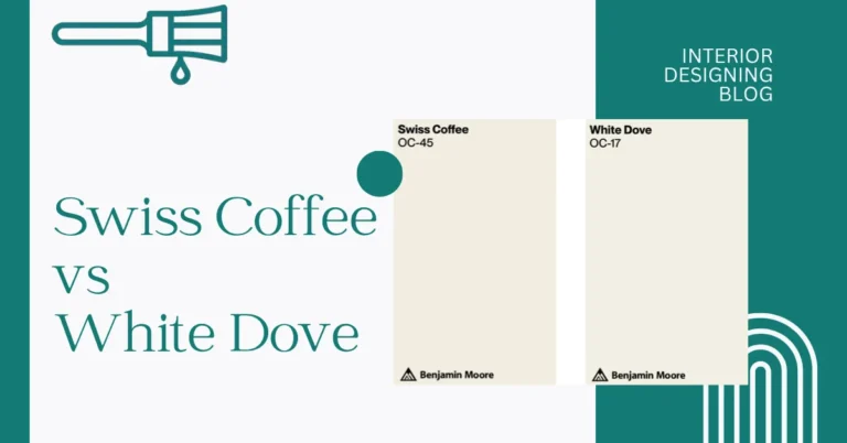
Is Dover white similar to Swiss coffee?
Dover White by Sherwin Williams and Swiss Coffee by Benjamin Moore are basically color twins — they look super similar on the wall. Their LRVs are nearly the same too: Dover White is 83, Swiss Coffee is 83.93, so both reflect a good amount of light without feeling stark. With their soft yellow and gray undertones, each one brings a cozy, calming vibe that works great in living rooms, bedrooms, or anywhere you want a gentle, warm feel.
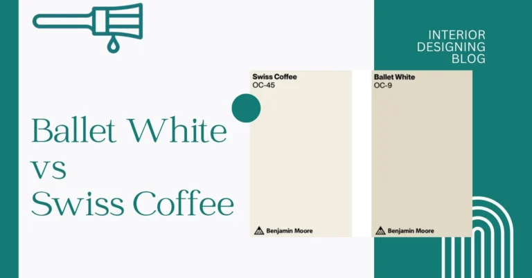
Which is lighter, alabaster or white dove?
Alabaster (SW 7008) and White Dove are pretty close in tone, but White Dove is just a bit lighter. Both have soft, grayed-out yellow undertones, which keeps them from feeling too warm. That said, White Dove reads more muted and less creamy on the wall, while Alabaster has a cozier, slightly richer feel.
Why is Alabaster White so popular?
Alabaster White belongs to the white color family, but its warm undertones set it apart from cooler, stark whites that can feel too clinical. Its popularity comes from how easily it fits into all kinds of spaces — from classic, traditional homes to clean, modern ones. With its soft, creamy look, Alabaster adds just enough warmth to feel welcoming without losing that fresh, timeless feel.
Which dove is pure white?
The terms “dove” and “pigeon” are often used interchangeably — they’re essentially the same bird, just with different names depending on context. Most white doves seen at events are domestic rock doves (Columba livia domestica), bred for their small size, white color, and homing ability. Another common type is the Barbary dove, also known as the ringneck dove (Streptopelia risoria), which carries a genetic mutation that makes them completely white.
Which dove is the best for skin?
The Dove Sensitive Skin Beauty Bar is one of the best choices for anyone with delicate or reactive skin. It’s hypoallergenic and completely unscented, making it gentle enough for even the most sensitive skin types. Trusted as the #1 dermatologist- and pediatrician-recommended bar, it’s safe to use daily on your face, hands, and body.
Why is white dove so popular?
White Dove is loved because it strikes that perfect middle ground — not too cool, not too creamy, and just warm enough to feel inviting. That kind of balance is surprisingly rare in white paints, which makes it a go-to for so many people. It’s also a favorite among top designers like Emily Henderson and Erin Gates, who often recommend it for its soft, timeless look.
Which dove soap is best, white or pink?
Both White Dove and Pink Dove (the coconut bar) are great, it just depends on what you like. White Dove is more of a one-size-fits-all — no added dye and a super mild scent, so it’s great for sensitive skin. Pink Dove has a light scent and a soft pink tint, which some folks love if they want a soap that feels a bit more fun or fragrant.