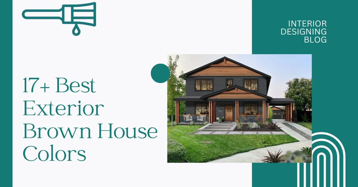
17+ Best Exterior Brown House Colors
I’ve seen a lot of people get stuck choosing brown for their home’s outside. Brown isn’t just one color—it can be espresso dark, soft ochre, or even like milk chocolate. Picking the right brown tone can really make your house stand out and boost its curb appeal.
Brown works great with many outside materials like wood, stone, and stucco. Plus, if you use weather-resistant paint, your home stays looking good no matter the weather. Acc to Interior Designing Blog research, some browns have red undertones, others gray or yellow, and that changes how they look in sunlight. Also, warmer browns fit colder places by adding cozy vibes, while cooler browns match desert or coastal homes better. So, there are Exterior Brown House Colors for almost every style and spot!
Best Exterior Brown House Colors
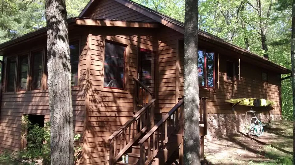
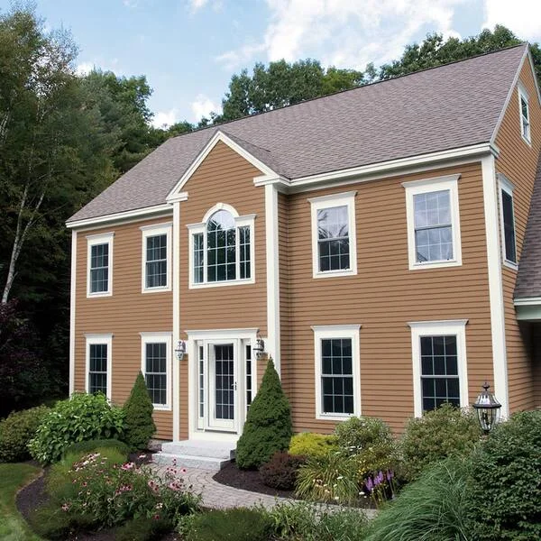
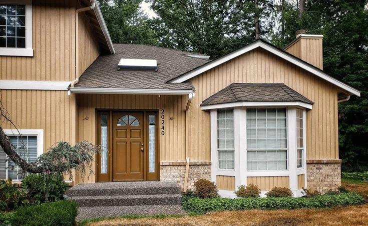
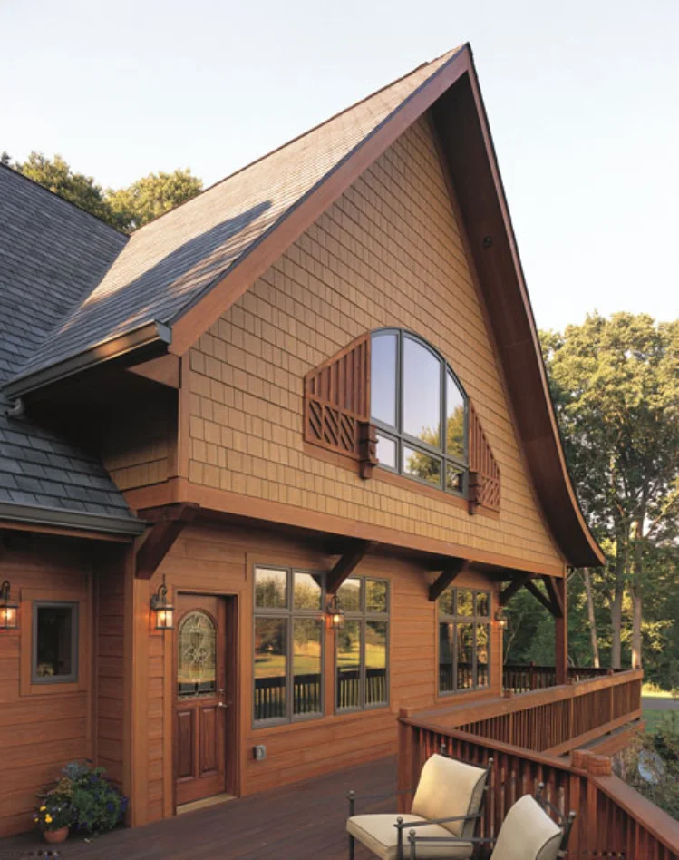
Hidden Valley – Earthy Brown with Warm Undertones
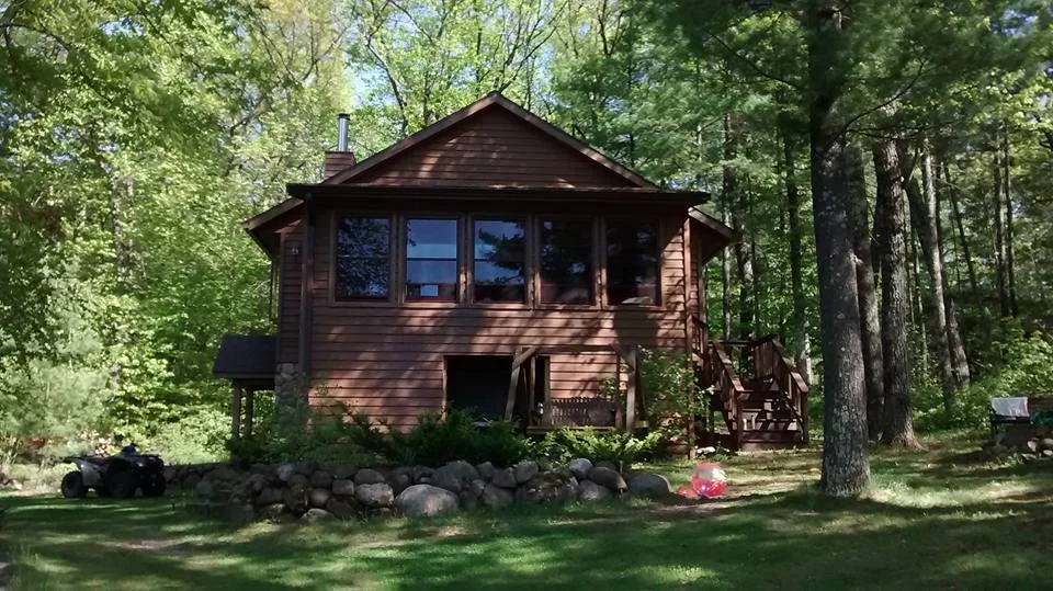
Hidden Valley by Benjamin Moore is a top choice for homes surrounded by nature. It’s a rich earthy brown house paint with orange undertones that feel warm and inviting. I like how it looks like the color of old trees glowing in sunlight.


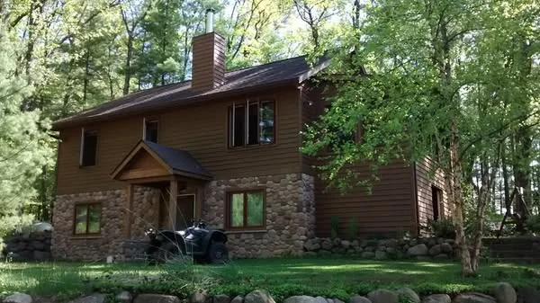
This warm brown exterior paint works well in all kinds of light — bright sun or cool shade. It keeps the natural surroundings looking fresh and never feels dull. The color stays pretty steady throughout the day, which means your home will always look good. Plus, it suits lots of styles, like rustic cabins, craftsman homes, or even modern farmhouses. Its Light Reflectance Value (LRV) is just right to balance brightness without washing out. If you want a color that blends with nature but still stands out, Hidden Valley is a solid pick.


Dragon’s Breath – Deep Gray-Brown with Subtle Green Tones
Dragon’s Breath by Benjamin Moore is a dark brown exterior paint with a modern, moody feel. Its LRV is 7, so it’s very dark but not too much to make your house look heavy.


The color has a gray-brown base with soft green undertones. It really shines on cloudy days and holds its rich look even in bright sunlight. It’s great for homes that want a cool, calm vibe. Plus, it hides dirt and weathering well, which makes it perfect if your yard has lots of plants or greenery. If you want to make a statement, try pairing it with matte black trim or cedar wood siding. This shade works best in cooler climates where the sun isn’t too strong, so the color stays fresh longer.


Smokey Topaz – Tuscan-Inspired Brown with Sun-Friendly Appeal
Smokey Topaz by Sherwin Williams is becoming a popular brown house color for hot climates. It gives off a warm, Tuscan villa vibe that many homeowners love these days. I’ve noticed it pairs really well with red roof tiles and sandstone accents, which makes it perfect for that classic Mediterranean look.


This fade-resistant brown holds up great in sunny weather. Unlike lighter colors, it doesn’t lose its charm even after lots of sun exposure. Smokey Topaz works best on bigger homes and looks amazing surrounded by lush landscaping. It’s especially good on stucco or Mediterranean-style exteriors. For the best effect, try a satin or matte finish to keep the warm glow without too much shine when the sun is bright.


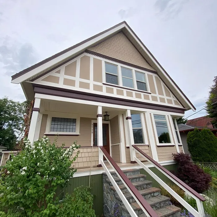
Latte – Soft Neutral Beige with Subtle Sand Tones
Latte by Sherwin Williams is a warm neutral exterior color that feels soft and inviting. It belongs to the beige house paint family with sandy undertones that give it a calm, natural look.


In sunlight, Latte shows warmer, golden notes, but in the shade, it looks cooler and more muted. This makes it a nice choice if your home gets both bright sun and shadow during the day. The color works well on different surfaces like vinyl, stucco, and siding.
I’ve seen Latte pair nicely with white trim, dark roofs, and bold front doors. It helps soften strong architectural lines and blends into natural surroundings. Plus, it’s good at hiding dust and aging better than pure white. It’s a great pick for Colonial, Ranch, or Mediterranean-style homes that want a warm but neutral look.


Chateau Brown – Deep Chocolate with a Modern Gray Twist
Chateau Brown by Sherwin Williams feels like rich dark chocolate with a cool gray undertone mixed in. I’d say it’s like 70% cocoa—bold but smooth. In the morning, it looks warm and soft, but as the day goes on, it shifts to a graphite-like shade that’s super sleek.


This modern brown house color works great in urban settings. It pairs well with materials like metal, glass, and wood. I’ve seen it look sharp alongside black or charcoal accents, especially on windows and doors. Using matte black trim or slate stone landscaping can really lift the whole look.
One bonus? Dark browns like Chateau Brown hide dirt and wear well, which is perfect for homes facing busy streets. It’s a stylish choice that balances boldness with everyday practicality.
Alexandria Beige – Versatile Taupe That Balances Beauty and Simplicity
Alexandria Beige by Benjamin Moore is a soft neutral exterior color with a classic taupe vibe. It pairs nicely with white trim and dark roofs, giving your home a fresh and balanced look.


This taupe exterior paint blends beautifully with brick walls and greenery around the house. It feels natural and calming, making outdoor spaces look connected and inviting. I think it works well for yards with lots of plants or stone accents.
If you have a large home, this color keeps things light without feeling too heavy or bulky. It creates a clean, timeless style that fits many home types. Alexandria Beige is especially great for transitional or colonial-style homes where subtle elegance counts. Plus, taupe tones like this resist yellowing better than cool grays when the sun shines strong.


Totally Tan – Elegant Warm Tan for Classic Curb Appeal
Totally Tan by Sherwin Williams is a warm tan exterior paint that feels soft without looking too yellow. It’s one of those colors that brings a gentle, timeless warmth to your home.


I’ve seen it look fantastic paired with white trim and darker features like wrought iron or black doors. Unlike some cooler browns, Totally Tan doesn’t feel heavy or gloomy. It shines in sunlight, showing off a cozy, inviting tone that suits classic homes well.
This brown paint for classical homes fits great on Georgian, Victorian, or Colonial Revival styles. Plus, tan shades like this tend to hide dust and weather wear better than bright whites or dark browns. If you want a timeless tan exterior color that’s elegant but easy to live with, Totally Tan is a solid pick.
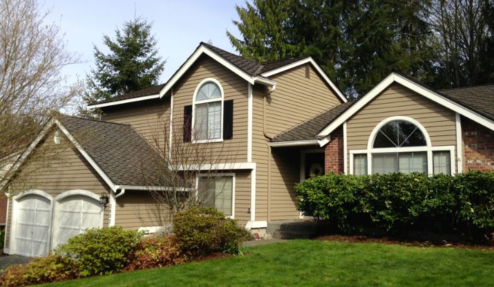
Homestead Brown – Earthy Sophistication with a Hint of Gray
Homestead Brown by Sherwin Williams feels like rich garden soil with a touch of gray mixed in. It’s a deep, earthy brown exterior that gives a warm, relaxed, yet elegant vibe to any home.


This gray-brown house color looks great with white trim, creating a clean contrast. The color changes with the light — it’s darker in the shade but softens nicely under the sun. That makes it interesting all day long.
I’ve seen it work really well with green landscaping, making the plants pop while adding depth to the overall look. It’s perfect for Craftsman, Prairie-style, or ranch homes that use natural stone or wood accents. For the best effect, try a satin or low-sheen finish to keep the rich look without too much shine.
Brown and Gray Siding – A Bold Contrast That Highlights Architecture
Brown and gray siding create a dynamic house color palette by mixing warm brown with cool gray. This exterior color contrast adds visual drama that really brings out your home’s architectural siding design. It’s perfect for modern or custom homes that want to catch attention from the street. The contrast helps define shapes and details, especially when sunlight hits during sunrise or golden hour. This combo works great with mixed materials like wood siding and fiber cement.

Red-Brown Siding – Rustic Warmth with a Hint of Autumn Charm
If you don’t want plain dark brown, red-brown siding is a great choice. It offers a rich, autumnal warmth that feels cozy and inviting. This warm rustic siding color works especially well on farmhouses or rustic-style homes. Pair it with white trim for a striking contrast that highlights your home’s architectural details. Red-brown shades also fade nicely over time, making them good for sun-exposed rural areas. It looks stunning on clapboard wood or board-and-batten siding too.

Brown Fieldstone Accents – Natural Texture That Unifies Exteriors
Brown fieldstone accents add natural texture and warmth to any home exterior. When paired with warm gray siding, the gray flecks in the stone help tie the colors together for a cohesive home exterior design. This stone and siding combination creates balanced contrast without clashing, making your home feel grounded and connected to nature. It works especially well on Craftsman, French Country, or Mountain-style homes. Plus, natural stone is durable and low-maintenance, which suits both hot and cold climates.

Gray Siding with a Brown Roof – Balanced Contrast That Grounds the Home
Don’t forget the roof when planning your exterior colors. A rich brown roof adds warmth and depth, especially when paired with light gray exterior paint. This combo avoids making the home look too dark or heavy. Adding cream or off-white trim softens the look, creating a balanced and welcoming exterior. Plus, brown roof house ideas like this help draw the eye upward, making your home feel taller. Brown shingles also do a good job hiding debris and weathering over time.

Three-Tone Exteriors – Layered Contrast for a Dynamic Look
Three-tone exterior design uses a main warm brown color, a cool gray accent, and a neutral trim like white or cream. This combo creates layered contrast that helps define different parts of your home’s architecture, like the main walls, accent areas, and trim. It works really well on homes with multiple surfaces or porches, making the design feel bold but organized. For best results, use the darkest tone on the base, the mid-tone on upper levels, and the lightest on trim. Just make sure the undertones match so the colors don’t clash.

Two-Tone Brown Siding – Subtle Depth Using Shade Variations
Using two-tone brown siding means pairing light brown siding with dark brown trim to add subtle contrast and depth. This tone-on-tone exterior design helps highlight windows, doors, and rooflines without looking flat or washed out. A dark gray or black roof adds extra color separation, preventing the home from feeling too matched. It’s a great choice for homeowners who want a unified but dimensional look. Just make sure both browns share similar undertones to keep everything harmonious. This style fits well with Craftsman and Prairie-style homes, where layered trim and detail really shine.

Brown Trim with Green Siding – Natural Contrast Without Overpowering
If you’re worried that too much dark brown might feel heavy, brown trim is a great way to add depth without overwhelming your home’s look. It works especially well with green or gray-green siding, keeping the exterior light and airy yet grounded. This light siding, dark trim combo is perfect for homeowners who want contrast but aren’t ready for a full brown exterior. Medium to dark wood-toned brown trim pairs best with muted sage or olive greens, creating a natural, earthy vibe that looks great all year round, especially in wooded or rural areas.

Blue, Gray, and Brown – Harmonious Neutral Hues with a Hint of Color
Combining light brown, gray, and soft blue with white trim creates a calm, cohesive exterior that feels balanced and inviting. The key is using similar tone levels across all three colors, so nothing clashes. Blue adds a gentle pop without overpowering the neutral tones. This multi-tone siding works great on homes with layered siding, accents, or porches. For best harmony, stick with warm undertones like greige-gray, dusty blue, and warm brown. It’s a smart choice for neighborhoods or HOA areas where soft, balanced palettes fit right in.

How to Choose the Right Brown for Your Exterior
Not all browns are the same, and picking the right one matters a lot. The right brown can make your home look cozy and fresh, but the wrong one might feel dull or too dark. Here are some key things to think about before choosing.
LRV (Light Reflectance Value): This tells you how much light the color reflects. Darker browns soak up more light and feel heavier. Lighter browns feel airier and brighter.
Undertones: Browns can lean warm (with red or orange hints) or cool (with gray or green). Warm tones give a cozy vibe, while cool tones feel calm and modern.
Sunlight & Home Direction: If your house faces south with strong sun, darker browns may fade faster. North-facing homes get softer light, so deeper browns work better there.
Roof Color: Your brown paint should match your roof’s undertone. For example, warm brown pairs well with warm roof colors but can clash with cool gray roofs.
Region/Climate: In hot areas, avoid very dark browns that absorb heat. Cooler regions can benefit from darker shades that add warmth.
Material Texture: Stucco softens brown colors, brick needs either contrast or harmony, and siding offers more flexibility for tone-on-tone looks.
Pro Tip: Always test paint samples on your actual home surface and watch how they look in real light. Colors usually look lighter outside, so it’s smart to pick a shade darker than you expect if you’re unsure.
Warm vs. Cool Browns: What’s the Difference?
Color temperature in paint means the undertone that changes how a brown feels on your home. Warm and cool browns each create very different moods.
Warm Browns
These have golden, reddish, or orange undertones. They feel cozy, inviting, and a bit rustic. Warm browns are perfect for farmhouses, traditional homes, or warmer climates. They glow nicely in golden-hour light and pair well with earthy materials like brick and terracotta.
Cool Browns
These lean toward gray, taupe, or greenish undertones. They give a sleek, modern, and grounded look. Cool browns fit urban homes, modern architecture, or cooler climates. They hold up well in cloudy or diffused light and look great alongside metals and glass.
Knowing warm brown vs cool brown helps you pick a color that matches your style and setting.
Color Comparison Table: Dragon’s Breath vs. Smokey Topaz
Comparing brown paint colors side-by-side helps you pick the best shade for your home. Here’s a quick look at Dragon’s Breath and Smokey Topaz to show their differences in tone, light reflectance, and style.
Dragon’s Breath vs Smokey Topaz
| Attribute | Dragon’s Breath | Smokey Topaz |
|---|---|---|
| Brand | Benjamin Moore | Sherwin-Williams |
| Undertone | Cool (gray-green) | Warm (Tuscan) |
| LRV | 7 | Moderate |
| Vibe / Best Use | Bold, moody, modern | Warm, sun-friendly, Tuscan |
| Pairs Well With | Matte black trim, cedar siding | Red roof tiles, sandstone accents |
Dragon’s Breath stays rich in shade and is great for cooler climates, while Smokey Topaz brightens nicely in sunlight and suits hot, sunny areas. Knowing these differences helps with choosing the right brown undertones and exterior look.
Final Verdict Of Best Brown House Colors
Picking the right brown house colors depends on the look you want and your climate. Warm browns like Smokey Topaz feel cozy and work well in sunny or cold areas. Cool browns like Dragon’s Breath suit modern homes and softer light.
Consider your roof, sunlight, and home materials. Always test colors outside first since light changes how they look.
FAQs
Is brown a good exterior house color?
Brown exterior house color gives a warm, natural look that fits well with modern lodge or bungalow styles. Besides looking great, brown siding is low maintenance and stands up well against warping, rotting, and pests, making it a smart, durable choice for any home.
What color compliments brown house?
Brown house color combinations that include blue and white accents create a soft, balanced look. Using colors close in tone, like light brown to gray, helps everything complement each other instead of clashing. This approach makes the whole design feel calm and cohesive, which many homeowners prefer over harsh contrasts.
What is the most popular color for a house exterior?
Taupe (Gray-Brown): Offers a warm and sophisticated look that blends well with nature.
Navy Blue: A classic, bold choice that adds depth and elegance.
Pale Yellow: Bright and cheerful, perfect for a welcoming feel.
Blue-Gray: Cool and calming, great for modern or coastal homes.
Off-White, White, Wheat, Gray: These neutral shades are timeless and versatile, fitting many styles.
What is the best color combination for brown?
Salmon + Khaki: A soft, warm pairing that feels fresh and inviting.
Mocha + Citron: Rich brown with a bright pop of yellow-green for energy.
Burnt Umber + Sage: Deep brown with muted green, perfect for calm spaces.
Cocoa + Crimson: A cozy mix of chocolate brown and deep red for warmth.
Mahogany + Alpine Green: Elegant wood tones paired with cool green for balance.
Charcoal + Honey: Dark gray with warm golden highlights creates contrast.
Terra-Cotta + Bronze: Earthy reds and metallic bronze add depth and shine.
Parchment + Olive: Light neutral with soft green for a natural look.
Which color suits to brown color?
Brown is a neutral colour, which means it pairs easily with many others. Colours like white, cream, grey, denim, black, and navy all go well with brown. These neutral combinations create a balanced and timeless look, whether in fashion or home decor. Because brown is so versatile, you can mix and match it with these shades to keep things simple yet stylish.
What is the color coordinate of brown?
The brown color hex code is #895129. In RGB values, it breaks down to 137 red, 81 green, and 41 blue. For printing purposes, its CMYK values are about 0% cyan, 41% magenta, 70% yellow, and 46% black. This specific combination represents a rich, warm shade known simply as brown.
What colors don’t go with brown?
Vivid Red: It can clash and feel too intense next to brown’s warmth.
Bright Green: Often too sharp and doesn’t blend smoothly with brown tones.
Pure White: Can create harsh contrast that feels cold and unbalanced.
Orange: Too close to warm browns, making the space look overly busy or clashing.
Which two colors combine brown?
Brown is made by combining a secondary color with its complementary color on the color wheel. For example, mixing blue and orange or purple and yellow creates brown. This happens because the colors balance each other out, resulting in the rich, neutral shade we know as brown.
What is the color tag for brown?
The color tag for brown is #964B00, a warm and earthy shade. Brown is often linked to feelings of reliability, healing, and strength. Its plainness gives a natural, comforting vibe that reminds us of the outdoors and stability. This hex code captures the deep warmth and grounded nature that brown brings to design and life.