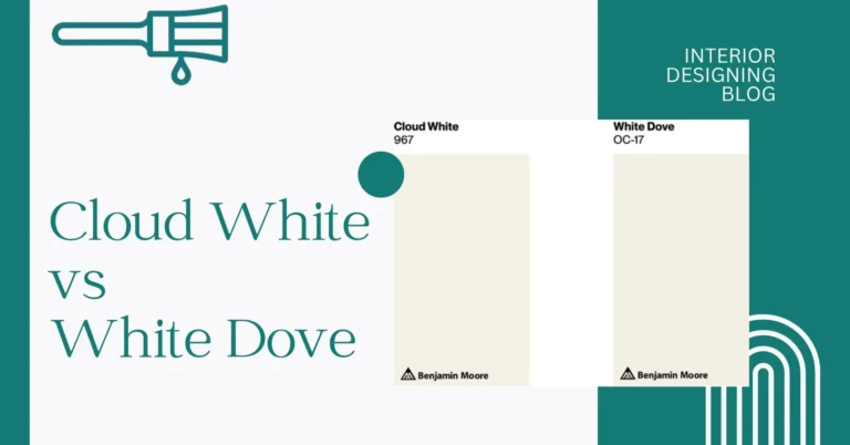
BM White Dove vs SW Alabaster
I’ve stood in a paint aisle staring at swatches and thought, “Why are there so many whites?” It’s like choosing between two identical clouds. My eyes darted from Benjamin Moore White Dove to Sherwin Williams Alabaster. White Dove vs SW Alabaster Both call themselves the best popular white paint, but they feel worlds apart when you hold a brush in your hand.
White Dove has that cozy, soft vibe that makes a room feel warm. Alabaster leans cooler, almost like a fresh sheet of paper. I’d heard both names tossed around by interior designers and paint experts as top picks for walls and trim. Seems like everyone’s talking about these whites when choosing paint colors for a clean, timeless look.
Well, here’s the deal BM White Dove vs SW Alabaster: this paint comparison isn’t just about swatches. Interior Designing Blog show you real rooms where each shade shines. You’ll see how they behave in morning light versus evening glow. By the end, you’ll know which one fits your space—no more guesswork, just clear advice on the right pick. Take a look at how I compare popular shades side by side.
Undertones & Character BM White Dove vs SW Alabaster
White Dove undertone (LRV of White Dove ~85)
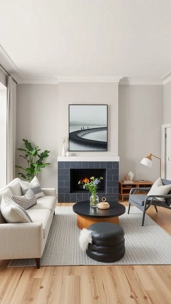
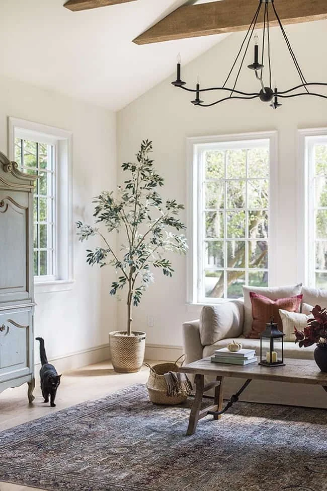
Feels like a soft warm white paint with a greige undertone. It’s kind of creamy, not super bright, and works great in north-facing rooms since it adds extra warmth, perfect if you’re comparing White Dove vs Alabaster and want the cozier option. According to the Benjamin Moore official page for White Dove (OC-17), its high LRV and subtle greige base make it one of their most versatile whites. I’d pair it with oak floors or warm wood tones for a timeless look.
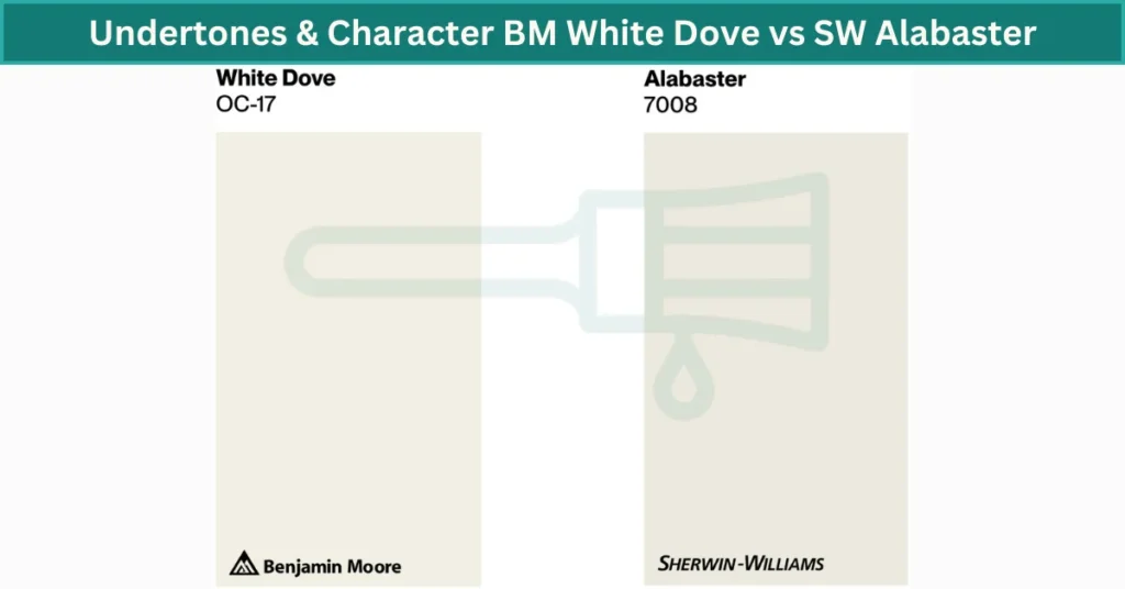
Alabaster paint color (LRV of Alabaster ~82)
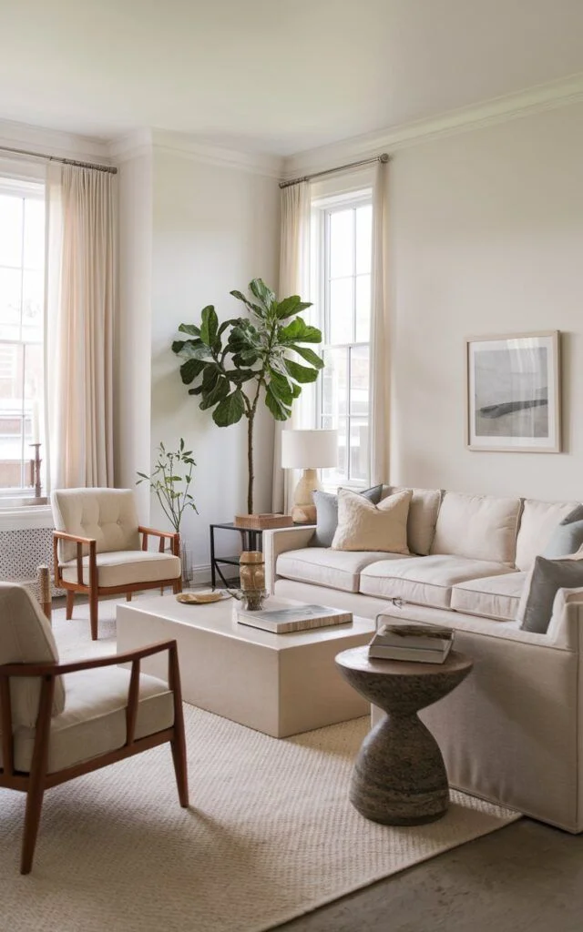
It has a yellow beige undertone with a hint of gray, giving it a more neutral and balanced look. It works well in south-facing rooms where light is strong, often standing out in the Alabaster versus White Dove comparison as the steadier choice. As shown on the Sherwin-Williams Alabaster (SW 7008) color page, this shade is one of their most popular picks for creating a calm backdrop. I personally like it next to gray tile or pale stone.
How white paint changes in lighting
- Morning: White Dove glows cozy, Alabaster looks true-to-tone.
- Afternoon sun: Dove warms up, Alabaster stays fairly cool.
- Evening: Both get richer, but Dove feels cozier; Alabaster feels still neutral.
So, if you want a snug, warm vibe, go with White Dove. If you need a calm, balanced off-white, Alabaster is your pick, making the classic Alabaster white vs White Dove decision easier.
Ideal Ways to Use BM White Dove vs SW Alabaster
White Dove vs SW Alabaster these two off-whites can work almost anywhere, but they each shine in different spots.
Best use of White Dove
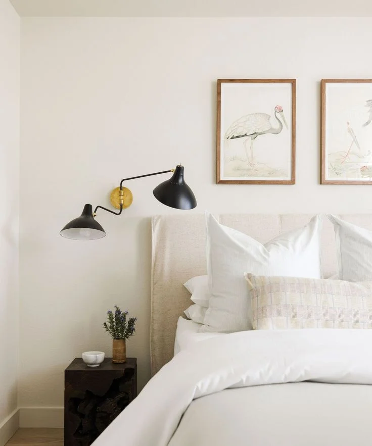
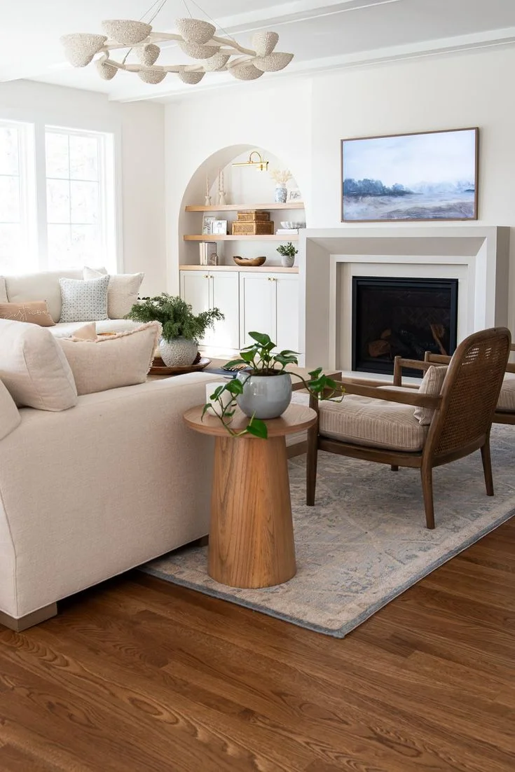
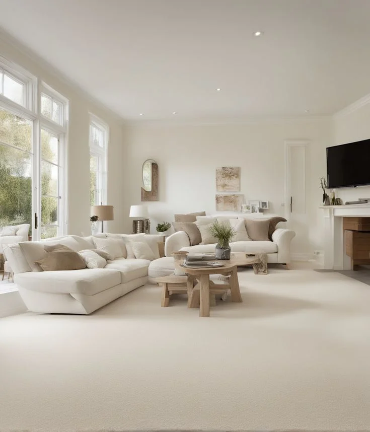
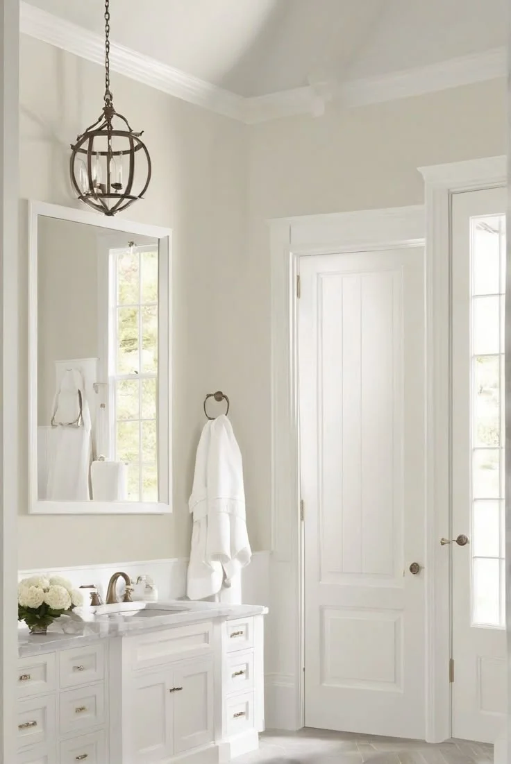
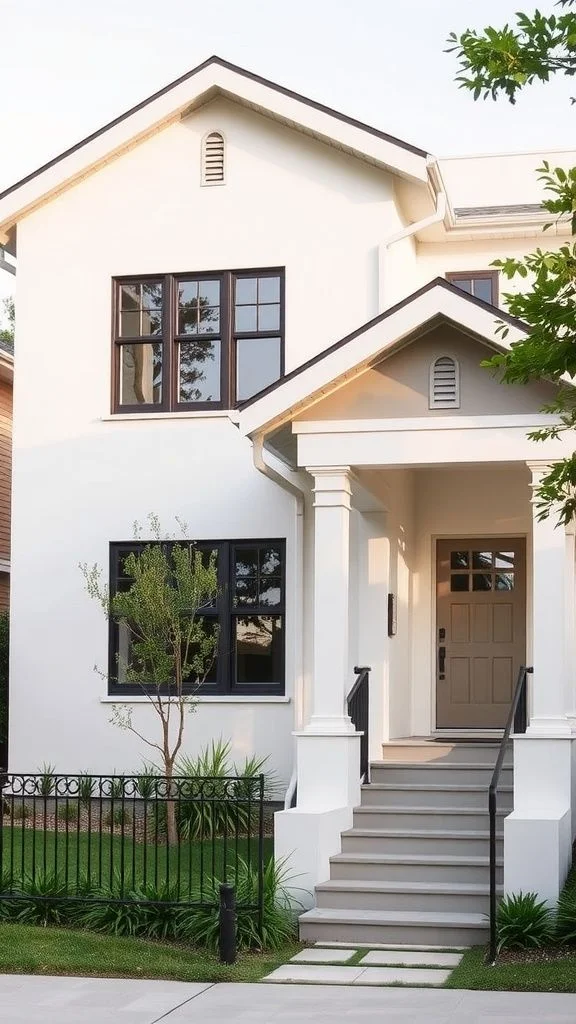
I love White Dove in big, open rooms. It’s perfect on kitchen cabinets. It ties spaces together and feels cozy. Its high LRV paint for interiors helps light bounce around. I’d pick it for farmhouse or traditional homes. Try it with Chantilly Lace trim for a soft contrast.


Where to use Alabaster paint
Alabaster in dark rooms feels calm. It’s great for north-facing bedroom paint or bathrooms with gray tile. It keeps light steady and fresh. I often see it in Scandinavian or modern spaces. Pair it with crisp white trim to make walls pop.


Quick tip:
If you need a soft white wall color that hugs wood tones, go White Dove. If you want a balanced white for darker corners, choose Alabaster in dark rooms.
Lighting really changes how these whites look.
White Dove’s light show
I painted my north-facing living room with White Dove in a cloudy week. On cloudy days, it feels warm and cozy—like a soft hug. When the golden hour hits south-facing room windows, it turns a little sunset yellow. It’s subtle, not harsh. Because of its high LRV, light bounces around, and you get that “sunset-like” glow without the glare. I’d say this mood shift is a pro if you want a living room that feels alive all day.


Alabaster’s steady glow
I tried Alabaster in my basement guest room under artificial light. It stayed clean white with no gray or muddy tint. Even under warm bulbs, it only adds a tiny warmth but never looks yellow. Designers often recommend Alabaster for basement rooms due to its stability. Its LRV of Alabaster around 82 means it still reflects light well, so low-light spaces feel brighter.


So, if you’re wondering how light affects white paint in different spots, pick White Dove for that mood-shifting warmth. For a calm, predictable white in south-facing rooms or low-light areas, Alabaster is your rockstar choice.
Coordinating Colors For White Dove vs SW Alabaster
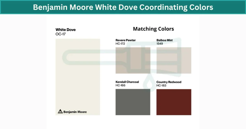
Benjamin Moore White Dove Coordinating Colors (a frequent talking point in the SW Alabaster vs BM White Dove debate).
- Deep grays and medium greige accent walls add contrast without starkness.
- I love it in traditional interiors paired with charcoal cabinets and oak floors.
- Try Chantilly Lace trim for a crisp edge—classic but soft.
- Warm undertone paint pairings like taupe or blush keep the vibe cozy.
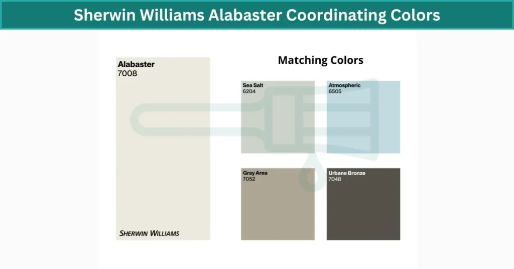
What colors go with Alabaster
- Mid-to-almost-black grays bring drama and anchor the space.
- Earth tone interior palettes—think olive green, sandy brown—feel grounded.
- Blue gray tones with white paint, like slate-hued pillows or rugs, balance its yellow-beige base.
- Pair with Shoji White on the ceiling for a seamless, warm glow.
Quick example combos
- White Dove + dark gray accent wall + oak floors + Chantilly Lace trim
- Alabaster + olive green cabinets + black fixtures + Shoji White ceiling
These pairings work with both modern and classic styles—just match your flooring and trim to your chosen accents for a polished look.
Technical Comparison BM White Dove vs SW Alabaster
Undertone behavior
White Dove has a slightly warmer vibe. It can read almost peachy next to a pure white. Alabaster leans cooler thanks to just a touch more gray in its mix. Both share greige and beige notes, but Dove’s yellow warmth edges it into that cozy zone, while Alabaster stays more balanced.
Color wheel & formula
On the color wheel, when looking at a white dove vs sw alabaster color scheme, White Dove sits a bit toward the warm, yellow side, while Alabaster nudges toward gray and feels cooler. In real rooms, you’ll notice this more than on a flat swatch—it’s subtle in the can but real once the light hits. Plus, White Dove from BM’s Aura line can reflect light a tad differently than Alabaster from SW’s Emerald line, adding to that warm-versus-cool feel.
| Specification | White Dove (Benjamin Moore OC-17) | Alabaster (Sherwin-Williams SW 7008) |
|---|---|---|
| LRV (Light Reflectance Value) | 85.3 – one of the highest in its line, reflects lots of light | 82.8 – still high, but slightly less reflective |
| RGB | 248, 247, 243 | 242, 239, 230 |
| HEX | #F8F7F3 | #F2EFE6 |
| Undertone | Greige with subtle yellow warmth | Yellow-beige with a hint of gray |
| Color Wheel Position | Slightly toward warm/yellow side | Slightly toward neutral/cool side |
| Paint Collection | Aura® Interior (premium, one-coat coverage) | Emerald® Interior (self-priming, stain-blocking) |
| Base & Binder | 100% acrylic latex; Nanoguard® for durability | Acrylic latex; advanced resin for washability |
| Available Sheens | Flat, Matte, Eggshell, Pearl, Satin, Semi-Gloss, High-Gloss | Flat, Matte, Eggshell, Satin, Semi-Gloss, High-Gloss |
| VOC Level | Zero VOC, zero-odor | Zero VOC, low odor |
| Coverage | ~400 sq ft per gallon | ~350–400 sq ft per gallon |
| Price per Gallon (approx.) | $75–$85 | $55–$65 |
| Dry Time | Touch: 1 hr; Recoat: 2 hrs | Touch: 2 hrs; Recoat: 4 hrs |
| Recommended Room Orientation | North-facing rooms or areas needing extra warmth | Low-light or south-facing rooms for consistent neutrality |
| Durability & Washability | Excellent—resists stains, scrubbable | Excellent—mildew resistance, high scrub rating |
| UV Resistance | Good for interior use; minimal yellowing over time | Good for interior use; holds color well under soft sunlight |
| Ideal Pairings | Oak or walnut floors, Chantilly Lace trim | Gray tile/stone floors, Shoji White ceiling |
LRV Comparison: BM White Dove vs SW Alabaster
LRV stands for Light Reflectance Value. It’s a simple scale from 0 (pure black) to 100 (pure white). Higher LRV means more light bounces off your walls—so your room feels brighter and airier.
LRV values & brand quirks
- White Dove has an LRV of about 83.16 on Benjamin Moore’s updated scale. I’ve noticed it often “feels” closer to 84 in my kitchen under morning light.
- Alabaster sits at 82 on Sherwin-Williams’ system. The difference isn’t huge, but you’ll spot it when you compare swatches side by side.
Remember, BM and SW use slightly different methods to measure LRV. That means paints with the same number can behave a bit differently once they’re on your wall. The Sherwin-Williams LRV guide explains how their reflectance system works, while Benjamin Moore uses its own updated scale. That’s why two paints with similar LRVs may still look noticeably different in a real room.
Despite being only a point or two apart, White Dove often looks a tad brighter in real rooms. If you want even more context, compare them with SW Snowbound (LRV 82)—it feels a hair darker than Alabaster.
| Paint Name | LRV Value | Brand System |
|---|---|---|
| White Dove | 83.16 | Benjamin Moore updated scale |
| Alabaster | 82 | Sherwin-Williams standard scale |
| SW Snowbound | 82 | Sherwin-Williams standard scale |
So, if you’re weighing paint reflectivity scale and white paint brightness comparison, White Dove edges out just enough to brighten a space more than Alabaster or Snowbound.
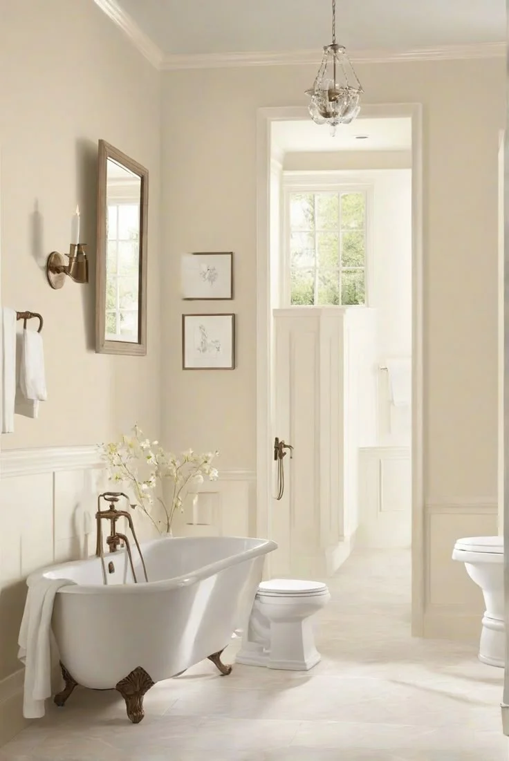
Comparing BM White Dove vs SW Alabaster in Real Homes
I’ve seen White Dove in a sunlit living room look a bit richer, and in a tiny bathroom it almost reads gray. Alabaster on interior walls can feel brighter in a big, open kitchen but more muted when furniture is dark. White Dove vs SW Alabaster interior shows White Dove adds cozy warmth, while Alabaster stays a calm, balanced white.


Remember, paint color in natural light really depends on your room’s size, lighting, and décor. Always sample with real room paint comparison before you commit.

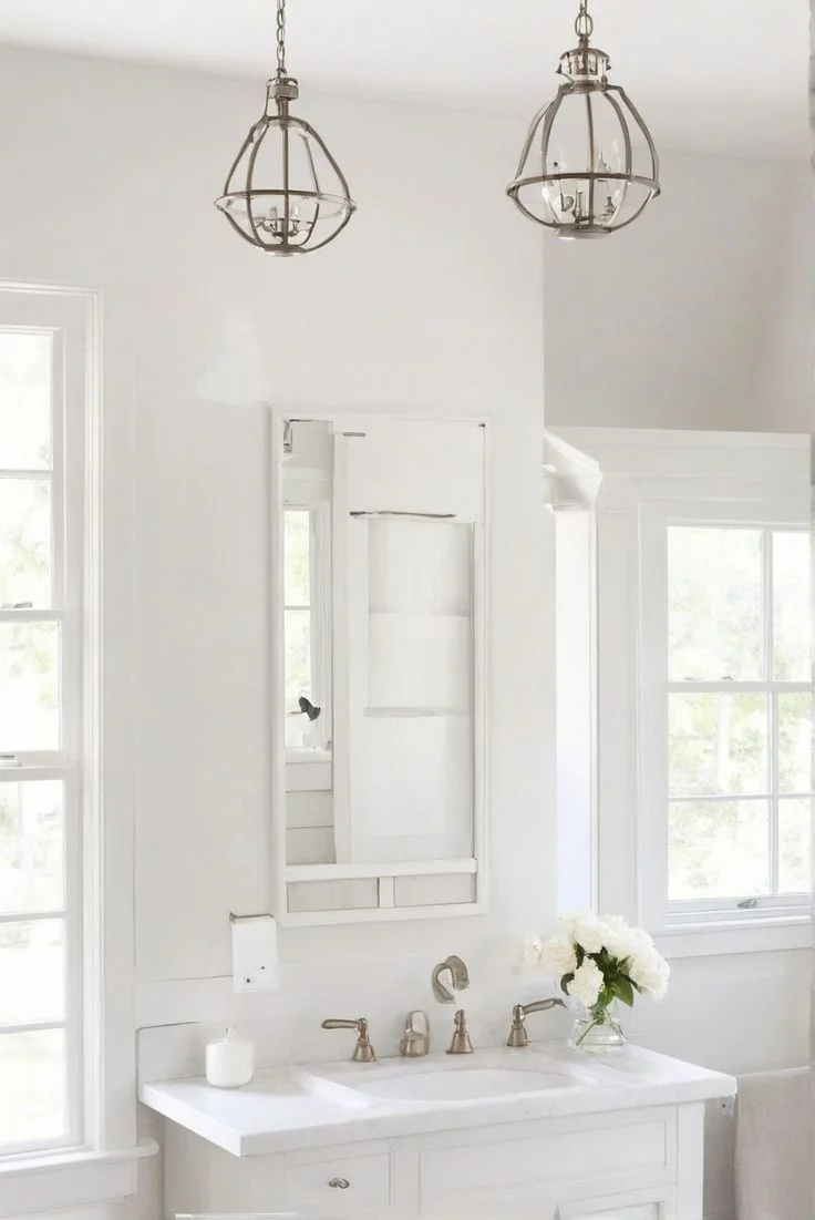

Bathroom Comparison: BM White Dove vs SW Alabaster
I’ve painted two small bathrooms with these off-whites, and here’s what I saw.
White Dove bathroom
I used White Dove on walls and trim. Under warm vanity lights, it looks cozy and creamy. Next to SW Extra White trim, the walls read warm white bathroom paint. It never felt yellow, just soft and inviting. I’d pick it for a powder room where you want a gentle glow.


Alabaster bathroom
I tried Alabaster walls with bright LED lights. It stayed a true off-white paint in bathrooms and looked clean next to white fixtures. When the window light came in, it felt cool and fresh. Alabaster bathroom always seemed calm, even in darker corners.


Quick insight: Lighting and trim color change how you see paint—this is what makes comparing white paint with different lighting so key. Expert tip: Use a satin or semi-gloss finish for easy cleaning and extra light reflection in wet rooms.
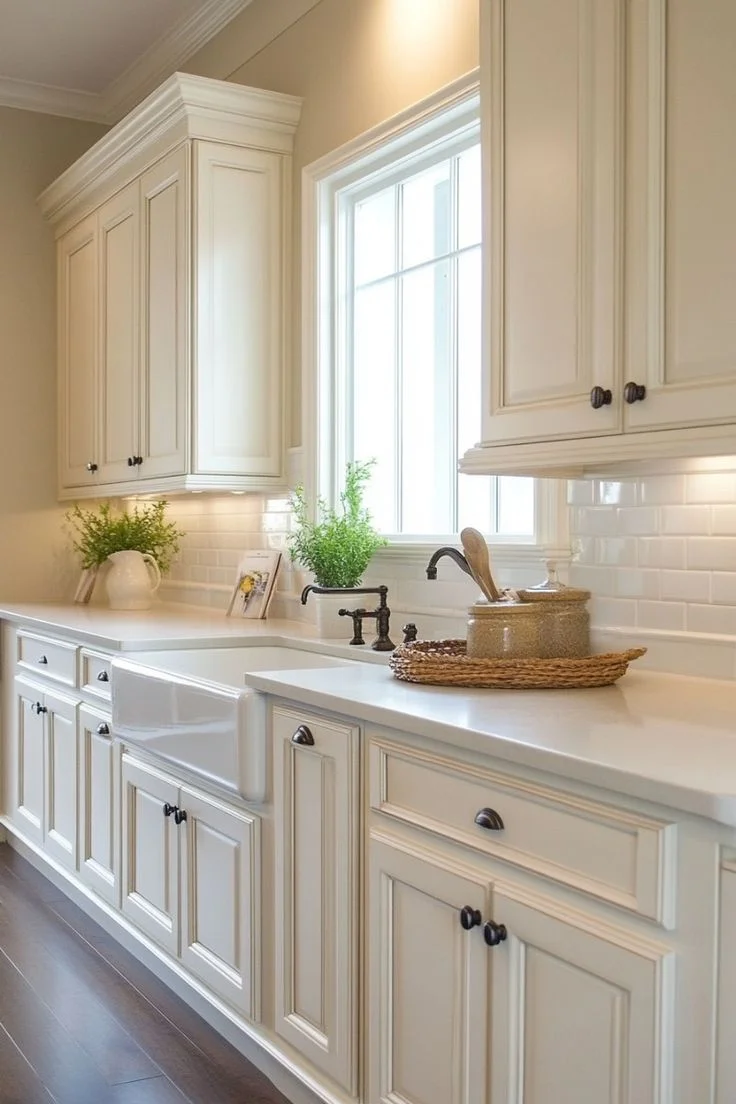
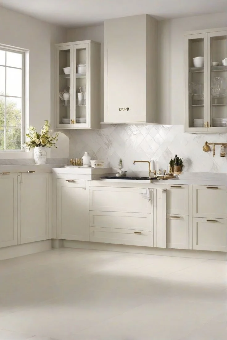
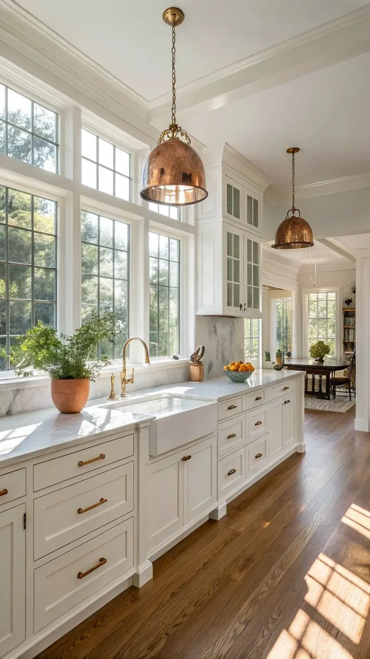
Kitchen Cabinets Comparison: BM White Dove vs SW Alabaster
I’ve painted more than one kitchen with these two whites on cabinets, and here’s what I spotted.
Cabinets are where these off-whites really shine. Under artificial light they can look nearly the same, but a closer look shows their true colors.
Example 1: White Dove kitchen cabinets under recessed lighting
- In my friend’s farmhouse-style kitchen, White Dove on cabinets looked bright and clean.
- The satin finish made the creamy white cabinet paint pop against dark countertops.
- Did you catch that? It read almost pure white, even with warm bulbs.


Example 2: Alabaster on cabinets with gold hardware
- At a client’s modern flat-panel kitchen, Alabaster on cabinets felt softer.
- Warm white kitchen cabinets paired with brass pulls gave a gentle glow.
- Under pendant lights, Alabaster on cabinets looked slightly creamier than White Dove.


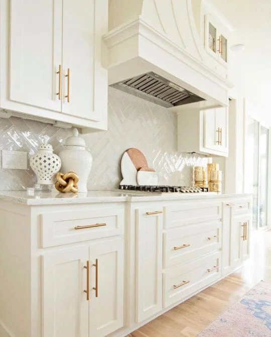
Example 3: Side-by-side under natural daylight
- I swatched both on shaker-style doors by a sunny window.
- White Dove kitchen cabinets appeared a touch brighter in natural light.
- Alabaster on cabinets leaned into its yellow beige undertone, offering a cozier feel.
How artificial light paint appearance shifts
- Under cool white LEDs, White Dove reflects more light and seems whiter.
- Alabaster stays true to its off-white cabinet colors, never flipping too yellow.
- In a north-facing kitchen, both paints’ high LRV helps bounce daylight around.
Observation summary
- Both can pass as true whites on cabinets, but Alabaster on cabinets is subtly softer in warm light.
- White Dove kitchen cabinets feel crisper and brighter, ideal for tight galley kitchens or small islands.
- Alabaster on cabinets works great in open layouts where you want a gentle, cozy vibe.
Practical tip:
Use a satin or semi-gloss finish for cabinets. It boosts durability and helps with color reflection, making both White Dove and Alabaster look their best.
Style pairings:
- White Dove kitchen cabinets + Hale Navy island + matte black knobs = sharp contrast.
- Alabaster on cabinets + wood accents + neutral stone backsplash = warm, balanced look.
At the end of the day, your cabinet lighting and surrounding finishes do the heavy lifting. If you need a rock-solid white that stands up to bright LEDs, lean into White Dove. If you want a creamy white that hugs the eye in softer light, Alabaster on cabinets is your go-to.
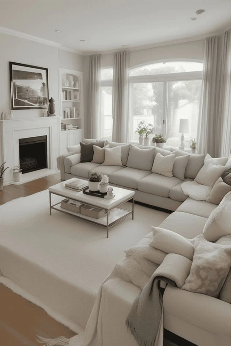
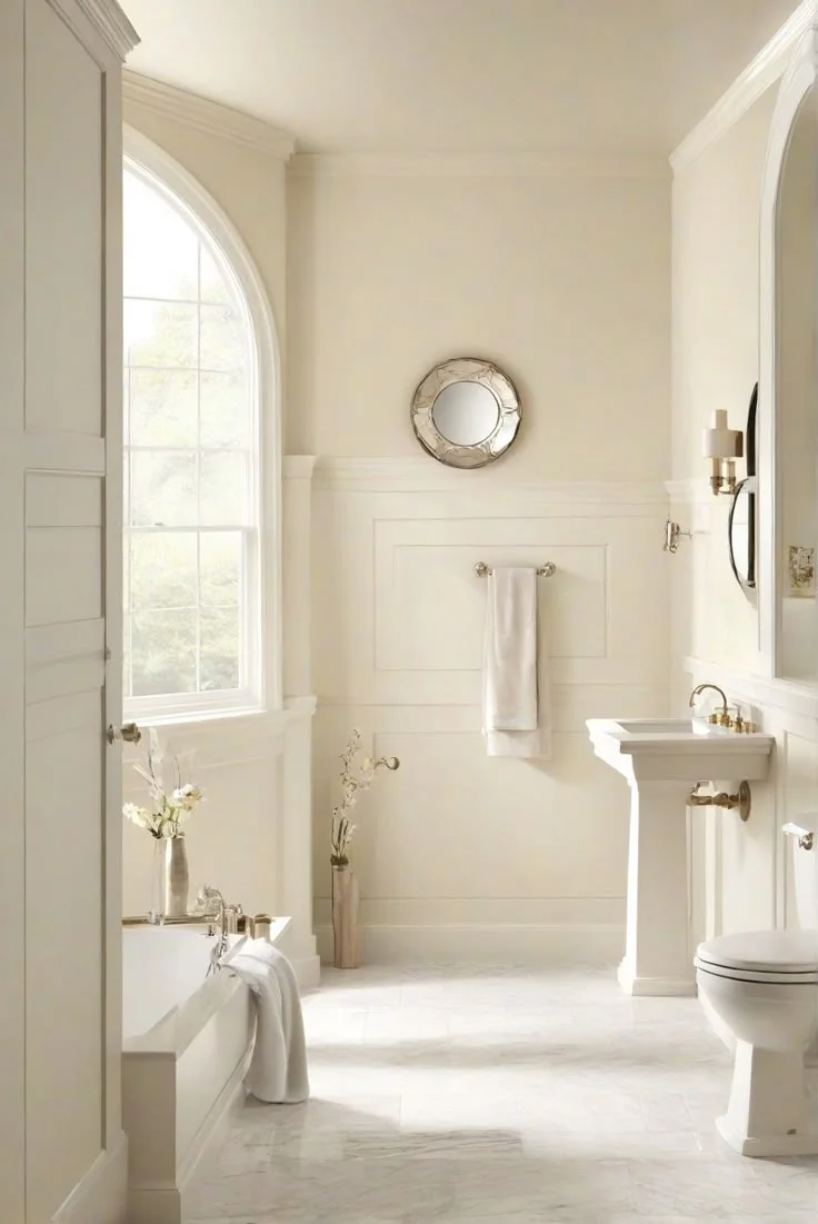
Living Room Comparison: Benjamin Moore Alabaster vs Sherwin Williams Alabaster
I’ve toured a few living rooms to see how these whites really behave.
Paired trims: guess which is which
- One room had White Dove walls with Chantilly Lace trim. The walls felt peachy-warm against the crisp trim—almost like a soft hug.
- Next door, Alabaster paint living room walls met Pure White trim. The result was more neutral, with a hint of gray-beige peeking out.
Full-room reveals
- In a sunlit loft, every surface was White Dove—from walls to ceiling. It read as a true white with just a whisper of warmth, perfect for bright, airy spaces.
- In a cozy study, Alabaster covered walls, ceiling, and trim. It looked soft and gentle, never stark, and kept the room feeling calm even under warm lamps.
I came across someone asking this on Quora, and the top picks were Sherwin-Williams Alabaster and Benjamin Moore White Dove. Both bounce tons of light in a living room—Alabaster stays clean and neutral, while White Dove adds a touch of warmth without going yellow. These shades also frequently appear in designer roundups on Architectural Digest and Houzz design discussions, where pros recommend them as two of the safest “go-to” whites for walls, cabinets, and trim.


Observation: White paint undertone comparison
When you contrast these Benjamin Moore vs Sherwin Williams white picks, the undertones only pop next to a different white. In all-white setups, both read as soft, non-stark “best white for walls and ceiling” choices to the untrained eye.
Pro tip: Interior designers often recommend using a slightly cooler trim with warmer wall whites to make that subtle contrast sing. Want to be sure? Grab sample boards and watch them in morning and evening light.


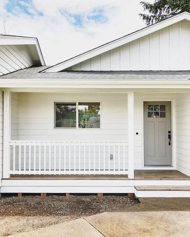
Exterior Comparison: BM White Dove vs SW Alabaster
Exterior light can turn these off-whites into a whole new show.
Side-by-side outdoor looks
White Dove exterior often reads brighter than indoors. On a sunlit siding, it can take on a peach-beige glow—especially if you’ve got green grass or flowering beds nearby. Against a brown door, it feels warm and welcoming. But catch it by a blue sky in late afternoon, and you might see a hint of greenish reflection—just one of those outdoor surprises.


Alabaster exterior paint leans more yellow-beige under direct sun, giving a soft, creamy white paint for outdoors vibe. In shaded spots or on north-facing walls, it can look almost true white. When snow or pale stone surrounds it, Alabaster pops as a gentle, balanced white.


Unusual behavior cases
- On a white brick façade, White Dove exterior next to pure white mortar can look richer—almost like a pale peach.
- Alabaster on wood features (think cedar shake) sometimes reads cooler, as its yellow-beige undertones get muted by the wood’s warmth.
- Reflections from nearby colors—like green shrubs or red brick—can nudge White Dove toward a greenish hint, while Alabaster might stay more reliably yellow-beige.
Expected outdoor appearance
Both paints appear lighter and brighter outdoors than in a spare swatch test. White Dove exterior gives an inviting, slightly warm look that adapts to surrounding greenery. Alabaster exterior paint stays soft and consistent, with just enough warmth to feel homey without going peach.
Bonus tip: If you really want a creamy white paint for outdoors, consider Shoji White exterior or Oyster White—they pack more pronounced warmth without the green-reflection curveball. And don’t forget to test on both north- and south-facing walls; exterior lighting changes how white paint looks outside more than you’d expect. Also, choose a high-quality exterior-grade finish—flat for broad siding, satin or semi-gloss for trim—to keep your home looking fresh season after season.
Comparing Price and Paint Coverage BM White Dove vs SW Alabaster
Here’s a quick look at White Dove vs SW Alabaster price and paint coverage so you know what to expect before you buy.
| Feature | White Dove (Benjamin Moore) | Alabaster (Sherwin-Williams) |
|---|---|---|
| Price per gallon | $70–$80 (White Dove paint cost) | $65–$75 (Alabaster paint price per gallon) |
| Availability | Sold through independent retailers; fewer corporate stores | Widely available at Sherwin Williams locations; frequent online stock |
| Coverage per gallon | ~400 sq ft | ~350–400 sq ft |
| Number of coats needed for full coverage | 2 coats over most light colors; 3+ over dark hues | 2 coats standard; often self-levels better on dark surfaces |
| Finish options affecting coverage | Satin, Eggshell, Semi-Gloss—higher sheen may show brush strokes | Eggshell, Satin, Semi-Gloss—Emerald line flows smoother |
| Primer recommendation | Use tinted primer over dark walls | Primer recommended on raw surfaces; Emerald self-priming option |
| Sale & budget tip | Less frequent—check with independent stores for promotions | Sherwin-Williams often runs 30–40% off sales |
Quick take: Both paints usually need two coats for full opacity, especially if you’re covering a darker base. Benjamin Moore’s Aura line (White Dove) can cost more but can cut down coats. Sherwin-Williams’ Emerald line (Alabaster) often levels out better, saving you touch-ups.
DIY Tip: Watch for SW sales if you’re budget-minded, and ask your BM retailer about tinted primer bundles to make that first coat count.
VOC Levels & Eco-Friendliness
VOCs and certifications matter a lot if you care about health and the planet.
VOC content
VOCs and certifications matter a lot if you care about health and the planet. The U.S. Environmental Protection Agency (EPA) highlights how VOCs impact indoor air quality. Both brands now offer low-VOC and zero-VOC options. For instance, Benjamin Moore’s Natura or Eco Spec lines provide true zero-VOC White Dove, while Sherwin-Williams’ Harmony and Emerald lines make Alabaster an eco-friendly choice that reduces harmful off-gassing. If you want proof of safety, look for GREENGUARD Gold Certification on the specific product line.
Certifications
Look for GREENGUARD Gold certified paint if you need proof it’s safe. Benjamin Moore’s Eco Spec and SW’s Harmony both carry that badge, meaning they meet strict third-party limits on chemical emissions. You can even find LEED-compliant options in each brand’s eco lines, which helps if you’re aiming for green home certifications.
Indoor air quality & safety
When you paint nurseries, bedrooms, or any cozy corner, non-toxic nursery wall paint is key. Zero-VOC white paint keeps rooms smelling fresh and cuts down lingering fumes—important for babies, pets, or anyone with allergies. Just remember: not every finish of White Dove or Alabaster is zero-VOC. You’ve got to pick the right paint line.
Choosing the right paint line is as important as picking the color. For the best white paint for indoor air quality, go with the certified, zero-VOC versions of White Dove or Alabaster. Your lungs—and the planet—will thank you.
Conclusion
Between White Dove vs SW Alabaster, I like White Dove when I want a warm, cozy room that feels sunny. Alabaster is great when I want the same soft white no matter the light. Try each paint on your wall and watch how it looks in your home. Then pick the one you like the most.
FAQs
Which is better, White Dove or Alabaster?
It depends on your space. Choose White Dove if you want a warmer, cozier white that plays well with wood tones and in north-facing rooms. Pick Alabaster if you need a balanced, slightly cooler white that stays consistent under bright light and in darker corners.
What is the SW equivalent to White Dove?
Sherwin-Williams doesn’t have an exact match, but SW Alabaster (SW 7008) is the closest popular off-white. It shares a soft warmth but leans a bit more neutral thanks to its gray undertone.
Why is Alabaster white so popular?
Alabaster’s popularity comes from its versatility. It has a subtle yellow-beige undertone that reads clean white in most light. It works in both modern and traditional homes, and it stays stable under different lighting conditions, making it a safe go-to choice.
Is SW Alabaster a warm or cool white?
Alabaster is a warm white paint with a gentle yellow-beige undertone. However, it’s more neutral than many warm whites, so it often reads as a soft, balanced white rather than obviously warm or cool.
Does White Dove look too yellow?
In most settings, White Dove’s yellow warmth is subtle. But under intense south-facing or golden-hour light, it can read more yellow than you expect. If that feels too warm, sampling both paints in your own light is the best way to decide.
When not to use White Dove?
Avoid White Dove in very sun-soaked, south-facing spaces if you hate any hint of warmth. In strong golden-hour light, it can look a bit yellow. If you need a crisp, cool white with no warmth at all, Alabaster or a cooler white might be a better pick.
Is there a difference between Dover White vs Alabaster?
Yes. Dover White (also by Sherwin-Williams) has a stronger creamy yellow undertone, while Alabaster is softer and more neutral. If you’re deciding between the two, Dover White feels warmer, while Alabaster is more balanced.