Ballet White vs Swiss Coffee – Which Neutral Is Right for You?
Picking paint sounds easy… until you’re staring at two off-whites that kind of look the same. I’ve been there—standing in the store, totally stuck between Ballet White vs Swiss Coffee. They’re both popular Benjamin Moore paint colors, and both seem like safe, soft choices. But they don’t behave the same once they hit the wall.
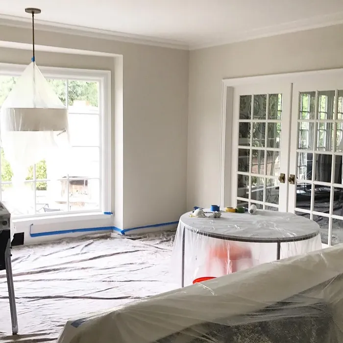
These neutral shades matter more than you’d think. The wrong one can make a room feel flat or yellowish. The right one? Feels calm, cozy, and just right with your furniture. This little guide is here to help you figure that out. We’ll look at how each one works in different rooms, how lighting changes them, and what colors they match with best.
Oh, and a quick nerdy tip: Ballet White has an LRV of 73.87, while Swiss Coffee is around 83. That’s a fancy way of saying one reflects more light—and yeah, it makes a difference. Here’s where all my paint color comparison articles live.
Ballet White vs Swiss Coffee – Quick Comparison
Ballet White has that soft, cozy look that makes a room feel warm without looking yellow. It’s part of the Benjamin Moore off-white family, but it leans just a little creamy. With an LRV around 72, it reflects a fair amount of light—just enough to keep things feeling calm and gentle. I’d say it works great with wooden furniture, soft greens, or pastel decor. It’s kind of like the color of light oatmeal or warm sand in the sun.
Swiss Coffee is also creamy but feels a bit fresher. It’s brighter than Ballet White, thanks to a higher LRV of about 82, which means it reflects more light. This one’s perfect if your space feels a little dark or dull—it can help open things up without being too stark. I’ve seen it in big living rooms, kitchens, even hallways—and it just fits. It’s clean, soft, and plays nice with both modern and classic looks.
Quick note on LRV: It stands for Light Reflectance Value. Higher LRV = more light bounce = brighter-looking room.
Ballet White vs Swiss Coffee Paint Comparison Table
| Feature | Ballet White | Swiss Coffee |
|---|---|---|
| Color Code | OC-9 | OC-45 |
| LRV | ~72 | ~82 |
| Color Family | Off-white, Warm Cream | Off-white, Creamy Neutral |
| Undertones | Beige with soft greige hints | Warm cream with a tiny green-yellow base |
| Best For | Small, cozy rooms with wood tones | Brightening large or darker spaces |
| Ideal Pairings | Pastels, wood furniture, soft taupe | White trim, earth tones, light gray |
Best Settings for Ballet White vs Swiss Coffee
Where Ballet White Shines Indoors
Bedrooms
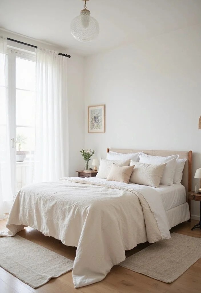
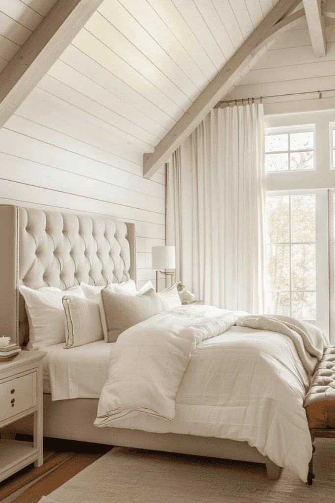
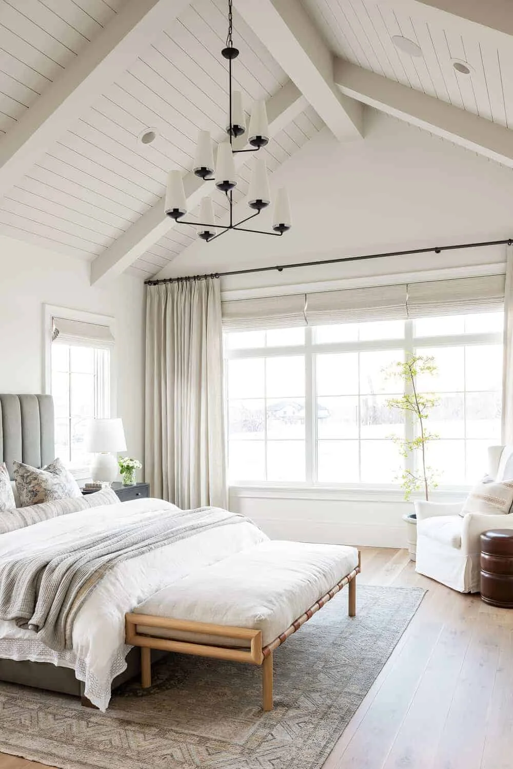
Ballet White is one of those colors that just makes a bedroom feel soft and calm. I’ve seen it with cozy white duvets, soft beige throws, and light wood nightstands—it all blends so well. It’s a great cozy paint color for bedrooms when you want a space that helps you relax without feeling too dark. And here’s a little thing I’ve noticed—it looks slightly creamier in the morning sun, which makes the room feel even warmer.


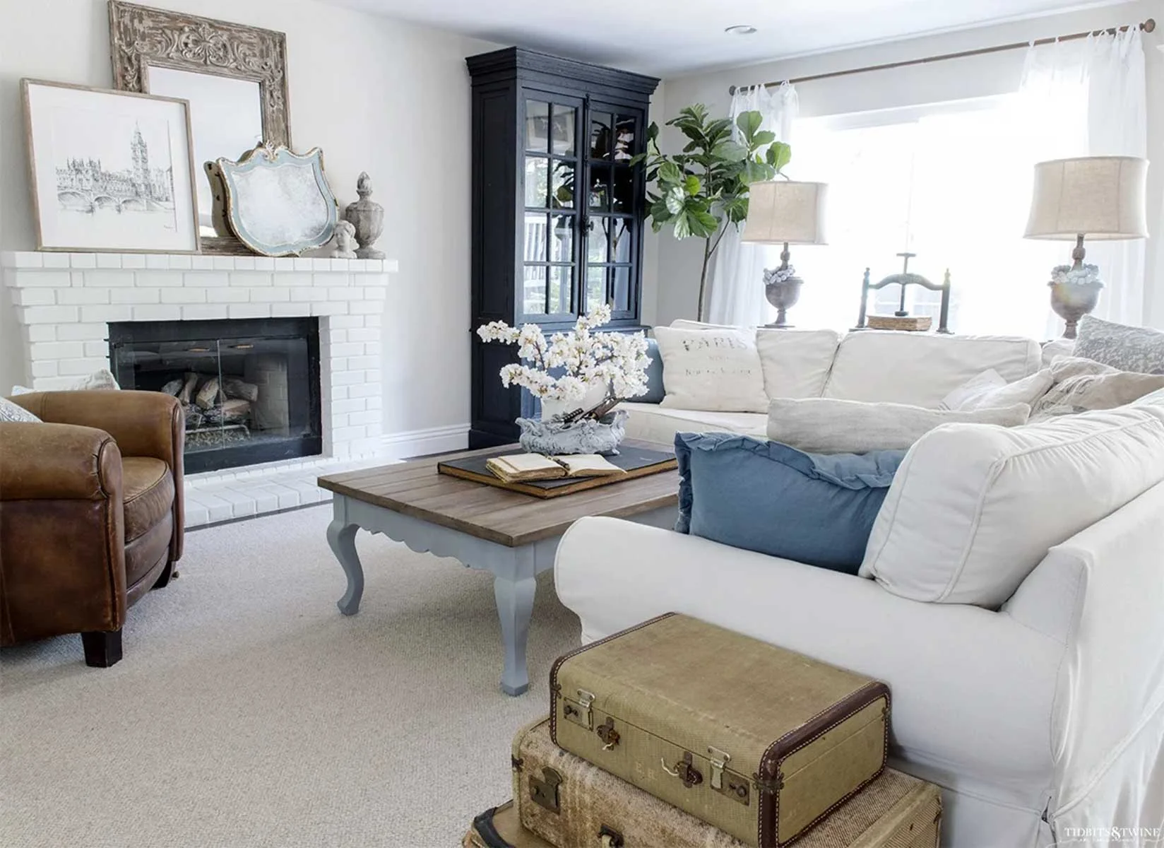
Living Rooms
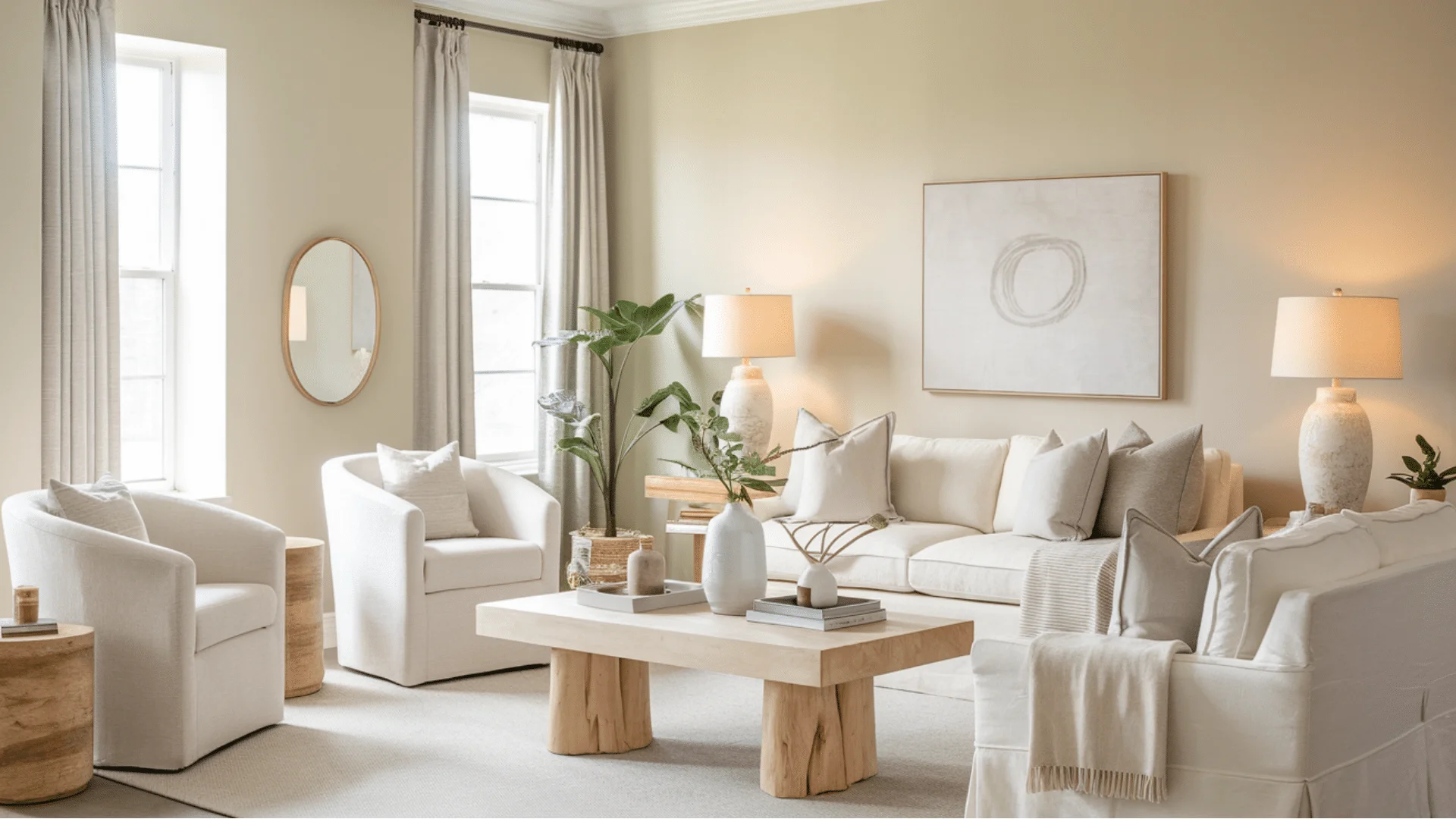
In the living room, BM Ballet White really pairs nicely with natural textures—think linen curtains, jute rugs, and oak or walnut wood furniture. If the room gets a lot of sunlight, this color glows just enough to make things feel bright but still cozy. It’s one of those neutral colors for living spaces that doesn’t shout, but still makes everything look pulled together and inviting.


Ideal Spaces for Swiss Coffee
Bedrooms
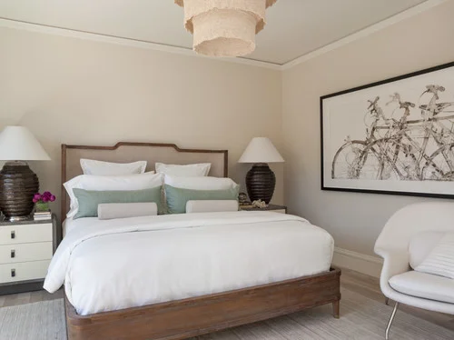
Swiss Coffee has this soft, creamy look that turns a bedroom into a peaceful little retreat. I’ve seen it with thick quilts, light gray pillows, and simple wood nightstands—it feels cozy but kind of fancy at the same time. It’s a perfect pick if you want a cozy bedroom color that feels warm but not too yellow. When the morning light hits, it gives off this soft glow that makes everything feel calm and quiet.


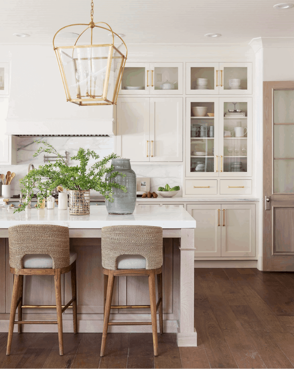
Kitchens
In the kitchen, Swiss Coffee is like a quiet helper—it brightens up the space without trying too hard. It’s a warm white paint that works great with natural light, especially in kitchens that don’t get a ton of sun. I’d pair it with white oak cabinets or matte brass handles for a soft, inviting look. Honestly, it just makes the kitchen feel like it’s saying, “Hey, come on in.”


Lighting
Ballet White in Different Lighting Conditions
With an LRV of 71.97, Ballet White doesn’t bounce tons of light, but it still keeps a room from feeling dark. In natural light, especially during sunrise or sunset, it leans a little creamier—like soft butter on toast. That warm undertone really shines in bedrooms and living rooms, making them feel extra cozy. In east-facing spaces, it feels brighter early on, then turns warmer by evening.


Swiss Coffee and Natural Light
Swiss Coffee has an LRV of 81.91, so it reflects a lot of light—more than Ballet White. That means it shows up brighter and whiter in sunny rooms, especially during the day. It makes spaces feel open and airy, which is perfect for north-facing or low-light spots. I’ve noticed it can feel a bit warmer under soft yellow bulbs, so it still keeps that cozy vibe at night.


Matching Colors & Decor
Styling Your Space with Ballet White
Picking paint is kind of like making soup—Ballet White is that warm, creamy base that lets everything else shine.
Matching Colors
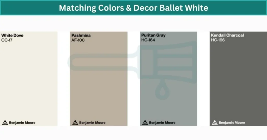
Ballet White plays well with other soft tones. I like pairing it with creams, pale pinks, or earthy greens. Even something as small as a pastel vase or blush throw pillow makes it pop. For a calm, layered look, Benjamin Moore’s Revere Pewter or Simply White sit nicely beside it.
Furniture Pairings
This warm neutral paint color really brings out the beauty in darker woods—think walnut, mahogany, or old farmhouse tables. It also sets a soft stage for antique pieces, vintage dressers, or even that old chair you’ve had forever. It just makes them feel special.
Fabric & Textile Harmony
Quilts, nubby throws, linen curtains—Ballet White Exterior wraps around them like a warm hug. It’s great for cozy rooms where you want things to feel soft and lived-in. I’d throw in some rattan baskets or even a leather accent to keep the space feeling grounded.
Designing with Swiss Coffee – What Works Best
Matching Colors
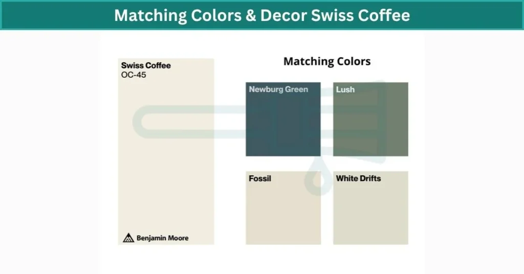
Swiss Coffee feels like a soft canvas pulled from nature. It looks beautiful next to muted greens, warm browns, and soft golds—colors that remind me of a quiet forest morning. I’d say try adding indoor plants, jute rugs, or even a few rattan accents. For a layered palette, BM’s Saybrook Sage or Pale Oak fit right in.
Wood Furniture Pairings
This paint color loves wood. Whether it’s oak, pine, walnut, or teak—Swiss Coffee lets the grain and tone shine through without clashing. It’s the kind of backdrop that works for both modern-rustic and farmhouse styles. I’ve seen it make even basic furniture feel more special.
Earthy & Natural Decor
If you’re into cork planters, terracotta pots, linen drapes, or chunky wool throws—Swiss Coffee ties it all together. It keeps the space from feeling too dark or too cold. I’ve also seen it work really well in Japandi and Scandinavian spaces where you want that calm, balanced, earthy vibe.
Real Room Photos & Examples
Paint colors can look dramatically different depending on lighting, furniture, and room size — here are some real-life examples to help visualize Ballet White and Swiss Coffee in action.
Ballet White in Real Spaces
- Bedroom with Soft Morning Light
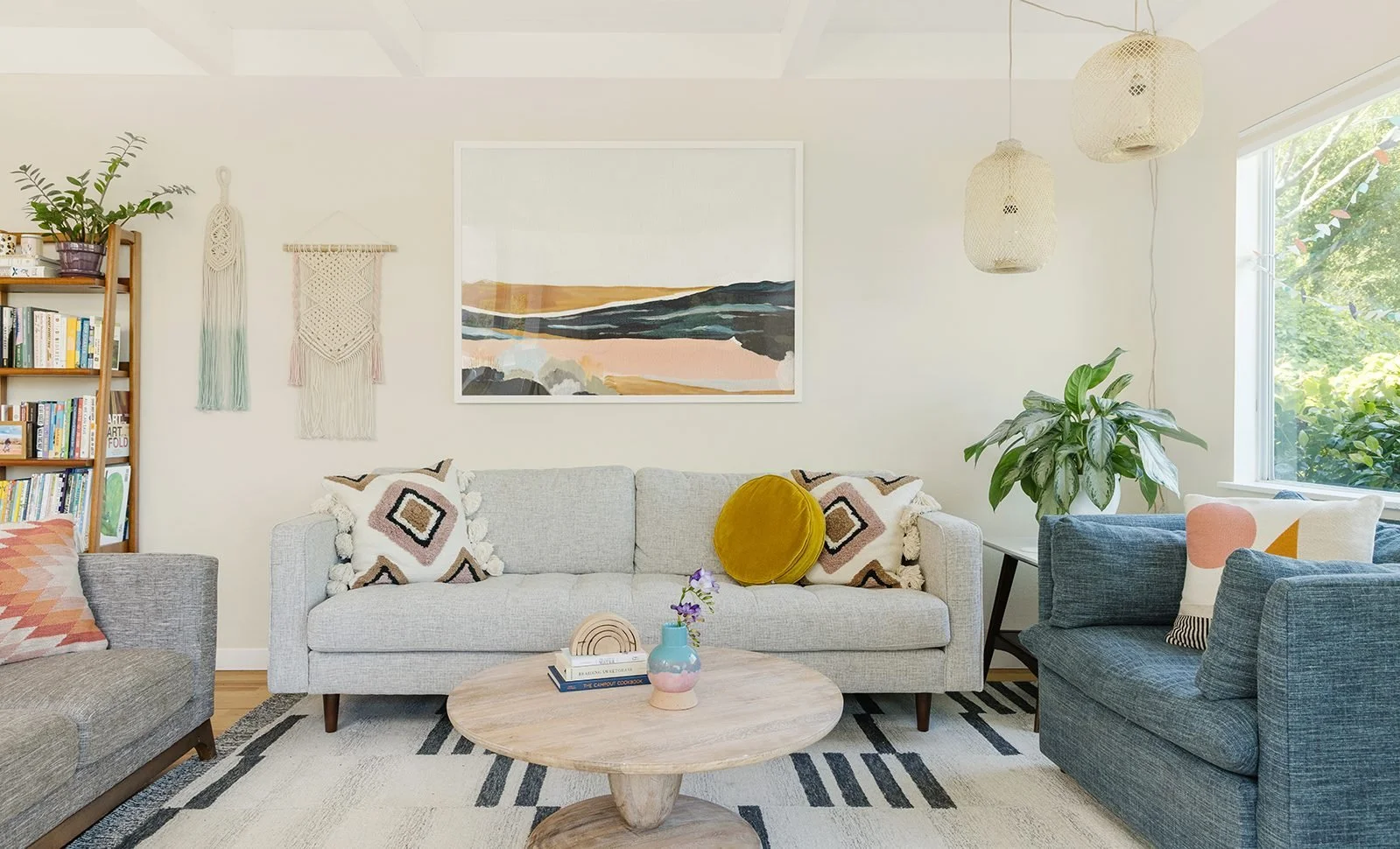
This cozy bedroom uses Benjamin Moore Ballet White on the walls with oak furniture and cream bedding. The color feels soft and creamy, especially in early light. - Farmhouse-Style Living Room
Ballet White adds warmth next to vintage wood and neutral fabrics. In this sunny space, it leans more beige than white, giving off a really calm feel. - Dining Area with Afternoon Glow
In afternoon lighting, Ballet White deepens slightly and makes the whole space feel grounded and peaceful.
Swiss Coffee in Real Spaces
- North-Facing Kitchen
This kitchen shows Swiss Coffee in low natural light, where it looks a bit cooler than you’d expect—almost creamy-white. - Bright Entryway
Lots of sunlight here makes Swiss Coffee feel almost like a soft white. Paired with white oak floors and black hardware, it looks super clean and welcoming. - Swiss Coffee Living Room with Warm Light
In this west-facing room, Swiss Coffee glows with a gentle golden hue during sunset. It blends beautifully with beige linen and matte brass.
Tip: Colors shift a lot depending on light, so I always recommend trying peel-and-stick samples like Samplize before painting the whole room.
Similar Paint Colors from Other Brands
Sometimes the original shade isn’t available, or maybe you’re just looking for something that’s a bit warmer, cooler, or more budget-friendly. Here are some solid alternatives that give you a similar look and feel to Ballet White and Swiss Coffee.
Ballet White Alternatives
- Sherwin-Williams Shoji White
A close match with slightly cooler undertones. It feels a bit more modern and has an LRV of 74, so it’s just a touch brighter than Ballet White. - Behr Blank Canvas
A creamy warm white that gives off a similar calm vibe. It’s a bit softer and slightly more neutral, making it flexible for many styles. LRV is 84. - Valspar Cream in My Coffee
Lower LRV than Ballet White (around 68), but still brings that warm, mellow tone. Works well in cozy rooms with wood tones.
Swiss Coffee Alternatives
- Sherwin-Williams Alabaster
Very close in warmth and tone, but leans just a bit more neutral. It has an LRV of 82, almost identical to Benjamin Moore Swiss Coffee. - Behr Swiss Coffee
Shares the same name but can vary slightly depending on finish and light. Still, it’s a common dupe that many homeowners go for. - Farrow & Ball Pointing
Creamier and a little richer, with a more classic feel. Great for traditional homes that want a soft off-white look with an old-world charm.
Tip: Always sample alternatives in different finishes (like matte vs eggshell) since that can shift how the color looks under different lighting.
Final Verdict of Ballet White vs Swiss Coffee
If you want a soft, cozy color that leans creamy without looking yellow, Ballet White is a solid pick. It’s perfect for smaller rooms, vintage furniture, and warm morning light. It stays steady throughout the day and gives off a calming, lived-in vibe without feeling too bright.
Swiss Coffee, on the other hand, is brighter and more versatile. It works great in big, open rooms or anywhere that needs a bit of a glow. With its subtle yellow warmth and higher LRV, it feels clean but still soft—great for kitchens, bedrooms, and just about everything in between. So that was the complete comparison of Ballet White vs Swiss Coffee.
People Also Ask
What is the undertone of ballet white?
Ballet White OC-9, also known as Muskoka Trail 974, is a warm off-white with a soft, creamy tone and a neutral base. It has gentle yellow and green undertones that keep it from feeling too bright or too cool. The result is a welcoming, easygoing color that gives any room a relaxed, cozy feel without ever looking stark or cold.
Is ballet white too dark?
Ballet White has an LRV of about 71.97, which means it’s right in that sweet spot—not too dark, not too light. It keeps a soft, creamy look that doesn’t change much in different lighting, so what you see is usually what you get. (Wondering what LRV means? It’s just a way to measure how much light a color reflects.)
What is the closest color to Swiss Coffee?
Swiss Coffee (OC-45) is very close to Sherwin-Williams Dover White, which has a slightly higher LRV of 83. Both are creamy off-whites, but Dover White leans a bit more yellow in tone. On the wall, they create a similar soft and warm feel, making them easy swaps for the same kinds of rooms.
What color undertone does Swiss Coffee have?
Swiss Coffee has subtle undertones that shape its warm and inviting feel. You’ll find hints of yellow, soft gray, and even a touch of green, which give it depth without making it look like a true yellow on the wall. This mix makes Swiss Coffee feel cozy and versatile in all kinds of spaces.
Is Swiss Coffee too yellow?
Swiss Coffee isn’t a bright, crisp white—so if you’re after a super modern, stark look, it might feel too soft. It does have a slight yellow tint that gives off a warm, golden-hour kind of glow. On walls or exteriors, it creates a timeless, sun-kissed feel that looks classic and gently lived-in.
Is Swiss Coffee a beige?
Swiss Coffee leans warm with creamy beige undertones and soft yellow hints, but it’s not a true beige. It gives rooms a cozy, inviting feel and works beautifully in living spaces, kitchens, and bedrooms where you want a soft and welcoming atmosphere.
Is Swiss Coffee a good interior color?
Swiss Coffee is a super versatile color for interiors—it works with just about any style. I’ve seen it in modern homes, traditional spaces, transitional rooms, even cozy cottages and farmhouse kitchens. It’s not a bright, stark white but more of a soft, beige warm white with gentle undertones. That cozy feel is exactly why so many design pros keep coming back to it.